はじめに
執筆者は趣味レベルのAndroidアプリ開発者である為,説明間違いが含まれている可能性があります。ですので,お気づきの点がありましたら,是非コメントお願いいたします。また,アップデートにより,機能やコードが記事執筆時点と異なる場合があります。
本記事の目的
Android Studioで使用可能なテンプレートActivityの一つである「Master/Detail Flow」について,機能や構成を説明します。
テンプレートの概要(公式より引用)
このテンプレートでは、アイテムリストと各アイテムの詳細を表示するアプリを作成します。リスト画面でアイテムをクリックすると、アイテムの詳細を示す画面が表示されます。2 つの画面のレイアウトは、アプリを実行しているデバイスによって異なります。
このテンプレートの内容は次のとおりです。
- アイテムのリストを表すアクティビティ
- 各アイテムの詳細を表示するためのアクティビティとフラグメントの各オプション
- 各画面の FloatingActionButton
- アイテム目の詳細画面で使用する折りたたみツールバー
- さまざまなデバイス設定に対応した代替リソース レイアウト ファイル
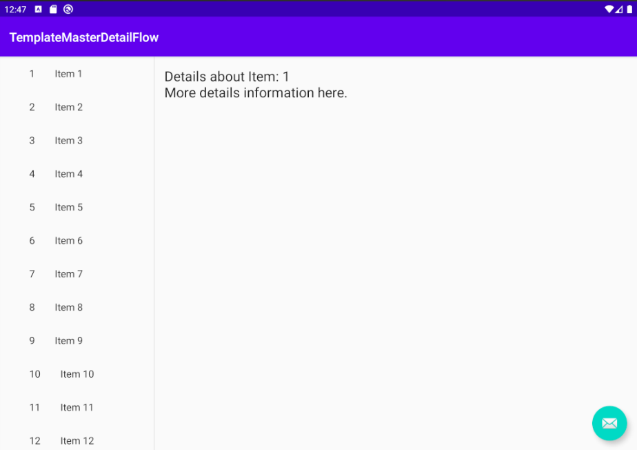
実際の画面と動作
幅が狭い場合の画面レイアウト(以下,通常レイアウト)は下のようになっています。
アプリを開くと,アイテムリストが表示されます。
右下にボタンが有り,押すと「自分で作成した動作に置き換えてください」と表示されます。
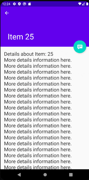
アイテムをタップするとアイテムの詳細画面が表示されます。
詳細画面にアイテム目のタイトルや詳細メッセージが表示され,ボタンも用意されています。
ボタンを押すと,同様に「自分で作成した動作に置き換えてください」と表示されます。
左上の戻るボタンを押すことで,またリストに戻ります。
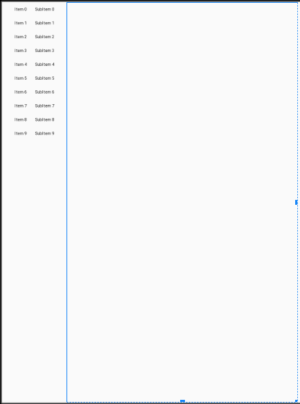
また,幅広ディスプレイ(幅900dp以上)の場合は画面遷移を行わず,詳細画面がアイテムリストの横に表示されます。
ソースコードを見てみる(アイテムリスト画面)
レイアウトファイル
以下がアイテムリスト画面のレイアウトファイルになります
含まれるViewの大きさや位置を動的に管理できる,CoordinatorLayoutというレイアウトを使用しています。
また,実際にコンテンツが表示される分はFrameLayoutになっていますが,この中に下のitem_list.xmlのレイアウトが適用されます。画面の幅の大きさにより2種類のitem_list.xmlが切り替わって適用されます。
<?xml version="1.0" encoding="utf-8"?>
<androidx.coordinatorlayout.widget.CoordinatorLayout xmlns:android="http://schemas.android.com/apk/res/android"
    xmlns:app="http://schemas.android.com/apk/res-auto"
    xmlns:tools="http://schemas.android.com/tools"
    android:layout_width="match_parent"
    android:layout_height="match_parent"
    android:fitsSystemWindows="true"
    tools:context=".ItemListActivity">

    <com.google.android.material.appbar.AppBarLayout
        android:id="@+id/app_bar"
        android:layout_width="match_parent"
        android:layout_height="wrap_content"
        android:theme="@style/AppTheme.AppBarOverlay">

        <androidx.appcompat.widget.Toolbar
            android:id="@+id/toolbar"
            android:layout_width="match_parent"
            android:layout_height="?attr/actionBarSize"
            app:popupTheme="@style/AppTheme.PopupOverlay" />

    </com.google.android.material.appbar.AppBarLayout>

    <FrameLayout
        android:id="@+id/frameLayout"
        android:layout_width="match_parent"
        android:layout_height="match_parent"
        app:layout_behavior="@string/appbar_scrolling_view_behavior">

        <include layout="@layout/item_list" />
    </FrameLayout>

    <com.google.android.material.floatingactionbutton.FloatingActionButton
        android:id="@+id/fab"
        android:layout_width="wrap_content"
        android:layout_height="wrap_content"
        android:layout_gravity="bottom|end"
        android:layout_margin="@dimen/fab_margin"
        app:srcCompat="@android:drawable/ic_dialog_email" />

</androidx.coordinatorlayout.widget.CoordinatorLayout>
通常レイアウト用のレイアウトファイルの中身は,単にRecyclerViewのみです。
<?xml version="1.0" encoding="utf-8"?>
<androidx.recyclerview.widget.RecyclerView xmlns:android="http://schemas.android.com/apk/res/android"
    xmlns:app="http://schemas.android.com/apk/res-auto"
    xmlns:tools="http://schemas.android.com/tools"
    android:id="@+id/item_list"
    android:name="xyz.hacchikh.templatemasterdetailflow.ItemListFragment"
    android:layout_width="match_parent"
    android:layout_height="match_parent"
    android:layout_marginLeft="16dp"
    android:layout_marginRight="16dp"
    app:layoutManager="LinearLayoutManager"
    tools:context=".ItemListActivity"
    tools:listitem="@layout/item_list_content" />
幅広レイアウトの中身ですが,こちらはRecyclerView + FrameLayoutが水平に並ぶ構成になっています。
RecyclerViewにはアイテムリストが表示され,FrameLayoutにはタップされたアイテムの詳細が表示されます。
<?xml version="1.0" encoding="utf-8"?>
<LinearLayout xmlns:android="http://schemas.android.com/apk/res/android"
    xmlns:app="http://schemas.android.com/apk/res-auto"
    xmlns:tools="http://schemas.android.com/tools"
    android:layout_width="match_parent"
    android:layout_height="match_parent"
    android:layout_marginLeft="16dp"
    android:layout_marginRight="16dp"
    android:baselineAligned="false"
    android:divider="?android:attr/dividerHorizontal"
    android:orientation="horizontal"
    android:showDividers="middle"
    tools:context=".ItemListActivity">

    <!--
    This layout is a two-pane layout for the Items master/detail flow.
    -->

    <androidx.recyclerview.widget.RecyclerView xmlns:android="http://schemas.android.com/apk/res/android"
        xmlns:tools="http://schemas.android.com/tools"
        android:id="@+id/item_list"
        android:name="xyz.hacchikh.templatemasterdetailflow.ItemListFragment"
        android:layout_width="@dimen/item_width"
        android:layout_height="match_parent"
        android:layout_marginLeft="16dp"
        android:layout_marginRight="16dp"
        app:layoutManager="LinearLayoutManager"
        tools:context="xyz.hacchikh.templatemasterdetailflow.ItemListActivity"
        tools:listitem="@layout/item_list_content" />

    <FrameLayout
        android:id="@+id/item_detail_container"
        android:layout_width="0dp"
        android:layout_height="match_parent"
        android:layout_weight="3" />

</LinearLayout>
アイテムリストの各行のレイアウトは以下のようになっています。
TextViewが水平に並んでいるだけです。
<?xml version="1.0" encoding="utf-8"?>
<LinearLayout xmlns:android="http://schemas.android.com/apk/res/android"
    android:layout_width="wrap_content"
    android:layout_height="wrap_content"
    android:orientation="horizontal">

    <TextView
        android:id="@+id/id_text"
        android:layout_width="wrap_content"
        android:layout_height="wrap_content"
        android:layout_margin="@dimen/text_margin"
        android:textAppearance="?attr/textAppearanceListItem" />

    <TextView
        android:id="@+id/content"
        android:layout_width="wrap_content"
        android:layout_height="wrap_content"
        android:layout_margin="@dimen/text_margin"
        android:textAppearance="?attr/textAppearanceListItem" />
</LinearLayout>
ItemListActivity
ItemListActivityの中身は少し長くなっていますが,これはRecyclerViewのAdapterクラスが含まれているためです。
フローティングアクションボタンの動作には,単にスナックバー表示処理のみが実装されているようです。
また,twoPaneという変数で,通常レイアウトと幅広用レイアウト用の表示処理を切り替えています。。
通常レイアウトはtwoPane == falseとなり,ItemDetailActivity(アイテム詳細画面)にタップされたアイテムのidを渡して遷移を行います。
幅広レイアウトの場合,タップされたアイテムのidの情報を付加したItemDetailFragmentの実体を生成し,それをFrameLayout(item_detail_container)に貼り付けています。
/**
 * An activity representing a list of Pings. This activity
 * has different presentations for handset and tablet-size devices. On
 * handsets, the activity presents a list of items, which when touched,
 * lead to a [ItemDetailActivity] representing
 * item details. On tablets, the activity presents the list of items and
 * item details side-by-side using two vertical panes.
 */
class ItemListActivity : AppCompatActivity() {

    /**
     * Whether or not the activity is in two-pane mode, i.e. running on a tablet
     * device.
     */
    private var twoPane: Boolean = false

    override fun onCreate(savedInstanceState: Bundle?) {
        super.onCreate(savedInstanceState)
        setContentView(R.layout.activity_item_list)

        val toolbar = findViewById<Toolbar>(R.id.toolbar)
        setSupportActionBar(toolbar)
        toolbar.title = title

        findViewById<FloatingActionButton>(R.id.fab).setOnClickListener { view ->
            Snackbar.make(view, "Replace with your own action", Snackbar.LENGTH_LONG)
                    .setAction("Action", null).show()
        }

        if (findViewById<NestedScrollView>(R.id.item_detail_container) != null) {
            // The detail container view will be present only in the
            // large-screen layouts (res/values-w900dp).
            // If this view is present, then the
            // activity should be in two-pane mode.
            twoPane = true
        }

        setupRecyclerView(findViewById(R.id.item_list))
    }

    private fun setupRecyclerView(recyclerView: RecyclerView) {
        recyclerView.adapter = SimpleItemRecyclerViewAdapter(this, DummyContent.ITEMS, twoPane)
    }

    class SimpleItemRecyclerViewAdapter(private val parentActivity: ItemListActivity,
                                        private val values: List<DummyContent.DummyItem>,
                                        private val twoPane: Boolean) :
            RecyclerView.Adapter<SimpleItemRecyclerViewAdapter.ViewHolder>() {

        private val onClickListener: View.OnClickListener

        init {
            onClickListener = View.OnClickListener { v ->
                val item = v.tag as DummyContent.DummyItem
                if (twoPane) {
                    val fragment = ItemDetailFragment().apply {
                        arguments = Bundle().apply {
                            putString(ItemDetailFragment.ARG_ITEM_ID, item.id)
                        }
                    }
                    parentActivity.supportFragmentManager
                            .beginTransaction()
                            .replace(R.id.item_detail_container, fragment)
                            .commit()
                } else {
                    val intent = Intent(v.context, ItemDetailActivity::class.java).apply {
                        putExtra(ItemDetailFragment.ARG_ITEM_ID, item.id)
                    }
                    v.context.startActivity(intent)
                }
            }
        }

        override fun onCreateViewHolder(parent: ViewGroup, viewType: Int): ViewHolder {
            val view = LayoutInflater.from(parent.context)
                    .inflate(R.layout.item_list_content, parent, false)
            return ViewHolder(view)
        }

        override fun onBindViewHolder(holder: ViewHolder, position: Int) {
            val item = values[position]
            holder.idView.text = item.id
            holder.contentView.text = item.content

            with(holder.itemView) {
                tag = item
                setOnClickListener(onClickListener)
            }
        }

        override fun getItemCount() = values.size

        inner class ViewHolder(view: View) : RecyclerView.ViewHolder(view) {
            val idView: TextView = view.findViewById(R.id.id_text)
            val contentView: TextView = view.findViewById(R.id.content)
        }
    }
}
ソースコードを見てみる(アイテム詳細画面)
では次は,アイテム詳細画面の実装について見ていきたいと思います。
レイアウトファイル
アイテム詳細画面に関するレイアウトファイルは2つあります。
1つめが,通常レイアウト時に,アイテムをタップした際の遷移先画面のレイアウトであるactivity_item_detail.xmlです。この画面では,スクロールに応じて上のバーが大きくなったり小さくなったりする機能があります。
この機能の実装の為に,CoordinatorLayout,CollapsingToolbarLayout等が使用されています。
(CollapsingToolbarは,日本語で「つぶれるツールバー」という意味)
app:layout_scrollFlags="scroll|exitUntilCollapsed"を指定することで,スクロール可能なViewが一番上までスクロールした時に、スクロールに応じて子View(今回はToolbar)の高さまで,AppBarLayoutは小さくなります。(他にもenterAlwaysやenterAlwaysCollapsedがあります。)
また,アイテム詳細表示部には,NestedScrollView等が含まれています。
これは,通常のScrollViewと異なり,大きさを変化させることが可能です。AppBarの大きさ応じてスクロール部分を変化させる必要があるため,NestedScrollViewを使用しているようです。
この辺の話は,こちらの記事で分かりやすく解説されています。
<?xml version="1.0" encoding="utf-8"?>
<androidx.coordinatorlayout.widget.CoordinatorLayout xmlns:android="http://schemas.android.com/apk/res/android"
    xmlns:app="http://schemas.android.com/apk/res-auto"
    xmlns:tools="http://schemas.android.com/tools"
    android:layout_width="match_parent"
    android:layout_height="match_parent"
    android:fitsSystemWindows="true"
    tools:context=".ItemDetailActivity"
    tools:ignore="MergeRootFrame">

    <com.google.android.material.appbar.AppBarLayout
        android:id="@+id/app_bar"
        android:layout_width="match_parent"
        android:layout_height="@dimen/app_bar_height"
        android:fitsSystemWindows="true"
        android:theme="@style/ThemeOverlay.AppCompat.Dark.ActionBar">

        <com.google.android.material.appbar.CollapsingToolbarLayout
            android:id="@+id/toolbar_layout"
            android:layout_width="match_parent"
            android:layout_height="match_parent"
            android:fitsSystemWindows="true"
            app:contentScrim="?attr/colorPrimary"
            app:layout_scrollFlags="scroll|exitUntilCollapsed"
            app:toolbarId="@+id/toolbar">

            <androidx.appcompat.widget.Toolbar
                android:id="@+id/detail_toolbar"
                android:layout_width="match_parent"
                android:layout_height="?attr/actionBarSize"
                app:layout_collapseMode="pin"
                app:popupTheme="@style/ThemeOverlay.AppCompat.Light" />

        </com.google.android.material.appbar.CollapsingToolbarLayout>

    </com.google.android.material.appbar.AppBarLayout>

    <androidx.core.widget.NestedScrollView
        android:id="@+id/item_detail_container"
        android:layout_width="match_parent"
        android:layout_height="match_parent"
        app:layout_behavior="@string/appbar_scrolling_view_behavior" />

    <com.google.android.material.floatingactionbutton.FloatingActionButton
        android:id="@+id/fab"
        android:layout_width="wrap_content"
        android:layout_height="wrap_content"
        android:layout_gravity="center_vertical|start"
        android:layout_margin="@dimen/fab_margin"
        app:layout_anchor="@+id/item_detail_container"
        app:layout_anchorGravity="top|end"
        app:srcCompat="@android:drawable/stat_notify_chat" />

</androidx.coordinatorlayout.widget.CoordinatorLayout>
2つめは,実際にアイテムの詳細について表示される部分だけのレイアウトを定義したitem_detail.xmlです。こちらは,TextViewのみの非常にシンプルな構成です。
<?xml version="1.0" encoding="utf-8"?>
<TextView xmlns:android="http://schemas.android.com/apk/res/android"
    xmlns:tools="http://schemas.android.com/tools"
    android:id="@+id/item_detail"
    style="?android:attr/textAppearanceLarge"
    android:layout_width="match_parent"
    android:layout_height="match_parent"
    android:padding="16dp"
    android:textIsSelectable="true"
    tools:context=".ItemDetailFragment" />
ItemDetailActivity
通常レイアウトにおいてアイテムをタップした際に遷移するActivityになります。
FloatingActionButtonをタップした際には,スナックバーが表示されるよう設定されています。
また,supportActionBar?.setDisplayHomeAsUpEnabled(true)で左上に戻るボタンを表示しています。
また,savedInstanceState == nullの際には,タップされたアイテムのidの情報を付加したItemDetailFragmentの実体を生成し,それをNestedScrollView(item_detail_container)に貼り付けるような流れになっています。
savedInstanceState == nullを指定している理由ですが,これはコメントによると,(画面回転等によりプロセスが破棄されて)savedInstanceStateが存在する状態ではフラグメントは自動的にコンテナに再追加される使用になっているため,わざわざ手動で再追加する必要ないとのことらしいです。
試しにこの条件式を外してみると,アイテム詳細画面で画面回転等をした際に,
ScrollView can host only one direct child
というエラーが生じ,アプリが落ちました。「何個もNestedScrollViewに子Viewをaddできないよ!」ということだと思います。
また,onOptionsItemSelectedですが,ここでは左上の矢印ボタン(android.R.id.home)に対し,ItemListActivityへ戻る動作を実装しています。
/**
 * An activity representing a single Item detail screen. This
 * activity is only used on narrow width devices. On tablet-size devices,
 * item details are presented side-by-side with a list of items
 * in a [ItemListActivity].
 */
class ItemDetailActivity : AppCompatActivity() {

    override fun onCreate(savedInstanceState: Bundle?) {
        super.onCreate(savedInstanceState)
        setContentView(R.layout.activity_item_detail)
        setSupportActionBar(findViewById(R.id.detail_toolbar))

        findViewById<FloatingActionButton>(R.id.fab).setOnClickListener { view ->
            Snackbar.make(view, "Replace with your own detail action", Snackbar.LENGTH_LONG)
                    .setAction("Action", null).show()
        }

        // Show the Up button in the action bar.
        supportActionBar?.setDisplayHomeAsUpEnabled(true)

        // savedInstanceState is non-null when there is fragment state
        // saved from previous configurations of this activity
        // (e.g. when rotating the screen from portrait to landscape).
        // In this case, the fragment will automatically be re-added
        // to its container so we don"t need to manually add it.
        // For more information, see the Fragments API guide at:
        //
        // http://developer.android.com/guide/components/fragments.html
        //
        if (savedInstanceState == null) {
            // Create the detail fragment and add it to the activity
            // using a fragment transaction.
            val fragment = ItemDetailFragment().apply {
                arguments = Bundle().apply {
                    putString(ItemDetailFragment.ARG_ITEM_ID,
                            intent.getStringExtra(ItemDetailFragment.ARG_ITEM_ID))
                }
            }

            supportFragmentManager.beginTransaction()
                    .add(R.id.item_detail_container, fragment)
                    .commit()
        }
    }

    override fun onOptionsItemSelected(item: MenuItem) =
            when (item.itemId) {
                android.R.id.home -> {

                    // This ID represents the Home or Up button. In the case of this
                    // activity, the Up button is shown. For
                    // more details, see the Navigation pattern on Android Design:
                    //
                    // http://developer.android.com/design/patterns/navigation.html#up-vs-back

                    navigateUpTo(Intent(this, ItemListActivity::class.java))

                    true
                }
                else -> super.onOptionsItemSelected(item)
            }
}
ItemDetailFragment
ItemDetailFragmentについて解説します。
こちらは,通常レイアウトの場合はNestScrollViewに,幅広レイアウトの場合はFrameLayoutに適用される部分で,実際に項目の説明が記載される部分になります。
onCreateでは,渡されたargumentsからアイテムの内容を取得し,そのアイテムのタイトルをツールバーに設定しています。(R.id.toolbar_layoutはアイテムリスト画面には存在しないため,幅広レイアウトではツールバーのテキストは変更されません。)
onCreateViewでは,アイテムの中身をTextViewに設定しています。
/**
 * A fragment representing a single Item detail screen.
 * This fragment is either contained in a [ItemListActivity]
 * in two-pane mode (on tablets) or a [ItemDetailActivity]
 * on handsets.
 */
class ItemDetailFragment : Fragment() {

    /**
     * The dummy content this fragment is presenting.
     */
    private var item: DummyContent.DummyItem? = null

    override fun onCreate(savedInstanceState: Bundle?) {
        super.onCreate(savedInstanceState)

        arguments?.let {
            if (it.containsKey(ARG_ITEM_ID)) {
                // Load the dummy content specified by the fragment
                // arguments. In a real-world scenario, use a Loader
                // to load content from a content provider.
                item = DummyContent.ITEM_MAP[it.getString(ARG_ITEM_ID)]
                activity?.findViewById<CollapsingToolbarLayout>(R.id.toolbar_layout)?.title = item?.content
            }
        }
    }

    override fun onCreateView(inflater: LayoutInflater, container: ViewGroup?,
                              savedInstanceState: Bundle?): View? {
        val rootView = inflater.inflate(R.layout.item_detail, container, false)

        // Show the dummy content as text in a TextView.
        item?.let {
            rootView.findViewById<TextView>(R.id.item_detail).text = it.details
        }

        return rootView
    }

    companion object {
        /**
         * The fragment argument representing the item ID that this fragment
         * represents.
         */
        const val ARG_ITEM_ID = "item_id"
    }
}
疑問点
初心者目線で疑問に思った点です。
- ItemDetailFragmentにおいて,onCreateとonCreateViewで表示を分けている理由