自分の覚書的な意味合いも含め、Rで多変数からなるデータフレームの関係性を視覚化する
関数(パッケージ)をまとめます。
多変数視覚化パッケージ&関数まとめ
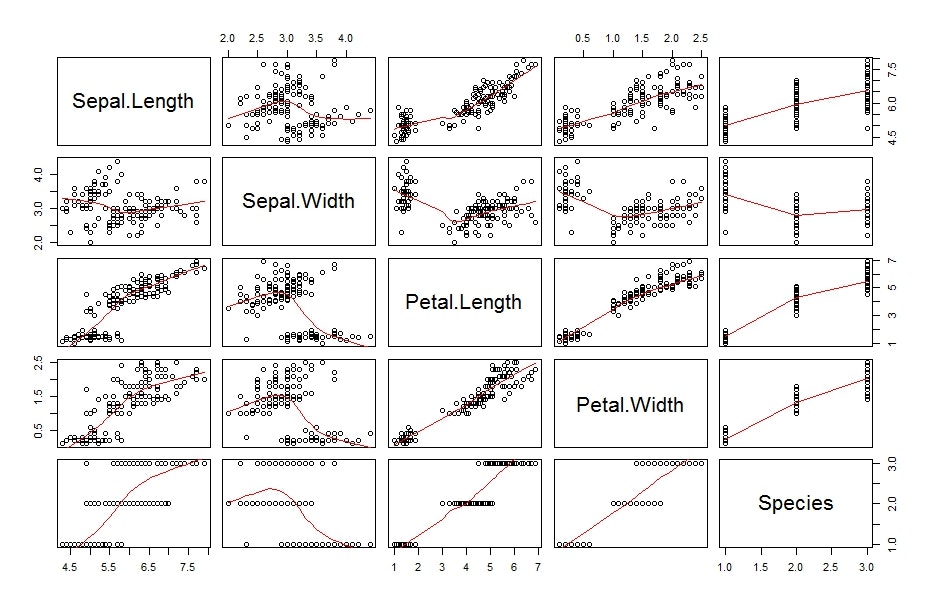
pairs:散布図行列
既定で利用できるpairs関数。
見やすく加工するには色々パラメータをいじる必要があります。
pairs
pairs(iris, panel = panel.smooth)
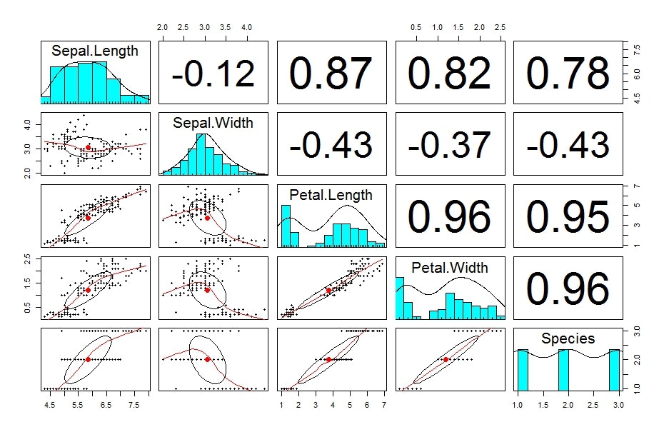
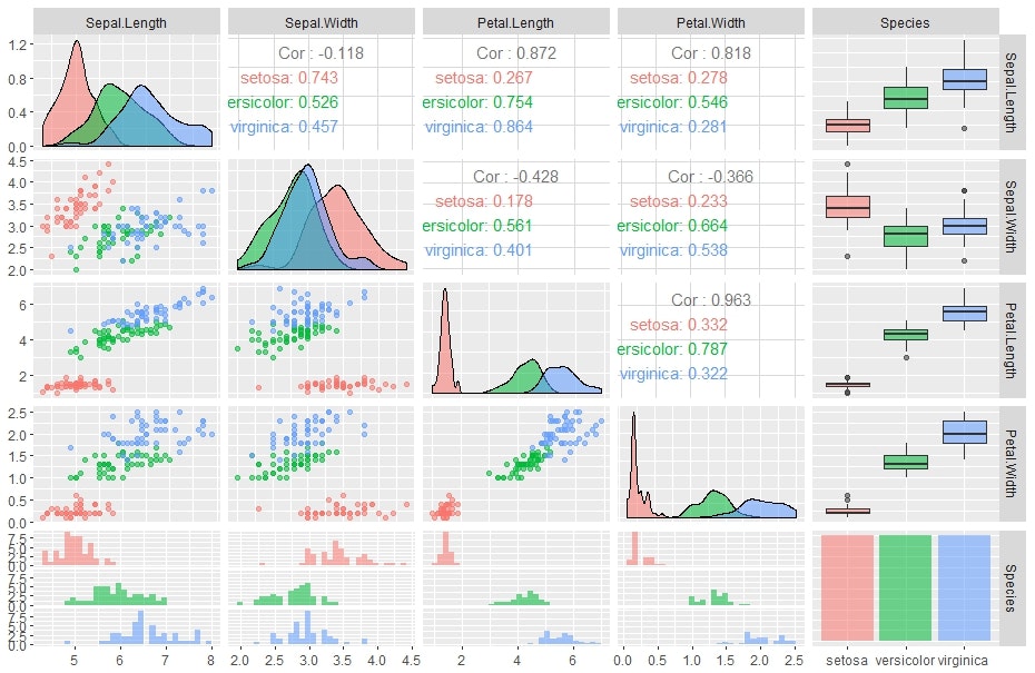
{psych}pairs.panels:散布図・相関行列図
個人的に一番好きなグラフ。
1変量も2変量も相関も分かりやすいです。
pairs.panels
library(psych)
psych::pairs.panels(iris)
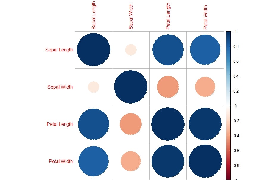
{corrplot}corrplot:相関行列図(円)
円の大きさで相関を表す相関行列図。
変数が多くても、パッと見分かりやすいかも。
corrplot
library(corrplot)
corrplot::corrplot(cor(iris[,-5]))
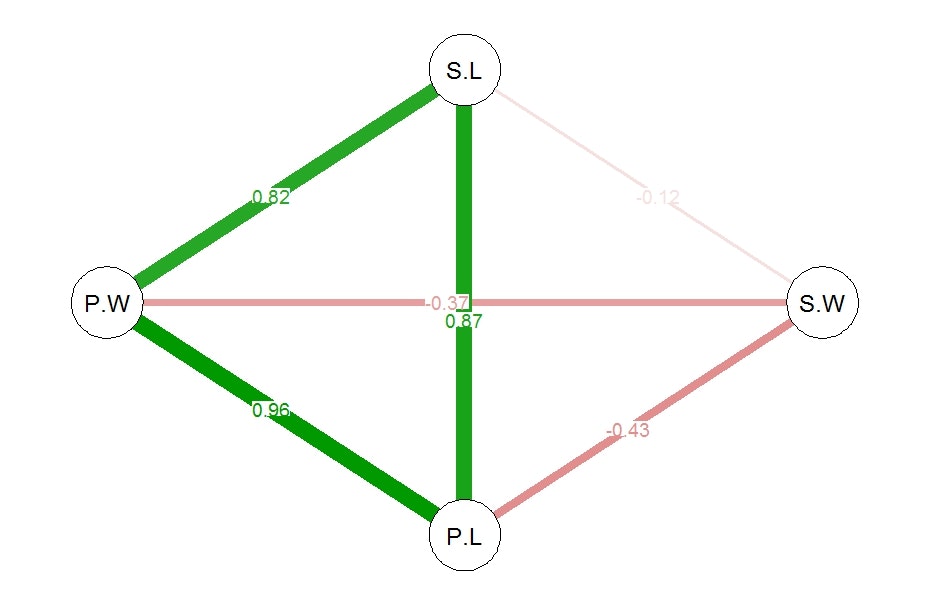
{qgraph}qgraph:ネットワーク図
各変数間の相関関係をネットワーク図で表示。こんな表現の仕方もありかー。
qgraph
library(qgraph)
qgraph(cor(iris[,-5]),edge.labels=T )
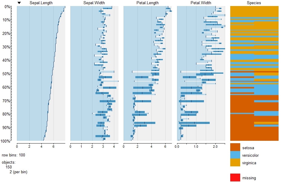
{tabplot}tableplot:テーブルプロット
ある変数をソートしてグラフ化。
ソートする変数はsortCol="xxxxx"のパラメーターで指定可能。
tableplot
library(tabplot)
tableplot(iris)
{GGally}ggpairs:モダンな散布図・相関行列etc
グラフ生成に時間がかかりますが、恐らく一番簡単に凝った多変数の関係図が可視化できるパッケージ。
ggpairs
library(ggplot2)
library(GGally)
ggpairs(iris,aes_string(colour="Species", alpha=0.5))
おわりに
探せばまだまだ視覚化に便利なパッケージがありそうです。
色々パラメータを操作すれば、自分好みにできる自由度の高いグラフも多いです。
データ分析の第一歩は、データの構造を理解することから。
上記のグラフがぱぱっと作れると、色々便利になりそうです。