SVD、もしかして需要がない?
昨日の朝に、特異値分解(SVD)に関する記事を書きました。ですが、あまりにもLGTMが少なくて、「もしかして特異値分解って需要がない?」という気持ちになりました。
今回は、SVDのよさを知ってほしくて、記事を書きます。
SVDは次元が大きいデータを整理して次元を圧縮できる、とても素晴らしいアルゴリズムなのです。
例として、機械学習の練習でおなじみの、アヤメの種類を特徴から分類するIrisデータセットを使って次元削減して、2次元で図示してみましょう。
この記事は、機械学習よりは、次元削減の方法や、それによって図示がしやすくなることに重みを置いています。
Irisデータセットをscikit-learnから取ってくる
このデータセットでは、4つの次元の特徴量と、0, 1, 2のラベルが用意されています。4次元というのは人間には難しく、なかなか図示もしづらいですね。
from itertools import combinations
import numpy as np
import pandas as pd
from sklearn.datasets import load_iris
from sklearn.model_selection import train_test_split
from sklearn.svm import LinearSVC
import matplotlib.pyplot as plt

iris = load_iris(as_frame=True)
iris.frame
| sepal length (cm) | sepal width (cm) | petal length (cm) | petal width (cm) | target | |
|---|---|---|---|---|---|
| 0 | 5.1 | 3.5 | 1.4 | 0.2 | 0 |
| 1 | 4.9 | 3.0 | 1.4 | 0.2 | 0 |
| 2 | 4.7 | 3.2 | 1.3 | 0.2 | 0 |
| 3 | 4.6 | 3.1 | 1.5 | 0.2 | 0 |
| 4 | 5.0 | 3.6 | 1.4 | 0.2 | 0 |
| ... | ... | ... | ... | ... | ... |
| 145 | 6.7 | 3.0 | 5.2 | 2.3 | 2 |
| 146 | 6.3 | 2.5 | 5.0 | 1.9 | 2 |
| 147 | 6.5 | 3.0 | 5.2 | 2.0 | 2 |
| 148 | 6.2 | 3.4 | 5.4 | 2.3 | 2 |
| 149 | 5.9 | 3.0 | 5.1 | 1.8 | 2 |
試しに、各2次元について、グラフを描いてみましょう。
axes = list(combinations(range(4), 2))
plt_cols = 3
plt_rows = (len(axes) - 1) // plt_cols + 1
targets = [0, 1, 2]

plt.figure(figsize=(12, 8))
for i, (x, y) in enumerate(axes):
    plt.subplot(plt_rows, plt_cols, i + 1)
    plt.xlabel(iris.frame.columns[x])
    plt.ylabel(iris.frame.columns[y])
    for t in targets:
        plt.plot(iris.frame[iris.frame.target == t].iloc[:, x], iris.frame[iris.frame.target == t].iloc[:, y], ".")
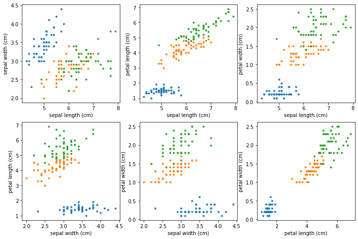
各軸ごとにプロットしてみました。おぼろげに何かは見えるけど、4次元を直感的に捉えるのはあまりにも難しすぎます。
SVDをやってみる
SVDをやるだけなら、train, testという概念は特になく、単なる次元削減という側面が強いです。情報を落とすことになるので、単に機械学習をしたいのであれば、SVDをしなくてもいいかもしれません。けれど、次元圧縮と機械学習の両方を同時にやってみましょう。
そのために、データセットをtrainデータとtestデータに分けます。そして、trainデータに対してSVDをやってみます。
x_train, x_test, y_train, y_test = train_test_split(iris.data, iris.target, test_size=0.2, random_state=1)
trainデータはデータ数が114、特徴量の数が4です。
print(x_train.shape) # => (120, 4)
SVD自体は、教師あり機械学習ではないので、ラベルのデータは使いません。単に x_train を次元削減します。
u, s, vt = np.linalg.svd(x_train, full_matrices=False)
112x4の行列である x_train を、SVDにより3つの行列の積に分割しました(sは対角行列なので対角成分だけが返ってきています)
u * s @ vt 、あるいは同じ意味ですが np.dot(u * s, vt) が、x_trainと一致します。
print(np.allclose(x_train, u * s @ vt)) # => True
あるいは、式変形により、x_train, vt, sからuを導く式も作れます。(今回はうまく合いましたが、割り算を使っているので、sの値によっては、浮動小数点誤差が大きく合わないかもしれません。しかし、この後、次元削減により小さな値は無視することにします)
この式は、trainデータでSVDした結果をtestデータに使うときに必要になります。
print(np.allclose(x_train @ vt.T / s, u)) # => True
ところで、sの値を見てみましょう。
print(s) # => [85.99229833 15.66745575 3.29372488 1.58329849]
sは、数字が大きい順になっています。uとvtは、x_trainを行列として見たとき、行列を長さを変えずに変換するもので、sの部分が長さの変換に相当します。そして、sが小さい部分というのは、あまり変換に寄与しないということです。
この値を見るに、最初の2つだけで十分だと思いませんか?
ということで、次元の削減ができます!
sのデータを削って、それと次元が合うように u, vtも削ります。
x_train_2d = u[:, :2] * s[:2] @ vt[:2, :2]
for t in targets:
    plt.plot(x_train_2d[y_train == t][:, 0], x_train_2d[y_train == t][:, 1], ".")
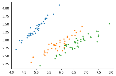
次元削減したデータをざっくりと線形分離してしまう
情報を削減しているので、単に機械学習をするなら、元のデータの方が精度はいいかもしれません。けれど、2次元平面で図示できるというのは圧倒的に分かりやすいです。少々精度は落ちても、SVM(サポートベクターマシン)で線形分離してみましょう。
ここでは、setosa(青)とversicolor(橙)、versicolor(橙)とvirginica(緑)を分類する2本の直線を引きます。
clf1 = LinearSVC()
clf1.fit(x_train_2d[y_train.isin([0, 1])], y_train[y_train.isin([0, 1])])
clf2 = LinearSVC(max_iter=2000)
clf2.fit(x_train_2d[y_train.isin([1, 2])], y_train[y_train.isin([1, 2])])
はい、できました。図示しましょう。
# train-data
for t in targets:
    plt.plot(x_train_2d[y_train == t][:, 0], x_train_2d[y_train == t][:, 1], ".")
# line
x0, x1 = plt.xlim()
y0, y1 = plt.ylim()
plt.plot([x0, -(clf1.coef_[0, 1] * y1 + clf1.intercept_[0]) / clf1.coef_[0, 0]], [-(clf1.coef_[0, 0] * x0 + clf1.intercept_[0]) / clf1.coef_[0, 1], y1], color="black")
plt.plot([-(clf2.coef_[0, 1] * y0 + clf2.intercept_[0]) / clf2.coef_[0, 0], x1], [y0, -(clf2.coef_[0, 0] * x1 + clf2.intercept_[0]) / clf2.coef_[0, 1]], color="black")
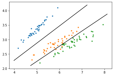
所詮は2次元の線形SVMですが、多次元で計算するよりも圧倒的に図として見やすいですし、「何かよさそうな特徴量を2個選びました」よりは、「SVDで寄与の大きい次元を選びました」の方が、選んだ根拠としても強いです。さて、ここにtestデータを載せてみたら、どうなるでしょう?
testデータを載せてみる
testデータ用のuをテストデータとvt, sから作り、さらに、testデータを次元圧縮するのですが、計算してみると、一度の計算にまとめられることが分かります。
# testデータの計算
# u_test_2d = x_test.to_numpy() @ vt.T[:, :2] / s[:2]
# x_test_2d = u_test_2d * s[:2] @ vt[:2, :2]
# と、2段階でできるが、上の2つをまとめると以下のようになる
x_test_2d = x_test.to_numpy() @ vt.T[:, :2] @ vt[:2, :2]
さて、これをプロットしましょう。
# train-data
for t in targets:
    plt.plot(x_train_2d[y_train == t][:, 0], x_train_2d[y_train == t][:, 1], ".", alpha=0.2)
# test-data
colors = plt.rcParams['axes.prop_cycle'].by_key()['color'] # point colors
for t in targets:
    plt.plot(x_test_2d[y_test == t][:, 0], x_test_2d[y_test == t][:, 1], "*", color=colors[t])

# line
x0, x1 = plt.xlim()
y0, y1 = plt.ylim()
plt.plot([x0, -(clf1.coef_[0, 1] * y1 + clf1.intercept_[0]) / clf1.coef_[0, 0]], [-(clf1.coef_[0, 0] * x0 + clf1.intercept_[0]) / clf1.coef_[0, 1], y1], color="black")
plt.plot([-(clf2.coef_[0, 1] * y0 + clf2.intercept_[0]) / clf2.coef_[0, 0], x1], [y0, -(clf2.coef_[0, 0] * x1 + clf2.intercept_[0]) / clf2.coef_[0, 1]], color="black")
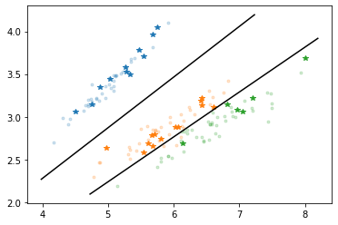
trainデータの色を薄くして、testデータは星でプロットしてみました。
どうですか? なかなか綺麗じゃないですか?