はじめに
PyCaretが話題になっていますね。PyCaretは最低限のコーディングで、データの準備からモデルのデプロイまで、数秒で出来るPythonの機械学習ライブラリです。
このライブラリを使用すると、ほとんど自分で実装することなく、複数モデルの学習、比較、予測など、一通りの分析作業が出来てしまいます。さらに、PyCaretは学習後のモデルについて、多彩なグラフで可視化を提供しています。その中には自分が普段使用しないグラフもあったので、この記事では、PyCaretの回帰および分類モデルで登場するグラフの種類について解説したいと思います。
Pycaretの分かりやすい入門記事↓
@tani_AI_Academy, 『DataRobotの無料版!?機械学習を自動化するライブラリ『PyCaret』入門』
Pycaretのグラフ
Pycaretのグラフ機能には、Yellowbrickという機械学習の可視化ライブラリが使用されています。この記事では最新バージョンである1.1を使用します。
> pip install -U yellowbrick
> python
Python 3.7.7 (default, Apr 15 2020, 05:09:04) [MSC v.1916 64 bit (AMD64)] :: Anaconda, Inc. on win32
Type "help", "copyright", "credits" or "license" for more information.
>> import yellowbrick
>> yellowbrick.__version__
'1.1'
サンプルコード例は公式ドキュメントにある例ですが、一部データのダウンロードに失敗する箇所があったので、書き換えています。記載したコードは動作することを確認済です。
回帰分析
回帰分析のチュートリアル内には次の可視化機能が紹介されています。

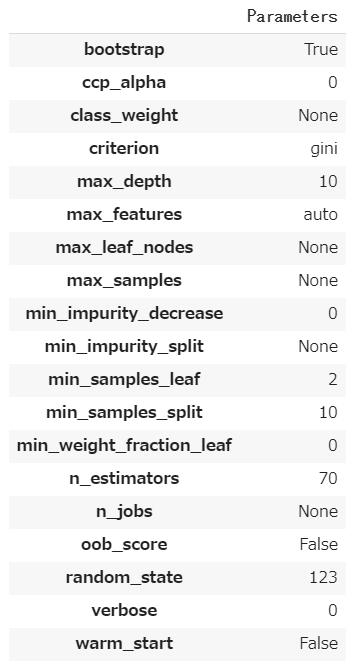
Hyperparameters
モデルのハイパーパラメータ―です。
Residuals Plot
残差プロットです。横軸に予測値、縦軸に残差をプロットします。良い予測モデルであれば、残差と予測値は相関しないので、いんすたんsは残差0のところに横に並ぶようなプロットになります。残差はランダムな誤差になるはずなので、ヒストグラムは正規分布になります。

Yellowbrickでは次のように書きます。
from sklearn.model_selection import train_test_split
from sklearn.linear_model import Ridge
from sklearn.datasets import load_boston
from yellowbrick.regressor import ResidualsPlot

# Load a regression dataset
X, y = load_boston(return_X_y=True)

# Create the train and test data
X_train, X_test, y_train, y_test = train_test_split(X, y, test_size=0.2, random_state=42)

# Instantiate the linear model and visualizer
model = Ridge()
visualizer = ResidualsPlot(model)

visualizer.fit(X_train, y_train)  # Fit the training data to the visualizer
visualizer.score(X_test, y_test)  # Evaluate the model on the test data
visualizer.show()                 # Finalize and render the figure
matplotlobで描こうとすると次のようになります。二つのグラフを組み合わせたものなので、練習がてら描いてみました。
from sklearn.model_selection import train_test_split
from sklearn.linear_model import Ridge
from sklearn.datasets import load_boston
import matplotlib.pyplot as plt
from mpl_toolkits.axes_grid1 import make_axes_locatable

# Load a regression dataset
X, y = load_boston(return_X_y=True)

# Create the train and test data
X_train, X_test, y_train, y_test = train_test_split(X, y, test_size=0.2, random_state=42)

# Instantiate the linear model and visualizer
model = Ridge()

# Training
model.fit(X_train, y_train)

y_train_pred = model.predict(X_train)
y_test_pred = model.predict(X_test)

e_train = y_train - y_train_pred
e_test = y_test - y_test_pred

train_score = model.score(X_train, y_train)
test_score = model.score(X_test, y_test)

label_train = "Train $R^2 = {:0.3f}$".format(train_score)
label_test = "Test $R^2 = {:0.3f}$".format(test_score)


fig, ax = plt.subplots(1, 1)

ax.scatter(y_train, e_train, s=10, color='C0', label=label_train)
ax.scatter(y_test, e_test, s=10, color='C1', label=label_test)

divider = make_axes_locatable(ax)
hax = divider.append_axes("right", size=1, pad=0.1, sharey=ax)
hax.yaxis.tick_right()
hax.grid(False, axis="x")
hax.hist(e_train, bins=50, orientation="horizontal", color='C0')
hax.hist(e_test, bins=50, orientation="horizontal", color='C1')

ax.axhline(y=0, color='k')
hax.axhline(y=0, color='k')

ax.legend(loc="best", frameon=True)
plt.show()
Prediction Error Plot
横軸に実際の値を、縦軸に予測値をプロットしたものです。予測が完全であれば、傾き1の直線上に点が乗ります。点が傾き1の直線周辺に集まるモデルが良いモデルになります。このモデルでは予測値が大きい領域では誤差が大きくなっているように見えます。

Yellowbrickでは次のように書きます。
from sklearn.model_selection import train_test_split
from sklearn.linear_model import Lasso
from sklearn.datasets import load_boston
from yellowbrick.regressor import PredictionError

# Load a regression dataset
X, y = load_boston(return_X_y=True)

# Create the train and test data
X_train, X_test, y_train, y_test = train_test_split(X, y, test_size=0.2, random_state=42)

# Instantiate the linear model and visualizer
model = Lasso()
visualizer = PredictionError(model)

visualizer.fit(X_train, y_train)  # Fit the training data to the visualizer
visualizer.score(X_test, y_test)  # Evaluate the model on the test data
visualizer.show()                 # Finalize and render the figure
Cook's Distance Plot
クックの距離は、OLS線形回帰モデルにおいて各点が回帰の計算にどれだけ影響力があるかを表すものです。全てのデータ用いた場合と着目している点1つを除いた場合で、モデルの推定係数がどれくらい変化するかを表しています。OLS線形回帰モデルは外れ値に敏感に反応するので、外れ値ほどクックの距離が大きくなります。
各点$i$に対して、クックの距離は次のように定義されます。
D_i = \frac{\sum_{j=1}^N(\hat y_j - \hat y_{j(i)})}{p \cdot \mathrm{MSE}}
ここで$\hat y_j$は全データで学習したモデルによる点$j$の予測値、$\hat y_{j(i)})$は点$i$を除いて学習したモデルによる点$j$の予測値、$p$は回帰モデルの係数の数、$\mathrm{MSE}$は全データで学習したモデルの平均二乗誤差です。
一般的な経験則では、$D_i > 4/N$が、影響力の高いポイントを外れ値として決定するのに良いしきい値で、Yellowbrickでは、そのしきい値を超えたデータの割合をレポートすることができます。

Yellowbrickでは次のように書きます。
from yellowbrick.regressor import CooksDistance
from sklearn.datasets import load_boston

# Load the regression dataset
X, y = load_boston(return_X_y=True)

# Instantiate and fit the visualizer
visualizer = CooksDistance()
visualizer.fit(X, y)
visualizer.show()
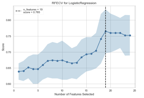
Recursive Feature Selection
Recursive Feature Selection(RFE)は、指定された数に達するまで最も弱い特徴を除去する、特徴選択法です。特徴はモデルのcoef_またはfeature_importances_属性によってランク付けされ、ループごとに少数の特徴を再帰的に除去することで、RFEはモデルに存在する可能性のある依存性や共線性を除去しようとします。
グラフの見方ですが、横軸が特徴量の数で、縦軸が精度です。精度が最大になる特徴量数のところに点線が引かれます。

Yellowbrickでは次のように書きます。
from sklearn.ensemble import RandomForestRegressor

from yellowbrick.model_selection import RFECV
from sklearn.datasets import load_boston


X, y = load_boston(return_X_y=True)

visualizer = RFECV(RandomForestRegressor(), scoring='r2')

visualizer.fit(X, y)        # Fit the data to the visualizer
visualizer.show()           # Finalize and render the figure
visualizer.rfe_estimator_で訓練済みモデルを取得できます。
visualizer.support_で精度が最大になる時のモデルに採用された特徴のマスクを得られます。
visualizer.ranking_[i]で特徴量$i$の重要ランキングを得ることができます。ただし、採用された特徴量はすべて1位になります。
Learning Curve
Learning Curveは横軸にデータ数、縦軸に精度をプロットしています。引数で与えられた方法でfoldを作成し、train-trainとtrain-testのクロスバリデーションを実施しています。
訓練データが少ない場合は普通、モデルはオーバーパラメトライズの状態になり、train-trainの精度が高く、train-testの精度が低くなります。これは過学習状態であるとも言えます。
データ数を増やしていくと、train-trainの精度が低くなっていき、train-testの精度が高くなります。これはモデルが訓練データ全てにフィットしなくなっていき、一方で汎化性能が上がっていっていることを表しています。データが追加されるにつれて、訓練精度と交差検証精度が一緒に収束する場合、これ以上データを増やしても汎化性能は上がらないと考えられます。
上図はこちらから引用。
一方で、訓練精度と交差検証精度に開きがある場合は、汎化性能を上げるためにより多くのデータを必要とする場合があります。

Yellowbrickでは次のように書きます。
import numpy as np

from sklearn.model_selection import StratifiedKFold
from sklearn.naive_bayes import MultinomialNB
from sklearn.preprocessing import OneHotEncoder, LabelEncoder
from sklearn.datasets import load_wine

from yellowbrick.model_selection import LearningCurve

# Load a classification dataset
X, y = load_wine(return_X_y=True)

# Encode the categorical data
X = OneHotEncoder().fit_transform(X)
y = LabelEncoder().fit_transform(y)

# Create the learning curve visualizer
cv = StratifiedKFold(n_splits=12)
sizes = np.linspace(0.3, 1.0, 10)

# Instantiate the classification model and visualizer
model = MultinomialNB()
visualizer = LearningCurve(
    model, cv=cv, scoring='f1_weighted', train_sizes=sizes, n_jobs=4
)

visualizer.fit(X, y)        # Fit the data to the visualizer
visualizer.show()           # Finalize and render the figure
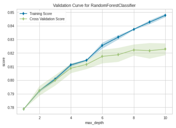
Validation Curve
Validation Curveは横軸にハイパーパラメータ、縦軸に精度をプロットしたものです。訓練精度と交差検証精度の両方をプロットします。一つのハイパーパラメータがどれくらい寄与するか見たいときに使用します。
Yellowbrickでは次のように書きます。
import numpy as np

from sklearn.model_selection import KFold
from sklearn.ensemble import RandomForestRegressor
from sklearn.datasets import load_boston

from yellowbrick.model_selection import LearningCurve


X, y = load_boston(return_X_y=True)

# Create the learning curve visualizer
cv = KFold(n_splits=3)
sizes = np.linspace(0.3, 1.0, 10)

model = RandomForestRegressor()
visualizer = LearningCurve(
    model, cv=cv, scoring='r2', train_sizes=sizes, n_jobs=4)

visualizer.fit(X, y)        # Fit the data to the visualizer
visualizer.show()           # Finalize and render the figure
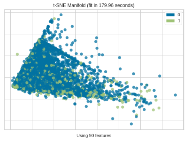
Manifold Learning
Manifold Learning は高次元データを2次元に落としてプロットします。一般的にデータ間の距離を使用して、埋め込みに最近傍アプローチを使用するため、PCAやSVDでは失われてしまう非線形構造を捉えることが出来ます。
Yellowbrickでは次のように書きます。
from sklearn.datasets import load_boston
from yellowbrick.features import Manifold


# Load the regression dataset
X, y = load_boston(return_X_y=True)

# Instantiate the visualizer
viz = Manifold(manifold="tsne", target_type="continuous", n_neighbors=10)

viz.fit_transform(X, y)  # Fit the data to the visualizer
viz.show()               # Finalize and render the figure
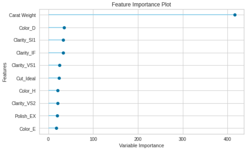
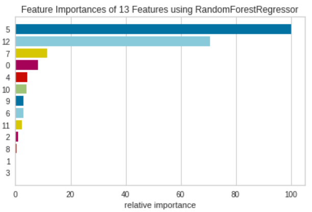
Feature Importance
Feature Importanceは、モデルのfeature_importances_属性もしくはcoef_属性を用いて、それぞれの特徴量が訓練にどれくらい寄与するかを表します。
from sklearn.ensemble import RandomForestRegressor
from sklearn.datasets import load_boston

from yellowbrick.datasets import load_occupancy
from yellowbrick.model_selection import FeatureImportances

X, y = load_boston(return_X_y=True)

model = RandomForestRegressor(n_estimators=10)
viz = FeatureImportances(model)
viz.fit(X, y)
viz.show()
Pycaretと少し違い、グラフがカラフルです。
クラス分類
分類のチュートリアル内では次の可視化機能が紹介されています。
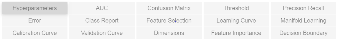
Hyperparameters
回帰分析と同じなので省略します。
AUC
AUCとありますが、ROC曲線をプロットしています。ROC曲線は、モデルの出力を二値化するときのスレッショルドを変化させていくことで作成できます。ROC曲線は通常、横軸に偽陽性率(1-specificity)を、縦軸に真陽性率(Recall)をプロットします。これは、プロットの左上隅が「理想的な」点(偽陽性率が0、真陽性率が1)であることを意味します。曲線の下の面積をAUC)と呼び、大きい方が良いことを意味します。AUCは0.5から1.0の間の値をとります。

Yellowbrickでは次のように書きます。
from sklearn.linear_model import LogisticRegression
from sklearn.model_selection import train_test_split
from sklearn.datasets import load_breast_cancer

from yellowbrick.classifier import ROCAUC


# Load the classification dataset
X, y = load_breast_cancer(return_X_y=True)

# Create the training and test data
X_train, X_test, y_train, y_test = train_test_split(X, y, random_state=11)

# Instantiate the visualizer with the classification model
model = LogisticRegression(multi_class="auto", solver="liblinear")
visualizer = ROCAUC(model, classes=['malignant', 'benign'])

visualizer.fit(X_train, y_train)        # Fit the training data to the visualizer
visualizer.score(X_test, y_test)        # Evaluate the model on the test data
visualizer.show()                       # Finalize and show the figure
Confusion Matrix
混同行列です。こちらのサイトに詳しい解説があります。
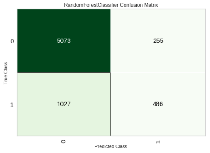
Yellowbrickでは次のように書きます。
from sklearn.datasets import load_iris
from sklearn.model_selection import train_test_split
from sklearn.linear_model import LogisticRegression
from yellowbrick.classifier import ConfusionMatrix

iris = load_iris()
X = iris.data
y = iris.target
classes = iris.target_names

X_train, X_test, y_train, y_test = train_test_split(X, y, test_size=0.2)

model = LogisticRegression(multi_class="auto", solver="liblinear")

iris_cm = ConfusionMatrix(
    model, classes=classes,
    label_encoder={0: 'setosa', 1: 'versicolor', 2: 'virginica'}
)

iris_cm.fit(X_train, y_train)
iris_cm.score(X_test, y_test)

iris_cm.show()
Threshold
Discrimination Thresholdは横軸に識別のスレッショルドを、縦軸にprecision, recall, f1 score, queue rateをプロットします。点線はf1 scoreが最大になるスレッショルドを表していて、バランスが取れたスレッショルドを意味しています。

Yellowbrickでは次のように書きます。
from sklearn.linear_model import LogisticRegression

from yellowbrick.classifier import DiscriminationThreshold
from yellowbrick.datasets import load_spam

# Load a binary classification dataset
X, y = load_spam()

# Instantiate the classification model and visualizer
model = LogisticRegression(multi_class="auto", solver="liblinear")
visualizer = DiscriminationThreshold(model)

visualizer.fit(X, y)        # Fit the data to the visualizer
visualizer.show()           # Finalize and render the figure
Precision-Recall Curves
Precision-Recall Curvesは横軸にRecall、縦軸にPrecisionをプロットします。特にクラスが非常に不均衡な場合に使用されます。
完全なモデルは、(1,1)の座標にある点として描かれます。
良いモデルは、(1,1)の座標に向かってお辞儀をする曲線で表されます。
ランダムな分類器は、Precisionが正例の比になる水平線になります.例えば正例と負例が1対1のときは、0.5の水平線になります。この水平線よりもPrecisionが大きくないと、ランダムな予測よりPrecisionが劣ってしまいます。
詳細はこちらのサイトが参考になります。

Avg Precisionにはscikit-learnのsklearn.metrics.average_precision_scoreで計算された値で、青色の面積を表しています。
Yellowbrickでは次のように書きます。
from sklearn.linear_model import RidgeClassifier
from sklearn.model_selection import train_test_split
from yellowbrick.classifier import PrecisionRecallCurve
from yellowbrick.datasets import load_spam

# Load the dataset and split into train/test splits
X, y = load_spam()

X_train, X_test, y_train, y_test = train_test_split(X, y, test_size=0.2, shuffle=True)

# Create the visualizer, fit, score, and show it
viz = PrecisionRecallCurve(RidgeClassifier())
viz.fit(X_train, y_train)
viz.score(X_test, y_test)
viz.show()
Class Prediction Error
Class Prediction Errorは、横軸に実際のクラスを、予測を積み上げ棒グラフで表したものです。モデルがどのクラスで問題を抱えているか、さらに重要なのは、クラスごとにどのような不正解を与えているかを可視化することができます。これにより、異なるモデルの長所と短所、およびデータセットに特有の課題をよりよく理解することができます。
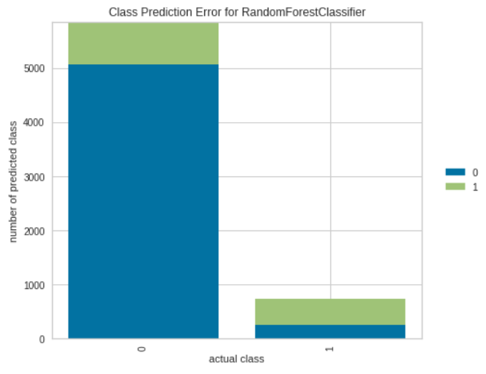
Yellowbrickでは次のように書きます。
from sklearn.ensemble import RandomForestClassifier
from yellowbrick.classifier import ClassPredictionError
from yellowbrick.datasets import load_credit

X, y = load_credit()

classes = ['account in default', 'current with bills']

# Perform 80/20 training/test split
X_train, X_test, y_train, y_test = train_test_split(X, y, test_size=0.20,
                                                    random_state=42)

# Instantiate the classification model and visualizer
visualizer = ClassPredictionError(
    RandomForestClassifier(n_estimators=10), classes=classes
)

# Fit the training data to the visualizer
visualizer.fit(X_train, y_train)

# Evaluate the model on the test data
visualizer.score(X_test, y_test)

# Draw visualization
visualizer.show()
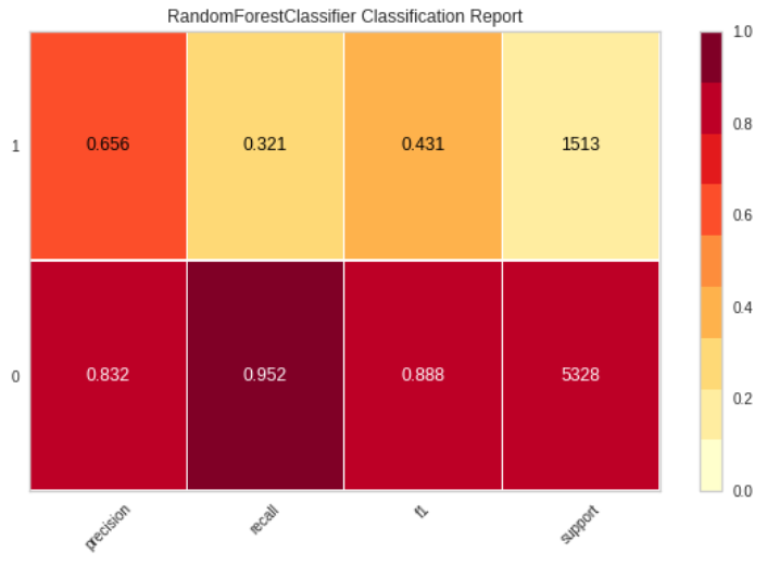
Classification Report
Classification Reportでは、主な分類基準を表現しています。Classification Reportは、モデルを比較するために使用されます。
二段ありますが、正例を1、負例を0とした場合の指標が上段で、正例を0、負例を1とした場合の指標が下段です。
Yellowbrickでは次のように書きます。
from sklearn.model_selection import TimeSeriesSplit
from sklearn.naive_bayes import GaussianNB

from yellowbrick.datasets import load_occupancy
from yellowbrick.classifier import classification_report

# Load the classification data set
X, y = load_occupancy()

# Specify the target classes
classes = ["unoccupied", "occupied"]

# Create the training and test data
tscv = TimeSeriesSplit()
for train_index, test_index in tscv.split(X):
    X_train, X_test = X.iloc[train_index], X.iloc[test_index]
    y_train, y_test = y.iloc[train_index], y.iloc[test_index]

# Instantiate the visualizer
visualizer = classification_report(
    GaussianNB(), X_train, y_train, X_test, y_test, classes=classes, support=True
)
Feature Selection
回帰分析と同じなので省略します。
Learning Curve
回帰分析と同じなので省略します。

Maniforld Learning
回帰分析と同じなので省略します。
Caribration Curve
こちらはYellowbrickでは提供されていません。
Caribration Curveは、二値分類のモデルが出力する確率(一般には正例である確率)を横軸に、実際の割合を縦軸にプロットします。モデルの出力する確率が実際のものと一致していれば、曲線は原点を通る傾き1の直線になるはずです。
Caribration Curveはpredict_probaメソッドを持っているestimatorの場合にのみプロットできます。
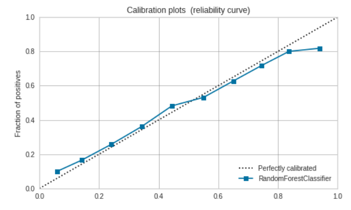
matplotlibで書く場合は次のようになります。scikit-learnのサイトが参考になります。
import matplotlib.pyplot as plt

from sklearn import datasets
from sklearn.calibration import calibration_curve
from sklearn.metrics import brier_score_loss
from sklearn.linear_model import LogisticRegression
from sklearn.model_selection import train_test_split
from sklearn.datasets import load_breast_cancer


# Load the classification dataset
X, y = datasets.make_classification(n_samples=100000, n_features=20,
                                    n_informative=2, n_redundant=10,
                                    random_state=42)

# Create the training and test data
X_train, X_test, y_train, y_test = train_test_split(X, y, random_state=21, shuffle=True)

model = LogisticRegression(multi_class="auto", solver="liblinear")
model_name = str(model).split("(")[0]
model.fit(X_train, y_train)

prob_pos = model.predict_proba(X_test)[:, 1]
prob_pos = (prob_pos - prob_pos.min()) / (prob_pos.max() - prob_pos.min())
fraction_of_positives, mean_predicted_value = calibration_curve(y_test, prob_pos, n_bins=10)

clf_score = brier_score_loss(y_test, prob_pos, pos_label=y.max())

fig, ax = plt.subplots(1, 1, figsize=(7, 6))

ax.plot([0, 1], [0, 1], "k:", label="Perfectly calibrated")
ax.plot(mean_predicted_value, fraction_of_positives, "s-",
        label="{} ({:.3f})".format(model_name, clf_score))

ax.set_xlabel("Estimated probabilities")
ax.set_ylabel("Fraction of positives")
ax.set_xlim([0, 1])
ax.set_ylim([0, 1])
ax.legend(loc="best")
ax.set_title('Calibration plots  (reliability curve)')
ax.set_facecolor('white')
ax.grid(b=True, color='grey', linewidth=0.5, linestyle = '-')
fig.tight_layout()
plt.show()
Validation Curve
回帰分析と同じなので省略します。
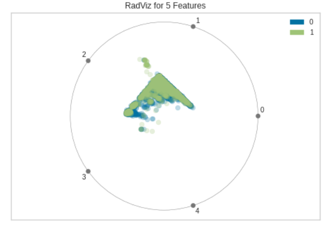
Dimensions (RadViz Visualizer)
RadViz Visualizerは多変量データ可視化アルゴリズムです。円周上に各特徴次元を一様に配置し、各特徴量を正規化して、中心から各円弧までの軸上に点をプロットします。このメカニズムにより、たくさんの次元を持つデータを円内に簡単に描画しすることができます。
もう少し具体的に見てみます。単位円の円周上に等間隔で特徴次元の数($=M$)だけ点をとります。
(x_i, y_i)=\left(\cos\frac{2\pi i}{M}, \sin\frac{2\pi i}{M}\right), \ i=0,...,M-1
データは各特徴量ごとにMinMax normalizationで正規化されているとします。データの$j$行が$(u_{j1}, u_{j2}, ..., u_{jM})$のとき、次の座標を計算します。
\left(\frac{\sum_{i=1}^M u_{ji} x_i}{\sum_{i=1}^M u_{ji}}, \frac{\sum_{i=1}^M u_{ji} y_i}{\sum_{i=1}^M u_{ji}}\right)
これを各行に対して求めてプロットします。各クラスに属する点の分離性を見ることができます。
Yellowbrickでは次のように書きます。
from yellowbrick.datasets import load_occupancy
from yellowbrick.features import RadViz

# Load the classification dataset
X, y = load_occupancy()

# Specify the target classes
classes = ["unoccupied", "occupied"]

# Instantiate the visualizer
visualizer = RadViz(classes=classes)

visualizer.fit(X, y)           # Fit the data to the visualizer
visualizer.transform(X)        # Transform the data
visualizer.show()              # Finalize and render the figure
Feature Importance
回帰分析と同じなので省略します。

Decision Boundary
Decision Boundaryはクラスを分類する決定境界を図示します。
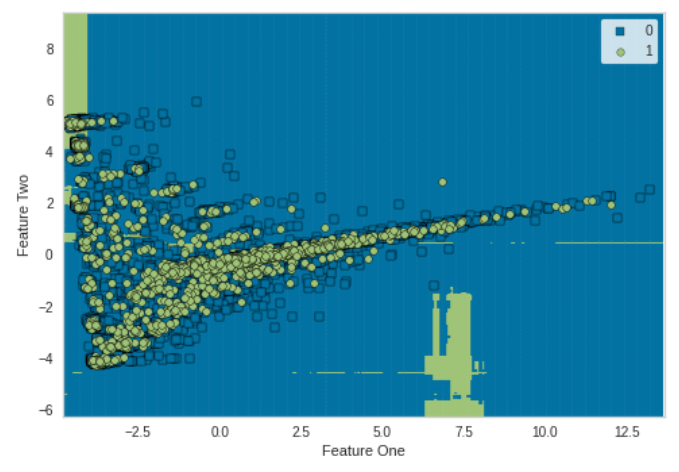
from sklearn.model_selection import train_test_split
from sklearn.preprocessing import StandardScaler
from sklearn.datasets import make_moons
from sklearn.neighbors import KNeighborsClassifier
from yellowbrick.contrib.classifier import DecisionViz

data_set = make_moons(noise=0.3, random_state=0)

X, y = data_set
X = StandardScaler().fit_transform(X)
X_train, X_test, y_train, y_test = train_test_split(X, y, test_size=.4, random_state=42)

viz = DecisionViz(
    KNeighborsClassifier(3), title="Nearest Neighbors",
    features=['Feature One', 'Feature Two'], classes=['A', 'B']
)
viz.fit(X_train, y_train)
viz.draw(X_test, y_test)
viz.show()
おわりに
以上のグラフをほとんど自動で出力してくれるPycaretめっちゃすごいです。