目次:
- はじめに
- DataFrameの前処理
- catplot 引数なし
- catplot bar型グラフ
- catplot violin型グラフ
- まとめ
1.はじめに
pandasのデータフレームからseabornのbarplotを作る場合、前処理が必要なのでメモ用に記載しておくとする。
(これが一番いいプロット方法というわけでもないので、急いでいるんだったらブラウザバックしてpd.DataFrame.plot()について調べてください。)
データフレームは以下のを使うとする。
df = pd.DataFrame({'Japan': [100, 300, 200, 100],
                   'USA': [200, 300, 400, 500],
                   'Canada': [300, 200, 100, 400]},
                  index=['cat', 'dog', 'hamster', 'horse'])
df
Out:
| Canada | Japan | USA | |
|---|---|---|---|
| cat | 300 | 100 | 200 |
| dog | 200 | 300 | 300 |
| hamster | 100 | 200 | 400 |
| horse | 400 | 100 | 500 |
似ているfactorplot関数についての注意!
旧名称はfactorplotで、もうすぐ使えなくなるとかなのでcatplotを使おう。
ちなみにfactorplotを使おうとすると以下のような警告が出る。
/usr/local/lib/python3.6/site-packages/seaborn/categorical.py:3666: UserWarning: The `factorplot` function has been renamed to `catplot`. The original name will be removed in a future release. Please update your code. Note that the default `kind` in `factorplot` (`'point'`) has changed `'strip'` in `catplot`.
  warnings.warn(msg)
seabornは主にsnsと略されるので以下ではsns.catplotとして使用していく。
DataFrame の前処理
あとで使うseabornの引数であるx, y, hueを取り入れるために今データの前処理をする。
前処理にはpd.melt()を使う(meltは溶かす、の意味。意味どおりdfを溶かして、数値データ、indexなどを列一個にまとめる)
melted_df = pd.melt(
    df.reset_index(), id_vars="index",
    var_name="Country", value_name="Species")
melted_df.rename(columns={'index': 'Animal'}, inplace=True)
melted_df
このように前処理をしなければあとで、ちょっとめんどくさい!
Out:
| Animal | Country | Species | |
|---|---|---|---|
| 0 | cat | Canada | 300 |
| 1 | dog | Canada | 200 |
| 2 | hamster | Canada | 100 |
| 3 | horse | Canada | 400 |
| 4 | cat | Japan | 100 |
| 5 | dog | Japan | 300 |
| 6 | hamster | Japan | 200 |
| 7 | horse | Japan | 100 |
| 8 | cat | USA | 200 |
| 9 | dog | USA | 300 |
| 10 | hamster | USA | 400 |
| 11 | horse | USA | 500 |
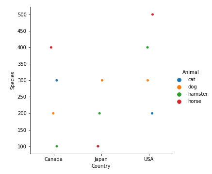
seabornのcatplotを引数無しで使う場合
seabornのcatplotは主にドットのプロットを描画してくれる。
sns.catplotを使うと以下のようなグラフが与えられる。
sns.catplot(x='Animal', y='Species', hue='Country', data=melted_df)
plt.show()
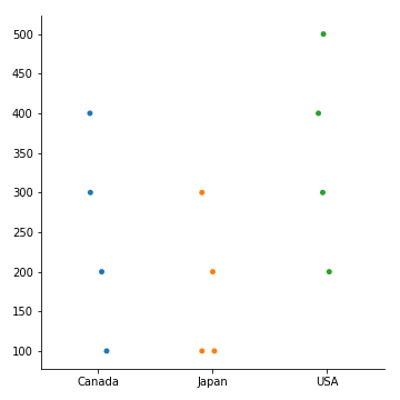
ここで、
sns.catplot(data=df)
plt.show()
を使うと以下のようになり、各国同じ色で動物が識別しにくいグラフが生まれてしまう。
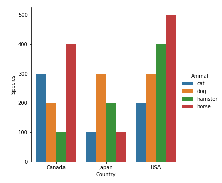
seabornのcatplotのbar graph型
棒グラフは以下のように描画可能
sns.catplot(x='Country', y='Species', hue='Animal', data=melted_df, kind='bar')
plt.show()
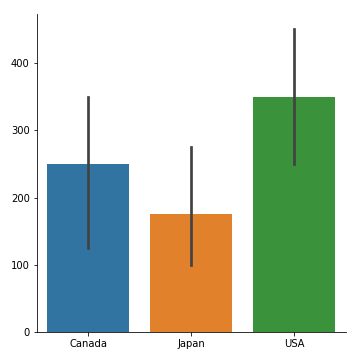
sns.catplot(data=df)
plt.show()
これだと以下のようになってしまい、各国、各動物の対比が見れない。
seabornのcatplotのviolin型
今回は前処理なしのdfを使う。
import pandas as pd
import seaborn as sns
import matplotlib.pyplot as plt


df = pd.DataFrame({'Japan': [100, 300, 200, 100],
                   'USA': [200, 300, 400, 500],
                   'Canada': [300, 200, 100, 400]},
                  index=['cat', 'dog', 'hamster', 'horse'])
sns.catplot(data = df, kind='violin')
plt.show()
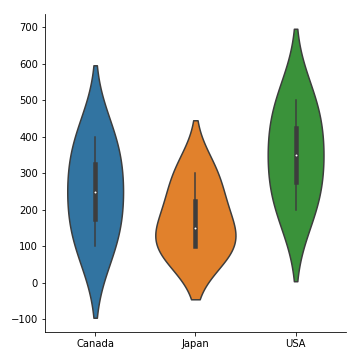
かっこいい!これは各国の動物の個体数の平均などを入れた箱ひげ図に近いグラフとなる。
まとめ
barかviolinは結局以下のようにかけば描画可能
df = pd.DataFrame({'Japan': [100, 300, 200, 100],
                   'USA': [200, 300, 400, 500],
                   'Canada': [300, 200, 100, 400]},
                  index=['cat', 'dog', 'hamster', 'horse'])
melted_df = pd.melt(
    df.reset_index(), id_vars="index",
    var_name="Country", value_name="Species")

# 動物のカラムの名前が'index'になってしまっているので、'Animal'に変更
melted_df.rename(columns={'index': 'Animal'}, inplace=True)

# 点のみのグラフを描画したい場合
sns.catplot(x='Animal', y='Species', hue='Country', data=melted_df)
plt.show()
# 一応figureをcloseしておく
plt.close()

# 棒グラフの場合
sns.catplot(x='Animal', y='Species', hue='Country', data=melted_df, kind='bar')
plt.show()
# 一応figureをcloseしておく
plt.close()
あとはseabornのdocumentationを参考にすると良い。
また繰り返しになりますが、violinなどが描きたい!以外のデータフレームのプロットは
pd.DataFrame.plot()を使ったほうがいいと思います。
参考(seaborn.catplotについてのドキュメンテーション)