はじめに
この記事はAdventCalender2022 Androidの12日目となります。
何を書くか悩みましたが、Jetpack Composeの勉強の一環として、既存アプリを模倣してみたいと思います。今回模倣するアプリは、東京都水道局アプリのBottomNavigationBarです。
BottomNavigationBarがとても可愛いので、LayoutやAnimationの練習がてら、Composeで作ってみたくなりました。
成果物は下記です。
https://github.com/goutarouh/WaterworksBureauClone
なお私は当該アプリの開発などとは一切関係ありません。
(引っ越しを機に当該アプリを使い始めた利用者の一人です。)
動作確認環境
- Android Studio Dolphin | 2021.3.1 Patch 1
- Kotlin 1.7.20
- Compose 1.3.1
- Compose Compiler 1.3.2
仕様の整理
まずは東京都水道局アプリのBottomNavigationBarのUI確認してみましょう。
他アプリの画面キャプチャを勝手に乗せるのもあれなので、どんなUIか知りたい方はアプリを使ってみるか、記事最後の方に成果物のgifを載せているので見てみてください!
各アイテム
- アイコン+文字列
- 選択中は青
- 未選択中は白
選択アイテムを示す水滴(Droplet)
- 選択したアイテムに水平方向のアニメーションで移動する(1)
- (1)のアニメーション中、水滴のTopが前選択アイテムの方向に傾いて、戻る
- 前選択アイテムを2個以上離れた移動の場合、移動中のopacityを薄くする
背景
- 上側の辺は波線
- 選択されたアイテムに応じて、移動アニメーション中に同じくアニメーションを行う
- 背景は二枚あり、逆方向にアニメーションする。
Indicatorの水滴を作る
Boxコンポーザブルで作ります。
- アニメーション中に角度と透明度を変更するのでそれぞれ引数で受け取ります。
-
graphicsLayerModifierに渡します。
-
- 水滴の形は
GenericShapeを使用して作成します。-
arcToは円弧 -
quadraticBezierToはベジェ曲線
-
@Composable
fun Droplet(
    angle: Float,
    alpha: Float,
    modifier: Modifier = Modifier
) {

    val dropletShape = GenericShape { size, _ ->
        val shapeRect = Rect(Offset(0f, 0f), size)
        val controlPointY = shapeRect.top + (shapeRect.bottom * 0.3f)
        val offsetX = (size.width * 0.1f)
        arcTo(
            rect = Rect(
                offset = Offset(offsetX, 0f),
                size = Size(size.width * 0.8f, size.height)
            ),
            startAngleDegrees = 0f,
            sweepAngleDegrees = 180f,
            forceMoveTo = false
        )
        quadraticBezierTo(
            x1 = size.width * 0.1f,
            y1 = controlPointY,
            x2 = shapeRect.topCenter.x,
            y2 = shapeRect.topCenter.y
        )
        quadraticBezierTo(
            x1 = size.width * 0.9f,
            y1 = controlPointY,
            x2 = shapeRect.centerRight.x * 0.9f,
            y2 = shapeRect.centerRight.y
        )
    }

    Box(
        modifier = modifier
            .fillMaxSize()
            .graphicsLayer(rotationZ = angle, alpha = alpha)
            .clip(dropletShape)
            .background(MaterialTheme.colors.background)
    )
}
こんな感じの水滴が出来上がります。(どんぐり!?)
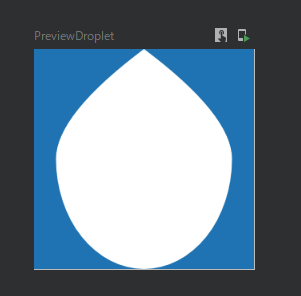
作成したDropletコンポーザブルは選択して水平方向に移動するときに、角度や透明度のアニメーションを実行します。以下のようなコンポーザブルでラップします。
- 引数として選択されたBottomNavのIndexと前選択されていたBottomNavのIndexを受け取ります。
- 角度のアニメーションの状態として、
indicatorAngleAnimSpecを作成します。- 右に移動の場合と左に移動した場合でアニメーションを分岐します。
- 透明度のアニメーションの状態として、
dropLetAlphaを定義します。- indexの移動幅に応じて、アニメーションの時間などを調整します。
※AnimationDropletコンポーザブルに外の情報である「どのindexが選ばれているか」という情報を渡すのは綺麗ではないですが、アニメーションロジックを中に入れたかったため、このようにしました。(時間があればよりよい方法を模索するかもしれないですが、)
@Composable
fun AnimationDroplet(
    selectedIndex: Int,
    preSelectedIndex: Int
) {

    val indicatorAngleAnimSpec = TweenSpec<Float>(durationMillis = 500)
    val dropLetAngle = remember { Animatable(0f) }
    LaunchedEffect(selectedIndex) {
        when {
            preSelectedIndex < selectedIndex -> dropLetAngle.animateTo(-20f, indicatorAngleAnimSpec)
            preSelectedIndex > selectedIndex -> dropLetAngle.animateTo(20f, indicatorAngleAnimSpec)
        }
        dropLetAngle.animateTo(0f, indicatorAngleAnimSpec)
    }


    val dropLetAlpha = remember { Animatable(1f) }
    LaunchedEffect(selectedIndex) {
        if (preSelectedIndex == selectedIndex) return@LaunchedEffect
        val diffPos = abs(preSelectedIndex - selectedIndex)
        if (diffPos <= 1) return@LaunchedEffect
        val durationMills = diffPos * 150
        dropLetAlpha.animateTo(0f, TweenSpec(durationMillis = durationMills, delay = 200))
        dropLetAlpha.animateTo(1f, TweenSpec(durationMillis = 0, delay = 200))
    }

    Droplet(angle = dropLetAngle.value, alpha = dropLetAlpha.value)
}
一辺が波線のBoxを作る
こちらもBoxコンポーザブルで作ります。水滴と同様にGenericShapeで上辺だけ波線にします。
詳細な値はだいぶ適当ですが、ベジェ曲線を繰り返しています。
@Composable
fun TopWavyLineBox(
    color: Color,
    modifier: Modifier = Modifier,
) {

    val topWavyLineBoxShape = GenericShape { size, _ ->

        val waveLength = size.width / 4f
        val halfPeriod = waveLength / 2f
        val amplitude = size.height / 4
        val center = amplitude / 2
        moveTo(0f, center)
        repeat( 16) {
            quadraticBezierTo(
                x1 = (halfPeriod / 2) * (2 * it + 1),
                y1 = center + (center * if (it % 2 == 0) 1 else -1),
                x2 = halfPeriod * (it + 1), y2 = center
            )
        }
        lineTo(size.width, size.height)
        lineTo(0f, size.height)
    }

    Box(
        modifier = modifier
            .fillMaxSize()
            .height(TOP_WAVY_LINE_BOX_HEIGHT)
            .clip(topWavyLineBoxShape)
            .background(color = color)
    )
}
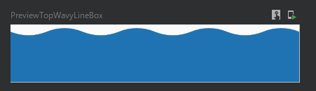
こんな感じのComposableが出来上がります。
BottomNavigationのアイテム
- 引数としてアイコンやテキストのComposableを受け取って、スロットの考えに従います。
- クリックしたときにリップルエフェクトをなくすために、ColumnのModifierでごにょごにょしています。
@Composable
fun WaterWorksBureauBottomNavigationItem(
    icon: @Composable ColumnScope.() -> Unit,
    text: @Composable ColumnScope.() -> Unit,
    selected: Boolean,
    onSelected: () -> Unit,
    modifier: Modifier = Modifier
) {
    Column(
        modifier = modifier
            .fillMaxSize()
            .clickable(
                interactionSource = remember { MutableInteractionSource() },
                indication = null,
                enabled = true,
                onClickLabel = null,
                role =  null,
                onClick = {
                    if (!selected) onSelected()
                }
            ),
        horizontalAlignment = Alignment.CenterHorizontally,
        verticalArrangement = Arrangement.Center
    ) {
        icon()
        text()
    }
}
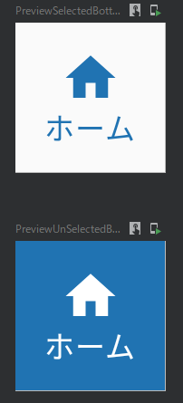
アイテムはこんな感じになりました。
アイテム、Indicator(水滴)、背景をLayoutでまとめる
Layoutコンポーザブルを使うと、各Composable間のサイズや配置がより柔軟になり、Composable間の配置的な連携も簡単になります。今回は下記のようなComposableを用意しました。
- 引数で描画するComposableを受け取ります。
contentにはBottomNavigationのアイテムComposableを渡します。 - 描画するComposableは
Layoutのcontentに渡します。- Layout内で判別可能にするために、
layoutIdを指定して渡します。
- Layout内で判別可能にするために、
- Layoutコンポーザブル内
- それぞれの測定可能なアイテム(
measurable)に対して測定(measure)を行います。 - 測定した各アイテムを配置(
placeRelative)します。-
placeRelativeは左上を基準に配置したい座標を指定します。
-
- それぞれの測定可能なアイテム(
@Composable
fun WaterWorksBureauBottomNavLayout(
    selectedIndex: Int,
    itemCount: Int,
    backgroundBack: @Composable BoxScope.() -> Unit,
    backgroundFront: @Composable BoxScope.() -> Unit,
    dropletIndicator: @Composable BoxScope.() -> Unit,
    modifier: Modifier = Modifier,
    content: @Composable () -> Unit
) {

    val indicatorMovingAnimSpec = TweenSpec<Float>(
        durationMillis = 1000
    )
    val backgroundMovingAnimSpec = TweenSpec<Float>(
        durationMillis = 1000
    )

    val targetIndex = selectedIndex.toFloat()
    val indicatorIndex = remember { Animatable(0f) }
    LaunchedEffect(targetIndex) {
        indicatorIndex.animateTo(targetIndex, indicatorMovingAnimSpec)
    }


    val backgroundPoint = remember { Animatable(0f) }
    LaunchedEffect(targetIndex) {
        backgroundPoint.animateTo(targetIndex, backgroundMovingAnimSpec)
    }

    Layout(
        modifier = modifier
            .height(BottomNavHeight),
        content = {
            Box(Modifier.layoutId(BackgroundBackId), content = backgroundBack)
            Box(Modifier.layoutId(BackgroundFrontId), content = backgroundFront)
            Box(Modifier.layoutId(IndicatorId), content = dropletIndicator)
            content()
        }
    ) { measurables, constraints ->

        val itemWidth = constraints.maxWidth / itemCount

        val backgroundBackMeasurable = measurables.first { it.layoutId == BackgroundBackId }
        val backgroundBackPlaceable = backgroundBackMeasurable.measure(
            constraints.copy(
                minWidth = constraints.minWidth * 2,
                maxWidth = constraints.maxWidth * 2
            )
        )

        val backgroundFrontMeasurable = measurables.first { it.layoutId == BackgroundFrontId }
        val backgroundFrontPlaceable = backgroundFrontMeasurable.measure(
            constraints.copy(
                minWidth = constraints.minWidth * 2,
                maxWidth = constraints.maxWidth * 2
            )
        )

        val indicatorMeasurable = measurables.first { it.layoutId == IndicatorId }
        val indicatorPlaceable = indicatorMeasurable.measure(
            constraints.copy(
                minWidth = itemWidth,
                maxWidth = itemWidth
            )
        )

        val itemPlaceables = measurables
            .filterNot { it == backgroundBackMeasurable }
            .filterNot { it == backgroundFrontMeasurable }
            .filterNot { it == indicatorMeasurable }
            .map { measurable ->
                measurable.measure(constraints.copy(
                    minWidth = itemWidth,
                    maxWidth = itemWidth
                ))
            }

        layout(
            width = constraints.maxWidth,
            height = constraints.maxHeight
        ) {
            val backgroundBackLeft = (backgroundPoint.value * itemWidth)
            backgroundBackPlaceable.placeRelative(-backgroundBackLeft.toInt() - itemWidth / 3, -constraints.maxHeight / 8)
            val backgroundFrontLeft = backgroundPoint.value * itemWidth
            backgroundFrontPlaceable.placeRelative(-constraints.maxWidth + backgroundFrontLeft.toInt(), 0)
            val indicatorLeft = indicatorIndex.value * itemWidth
            indicatorPlaceable.placeRelative(x = indicatorLeft.toInt(), y = 0)
            var x = 0
            itemPlaceables.forEach { placeable ->
                placeable.placeRelative(x = x, y = 0)
                x += placeable.width
            }
        }
    }
}
こんな感じになります。(gifなのでだいぶスローになっています)

まとめ
今回はJetpack ComposeのアニメーションやLayoutコンポーザブルを使って、既存アプリの一部模倣を行ってみました。
各種パラメーターが分散していたり、もっと本物に寄せれるとは思いますが、だいたい同じものができたので今回は良しとします。笑
改めて成果物はこちらとなります。
自分が考えたUIを作ろうとすると、無意識に自分が知っているor使ったことある技術内でものを考えてしまいます。普段使っているアプリの中で、このUIはどうやって作られているんだろう?とたまには疑問に思い、実装しないまでも頭の中で想像することが大切です。