概要
X線衛星チャンドラの画像を描画したいと思います。使うツールはPython, astropy, numpy, matplotlibです。
使用するデータ
チャンドラ衛星のデータ配布ページの"Kepler's Supernova Remnant"のデータを使用します。High Energy, Low Energyの両方と、スピッツァーのInfra-Redのデータを用います。
スクリプト
# !/usr/bin/env python

from astropy.io import fits
from matplotlib import pyplot as plt
import numpy as np


# load from the data files
header = fits.getheader('kepler_xray_he.fits')
high = fits.getdata('kepler_xray_he.fits')
low = fits.getdata('kepler_xray_le.fits')
ir = fits.getdata('kepler_ir.fits')
# merge data
data = np.dstack([ir, low, high])
# stack the data
plt.imshow(data, origin='lower', interpolation='nearest')
plt.show()
plt.clf()
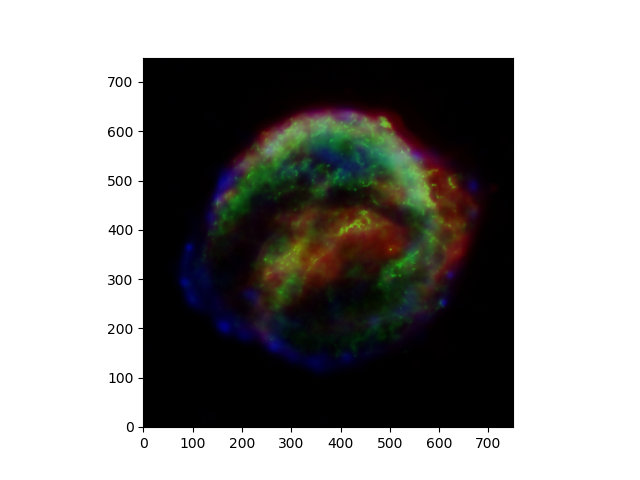
結果図
結果は以下のようになります。綺麗な3色合成図が出来上がります。
スクリプト詳細
fits.getdata
high = fits.getdata('kepler_xray_he.fits')
low = fits.getdata('kepler_xray_le.fits')
ir = fits.getdata('kepler_ir.fits')
の行で、上からそれぞれHigh Energy(4-6keV), Low Energy(0.3-1.4keV), Infra-Redのデータを取得しています。
np.dstack
data = np.dstack([ir, low, high])
で、1pixelに3色のデータ、というようにデータをひとまとめにしています。irをRed, lowをGreen, highをBlueに対応づけてデータセットを作成しています。dstackの挙動についての詳細はこちらのページをご覧ください。
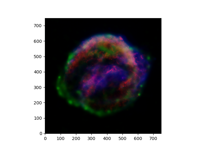
試しに
data = np.dstack([low, high, ir])
としてみましょう。すると結果は以下のように色合いが変化します。
plt.imshow
plt.imshow(data, origin='lower', interpolation='nearest')
この行で、先ほどひとまとめにしたデータを描画しています。origin='lower'で左下を原点にしています。interpolation='nearest'でピクセルの補間方法を決定しています。詳しくはこちらのページをご覧ください。
注意点
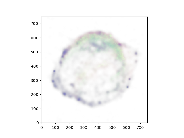
ちなみにですが
data = np.dstack([low, high])
として純粋にチャンドラのデータのみを描画しようとしてもplt.imshowでエラーとなります。これはimage dataがRGBの3色でなければならないからです。試しに
data = np.dstack([ir, low, high, high])
とするとこれはRGBAを指定していることになり、結果は以下のようになります。
結言
他にもまだまだ方法はありそうです。皆さんもRGBの綺麗な画像作成にぜひチャレンジしてみてください。