はじめに
switchのカスタマイズをしたいけど思ったようにできない。コピペで時間を取られずカスタマイズができると幸せです。 **theme変更、画像、drawable(xml)**それぞれの方法でやってみます。
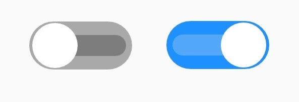
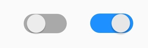
デフォルトSwitch
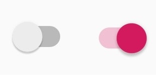

サンプル1

サンプル2
サンプル3

目次
1.themeの変更
1.1 styleで変更したい
1.2 長さを変更したい
2. thumb、backgroundの変更
2.1 ボタンの変更したい
2.2 背景を変更したい
2.3 trackの変更(ボタンの通り道)
3. とりあえずコピペ
3.1 サンプル1(★)(theme変更のみ)
3.2 サンプル2(★★)(xmlで背景(track)、ボタン作成)
3.3 サンプル3(★★★)(画像ファイルでtrack、ボタン作成)
※基本的にそれぞれの項目ごとに独立しています。
※★が多いと面倒です
1.1 styleファイルへ追加
app\src\main\res\values\styles.xml
    <style name="CustomSwitch" parent="Theme.AppCompat.Light">

        <!--ボタンON時のボタンの通り道(透明度30%)・ボタンとタッチフィードバックカラー-->
        <item name="colorControlActivated">#ff0000</item>

        <!--ボタンOFF時のボタンの通り道(透明度30%)-->
        <item name="android:colorForeground">#0000ff</item>

        <!-- OFFボタンを押したときのタッチフィードバックカラー -->
        <item name="colorControlHighlight">#ffff00</item>

    </style>
#ff0000``#0000ff``#ffff00
style.xmlに上記を追加し、Switchのtheme属性にnameで入力した名前を指定。
<?xml version="1.0" encoding="utf-8"?>
<android.support.constraint.ConstraintLayout xmlns:android="http://schemas.android.com/apk/res/android"
    xmlns:app="http://schemas.android.com/apk/res-auto"
    xmlns:tools="http://schemas.android.com/tools"
    android:layout_width="match_parent"
    android:layout_height="match_parent"
    tools:context=".MainActivity">

    <Switch
        android:id="@+id/switch1"
        android:layout_width="wrap_content"
        android:layout_height="wrap_content"
        android:showText="false"
        android:theme="@style/CustomSwitch"/>

</android.support.constraint.ConstraintLayout>
1.2 長さを変える
switchの長さや高さはwidth,height属性とは別のところで制御されているようです。(多分ボタンのつまみ部分の大きさに依存します。)変更してもView全体の大きさは変わりますが、Switchの大きさは変わりません。
長さはswitchMinWidth属性で変更できます。
<?xml version="1.0" encoding="utf-8"?>
<android.support.constraint.ConstraintLayout xmlns:android="http://schemas.android.com/apk/res/android"
    xmlns:app="http://schemas.android.com/apk/res-auto"
    xmlns:tools="http://schemas.android.com/tools"
    android:layout_width="match_parent"
    android:layout_height="match_parent"
    tools:context=".MainActivity">

    <Switch
        android:id="@+id/switch1"
        android:layout_width="wrap_content"
        android:layout_height="wrap_content"
        android:showText="false"
        android:switchMinWidth="200dp"/>

</android.support.constraint.ConstraintLayout>

2.1 ボタンの変更
thumbとはつまみの部分のことです。xmlで作った形や画像にイメージを変更します。
<?xml version="1.0" encoding="utf-8"?>
<android.support.constraint.ConstraintLayout xmlns:android="http://schemas.android.com/apk/res/android"
    xmlns:app="http://schemas.android.com/apk/res-auto"
    xmlns:tools="http://schemas.android.com/tools"
    android:layout_width="match_parent"
    android:layout_height="match_parent"
    tools:context=".MainActivity">

    <Switch
        android:id="@+id/switch1"
        android:layout_width="wrap_content"
        android:layout_height="wrap_content"
        android:showText="false"
        android:thumb="@mipmap/ic_launcher" />

</android.support.constraint.ConstraintLayout>
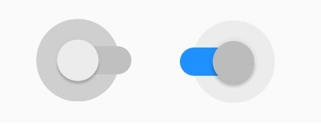
 デフォルトのSwitchは非常に短いのですが画像に合わせて全体の大きさも変わりました。
四角いイメージなら四角くなります。丸いイメージなら丸くなります。
デフォルトのSwitchは非常に短いのですが画像に合わせて全体の大きさも変わりました。
四角いイメージなら四角くなります。丸いイメージなら丸くなります。
2.2 背景の変更
背景の変更によるカスタマイズはタッチフィードバックが消失します。
タッチフィードバックを残したい場合は trackの変更(ボタンの通り道)へ移動
タッチフィードバックを消したい場合はこのまま背景の変更を。
backgroud変更で必要となるのは
- 背景となるイメージ画像もしくはxmlファイルの準備
- track属性でボタン通り道の色の調整(重要)
まずは背景となるdrawableイメージの準備
<?xml version="1.0" encoding="utf-8"?>
<selector xmlns:android="http://schemas.android.com/apk/res/android">

    <!-- ON時 -->
    <item android:state_checked="true">
        <layer-list>
            <item android:bottom="3dp" android:top="3dp">
                <!--形のタイプ-->
                <shape android:shape="rectangle">
                    <!--角丸の半径-->
                    <corners android:radius="32dp" />
                    <!--背景色-->
                    <solid android:color="#1e90ff" />
                </shape>
            </item>
        </layer-list>
    </item>

    <!-- OFF時 -->
    <item>
        <layer-list>
            <item android:bottom="3dp" android:top="3dp">
                    <!--形のタイプ-->
                <shape android:shape="rectangle">
                    <!--角丸の半径-->
                    <corners android:radius="32dp" />
                    <!--背景色-->
                    <solid android:color="#a9a9a9"/>
                </shape>
            </item>
        </layer-list>
    </item>

</selector>
#a9a9a9``#1e90ff
 左がOFF右がONの時の背景イメージです
このイメージを背景をbackgroundで指定します。
ただ、このまま背景を指定すると、デフォルトのボタンの通り道の色(track)がかぶさり下のようになります。
左がOFF右がONの時の背景イメージです
このイメージを背景をbackgroundで指定します。
ただ、このまま背景を指定すると、デフォルトのボタンの通り道の色(track)がかぶさり下のようになります。
これを解決するためにはtrackにbackgroundと同じイメージをかぶせます。
また、ボタンの色が背景とマッチしていないのでthemeを変更します。
app\src\main\res\values\styles.xml
    <style name="CustomSwitch" parent="Theme.AppCompat.Light">
        <!--ボタンON時のボタンの通り道(透明度30%)・ボタンとタッチフィードバックカラー-->
        <item name="colorControlActivated">#ececec</item>

    </style>
#ecececOFFのボタンの色に合わせています。
<?xml version="1.0" encoding="utf-8"?>
<android.support.constraint.ConstraintLayout xmlns:android="http://schemas.android.com/apk/res/android"
    xmlns:app="http://schemas.android.com/apk/res-auto"
    xmlns:tools="http://schemas.android.com/tools"
    android:layout_width="match_parent"
    android:layout_height="match_parent"
    tools:context=".MainActivity">

    <Switch
        android:id="@+id/switch1"
        android:layout_width="wrap_content"
        android:layout_height="wrap_content"
        android:showText="false"
        android:theme="@style/CustomSwitch"
        android:track="@drawable/switch_bg"
        android:background="@drawable/switch_bg"/>

</android.support.constraint.ConstraintLayout>
2.3 trackの変更(ボタンの通り道)
app\src\main\res\values\styles.xml
    <style name="CustomSwitch" parent="Theme.AppCompat.Light">
        <!--ボタンON時のボタンの通り道(透明度30%)・ボタンとタッチフィードバックカラー-->
        <item name="colorControlActivated">#c0c0c0</item>
        <!-- OFFボタンを押したときのタッチフィードバックカラー -->
        <item name="colorControlHighlight">#c0c0c0</item>

    </style>
#ecececOFFのボタンの色に合わせています。
trackイメージの準備
<?xml version="1.0" encoding="utf-8"?>
<selector xmlns:android="http://schemas.android.com/apk/res/android">

    <!-- ON時 -->
    <item android:state_checked="true">
        <layer-list>
            <item android:bottom="3dp" android:top="3dp">
                <!--形のタイプ-->
                <shape android:shape="rectangle">
                    <!--角丸の半径-->
                    <corners android:radius="32dp" />
                    <!--背景色-->
                    <solid android:color="#1e90ff" />
                </shape>
            </item>
        </layer-list>
    </item>

    <!--OFF時-->
    <item>
        <layer-list>
            <item android:bottom="3dp" android:top="3dp">
                <!--形のタイプ-->
                <shape android:shape="rectangle">
                    <!--角丸の半径-->
                    <corners android:radius="32dp" />
                    <!--背景色-->
                    <solid android:color="#eeeeee"/>
                </shape>
            </item>
        </layer-list>
    </item>

</selector>
#a9a9a9``#1e90ff
<?xml version="1.0" encoding="utf-8"?>
<android.support.constraint.ConstraintLayout xmlns:android="http://schemas.android.com/apk/res/android"
    xmlns:app="http://schemas.android.com/apk/res-auto"
    xmlns:tools="http://schemas.android.com/tools"
    android:layout_width="match_parent"
    android:layout_height="match_parent"
    tools:context=".MainActivity">

    <Switch
        android:id="@+id/switch1"
        android:layout_width="wrap_content"
        android:layout_height="wrap_content"
        android:showText="false"
        android:theme="@style/CustomSwitch"
        android:track="@drawable/switch_track"/>

</android.support.constraint.ConstraintLayout>
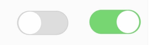
3.1 サンプル1
themeの変更のみです。
app\src\main\res\values\styles.xml
    <style name="CustomSwitch" parent="Theme.AppCompat.Light">
        <!--ボタンON時のボタンの通り道(透明度30%)・ボタンとタッチフィードバックカラー-->
        <item name="colorControlActivated">#1e90ff</item>
        <!--ボタンOFF時のボタンの通り道(透明度30%)-->
        <item name="android:colorForeground">#c0c0c0</item>
        <!-- OFFボタンを押したときのタッチフィードバックカラー -->
        <item name="colorControlHighlight">#c0c0c0</item>

    </style>
#1e90ff``#c0c0c0
<?xml version="1.0" encoding="utf-8"?>
<android.support.constraint.ConstraintLayout xmlns:android="http://schemas.android.com/apk/res/android"
    xmlns:app="http://schemas.android.com/apk/res-auto"
    xmlns:tools="http://schemas.android.com/tools"
    android:layout_width="match_parent"
    android:layout_height="match_parent"
    tools:context=".MainActivity">

    <Switch
        android:id="@+id/switch1"
        android:layout_width="wrap_content"
        android:layout_height="wrap_content"
        android:showText="false"
        android:switchMinWidth="70dp"
        android:theme="@style/CustomSwitch" />

</android.support.constraint.ConstraintLayout>
3.2 サンプル2
xmlでtrackやボタンを作ります。
track&backgroundソース
<?xml version="1.0" encoding="utf-8"?>
<selector xmlns:android="http://schemas.android.com/apk/res/android">

    <!-- ON時 -->
    <item android:state_checked="true">
        <layer-list>
            <item android:bottom="3dp" android:top="3dp">
                <!--形のタイプ-->
                <shape android:shape="rectangle">
                    <!--角丸の半径-->
                    <corners android:radius="32dp" />
                    <!--背景色-->
                    <solid android:color="#76d672" />
                </shape>
            </item>
        </layer-list>
    </item>

    <!-- OFF時 -->
    <item>
        <layer-list>
            <item android:bottom="3dp" android:top="3dp">
                <!--形のタイプ-->
                <shape android:shape="rectangle">
                    <!--角丸の半径-->
                    <corners android:radius="32dp" />
                    <!--背景色-->
                    <solid android:color="#dcdcdc"/>
                    <!--周りの色-->
                    <stroke android:width="1dp" android:color="#d3d3d3"/>
                </shape>
            </item>
        </layer-list>
    </item>

</selector>
#76d672``#dcdcdc``#d3d3d3
thumbソース
<?xml version="1.0" encoding="utf-8"?>
<selector xmlns:android="http://schemas.android.com/apk/res/android">
    <!-- ON時 -->
    <item>
        <layer-list>
            <item android:bottom="4dp"
                android:left="2dp"
                android:right="2dp"
                android:top="4dp">
                <shape android:shape="oval" >
                    <size android:height="30dp" android:width="30dp" />
                    <solid android:color="#fefefe" />
                </shape>
            </item>
        </layer-list>
    </item>

    <!-- OFF字 -->
    <item>
        <layer-list>
            <item android:bottom="4dp"
                android:left="2dp"
                android:right="2dp"
                android:top="4dp">
                <shape android:shape="oval" >
                    <size android:height="30dp" android:width="30dp" />
                    <solid android:color="#fefefe" />
                </shape>
            </item>
        </layer-list>
    </item>

</selector>
#fefefe
<?xml version="1.0" encoding="utf-8"?>
<android.support.constraint.ConstraintLayout xmlns:android="http://schemas.android.com/apk/res/android"
    xmlns:app="http://schemas.android.com/apk/res-auto"
    xmlns:tools="http://schemas.android.com/tools"
    android:layout_width="match_parent"
    android:layout_height="match_parent"
    tools:context=".MainActivity">

    <Switch
        android:id="@+id/switch1"
        android:layout_width="wrap_content"
        android:layout_height="wrap_content"
        android:showText="false"
        android:theme="@style/CustomSwitch"
        android:thumb="@drawable/switch_thumb"
        android:track="@drawable/switch_bg"
        android:background="@drawable/switch_bg"/>

</android.support.constraint.ConstraintLayout>
3.3 サンプル3
素材を画像で準備して作ります。
画像ファイル
switch_track_on.svg 
switch_track_off.svg 
switch_thumb.svg 
元画像の比率や完成度が低いのは気にしない。私にそんなスキルはないのだ。
表示するために画像はpng形式になっています。
<?xml version="1.0" encoding="utf-8"?>
<selector xmlns:android="http://schemas.android.com/apk/res/android">

    <!-- ON時 -->
    <item android:state_checked="true">
        <layer-list>
            <item android:drawable="@drawable/switch_track_on"/>
        </layer-list>
    </item>

    <!-- OFF時 -->
    <item>
        <layer-list>
            <item android:drawable="@drawable/switch_track_off"/>
        </layer-list>
    </item>

</selector>
app\src\main\res\values\styles.xml
    <style name="CustomSwitch" parent="Theme.AppCompat.Light">
        <!--ボタンON時のボタンの通り道(透明度30%)・ボタンとタッチフィードバックカラー-->
        <item name="colorControlActivated">#ffff00</item>
        <!-- OFFボタンを押したときのタッチフィードバックカラー -->
        <item name="colorControlHighlight">#ffff00</item>

    </style>
#ffff00
<?xml version="1.0" encoding="utf-8"?>
<android.support.constraint.ConstraintLayout xmlns:android="http://schemas.android.com/apk/res/android"
    xmlns:app="http://schemas.android.com/apk/res-auto"
    xmlns:tools="http://schemas.android.com/tools"
    android:layout_width="match_parent"
    android:layout_height="match_parent"
    tools:context=".MainActivity">

    <Switch
        android:id="@+id/switch1"
        android:layout_width="wrap_content"
        android:layout_height="wrap_content"
        android:showText="false"
        android:theme="@style/CustomSwitch"
        android:thumb="@drawable/switch_thumb"
        android:track="@drawable/switch_track" />

</android.support.constraint.ConstraintLayout>
一番大変だったのにしょぼい。。。すべて画像が元なのでON・OFFなどの文字も入れることができます。
私はSVGファイルでなぜか文字が入らず断念。とほほ
おわりに
他の項目もコピペしたい。