環境
Windows
R 3.2.5
Microsoft R Open 3.2.5
これからやること
前回( https://qiita.com/gaborotta/items/0038f308608b21b73542 )の続きで、2019年2月から過去1年間でニコニコ動画ゲームカテゴリのランキングTOP100に入った動画・投稿者の情報を統計的に分析する。
前回は上位100以内の全てのデータを一つのデータセットとして分析。
今回は、データを一度でも上位20以内に入った動画と100~20位の動画に分割して、それぞれの傾向を把握する。
これにより、上位20位以内に入る動画かどうかを判定するモデルを作る足掛かりに。
というわけで相対度数ヒストグラムで比較
とりあえず各データセットの各属性の相対度数ヒストグラムを描いて分布を見てみる。
サンプル数が違うので、度数分布ではなく相対度数分布を見て比較する。
上位20以内に入る動画の特性を見つける。
1.投稿時間に着目
方法
まずは過去に一度でも上位20以内に入った動画とそれ以外を分ける。
あとは投稿時間について前回と同様の方法で加工する。
グラフの表示は棒グラフだと分かりにくかったので、折れ線グラフで表示。
# Divide data within 20th place and others
videoData <- videoData %>% mutate(isOver20 = ifelse( MAX_RANK <= 20, 1, 0)) %>% mutate(isOver20=factor(isOver20))

### Hour###
video_hour<-mutate(videoData,DATE=as.character(DATE))
video_hour<-separate(video_hour,DATE,into = c("day", "time"),sep = "T",extra = "drop")
video_hour<-separate(video_hour,time,into = c("hour", "minute","second"),sep = ":",extra = "drop")
video_hour<-group_by(video_hour,hour,isOver20)
video_hour<-summarise(video_hour,count=n())
sum_hour<-video_hour%>%ungroup()%>%group_by(isOver20)%>%summarise(count=sum(count))
video_hour<-video_hour%>%right_join(sum_hour,by="isOver20")%>%mutate(rate=count.x/count.y)%>%filter(hour != is.na(hour))
video_hour<-video_hour%>%ungroup()%>%mutate(hour=as.numeric(hour))

g <- ggplot(video_hour, aes(x = hour, y = rate, color=isOver20))
g <- g + geom_line()+geom_point()
plot(g)
結果
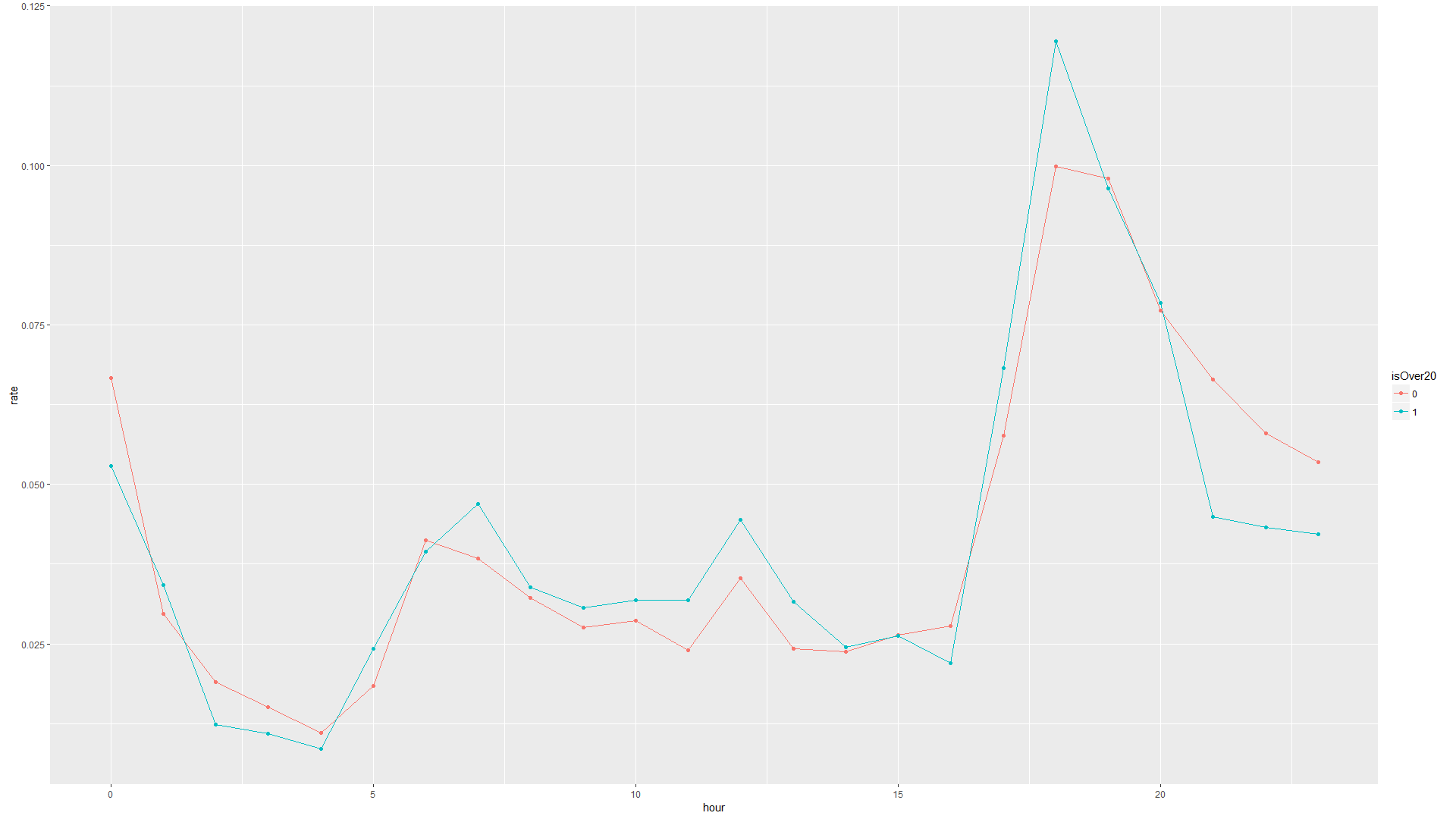
考察
過去に20以内に入った動画は7時、12時、17時~18時に投稿されている。
いずれも通勤時間中、お昼休憩中、仕事終わりに見そうな時間を狙っているだめだと思われる。
その時間に見ることはないにしても、ニコレポへの投稿通知等、視聴者が情報をチェックしそうな時間帯を狙っていると思われる。
2.動画再生時間に着目
方法
geom_histogramで相対度数ヒストグラムを描画するために、y=..density..を指定。
position = "identity", alpha = 0.4を指定することで、二つの分布を透過して重ねて表示できる。比較しやすい気がする。
### LENGTH###
video_length<-videoData
video_length<-video_length %>% separate(LENGTH,into = c("minute"),sep = c("秒"),extra = "drop")
video_length<-video_length %>% separate(minute,into = c("minute", "second"),sep = c("分"),extra = "drop")
video_length<-video_length %>% separate(minute,into = c("hour", "minute"),sep = c("時間"),extra = "drop",fill="left")
video_length<-video_length %>% mutate(hour=as.numeric(hour),minute=as.numeric(minute),second=as.numeric(second))
video_length[is.na(video_length)]<-0
video_length<-video_length %>% mutate(time=hour*3600+minute*60+second)
video_length<-video_length%>%group_by(isOver20)

# Draw graph
g1 <- ggplot(video_length, aes(x = time,y=..density..,color=isOver20,fill=isOver20))+geom_histogram(binwidth = 60,position = "identity", alpha = 0.4)
g1<-g1+theme(axis.text.x = element_text(angle = 90, hjust = 1))+scale_x_continuous(breaks=seq(0,25000,300))
plot(g1)

g2 <- ggplot(video_length, aes(x = time,y=..density..,color=isOver20,fill=isOver20))+geom_histogram(binwidth = 60,position = "identity", alpha = 0.4)
g2<-g2+scale_x_continuous(breaks=seq(0,2700,60),limits = c(0,2700))+theme(axis.text.x = element_text(angle = 90, hjust = 1))
plot(g2)

# Output
layout1 <- rbind(c(1),c(1),c(1),c(2),c(2))
g<-grid.arrange(g1, g2,layout_matrix = layout1)
結果
上が全体グラフ表示
下が2700秒(45分)までの範囲で表示。
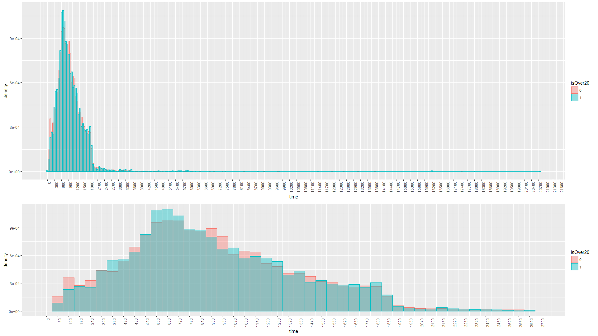
考察
やはり正規分布なグラフに。素敵。
上位20以内に入った動画が比較的多いのは、300秒(5分)と600~660秒(10分~11分)の動画。
やはりそのくらいの長さが見やすいし作りやすいのかもしれない。
かといって双方の分布に大きな差があるわけではないが、何かしら影響はしているかもしれない。
3.投稿者のフォロワー数に着目
方法
そのまま相対度数指定でヒストグラム関数に突っ込むだけ。
### FOLLOWER_NUM###
user_follow<-videoData%>%filter(FOLLOWER_NUM>0)

# Draw graph
g1 <- ggplot(user_follow, aes(x = FOLLOWER_NUM,y=..density..,color=isOver20,fill=isOver20))+geom_histogram(binwidth = 1000,position = "identity", alpha = 0.4)
g1<-g1+theme(axis.text.x = element_text(angle = 90, hjust = 1))+scale_x_continuous(breaks=seq(0,100000,1000),limits = c(0, 100000))
plot(g1)

g2 <- ggplot(user_follow, aes(x = FOLLOWER_NUM,y=..density..,color=isOver20,fill=isOver20))+geom_histogram(binwidth = 100,position = "identity", alpha = 0.4)
g2<-g2+theme(axis.text.x = element_text(angle = 90, hjust = 1))+scale_x_continuous(breaks=seq(0,10000,100),limits = c(0, 10000))
plot(g2)

# Output
layout1 <- rbind(c(1),c(1),c(2),c(2),c(2))
g<-grid.arrange(g1, g2,layout_matrix = layout1)
結果
上段がグラフ全体図
下段がフォロワー5000人以下の範囲で表示したグラフ
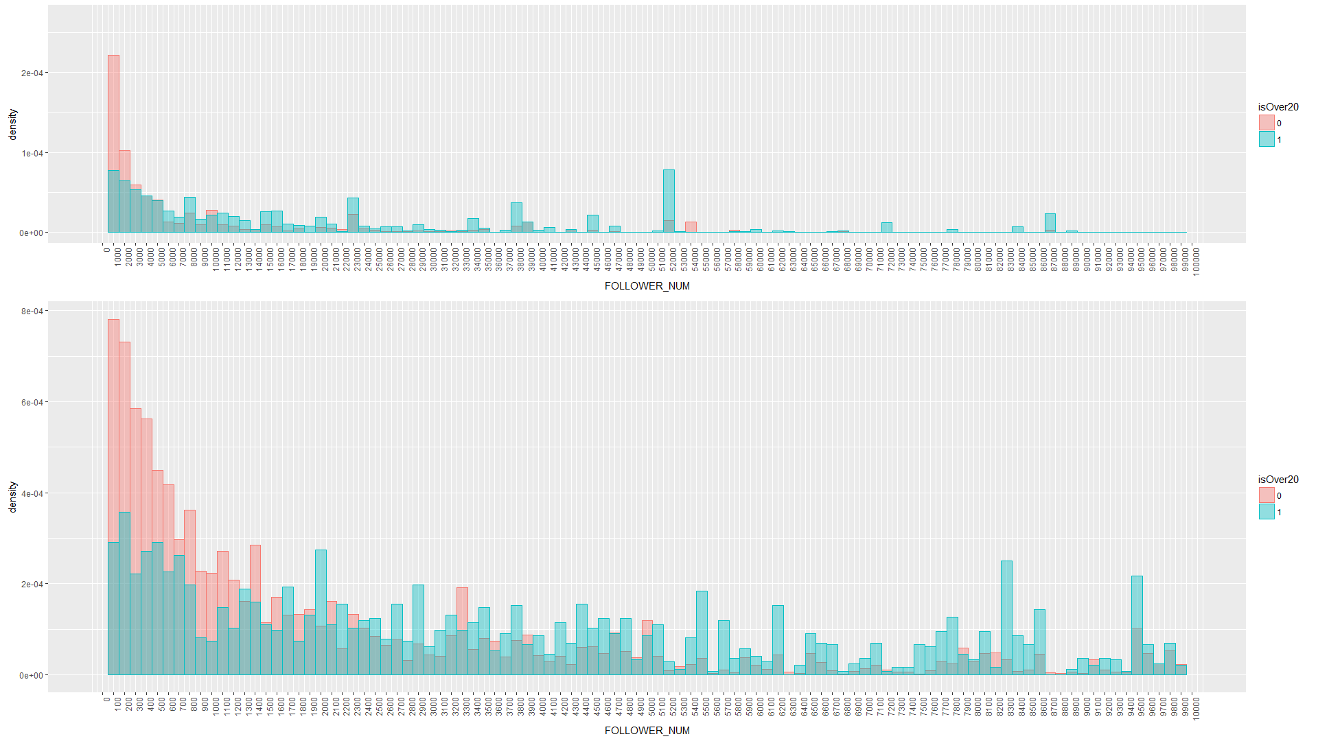
考察
下のグラフからはフォロワー数2000人以上の投稿者の動画が多く入っているような傾向に。
上のグラフからは5000人以上からが多くなっている印象。
2000人~5000人のあたりに上位20以内に入れる投稿者の壁があるのかもしれない。
上位に入るからフォロワー数が多いのか、フォロワー数が多いから上位に入るのかは定かではないが...。
4.投稿者の動画投稿数に着目
方法
これもそのままヒストグラムの関数に入れる。
user_video<-videoData%>%filter(VIDEO_NUM>0)

# Draw graph
g1 <- ggplot(user_video, aes(x = VIDEO_NUM,y=..density..,color=isOver20,fill=isOver20))+geom_histogram(binwidth = 50,position = "identity", alpha = 0.4)
g1<-g1+theme(axis.text.x = element_text(angle = 90, hjust = 1))+scale_x_continuous(breaks=seq(0,3000,50),limits = c(0, 3000))

g2 <- ggplot(user_video, aes(x = VIDEO_NUM,y=..density..,color=isOver20,fill=isOver20))+geom_histogram(binwidth = 10,position = "identity", alpha = 0.4)
g2<-g2+theme(axis.text.x = element_text(angle = 90, hjust = 1))+scale_x_continuous(breaks=seq(0,500,10),limits = c(NA, 500))

# Output
layout1 <- rbind(c(1),c(1),c(2),c(2),c(2))
g<-grid.arrange(g1, g2,layout_matrix = layout1)
結果
上段が全体表示
下段が動画数300以下の範囲で表示。
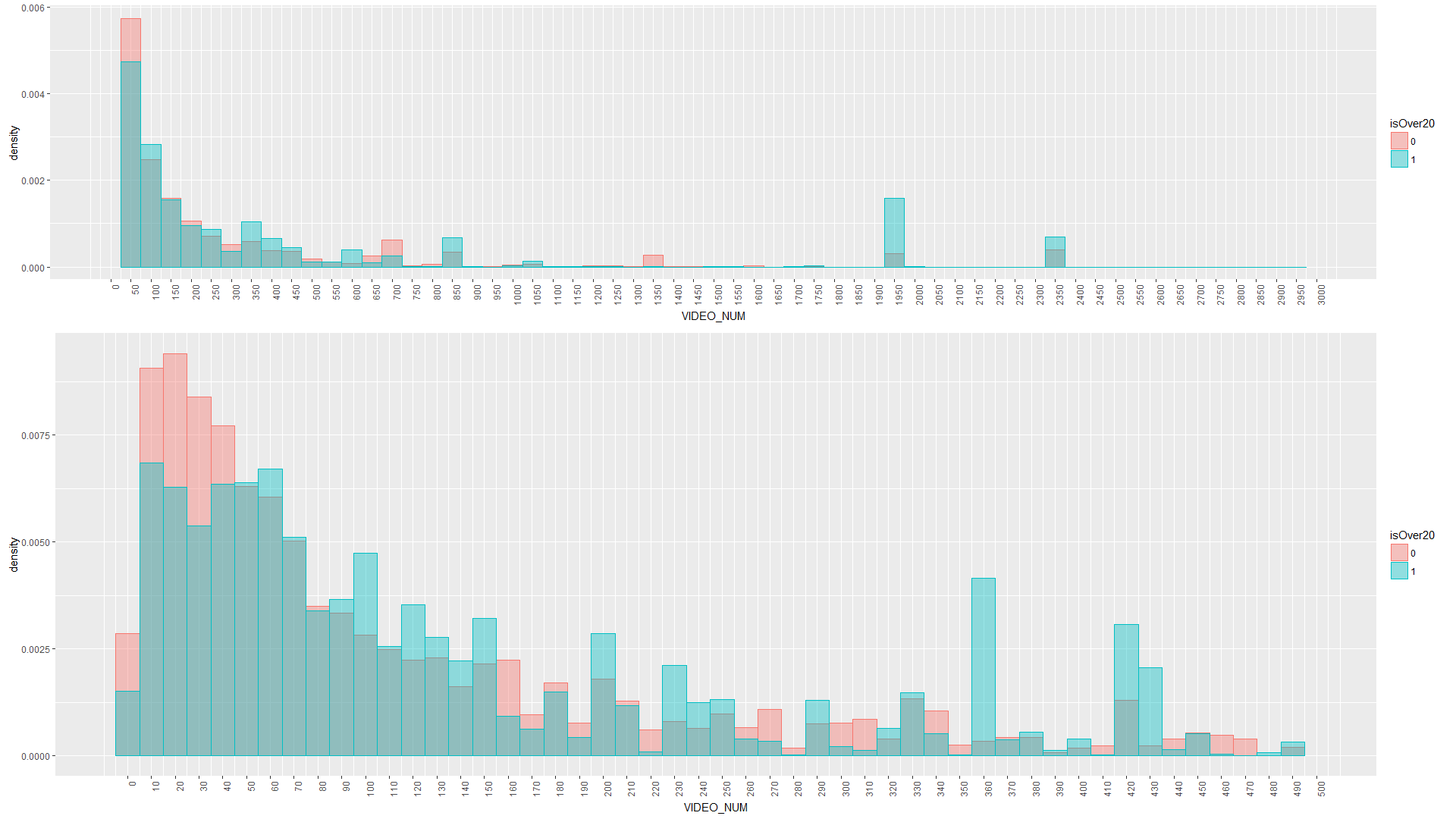
考察
0本が多くなっているが、これは非公開設定によるもの。
20以内に入っている動画は投稿数50本以上からが多い傾向に。
継続は力なり。
やはり投稿数が多いのは強い。
投稿数が多いからランクインしやすくなるのか、ランクインしないから投稿数が少なくなるのかは不明...。
5.投稿者のユーザー登録時のニコニコVerに着目
方法
前回同様、こちらは文字列なので集計してから棒グラフで表示。
横軸がニコニコVer、縦軸が投稿者数
### NICO_VER###
user_nico<-videoData%>%filter(NICO_VER!=is.na(NICO_VER))
user_nico<-user_nico %>% group_by(NICO_VER,isOver20) %>% summarise(count_num=n())
sum_nico<-user_nico%>%ungroup()%>%group_by(isOver20)%>%summarise(count=sum(count_num))
user_nico<-user_nico%>%right_join(sum_nico,by="isOver20")%>%mutate(rate=count_num/count)

# Draw graph
g <- ggplot(user_nico, aes(x = NICO_VER, y = rate, fill = isOver20,color=isOver20))
g <- g + geom_bar(stat = "identity",position = "dodge")
plot(g)
ggsave(file = "sep_user_nico.png", plot = g,dpi = 100, width = 19.20, height = 10.80)
結果
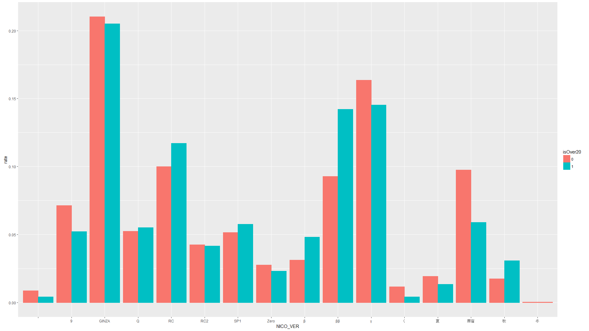
考察
ββやRCが多い傾向に。やはり古参は強いのか。
これは動画投稿数やフォロワー数とも相関がありそう。
モデル化するときは多重共線性に注意する必要がありそうです。
しかし原宿や9はそれなりに時間も経っているのになぜ低くなっているのか...。
原宿もしくは9であることが負のパラメータを持つ可能性がありそうです。可哀想に...。
6.動画タグに着目
方法
そして最後、タグ名。
方法は前回同様。相対度数計算のために各動画数で除算している点くらい。
タグはあまりにも種類が多いので、今回は100本以上の動画に付けられているタグにのみ着目
### Tag###
# Process data
videoTagData<-left_join(videoTagData,videoData,by=c("VIDEO_ID"="ID"))
tag_name<-group_by(videoTagData,TAG_NAME,isOver20)
tag_name<-summarise(tag_name,count=n())
sum_tag<-videoData%>%ungroup()%>%group_by(isOver20)%>%summarise(count=n())
tag_name<-tag_name%>%right_join(sum_tag,by="isOver20")%>%mutate(rate=count.x/count.y)
sum_tag<-tag_name%>%ungroup()%>%group_by(TAG_NAME)%>%summarise(sum_count=sum(count.x))
tag_name<-tag_name%>%right_join(sum_tag,by="TAG_NAME")
tag_name<-setorder(tag_name,sum_count)
tag_name1<-filter(tag_name,sum_count>=100,sum_count<200)
tag_name2<-filter(tag_name,sum_count>=200,sum_count<1000)
tag_name3<-filter(tag_name,sum_count>=1000)

# Draw graph
g1 <- ggplot(tag_name1,aes(x=reorder(x = TAG_NAME, X = sum_count, FUN = mean),y=rate,fill=isOver20,color=isOver20))
g1 <- g1 + geom_bar(stat = "identity",position = "dodge")+theme(legend.position = 'none')+theme(axis.text.x = element_text(angle = 90, hjust = 1))
plot(g1)

g2 <- ggplot(tag_name2,aes(x=reorder(x = TAG_NAME, X = sum_count, FUN = mean),y=rate,fill=isOver20,color=isOver20))
g2 <- g2 + geom_bar(stat = "identity",position = "dodge")+theme(legend.position = 'none')+theme(axis.text.x = element_text(angle = 90, hjust = 1))
plot(g2)

g3 <- ggplot(tag_name3,aes(x=reorder(x = TAG_NAME, X = sum_count, FUN = mean),y=rate,fill=isOver20,color=isOver20))
g3 <- g3 + geom_bar(stat = "identity",position = "dodge")+theme(legend.position = 'none')+theme(axis.text.x = element_text(angle = 90, hjust = 1))
plot(g3)

# Output
layout1 <- rbind(c(1,1,1),c(1,1,1),c(2,2,3),c(2,2,3),c(2,2,3))
g<-grid.arrange(g1, g2,g3,layout_matrix = layout1)
結果
上段が動画数100本以上200本未満
下段左が200本以上1000本未満
下段右が1000本以上
考察
ゆっくり実況はボイロ実況よりも上位によく入ってる。ゆっくりは大御所が多いからな気もする。
ゲームだとDbD,FGO,PUBG,Steamがよく上位になってる。マイクラは上位下位関係なさそう。
タグによって影響の出る出ないがありそうな事は分かる。
まとめ
過去に上位20以内に入った動画とそうでない動画を分けてヒストグラムを見てみました。
それぞれの属性が影響してそうな予感もしつつ、そうでない予感もしつつです。
次は上位20以内に入る動画の判定モデルを作ろうと思います。