前段
AndroidといえばMaterialDesign。
MaterialDesignのタブといえばこれ。

Components - Tabs
https://material.io/guidelines/components/tabs.html#tabs-usage
ふつーにTabLayoutを使えばそうなります。
が、世の中にはこんなタブのニーズもあるはず。。
タブが現実世界のメタファーを利用していた頃のタブ。
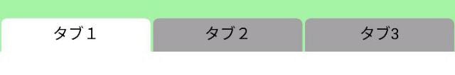
いいですねー。タブですねー。書類をはさみたくなりますねー。
早速実装です。
実装
なにしろまずはTabLayoutです。
layout_heightでタブの高さ、backgroundで背景色を指定します。
TabLayoutの中にTabItemを3つもたせます。
main_layout.xml
<LinearLayout
    android:layout_height="match_parent"
    android:layout_width="match_parent"
    android:orientation="vertical">

    <android.support.design.widget.TabLayout
        android:id="@+id/notification_tabs"
        android:layout_width="match_parent"
        android:layout_height="30dp"
        android:background="#A0F0A0"
        >
        <android.support.design.widget.TabItem
            android:layout_height="match_parent"
            android:layout_width="match_parent"
            android:layout="@layout/tab1"
            />
        <android.support.design.widget.TabItem
            android:layout_height="match_parent"
            android:layout_width="match_parent"
            android:layout="@layout/tab2"
            />
        <android.support.design.widget.TabItem
            android:layout_height="match_parent"
            android:layout_width="match_parent"
            android:layout="@layout/tab3"
            />
    </android.support.design.widget.TabLayout>
    <!--
        The contents area.
    -->
</LinearLayout>
各TabItemのandroid:layoutで指定しているタブのレイアウトはこちら。
タブの丸みはbackgroundで指定しているdrawableで実現しています。
layout/tab1.xml
<?xml version="1.0" encoding="utf-8"?>
<RelativeLayout xmlns:android="http://schemas.android.com/apk/res/android"
    android:layout_width="match_parent"
    android:layout_height="match_parent"
    android:background="@drawable/tab_shape_rounded_corner">

    <TextView
        android:layout_width="match_parent"
        android:layout_height="match_parent"
        android:text="タブ1"
        android:textColor="#000000"
        android:paddingTop="4dp"
        android:textAlignment="center" />

</RelativeLayout>
そのdrawable。
似たようなitemが2つありますが、最初のが選択した時、次のが未選択の時のデザインです。
xmlだけで表現できるのがいいですね。
drawable/tab_shape_rounded_corner.xml
<?xml version="1.0" encoding="utf-8"?>
<selector xmlns:android="http://schemas.android.com/apk/res/android">
    <item android:state_selected="true">
        <shape android:shape="rectangle">
            <corners android:topLeftRadius="5dp" android:topRightRadius="5dp" />
            <solid android:color="@color/white" />
        </shape>
    </item>
    <item>
        <shape android:shape="rectangle">
            <corners android:topLeftRadius="5dp" android:topRightRadius="5dp" />
            <solid android:color="#A0A0A0" />
        </shape>
    </item>
</selector>
これだけだとタブの間が離れすぎるし、インディケータが表示されてしまうのでデフォルトのタブデザインを少々いじります。
values/styles.xmlにTabLayoutの項をまるっと追加。
values/styles.xml
.
.
    <style name="Base.Widget.Design.TabLayout" parent="android:Widget">
        <item name="tabMaxWidth">@dimen/design_tab_max_width</item>
        <item name="tabIndicatorColor">?attr/colorAccent</item>
        <item name="tabIndicatorHeight">0dp</item>
        <item name="tabPaddingStart">1dp</item>
        <item name="tabPaddingEnd">1dp</item>
        <item name="tabBackground">?attr/selectableItemBackground</item>
        <item name="tabTextAppearance">@style/TextAppearance.Design.Tab</item>
        <item name="tabSelectedTextColor">?android:textColorPrimary</item>
    </style>
.
.
tabIndicatorHeightを0にして、tabPaddingStartとEndでタブの幅を調整しています。
これで完成。
お役にたてば。