CSS ホバーでテキストに下線をつける(アニメーション)
疑似要素を使ってテキストに下線を入れて
アニメーションで表示してみましょう。
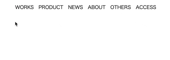
完成イメージ

完成コード
<ul class="header">
  <li class="link hover-Uline"><a href="">WORKS</a></li>
  <li class="link hover-Uline"><a href="">PRODUCT</a></li>
  <li class="link hover-Uline"><a href="">NEWS</a></li>
  <li class="link hover-Uline"><a href="">ABOUT</a></li>
  <li class="link hover-Uline"><a href="">OTHERS</a></li>
  <li class="link hover-Uline"><a href="">ACCESS</a></li>
</ul>
* a,li{ /*リセット*/
  color: black;
  text-decoration: none;
  list-style: none;
}

.header { /*要素の横並び*/
  display: flex;
}

.link { /*要素の整列*/
 margin-left: 1rem;
 text-align: center;
}

.hover-Uline {
  position: relative; /*疑似要素の親を固定*/
  cursor: pointer; /*カーソルをポインターへ*/
  text-decoration: none;  /*ホバーなしは非表示*/
}

.hover-Uline:before {
  content: ""; /*疑似要素の中身は空(記述は必須)*/
  position: absolute; /*子要素として疑似要素を固定*/
  left: 0; /*長さはテキストの両端まで*/
  right: 0; /*長さはテキストの両端まで*/
  bottom: -5px;  /*線の上下位置*/
  width: 100%; /*線の長さ*/
  height: 2px; /*線の太さ*/
  background-color: #9e9c9c; /*線の色*/
  transform: scale(0, 1); /*横方向に0状態から全体まで線を入れる*/
  transform-origin: center; /*中央を起点にアニメーション*/
  transition: transform .2s; /*アニメーションの時間*/
}

.hover-Uline:hover:before {
  transform: scale(1); /*ホバー時に等倍へ拡大*/
}
実行結果
プロパティを変えれば左端から線をアニメーションなども可能です。
transform-origin: left;