ggplot2を使ったらいろいろときれいな絵を掛けるんだけど、今まではとりあえずネットの情報を見よう見まねでなんとなくコピペしてきただけだった。
ということでここで自分なりに整理してみる。
今回は その2 として棒グラフについて整理。
テスト環境
データとしてRに最初っから組み込まれているirisデータを使う。
あとRの開発・実行環境はRStudio。
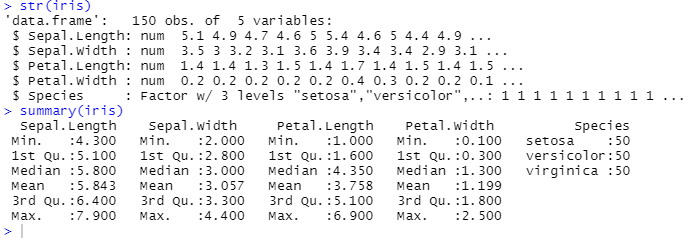
irisとは花のアイリスです。
- Sepal.Length:がく片の長さ
- Sepal.Width:がく片の幅
- Petal.Length:花弁の長さ
- Petal.Width:花弁の幅
- Speies:種類
棒グラフ
geom_barを使います。
今までと同様に、引数として、aesを使ってxやyを設定したり、色を設定したりします。
それとともに、statという引数に設定を与えます。
sata="identity"と設定すると、xで設定したグループごとに、yの値を加算していく形(要するに積み上げグラフ)になります。
stat="count"と設定すると、xで設定したグループごとに、数を数え上げます。こちらに設定した場合、軸は1つしか設定できません。
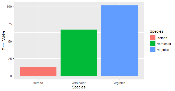
g <- ggplot(iris)+
geom_bar(aes(x=Species, y=Petal.Width,fill=Species),stat="identity")
plot(g)
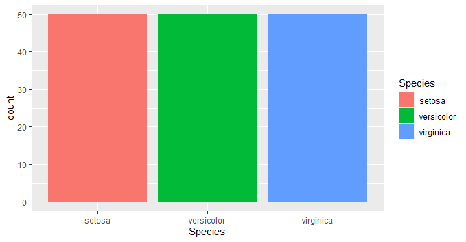
g <- ggplot(iris)+
geom_bar(aes(x=Species,fill=Species),stat="count")
plot(g)
g <- ggplot(iris)+
geom_bar(aes(y=Petal.Width,fill=Species),stat="count")
plot(g)
グループごとの棒グラフを並べる(2021/3/7追記)
上記の3つ目のグラフだと、VirginicaとVersicolorで重なっているところが積み上げになってしまいます。
これを解消するためには、intaraction()を設定します。書く順番を入れ換えると、主従が入れ替わります。
g <- ggplot(iris)+
  geom_bar(aes(y=interaction(Petal.Width,Species),fill=Species),stat="count")
plot(g)

g <- ggplot(iris)+
  geom_bar(aes(y=interaction(Species,Petal.Width),fill=Species),stat="count")
plot(g)
ちょっと例として今一でしたが(苦笑)下のグラフでは、Petal.Widthが1.4から1.8の間ではVeriginicaとVersicolorが積み上げではなく、横並びになっているのが分かります。
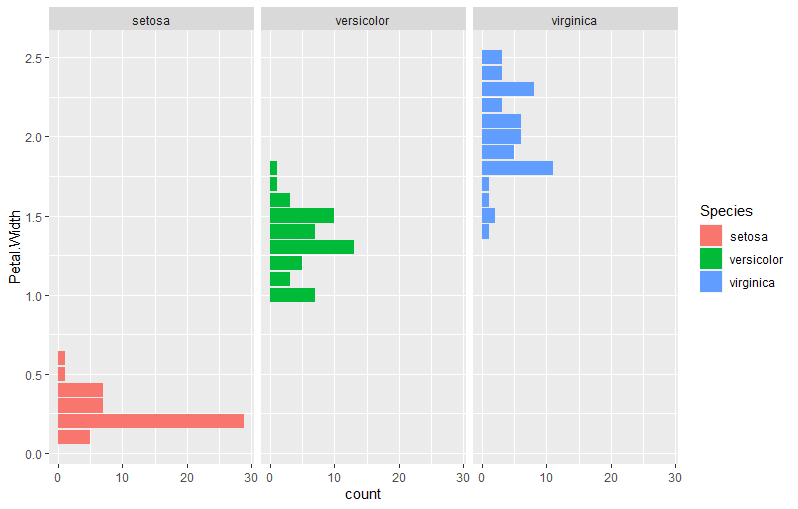
グループごとの棒グラフを並べる facet_wrapを使う(2021/3/7追記)
facet_wrapを使って、こうもできます。引数はvars()を使って、グループ分けに使う変数を与えます。
g <- ggplot(iris)+
  geom_bar(aes(y=Petal.Width,fill=Species),stat="count")+
  facet_wrap(vars(Species))

plot(g)
xとyの入れ替え
棒グラフに限らないですが、xとyを入れ換えたグラフをするときには、aesのxとyを明示的に入れ替えてもよいですが、
以下のようにcoord_flip()を書き加えるのでもできます。
g <- ggplot(iris)+
  geom_bar(aes(x=Petal.Width,fill=Species),stat="count")+
  coord_flip()
plot(g)
度数分布グラフに度数も書き込む(2021/3/5追記)
geom_barでstatをcountにすれば度数分布グラフを書けますが、グラフに度数も書き込みたい場合には、結局は別に度数計算をしておく必要があります。
まずは度数計算
各種の度数計算の方法は,sum(iris$Species==***))(***は種の名前)になる)です。
3個程度なので、マニュアルで1個1個計算させても良いですが、面倒な場合には、sapply関数を使います。
Species = c("setosa","versicolor","virginica")
countdata <- data.frame(
  Species  = Species,
  Count = sapply(Species, function(x){sum(na.omit(iris$Species)==x)})
)
# print(countdata)
#              Species Count
# setosa         setosa    50
# versicolor versicolor    50
# virginica   virginica    50
ちなみに、sumの中にna.omitをいれてるのはsum関数がnaを含んだデータを流すとnaを返してしまうからです。
もしnaを含んだデータであった場合で、naの数も見たい場合には以下のようにします。
Species = c("setosa","versicolor","virginica")
countdata <- data.frame(
  Species  = Species,
  Count = sapply(Species, function(x){sum(na.omit(iris$Species)==x)})
)
countdata[nrow(countdata)+1,] <- c(NA, sum(is.na(iris$Species))
# print(countdata)
#              Species Count
# setosa         setosa    50
# versicolor versicolor    50
# virginica   virginica    50
# 4                <NA>     0
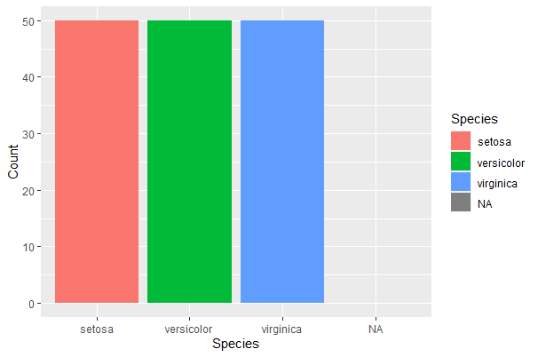
度数計算したものをグラフにする。
geom_barでstat=identityを使います。xはSpecies、yはCountですね。
ggplot(countdata,aes(x=Species, y=Count,fill=Species))+geom_bar(stat="identity")
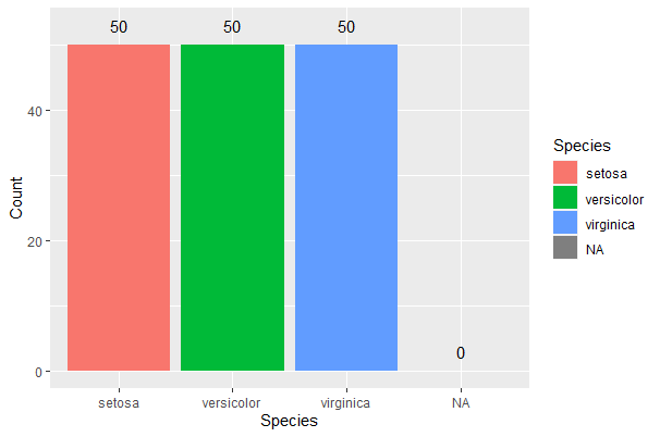
度数をグラフに加える
要は、度数を直接テキストとして書き込むというかたちです。
なのでgeom_textを使います。aesの引数の中でlabelに書き込みたい内容を書き入れます。
ここでは度数なのでcountdataのなかのCountを指定してます。
ggplot(countdata,aes(x=Species, y=Count,fill=Species))+geom_bar(stat="identity")+
  geom_text(aes(x=Species,y=Count+3,label=Count))
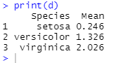
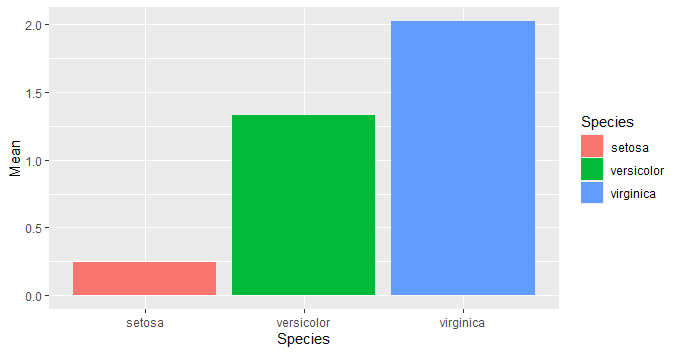
平均値を棒グラフにする。
geom_barは数え上げか積み上げかしかしてくれないようなので、平均値の棒グラフにしたいときには、平均値を直接データとして与えたやるしかなさそう。
ということで、by関数を使って、グループごとの平均値を求め、それをdataframeにしてggplotに渡してやります。
m <- by(iris$Petal.Width,iris$Species,mean)
d <- data.frame(
  Species = rownames(m),
  Mean = c(m[[1]],m[[2]],m[[3]])
)
g <- ggplot()+
  geom_bar(d,aes(x=Species,y=Mean,fill=Species),stat="identity")
plot(g)
dの中身は以下のような感じ。
描画はこうなります。
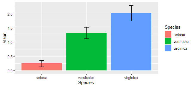
標準偏差のエラーバーを書き足す(信頼区間でも可)
標準偏差をエラーバーとして描画もしたいです。
そういう場合は、geom_errorbar()を使います。
aesでx軸、y軸の設定を与えるとともに、エラーバーの上下端をyminとymaxで与えてやります。widthで上下端の幅を指定します。
m <- by(iris$Petal.Width,iris$Species,mean)
SD <- by(iris$Petal.Width,iris$Species,sd)
d <- data.frame(
  Species = rownames(m),
  Mean = c(m[[1]],m[[2]],m[[3]]),
  SD = c(SD[[1]],SD[[2]],SD[[3]])
)
g <- ggplot(d)+
  geom_bar(aes(x=Species,y=Mean,fill=Species),stat="identity")+
  geom_errorbar(aes(x=Species,y=Mean,ymin=Mean-SD, ymax=Mean+SD,width=0.3))
plot(g)
上下端のyminとymaxにはそれぞれm-SD,m+SDという式を与えています。このように式で与えても良いですし、直接数値を与え手も良いです。
95%信頼区間の場合だと、直接数値になってるのではないでしょうか。
検定結果を書き足す
描画コマンドを使って1つ1つ書き足すやり方と、パッケージを使う方法があります。
とりあえず検定
まあともかく検定しないと始まらないので、ペアワイズt検定(Holmの補正)。
pairwise.t.test(iris$Petal.Width, iris$Species,"holm")
結果はこんな感じ。
	Pairwise comparisons using t tests with pooled SD

data:  iris$Petal.Width and iris$Species

           setosa versicolor
versicolor <2e-16 -
virginica  <2e-16 <2e-16

P value adjustment method: holm
ということでどの組み合わせでも有意差があるということですね。
直接書く方法
参考:https://indenkun.hatenablog.com/entry/2020/08/13/233029
geom_textとgeom_segmentを使って手作業で書き加えていきます。
aesを使ってx座標、y座標(始点の座標)、xend座標、yend座標(終点の座標)を与えます。
今回みたいにx軸が連続変数ではない場合、左から順にグラフの中心が1、2、3・・・と数字が振られてると考えて、その少し右よりからスタートする、ということで始点は1.1,2.1,3.1とし、終点は1.9、2.9、0.9とします。
yの方は、今回はy軸は連続変数なので、y軸の値で指定します。
テキストは傘より0.1だけ上にするということにします。
g <- ggplot(d,aes(x=Species,y=Mean))+
  geom_bar(aes(fill=Species),stat="identity")+
  geom_errorbar(aes(ymin=Mean-SD, ymax=Mean+SD,width=0.1))+
  #一つ目の傘
  geom_text(aes(x = 1.5, y = 2.0, label = "***")) +
  geom_segment(aes(x = 1.1, xend = 1.1, y = 0.5, yend = 1.9)) +
  geom_segment(aes(x = 1.1, xend = 1.9, y = 1.9, yend = 1.9)) +
  geom_segment(aes(x = 1.9, xend = 1.9, y = 1.9, yend = 1.6)) +
  #2つめの傘
  geom_text(aes(x = 2.5, y = 2.6, label = "***")) +
  geom_segment(aes(x = 2.1, xend = 2.1, y = 1.8, yend = 2.5)) +
  geom_segment(aes(x = 2.1, xend = 2.9, y = 2.5, yend = 2.5)) +
  geom_segment(aes(x = 2.9, xend = 2.9, y = 2.3, yend = 2.5)) +
  #3つめの傘
  geom_text(aes(x = 2, y = 3.1, label = "***")) +
  geom_segment(aes(x = 0.9, xend = 0.9, y = 0.5, yend = 3.0)) +
  geom_segment(aes(x = 0.9, xend = 3.1, y = 3.0, yend = 3.0)) +
  geom_segment(aes(x = 3.1, xend = 3.1, y = 3.0, yend = 2.3))

plot(g)
結果

もう少しすっきりさせる。
geom_textとgeom_segmentはデータフレームをあたえることで同時に複数かきこむことができます。
それをつかって、以下のようにもできます。
d.signif <- data.frame(yl    = c(0.5, 1.6, 2.3),
                       ylend = c(1.9, 2.5, 3.0),
                       x     = c(1.1, 2.1, 3.1),
                       xend  = c(1.9, 2.9, 0.9),
                       yr    = c(1.9, 2.5, 3.0),
                       yrend = c(1.6, 2.3, 0.5),
                       label = c("***", "***", "***"),
                       label.x = c(1.5, 2.5, 2),
                       label.y = c(2.0, 2.6, 3.1))

ggplot(iris, aes(x = Species, y = Sepal.Length)) +
  geom_boxplot() +
  geom_text(aes(x = label.x, y = label.y, label = label), d.signif) +
  geom_segment(aes(x = x, xend = x, y = y , yend = yend), d.signif) +
  geom_segment(aes(x = x, xend = xend, y = yend, yend = yend), d.signif) +
  geom_segment(aes(x = xend, xend = xend, y = y, yend = yend), d.signif)
結果

y軸方向を自動設定にする。
y軸の設定がとにかく面倒くさい!
結局エラーバーよりちょと上から書いてくれれば良いのでそこをうまくやる!
b.legg = d$Mean+d$SD+0.1  #エラーバーより0.1目盛りだけ上
b.height = c(2,2.5,3)    #傘の高さ。これは適当な長さに。
d.signif <- data.frame(yls    = c(b.legg[1], b.legg[2], b.legg[3]),  #バーの左足。
                       yrs    = c(b.legg[2], b.legg[3], b.legg[1]),  #バーの右足。
                       height  = b.height,
                       x     = c(1.1, 2.1, 3.1),
                       xend  = c(1.9, 2.9, 0.9),
                       label = c("***", "***", "***"),
                       label.x = c(1.5, 2.5, 2),
                       label.y = b.height+0.1
                       )

g <- ggplot(d,aes(x=Species,y=Mean))+
  geom_bar(aes(fill=Species),stat="identity")+
  geom_errorbar(aes(ymin=Mean-SD, ymax=Mean+SD,width=0.1))+
  #傘
  geom_text(aes(x = label.x, y = label.y, label = label), d.signif) +
  geom_segment(aes(x = x, xend = x, y = yls , yend = height), d.signif) +
  geom_segment(aes(x = x, xend = xend, y = height, yend = height), d.signif) +
  geom_segment(aes(x = xend, xend = xend, y = yrs, yend = height), d.signif)
plot(g)
ggsiginfを使う方法
ggsignifパッケージを使うとキャンバスに検定結果を追加できます。
参考:https://www.karada-good.net/analyticsr/r-585
xminは有意差を示すときの傘の始点の位置をベクトルで書きます。ベクトルの要素数が書かれる傘の本数になりますね。
xmaxは逆に傘の終点になります。同じくベクトルです。今回の場合は中心より少し左側にするということでc1.9,2.9,0.9とします。
y_positionは傘の縦方向の位置の指定になります。y軸の値で指定します。傘が3つなので、ここも3つ書きます。
最後にannotationsで書き込む内容を文字列ベクトルとして書きます。
g <- ggplot(d,aes(x=Species,y=Mean))+
  geom_bar(aes(fill=Species),stat="identity")+
  geom_errorbar(aes(ymin=Mean-SD, ymax=Mean+SD,width=0.1))+
  geom_signif(xmin = c(1.1,2.1,3.1),
              xmax = c(1.9,2.9,0.9),
              y_position = c(3,3.2,3.4),
              annotations = c("***","***","***")
            )
結果

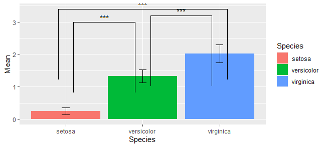
足の長さを調整
傘の足の長さを調整したい場合には、tip_lengthを設定します。
1つの傘あたり、左足と右足を設定することになります。それを順にベクトルとして書き並べていきます。
なお設定する値はあくまで割合だそうです。何を基準にした割合なのかはよく分からないので、出力結果を見て微調整しないといけないように思います。
g <- ggplot(d,aes(x=Species,y=Mean))+
  geom_bar(aes(fill=Species),stat="identity")+
  geom_errorbar(aes(ymin=Mean-SD, ymax=Mean+SD,width=0.1))+
  geom_signif(xmin = c(1.1,2.1,3.1),
              xmax = c(1.9,2.9,0.9),
              y_position = c(3,3.2,3.4),
              annotations = c("***","***","***"),
              tip_length = c(1,1,1,1,1,1)
            )

plot(g)
結果