散布図と回帰直線と混合モデルと。
使うデータは相変わらずRにデフォルトで組み込まれているirisで。
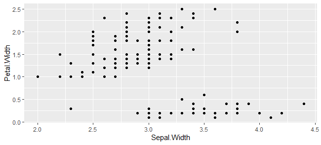
とりあえず散布図。
g <- ggplot(iris,aes(x=Sepal.Width, y=Petal.Width))+
  geom_point()
plot(g)
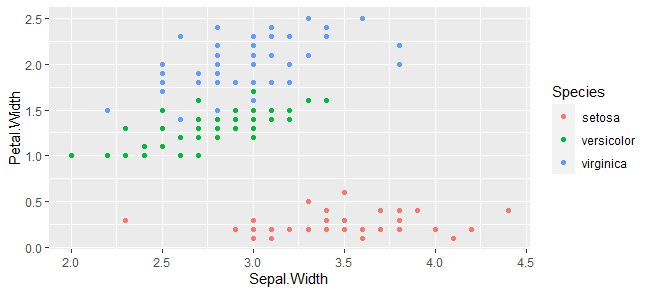
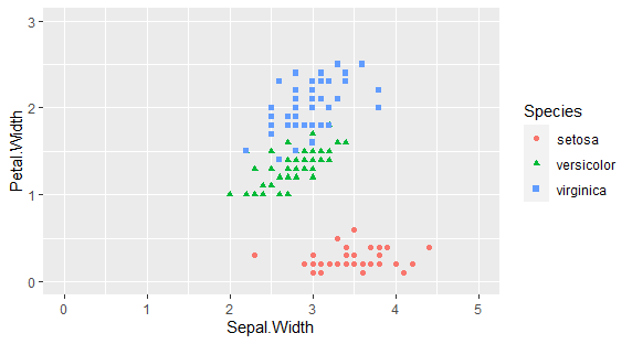
種類別で色分けする。
g <- ggplot(iris,aes(x=Sepal.Width, y=Petal.Width))+
  geom_point(aes(color=Species)
plot(g)
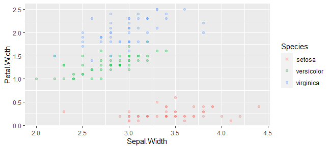
半透明にして重なってるところを可視化する。
g <- ggplot(iris,aes(x=Sepal.Width, y=Petal.Width))+
  geom_point(aes(color=Species),alpha=0.3)
plot(g)
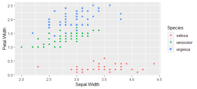
ポイントの点を変える
g <- ggplot(iris,aes(x=Sepal.Width, y=Petal.Width))+
  geom_point(aes(color=Species,shape=Species))
plot(g)
x軸、y軸の表示範囲を変える。
xlim(00,00)とylim(00,00)で変えられます。
g <- ggplot(iris,aes(x=Sepal.Width, y=Petal.Width))+
  geom_point(aes(color=Species,shape=Species))+
  xlim(0,5)+ylim(0,3)
plot(g)
回帰直線を書き加える
基本はgeom_smoothをつかうことです。
失敗事例
とりあえず、まずは失敗事例から。
g <- ggplot(iris,aes(x=Sepal.Width, y=Petal.Width))+
  geom_point(aes(color=Species,shape=Species))+
  geom_smooth(method="lm",fomula='y~x')
plot(g)
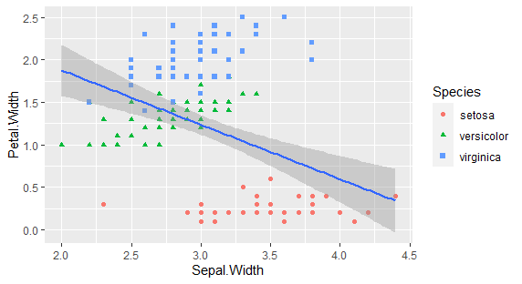
グループ分けされずに全部のプロットを入力データとした回帰分析が実行されてしまいます。
なので、今回のデータの場合、3つのグループがあるので、aesを使って分けてやります。
グループごとに回帰分析
aesでcolorを設定してやると、色分け用に設定した変数でグループ分けされた回帰分析が実行されます。
g <- ggplot(iris,aes(x=Sepal.Width, y=Petal.Width))+
  geom_point(aes(color=Species,shape=Species))+
  geom_smooth(method="lm",fomula='y~x',aes(color=Species))
plot(g)
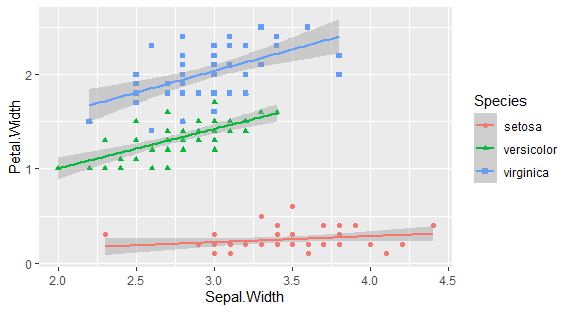
こうなります。
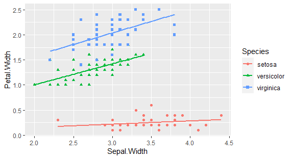
誤差範囲の表示を消す。
se=FALSEを加えてやればOK!
g <- ggplot(iris,aes(x=Sepal.Width, y=Petal.Width))+
  geom_point(aes(color=Species,shape=Species))+
  geom_smooth(method="lm",formula='y~x',aes(color=Species),se=FALSE)
plot(g)
回帰分析の結果から描画する
実際に回帰分析してみると、
summary(lm(Petal.Width~Sepal.Width, subset(iris,Species=="setosa")))
summary(lm(Petal.Width~Sepal.Width, subset(iris,Species=="versicolor")))
summary(lm(Petal.Width~Sepal.Width, subset(iris,Species=="virginica")))
結果
Call:
lm(formula = Petal.Width ~ Sepal.Width, data = subset(iris, Species ==
    "setosa"))
Coefficients:
(Intercept)  Sepal.Width
    0.02418      0.06471

Call:
lm(formula = Petal.Width ~ Sepal.Width, data = subset(iris, Species ==
    "versicolor"))
Coefficients:
(Intercept)  Sepal.Width
     0.1669       0.4184

Call:
lm(formula = Petal.Width ~ Sepal.Width, data = subset(iris, Species ==
    "virginica"))
Coefficients:
(Intercept)  Sepal.Width
     0.6641       0.4579
となります。
傾きと切片を指定して直線を引く
それっぽい数値になっていますが、実際にこれらの数値を使って書いてみます。
傾きと接点を指定して直線を引くには、geom_ablineを使います。
r.lm1<-lm(Petal.Width~Sepal.Width, subset(iris,Species=="setosa")))
r.lm2<-lm(Petal.Width~Sepal.Width, subset(iris,Species=="versicolor"))
r.lm3<-lm(Petal.Width~Sepal.Width, subset(iris,Species=="virginica"))

g <- ggplot(iris,aes(x=Sepal.Width, y=Petal.Width))+
  geom_point(aes(color=Species,shape=Species))+
  xlim(0,5)+ylim(0,3)+
  geom_smooth(method="lm",formula='y~x',aes(color=Species))+
  geom_abline(intercept = r.lm1$coefficients[[1]],slope = r.lm1$coefficients[[2]],linetype=2,color="red")+
  geom_abline(intercept = r.lm2$coefficients[[1]],slope = r.lm2$coefficients[[2]],linetype=2,color="green")+
  geom_abline(intercept = r.lm3$coefficients[[1]],slope = r.lm3$coefficients[[2]],linetype=2,color="blue")
plot(g)
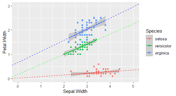
ということで確かに回帰分析になっているようです。
信頼区間について
回帰係数の信頼区間を求める
回帰係数の信頼区間はconfint()を使うと簡単に得られます。
引数はlmの出力結果と、level=0.95といった形で信頼区間を指定します。levelは省略可です。
r.lm.se<-lm(Petal.Width~Sepal.Width, subset(iris,Species=="setosa"))
confint(r.lm.se)
#                  2.5 %    97.5 %
# (Intercept) -0.24641235 0.2947705
# Sepal.Width -0.01375836 0.1431755
ただ、これはあくまで回帰係数の有意検定のためのものであって、geom_smoothで表示されるSEに対応したものではありません。
母平均の信頼区間を求める。
推定された回帰係数を使って、Sepat.Widthの値に応じた、Petal.Widthの値(母平均)を求めることができるわけですが、その母平均の信頼区間を求める時には、predict関数を使います。
第1引数は、lmの出力結果です。
第2引数は、信頼区間を算出するためのxをデータフレームで渡します。省略するとlmで使ったxのデータが使われます。
第3引数は、interval=c("none", "confidence", "prediction")になり、confidenceに設定すると信頼区間が、predictionにすると予測区間が計算されます。
第4引数はlevel = 0.95ということで、信頼区間の範囲を指定します。デフォルトは0.95です。
Petal.Width = predict(r.lm.se, interval = 'confidence', level = 0.95)
#          fit        lwr       upr
# 1  0.2506590 0.22067685 0.2806412
# 2  0.2183047 0.17364059 0.2629689
# 3  0.2312464 0.19679241 0.2657005
# 4  0.2247756 0.18566789 0.2638833
# 以下略

newx<-data.frame( Sepal.Width = seq(2, 4.5,0.05) )
Petal.Width = predict(r.lm.se, newdata = newx, interval = 'confidence', level = 0.95)
#          fit        lwr       upr
# 1  0.1535962 0.03774117 0.2694512
# 2  0.1568316 0.04476668 0.2688965
# 3  0.1600670 0.05178270 0.2683514
# 4  0.1633025 0.05878819 0.2678167
# 以下略
母平均の信頼区間を描画する
geom_lineを使います。ちょっと面倒なんですが、geom_lineへのデータフレームを渡す必要があります。
データフレームでは、xとするものとyとするものをそれぞれ入れる必要があります。
なお、predictの出力はfit, lwr, uprという列名と、"1", "2", "3"・・・という行名を持つ行列になります。
これをデータフレームに放り込むと、fit, lwr, uprはそれぞれ、y.fit, y.lwr, y.uprと名前が振られます。
d <- data.frame(x=newx$Sepal.Width,
                y=Petal.Width
                )
#       x     y.fit      y.lwr     y.upr
# 1  2.00 0.1535962 0.03774117 0.2694512
# 2  2.05 0.1568316 0.04476668 0.2688965
# 3  2.10 0.1600670 0.05178270 0.2683514
# 以下略

g <- ggplot(iris,aes(x=Sepal.Width, y=Petal.Width))+
  geom_point(aes(color=Species,shape=Species))+
  geom_line(d,mapping=aes(x=x, y=y.lwr),color="red",linetype=2)+
  geom_line(d,mapping=aes(x=x, y=y.upr),color="red",linetype=2)
plot(g)
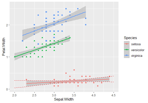
ということでgeom_smoothでse=TRUE(デフォルトです)によって表示される範囲が母平均推定の信頼区間を表示しているということが分かりました。