ggplot2を使ったらいろいろときれいな絵を掛けるんだけど、今まではとりあえずネットの情報を見よう見まねでなんとなくコピペしてきただけだった。
ということでここで自分なりに整理してみる。
参考:
https://www.atmarkit.co.jp/ait/articles/1009/02/news119.html
http://nfunao.web.fc2.com/files/R-ggplot2.pdf
テスト環境
とりあえず、テストデータとしてRに最初っから組み込まれているirisデータを使う。
あとRの開発・実行環境はRStudio。
View(iris)
str(iris)
summary(iris)
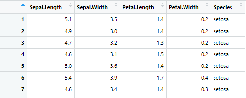
irisとは花のアイリスです。
- Sepal.Length:がく片の長さ
- Sepal.Width:がく片の幅
- Petal.Length:花弁の長さ
- Petal.Width:花弁の幅
- Speies:種類
ということで、アイリスの中でもいろいろな種類があるので、このデータではsetosa、veriscolor、virginicaという3種類のアイリスについて実際に50株ずつ植えて、開花した花のがくと花弁のサイズを測ったというデータになってます。
まずはキャンバスを用意する。
ggplot2で描画するためには、まずデータと紐付いたキャンバスを用意する必要がある。
ggplot()がキャンバスを用意する関数。
引数は、1つめは描画させたいデータが含まれているデータフレーム。
2つめはaes()を使って、x軸とする変数、y軸とする変数、その他の審美的属性を設定します。
(ちなみにaesはaestheticsの略で美観という意味です。)
library(ggplot2)

g <- ggplot(iris)
plot(g)

あくまでまだキャンバスを用意しただけなので何も描画されません。
箱ひげ図を描く
基本の描画
キャンバスに追記するというイメージで、geom_boxplot()を+後に書き込みます。
引数としてaesで描画のための諸属性を設定します。
x:irisに格納されている変数の中のどれをx軸にするか
y:irisに格納されている変数の中のどれをy軸にするか
g <- ggplot(iris)+geom_boxplot(aes(x=Species,y= Petal.Width))
plot(g)

箱に色を塗る
とりあえず単色を塗る
aesにfillを設定する。とりあえず"red"に設定。
g <- ggplot(iris)+geom_boxplot(aes(x=Species,y= Petal.Width, fill="red"))
plot(g)

ということで、全部赤色に描画されます。
塗り分ける
一色に塗るだけなんて面白くない。ということで、塗り分けします。
x軸に各グループ設定をしているので、x軸と同じものをfillに与えてあげるとx軸に合わせて色の塗り分けがされます。
x軸はにはc("setosa", "verisicolor", "virginica")という3つのレベルが設定されています。それぞれにデフォルトのカラーパレット順序に従って色が塗りつけられます。
g <- ggplot(iris)+geom_boxplot(aes(x=Species,y= Petal.Width, fill=Species))
plot(g)

箱の幅を変える
geom_boxplot()の引数としてwidthを与えます。デフォルトは0.75に設定されてるようです。
g <- ggplot(iris)+geom_boxplot(aes(x=Species, y=Petal.Width, fill=Species), width=0.3)
plot(g)

実際のデータを点としてプロットする
geom_jitter()を使います。
引数としてaes()を使って同じようにx、yを設定します。
g <- ggplot(iris)+geom_jitter(aes(x=Species, y=Petal.Width))
plot(g)

点のばらつきは完全なランダムなので描画ごとに点の位置は左右方向にいろいろ動きます。
いろいろといじる。
geom_jitter()の引数としてwidthに数値を設定するとプロットの幅を変えることができます。デフォルトは0.4に設定されているようで、省略するとデフォルトで描画されます。
また色を変えるには、aes()の引数にcolorを設定します。
g <- ggplot(iris)+geom_jitter(aes(x=Species, y=Petal.Width, color = Species), width=0.3)
plot(g)

箱ひげ図と散布図を重ね合わせる
これがggplot2の真骨頂だと思うんですが、簡単に組み合わせた図を作ることができます。
ということで、箱ひげ図と散布図を組み合わせます。
箱の幅はデフォルトのまま、散布図の幅は0.2に設定しています。
g <- ggplot(iris)+
  geom_boxplot(aes(x=Species, y=Petal.Width))+
  geom_jitter(aes(x=Species, y=Petal.Width, color = Species),width=0.2)
plot(g)

jitterではなく度数分布にする
geom_dotplotを使って度数分布を表示させることもできます。
g <- ggplot(iris,aes(x=Species, y=Petal.Width))+
  geom_boxplot()+
  #geom_jitter(aes(x=Species, y=Petal.Width, color = Species,shape=Species,alpha=0.5),width=0.2)
  geom_dotplot(binaxis = "y", dotsize = 0.3, stackdir = "down",
             binwidth = 0.1, position = position_nudge(-0.025))
plot(g)

参考:箱ひげ図と頻度分布
参考:aesの設定項目
| 項目 | 内容 |
|---|---|
| color | 点や線の色 |
| fill | 面の色 |
| alpha | 不透明度 (0が透明、1が不透明) |
| size | 点や文字の大きさ、線の太さ |
| shape | 点の形 |
| linetype | 線の種類 |
| group | 反復試行の折れ線グラフなど、色や形はそのままで切り分けたいときに。 |
| x, y | x軸に設定する変数、y軸に設定する変数 |
| xmin, xmax, ymin, ymax, xend, yend | ものによって |
参考:https://heavywatal.github.io/rstats/ggplot2.html
shapeをSpeciesに設定してグループごとに形を変えてみた。
さらに、alphaを使って半透明にしもしてみた。
g <- ggplot(iris)+
  geom_boxplot(aes(x=Species, y=Petal.Width))+
  geom_jitter(aes(x=Species, y=Petal.Width, color = Species,shape=Species,alpha=0.5),width=0.2)
plot(g)

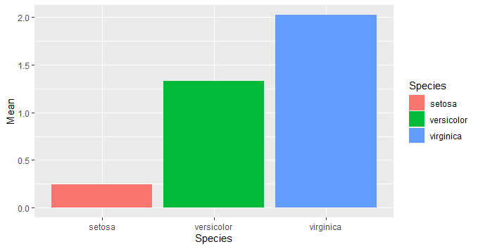
挿話:キャンバスへのデータの与え方
今まで、キャンバスを作った際にデータフレームを与え、その後、描画をする際にxとyを指摘してきましたが、キャンバスを作るときにxとyも指定することができます。そうすると、描画をするときに、いちいちx、yを指定しなくても良くなります。
g <- ggplot(d)+
  geom_bar(aes(x=Species,y=Mean,fill=Species),stat="identity")+
  geom_errorbar(aes(x=Species,y=Mean,ymin=Mean-SD, ymax=Mean+SD,width=0.3))
plot(g)

g <- ggplot(d,aes(x=Species,y=Mean))+
  geom_bar(aes(fill=Species),stat="identity")+
  geom_errorbar(aes(ymin=Mean-SD, ymax=Mean+SD,width=0.3))
plot(g)
軸の書式や凡例をいじる
軸や凡例の書き方はいろいろと設定方法があるみたいだけど、とりあえず自分のなかで一番整理がついたものを紹介します。
軸のタイトルを消したり書き換えたり
デフォルトでは軸タイトルはaesで設定した各軸の変数名がそのまま入ってしまいます。
そこでこれをxlabとylabを使って自分の好きなように変えます。
引数にNULLを設定するとタイトルが消えます。
g <- ggplot(d,aes(x=Species,y=Mean))+
  geom_bar(aes(fill=Species),stat="identity")+
  geom_errorbar(aes(ymin=Mean-SD, ymax=Mean+SD,width=0.3))+
  xlab(NULL)+ylab("花弁の幅")
plot(g)

凡例を消す
theme(legend.position = "none")を使います。
g <- ggplot(d,aes(x=Species,y=Mean))+
  geom_bar(aes(fill=Species),stat="identity")+
  geom_errorbar(aes(ymin=Mean-SD, ymax=Mean+SD,width=0.3))+
  xlab(NULL)+ylab("花弁の幅")+
  theme(legend.position = "none")
plot(g)

凡例タイトルを書き換える
labs()を使います。
引数には、aesで色を指定するときに使った引数に、書き換えたいタイトルを与えます。
これまでの例だと、fillを使って色を与えているので、fill=****というのを引数としてlabelに与えます。
g <- ggplot(d,aes(x=Species,y=Mean))+
  geom_bar(aes(fill=Species),stat="identity")+
  geom_errorbar(aes(ymin=Mean-SD, ymax=Mean+SD,width=0.3))+
  xlab("種類")+ylab("花弁の幅")+labs(fill="種類")

plot(g)

ちなみにlabsは引数として以下のものを取ります。この通りに、xlabやylabもlabsでまとめて設定することもできます。
| 項目 | 内容 |
|---|---|
| title | タイトル |
| subtitle | サブタイトル |
| x | x軸ラベル |
| y | y軸ラベル |
| caption | キャプション |
| fill またはcolor | 凡例ラベルのタイトル |
軸タイトルや軸ラベル、凡例の文字サイズを換える
凡例を消した時と同じようにthemeを使う。引数には以下のようなものを入れる。
axis.text.x=element_text(size=15)
axis.text.y=element_text(size=15)
axis.title.x=element_text(size=15)
axis.title.y=element_text(size=15)
legend.text=element_text(size=9)
g <- ggplot(d,aes(x=Species,y=Mean))+
  geom_bar(aes(fill=Species),stat="identity")+
  geom_errorbar(aes(ymin=Mean-SD, ymax=Mean+SD,width=0.3))+
  xlab("種類")+ylab("花弁の幅")+
  theme(legend.position = 'none')+
  theme(
    axis.title.x=element_text(size=15),
    axis.title.y=element_text(size=15),
    axis.text.x=element_text(size=10),
    axis.text.y=element_text(size=10)
    legend.text=element_text(size=5),
    legend.title = element_text(size=8)  )

plot(g)

参考:themeの設定項目
themeは細かくいろいろ設定できます。設定できるものは以下の通りです。
| 名前 | 説明 | 要素の型 |
|---|---|---|
| text | すべてのテキスト要素 | element_text() |
| axis.title | 両軸ラベルの体裁 | element_text() |
| axis.title.x | x軸ラベルの体裁 | element_text() |
| axis.title.y | y軸ラベルの体裁 | element_text() |
| axis.text | 両軸目盛ラベルの体裁 | element_text() |
| axis.text.x | x軸目盛ラベルの体裁 | element_text() |
| axis.text.y | y軸目盛ラベルの体裁 | element_text() |
| legend.text | 凡例項目の体裁 | element_text() |
| legend.title | 凡例タイトルの体裁 | element_text() |
| plot.title | タイトルの体裁 | element_text() |
| strip.text | 両方向ファセットラベルテキストの体裁 | element_text() |
| strip.text.x | 水平方向ファセットラベルテキストの体裁 | element_text() |
| strip.text.y | 垂直方向ファセットラベルテキストの体裁 | element_text() |
| legend.position | 凡例の位置 | left, right, bottom, top, c(x,y) :x,yは0~1 |
| legend.background | 凡例の背景 | element_rect(fill="xxx", color="yyy") fillは塗りつぶし、colorは枠線 |
| plot.background | プロット全体の背景 | element_rect(fill="xxx", color="yyy") |
| panel.background | プロット領域の背景 | element_rect() |
| panel.border | プロット領域の枠線 | element_rect(linetype="xxx") |
| rect | 全ての長方形要素 | element_rect() |
| panel.grid.major | 主目盛線 | element_line() |
| panel.grid.major.x | 主目盛線の垂直方向 | element_line() |
| panel.grid.major.y | 主目盛線の水平方向 | element_line() |
| panel.grid.minor | 補助目盛線 | element_line() |
| panel.grid.minor.x | 補助目盛線の垂直方向 | element_line() |
| panel.grid.minor.y | 補助目盛線の水平方向 | element_line() |
| axis.line | 軸に沿った線 | element_line() |
| line | すべての線要素 | element_line() |
引用(順序は改変しました):https://knknkn.hatenablog.com/entry/2019/02/23/181311
参考:element_text()の設定項目
| 設定項目 | element_text()の引数 |
|---|---|
| 角度 | angle |
| 水平位置 | hjust(0:左揃え~1:右揃え) |
| 垂直位置 | vjust(0:下揃え~1:上揃え) |
| サイズ | size |
| 色 | colour |
| スタイル | face(bold or italic) |
| フォントファミリー | family |
参考:http://mukkujohn.hatenablog.com/entry/2016/10/11/220722
参考:element_xxxのその他の項目
element_rect(fill, color, size, linetype, inherit.blank) — 長方形
| 項目 | 内容 |
|---|---|
| fill | 塗りつぶしの色 |
| color | 枠の色 |
element_line(color, size, linetype, lineend, arrow, inherit.blank) — 線
element_blank() — 空
消したい要素にはこれを指定する
参考:https://heavywatal.github.io/rstats/ggplot2.html
目盛ラベルを変える
目盛ラベルを変えるには、scale_x_****やscale_y_***を使います。
以下は、x軸の目盛りをsetosa, versicolor, virgnicaから、a, b, cに変え、y軸を普通の目盛から対数目盛に変えた例です。
g <- ggplot(iris)+
  geom_bar(aes(x=Species,fill=Species),stat="count") +
  scale_x_discrete(labels=c("a","b","c"))+
  scale_y_log10(limits=c(1,1000))
plot(g)

***の部分には、いずれも以下のものが入ります。
| *** | 内容 |
|---|---|
| discrete | 離散目盛 |
| continuous | 連続目盛 |
| log10 | 対数目盛 |
| reverse | 目盛の逆転 |
| sqrt | 平方根目盛 |
また、代表的な引数としては以下のものが入ります。
| 引数 | 内容 |
|---|---|
| labels | 離散目盛のラベルを変える(以下のbreaksを併用すると、連続変数でも可能) |
| breaks | 連続変数の目盛のうち指定したものだけを表示させる |
| limits | 連続変数の表示範囲を指定したものにする.xlim,ylimと同じ効果。 |
| name | 変数の軸ラベルを変える。xlab,ylabと同じ効果。 |
結局、軸タイトルを変える方法って、色々あるってことですね。
xlabでもよいし、labs(x=)dでもよいし、scale_x_***(name=)でも変えれる。
凡例の各項目のラベルを書き換える。
グループ分けにfillを使っている場合は、sacle_fill_dicrete()を、Colorを使っている場合はscale_color_discrete()を使います。
g <- ggplot(iris)+
  geom_bar(aes(x=Species,fill=Species),stat="count")+
  scale_fill_discrete(label=c("花1","花2","花3"))
plot(g)
