今回行ったこと
- matplotlibのヒストグラム生成時に、パターン(模様) を使用して描画する方法を実装。
- 白黒の印刷 に対応できるよう、模様を使った視覚化を実現。
私の環境
- Python: 3.10.9
- matplotlib: 3.7.0
- numpy: 1.23.5
matplotlib で使用可能なパターン一覧
matplotlib を使ったグラフ描画では、以下のパターンを hatch オプションで指定することができます。これにより、色だけでなく模様を使った視覚化が可能になります。
| パターン文字 | 描画される模様 |
|---|---|
/ |
右斜線 |
\\ |
左斜線 |
| |
縦線 |
- |
横線 |
+ |
十字 |
x |
交差 |
o |
小さな円 |
O |
大きな円 |
. |
点 |
* |
星 |
サンプルコード
以下は、模様を使ったヒストグラムを描画する例です。
import matplotlib.pyplot as plt
import numpy as np

# ダミーデータ
data1 = np.random.normal(10, 15, 1000)
data2 = np.random.normal(50, 15, 1000)
data3 = np.random.normal(100, 15, 1000)

# ヒストグラムを模様付きで描画
fig, ax = plt.subplots()

# 各データに異なる模様を設定
ax.hist(data1, bins=20, color='white', edgecolor='blue', alpha=0.7, hatch='/', label='Pattern: /')
ax.hist(data2, bins=20, color='white', edgecolor='green', alpha=0.7, hatch='x', label='Pattern: x')
ax.hist(data3, bins=20, color='white', edgecolor='red', alpha=0.7, hatch='o', label='Pattern: o')

# グラフの設定
ax.legend()
ax.set_xlabel('Value')
ax.set_ylabel('Frequency')
ax.set_title('Histogram with Different Patterns')

# グラフの表示
plt.show()
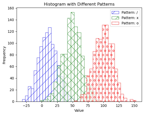
出力結果
上記のコードを実行すると、以下のようなヒストグラムが描画されます。
-
青の右斜線 (
/): 最初のデータセットを表します。 -
緑の交差模様 (
x): 2つ目のデータセットを表します。 -
赤の小さな円模様 (
o): 3つ目のデータセットを表します。
模様を使うことで、データセット同士の違いを色覚に依存せずに判別しやすくなります。
実用例
白黒のレポートや論文用の資料を作成する際、色だけでは区別がつかない場合があります。この方法を使えば、模様でデータセットを区別できるため、印刷物にも対応可能です。