Matplotlib入門
Matplotlibはデータの可視化とカスタマイズに最も柔軟性のあるインターフェースpyplotを提供します。
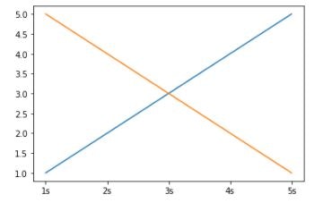
pyplotの簡単な使用方法は以下:
import pandas as pd

df01 = pd.DataFrame(
    {'time': ['1s', '2s', '3s', '4s', '5s'],
     'value': [1, 2, 3, 4, 5]})
df02 = pd.DataFrame(
    {'time': ['1s', '2s', '3s', '4s', '5s'],
     'value': [5, 4, 3, 2, 1]}
)
# matplotlib.pyplotをインポート
import matplotlib.pyplot as plt

# FigureとAxesオブジェクトを作成
fig, ax = plt.subplots()

# df01のvalueをtimeに対してプロット
ax.plot(df01['time'], df01['value'])

# df02のvalueをtimeに対してプロット
ax.plot(df02['time'], df02['value'])

# プロット表示
plt.show()
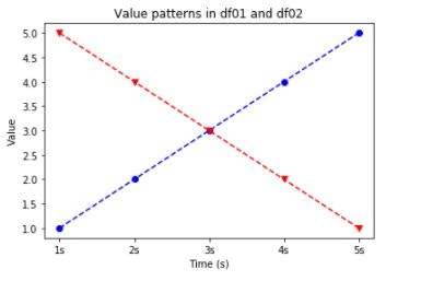
プロットのカスタマイズ
マーカー、線のスタイル、線の色を設定できます。
また、タイトル、X軸の名称、Y軸の名称も設定できます。
設定可能なフォーマットは matplotlib.pyplot.plot にあります。
# マーカー、線のスタイル、線の色を設定
ax.plot(df01["time"], df01["value"], color='b', marker='o', linestyle='--')
ax.plot(df02["time"], df02["value"], color='r', marker='v', linestyle='--')

# X軸の名称を設定
ax.set_xlabel('Time (s)')

# Y軸の名称を設定
ax.set_ylabel('Value')

# タイトルを設定
ax.set_title('Value patterns in df01 and df02')

plt.show()
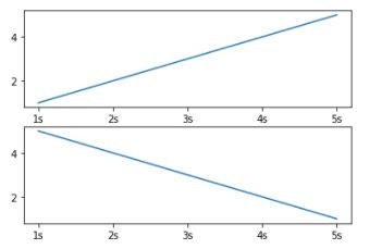
サブプロット
プロットにデータを追加しすぎると、場合によってはプロットが煩雑になりすぎて、パターンが見えなくなってしまうことがあります。
その場合はサブプロットを使用します。 matplotlib.pyplot.subplot
# 2行1列のサブプロットを作成
fig, ax = plt.subplots(2, 1)

ax[0].plot(df01['time'], df01['value'])

ax[1].plot(df02['time'], df02['value'])

plt.show()