ヒストグラムとは
ヒストグラムは変数の全体的分布を示すものです。
ヒストグラムを見て、どんな数値が多いか、少ないか、偏りがあるかないかを読み解きます。
ヒストグラムのX軸は階級(データを区切った空間)、Y軸は度数(データの数量)を表します。
簡単なヒストグラム
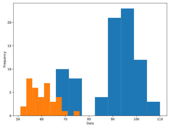
import matplotlib.pyplot as plt

fig, ax = plt.subplots()
ax.hist(data01['colName'])
ax.hist(data02['colName'])

ax.set_xlabel('Data')
ax.set_ylabel('Frequency')

plt.show()
常用オプション
- label : 凡例のラベル(凡例を表示するためplt.legend()との併用が必要)
- bins : ビンの数またはビンの境界 例:bin=5 or bin=[100, 150, 200, 250, 300]
- histtype : ヒストグラムの種類 stepは透明
import matplotlib.pyplot as plt

fig, ax = plt.subplots()

ax.hist(data01['colName'], label='Data01', bins=5, histtype='step')
ax.hist(data02['colName'], label='Data02', bins=5, histtype='step')

ax.set_xlabel("Data")
ax.set_ylabel("Frequency")

ax.legend()
plt.show()
