この記事は、Xamarin Advent Calendar 2020の20日目の記事です。
はじめに
Xamarin Community Toolkit カタログの続きです。この記事では、エフェクト、XAMLマークアップ拡張、コントロールについて紹介します。
以下が他の記事です。
ソースコード
XamarinCommunityToolkitCatalog
エフェクト
IconTintColorEffect
アイコン画像の色を変更するエフェクトです。ただし、現状ではiOSだとうまく色が変わらない場合があります。どうも画像が設定される前に色を変更する処理が走っているようで、何も処理をせず終了しているようです。このエフェクトを使う場合は、タイマーやイベントなど何らかの方法で画像設定後に処理が行われるように工夫する必要がありそうです。
<ContentPage xmlns="http://xamarin.com/schemas/2014/forms"
             xmlns:x="http://schemas.microsoft.com/winfx/2009/xaml"
             xmlns:xct="http://xamarin.com/schemas/2020/toolkit"
             x:Class="XamarinCommunityToolkitCatalog.Views.IconTintColorEffectPage"
             Title="IconTintColorEffect">
    <Image HorizontalOptions="Center"
           Source="{xct:ImageResource XamarinCommunityToolkitCatalog.Images.icon.png}"
           xct:IconTintColorEffect.TintColor="Red" />
</ContentPage>
RemoveBorderEffect
Entryの枠を消すエフェクトです。
<ContentPage xmlns="http://xamarin.com/schemas/2014/forms"
             xmlns:x="http://schemas.microsoft.com/winfx/2009/xaml"
             xmlns:xct="http://xamarin.com/schemas/2020/toolkit"
             x:Class="XamarinCommunityToolkitCatalog.Views.RemoveBorderEffectPage"
             Title="RemoveBorderEffect">
    <Entry VerticalOptions="Center" Margin="32, 0"
           Placeholder="placeholder">
        <Entry.Effects>
            <xct:RemoveBorderEffect />
        </Entry.Effects>
    </Entry>
</ContentPage>
SafeAreaEffect
コントロールにセーフエリアの分マージンを追加するエフェクトです。iOSのみ有効です。
<ContentPage xmlns="http://xamarin.com/schemas/2014/forms"
             xmlns:x="http://schemas.microsoft.com/winfx/2009/xaml"
             xmlns:xct="http://xamarin.com/schemas/2020/toolkit"
             x:Class="XamarinCommunityToolkitCatalog.Views.SafeAreaEffectPage"
             Title="SafeAreaEffect">
    <Label Text="value"
           xct:SafeAreaEffect.SafeArea="True"/>
</ContentPage>
SelectAllTextEffect
EntryやEditorでタップしたら全テキストが選択されるようになるエフェクトです。
<ContentPage xmlns="http://xamarin.com/schemas/2014/forms"
             xmlns:x="http://schemas.microsoft.com/winfx/2009/xaml"
             xmlns:xct="http://xamarin.com/schemas/2020/toolkit"
             x:Class="XamarinCommunityToolkitCatalog.Views.SelectAllTextEffectPage"
             Title="SelectAllTextEffect">
    <Entry VerticalOptions="Center" Margin="32, 0"
           Text="hoge fuga">
        <Entry.Effects>
            <xct:SelectAllTextEffect />
        </Entry.Effects>
    </Entry>
</ContentPage>
TouchEffect
タップ時にスケール変化や回転などアニメーションを追加するエフェクトです。ロングタップにも対応しています。
<ContentPage xmlns="http://xamarin.com/schemas/2014/forms"
             xmlns:x="http://schemas.microsoft.com/winfx/2009/xaml"
             xmlns:xct="http://xamarin.com/schemas/2020/toolkit"
             x:Class="XamarinCommunityToolkitCatalog.Views.TouchEffectPage"
             Title="TouchEffect">
    <Label VerticalOptions="Center"
           HorizontalTextAlignment="Center"
           Text="tap"
           xct:TouchEffect.PressedScale="0.7" />
</ContentPage>
VisualFeedbackEffect
タップ時のフィードバックエフェクトの色を変更するエフェクトです。
<ContentPage xmlns="http://xamarin.com/schemas/2014/forms"
             xmlns:x="http://schemas.microsoft.com/winfx/2009/xaml"
             xmlns:xct="http://xamarin.com/schemas/2020/toolkit"
             x:Class="XamarinCommunityToolkitCatalog.Views.VisualFeedbackEffectPage"
             Title="VisualFeedbackEffect">
    <Button VerticalOptions="Center"
           Text="tap"
           xct:VisualFeedbackEffect.FeedbackColor="Red">
        <Button.Effects>
            <xct:VisualFeedbackEffect />
        </Button.Effects>
    </Button>
</ContentPage>
XAMLマークアップ拡張
GravatarImageExtension
Gravatarのアバター画像を取得するXAMLマークアップ拡張です。
<ContentPage xmlns="http://xamarin.com/schemas/2014/forms"
             xmlns:x="http://schemas.microsoft.com/winfx/2009/xaml"
              xmlns:xct="http://xamarin.com/schemas/2020/toolkit"
             x:Class="XamarinCommunityToolkitCatalog.Views.GravatarImageExtensionPage"
             Title="GravatarImageExtension">
    <Image VerticalOptions="Center"
           Source="{xct:GravatarImage hogehoge@foo.com, Size=128}" />
</ContentPage>
ImageResourceExtension
リソースID使用して埋め込み画像の読み込みを行うためのXAMLマークアップ拡張です。
<ContentPage xmlns="http://xamarin.com/schemas/2014/forms"
             xmlns:x="http://schemas.microsoft.com/winfx/2009/xaml"
             xmlns:xct="http://xamarin.com/schemas/2020/toolkit"
             x:Class="XamarinCommunityToolkitCatalog.Views.ImageResourceExtensionPage"
             Title="ImageResourceExtension">
    <Image HorizontalOptions="Center"
           Source="{xct:ImageResource XamarinCommunityToolkitCatalog.Images.icon.png}"/>
</ContentPage>
TranslateExtension
Resxファイルのローカライズテキストを取得するためのXAMLマークアップ拡張です。StringFormatでフォーマットの指定もできます。なお、使用するためには、ResourceManagerの設定が必要です。
LocalizationResourceManager.Current.Init(AppResources.ResourceManager);
<ContentPage xmlns="http://xamarin.com/schemas/2014/forms"
             xmlns:x="http://schemas.microsoft.com/winfx/2009/xaml"
             xmlns:xct="http://xamarin.com/schemas/2020/toolkit"
             x:Class="XamarinCommunityToolkitCatalog.Views.TranslateExtensionPage"
             Title="TranslateExtension">
    <Label VerticalOptions="Center" HorizontalOptions="Center"
           Text="{xct:Translate Value}" />
</ContentPage>
コントロール
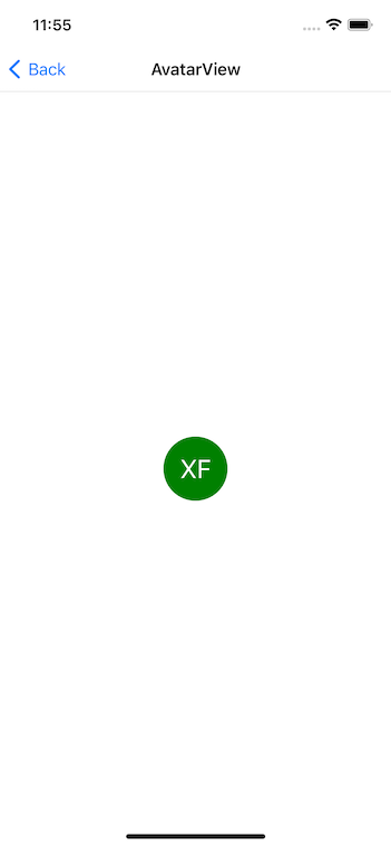
AvatarView
塗りつぶしの丸の中央に名前といったデフォルトのアバター画像の表示を行うコントロールです。Sourceで画像の設定も行うこともできます。
<ContentPage xmlns="http://xamarin.com/schemas/2014/forms"
             xmlns:x="http://schemas.microsoft.com/winfx/2009/xaml"
             xmlns:xct="http://xamarin.com/schemas/2020/toolkit"
             x:Class="XamarinCommunityToolkitCatalog.Views.AvatarViewPage"
             Title="AvatarView">
    <xct:AvatarView VerticalOptions="Center"
                    HorizontalOptions="Center"
                    Text="XF"
                    Size="64"
                    Color="Green"
                    TextColor="White" />
</ContentPage>
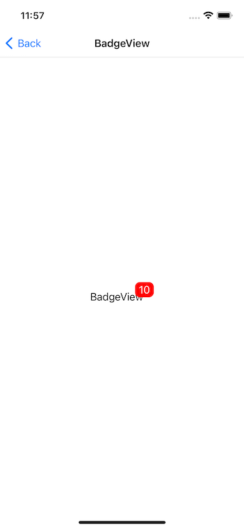
BadgeView
子のコントロールにバッジをつけることができるコントロールです。色、サイズ、位置、アニメーションなどの設定を行うことができます。
<ContentPage xmlns="http://xamarin.com/schemas/2014/forms"
             xmlns:x="http://schemas.microsoft.com/winfx/2009/xaml"
             xmlns:xct="http://xamarin.com/schemas/2020/toolkit"
             x:Class="XamarinCommunityToolkitCatalog.Views.BadgeViewPage"
             Title="BadgeView">
    <xct:BadgeView HorizontalOptions="Center"
                   VerticalOptions="Center"
                   BackgroundColor="Red"
                   TextColor="White"
                   Text="10">
        <Label Text="BadgeView" />
    </xct:BadgeView>
</ContentPage>
CameraView
カメラのプレビューを表示するコントロールです。Shutter()メソッドや、ShutterCommandで写真やビデオの撮影ができ、MediaCapturedイベントで画像データを受けることができます。カメラとマイクを使うので、iOSではカメラとマイクの使用のプライバシー、Androidでは、CAMERA、RECORD_AUDIOのパーミッションの設定が必要です。
<ContentPage xmlns="http://xamarin.com/schemas/2014/forms"
             xmlns:x="http://schemas.microsoft.com/winfx/2009/xaml"
             xmlns:xct="http://xamarin.com/schemas/2020/toolkit"
             xmlns:ios="clr-namespace:Xamarin.Forms.PlatformConfiguration.iOSSpecific;assembly=Xamarin.Forms.Core"
             x:Class="XamarinCommunityToolkitCatalog.Views.CameraViewPage"
             Title="CameraView"
             ios:Page.UseSafeArea="True">
    <StackLayout>
        <xct:CameraView x:Name="cameraView"
                        VerticalOptions="FillAndExpand"
                        HorizontalOptions="FillAndExpand"
                        MediaCaptured="CameraView_MediaCaptured" />
        <Button Text="撮影" Command="{Binding Path=ShutterCommand, Source={x:Reference cameraView}}" />
        <Image x:Name="image" HeightRequest="100" />
    </StackLayout>
</ContentPage>
DockLayout
上下左右に簡単にコントロールを配置できるようにするコントロールです。LastChildFillがTrueだと、最後に追加したコントロールのサイズが拡張されます。
<ContentPage xmlns="http://xamarin.com/schemas/2014/forms"
             xmlns:x="http://schemas.microsoft.com/winfx/2009/xaml"
             xmlns:xct="http://xamarin.com/schemas/2020/toolkit"
             x:Class="XamarinCommunityToolkitCatalog.Views.DockLayoutPage"
             Title="DockLayout">
    <xct:DockLayout LastChildFill="False">
        <Label xct:DockLayout.Dock="Top" Text="Top" Background="red" />
        <Label xct:DockLayout.Dock="Left" Text="Left" Background="blue" />
        <Label xct:DockLayout.Dock="Bottom" Text="Bottom" Background="green" />
        <Label xct:DockLayout.Dock="Right" Text="Right" Background="yellow" />
    </xct:DockLayout>
</ContentPage>
Expander
タップでコントロールの表示、非表示を切り替えることができるコントロールです。常に表示されるヘッダーのコントロールは、Expander.Headerで設定します。アニメーションやタップ時のコマンドの設定などもできます。
<ContentPage xmlns="http://xamarin.com/schemas/2014/forms"
             xmlns:x="http://schemas.microsoft.com/winfx/2009/xaml"
             xmlns:xct="http://xamarin.com/schemas/2020/toolkit"
             x:Class="XamarinCommunityToolkitCatalog.Views.ExpanderPage"
             Title="Expander">
    <xct:Expander >
        <xct:Expander.Header>
            <Label Text="Header" />
        </xct:Expander.Header>
        <Label Text="Content" />
    </xct:Expander>
</ContentPage>
MediaElement
動画の再生を行うコントロールです。Sorceで動画のソースを設定します。再生位置や音量などの設定も可能です。
<ContentPage xmlns="http://xamarin.com/schemas/2014/forms"
             xmlns:x="http://schemas.microsoft.com/winfx/2009/xaml"
             xmlns:xct="http://xamarin.com/schemas/2020/toolkit"
             xmlns:ios="clr-namespace:Xamarin.Forms.PlatformConfiguration.iOSSpecific;assembly=Xamarin.Forms.Core"
             x:Class="XamarinCommunityToolkitCatalog.Views.MediaElementPage"
             Title="MediaElement"
             ios:Page.UseSafeArea="True">
    <xct:MediaElement Source="https://sec.ch9.ms/ch9/5d93/a1eab4bf-3288-4faf-81c4-294402a85d93/XamarinShow_mid.mp4" />
</ContentPage>
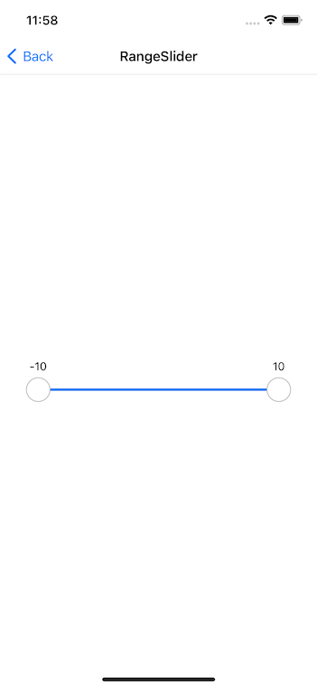
RangeSlider
2つのつまみをもつ数の範囲を設定できるスライダーです。
<ContentPage xmlns="http://xamarin.com/schemas/2014/forms"
             xmlns:x="http://schemas.microsoft.com/winfx/2009/xaml"
             xmlns:xct="http://xamarin.com/schemas/2020/toolkit"
             x:Class="XamarinCommunityToolkitCatalog.Views.RangeSliderPage"
             Title="RangeSlider">
    <xct:RangeSlider VerticalOptions="Center" Margin="32,0"
                     MinimumValue="-10"
                     MaximumValue="10"
                     LowerValue="-10"
                     UpperValue="10" />
</ContentPage>
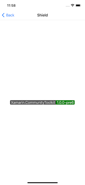
Shield
Shields IOのようなステータスのバッジを表示するコントロールです。TappedイベントやCommandでタップ時の処理を設定することもできます。
<ContentPage xmlns="http://xamarin.com/schemas/2014/forms"
             xmlns:x="http://schemas.microsoft.com/winfx/2009/xaml"
             xmlns:xct="http://xamarin.com/schemas/2020/toolkit"
             x:Class="XamarinCommunityToolkitCatalog.Views.ShieldPage"
             Title="Shield">
    <xct:Shield VerticalOptions="Center"
                Subject="Xamarin.CommunityToolkit"
                Status="1.0.0-pre6"
                Color="Green"
                TextColor="White" />
</ContentPage>
SideMenuView
左右にスライドして、サイドメニューを表示するコントロールです。メインの表示の下にメニューが存在しているので、メインの背景色の設定は必須です。
<ContentPage xmlns="http://xamarin.com/schemas/2014/forms"
             xmlns:x="http://schemas.microsoft.com/winfx/2009/xaml"
             xmlns:xct="http://xamarin.com/schemas/2020/toolkit"
             x:Class="XamarinCommunityToolkitCatalog.Views.SideMenuViewPage"
             Title="SideMenuView">
    <xct:SideMenuView>
        <Label HorizontalTextAlignment="Center"
               VerticalTextAlignment="Center"
               Background="white"
               Text="Main" />
        <Label xct:SideMenuView.Position="LeftMenu"
               xct:SideMenuView.MenuWidthPercentage=".5"
               HorizontalTextAlignment="Center"
               VerticalTextAlignment="Center"
               Background="red"
               Text="LeftMenu" />
        <Label xct:SideMenuView.Position="RightMenu"
               xct:SideMenuView.MenuWidthPercentage=".3"
               HorizontalTextAlignment="Center"
               VerticalTextAlignment="Center"
               Background="blue"
               Text="RightMenu" />
    </xct:SideMenuView>
</ContentPage>
SnackBar
Pageの拡張メソッドDisplaySnackBarAsyncでスナックバーを表示できます。
this.DisplaySnackBarAsync("SnackBar", "Action", () => Task.CompletedTask);
Toast
Pageの拡張メソッドDisplayToastAsyncでトーストを表示できます。
this.DisplayToastAsync("Toast");
StateLayout
状態によって表示を切り替えるコントロールです。StateLayout.StateViewsに各状態でのStateViewを設定します。用意されている状態だけではなく、独自の状態も追加することができます。
<ContentPage xmlns="http://xamarin.com/schemas/2014/forms"
             xmlns:x="http://schemas.microsoft.com/winfx/2009/xaml"
             xmlns:xct="http://xamarin.com/schemas/2020/toolkit"
             x:Class="XamarinCommunityToolkitCatalog.Views.StateLayoutPage"
             Title="StateLayout">
    <StackLayout VerticalOptions="Center"
                 Margin="32,0"
                 xct:StateLayout.CurrentState="{Binding CurrentState}"
                 xct:StateLayout.CurrentCustomStateKey="{Binding CustomState}">
        <xct:StateLayout.StateViews>
            <xct:StateView StateKey="Loading">
                <Label Text="Loading" HorizontalTextAlignment="Center" />
            </xct:StateView>
            <xct:StateView StateKey="Saving">
                <Label Text="Saving" HorizontalTextAlignment="Center" />
            </xct:StateView>
            <xct:StateView StateKey="Success">
                <Label Text="Success" HorizontalTextAlignment="Center" />
            </xct:StateView>
            <xct:StateView StateKey="Error">
                <Label Text="Error" HorizontalTextAlignment="Center" />
            </xct:StateView>
            <xct:StateView StateKey="Empty">
                <Label Text="Empty" HorizontalTextAlignment="Center" />
            </xct:StateView>
            <xct:StateView StateKey="Custom"
                           CustomStateKey="CustomState">
                <Label Text="Custom" HorizontalTextAlignment="Center" />
            </xct:StateView>
        </xct:StateLayout.StateViews>
        <Button Text="CycleStates" Command="{Binding CycleStatesCommand}" />
    </StackLayout>
</ContentPage>
UniformGrid
同じ高さと幅でグリッドに配置されるレイアウトです。WidthRequestで指定された幅以上で最も小さくなるような幅に決められます。
<ContentPage xmlns="http://xamarin.com/schemas/2014/forms"
             xmlns:x="http://schemas.microsoft.com/winfx/2009/xaml"
             xmlns:xct="http://xamarin.com/schemas/2020/toolkit"
             x:Class="XamarinCommunityToolkitCatalog.Views.UniformGridPage"
             Title="UniformGrid">
    <ContentPage.Resources>
        <Style TargetType="BoxView">
            <Setter Property="WidthRequest" Value="100" />
            <Setter Property="HeightRequest" Value="100" />
        </Style>
    </ContentPage.Resources>

    <xct:UniformGrid>
        <BoxView Color="Pink" />
        <BoxView Color="Yellow" />
        <BoxView Color="LightBlue" />
        <BoxView Color="Blue" />
        <BoxView Color="Orange" />
        <BoxView Color="Purple" />
        <BoxView Color="Red" />
        <BoxView Color="LightGreen" />
        <BoxView Color="LightGray" />
    </xct:UniformGrid>
</ContentPage>
TabView
タブの位置やアイコン、バッジなどいろいろとカスタマイズできるタブのコントロールです。
<ContentPage xmlns="http://xamarin.com/schemas/2014/forms"
             xmlns:x="http://schemas.microsoft.com/winfx/2009/xaml"
             xmlns:xct="http://xamarin.com/schemas/2020/toolkit"
             x:Class="XamarinCommunityToolkitCatalog.Views.TabViewPage"
             Title="TabView">
    <xct:TabView TabIndicatorColor="Red">
        <xct:TabViewItem Text="Tab1">
            <Label VerticalOptions="Center"
                   HorizontalOptions="Center"
                   Text="Tab1"/>
        </xct:TabViewItem>
        <xct:TabViewItem Text="Tab2">
            <Label VerticalOptions="Center"
                   HorizontalOptions="Center"
                   Text="Tab2"/>
        </xct:TabViewItem >
    </xct:TabView>
</ContentPage>
おわりに
Xamarin Community Toolkitの機能を紹介してきました。
機能が多くて把握が大変ですが、汎用的に使える機能が多いので、Xamarin.Formsを使うなら入れといて損はないかと思います。