はじめに
chart.jsでレーダーチャートを描いていてデータセットが動的だった時に、いい感じの色を自動で生成する方法。
使うパッケージ
chart.js
シンプルなグラフを描いてくれるクールなライブラリ。
google-palette
カラーパレットを自動で生成してくれるイカしたライブラリ。
公式サンプル
今回はレーダーチャートなのでmpn65が使いたい。
tolは動いたのにmpn65はすんなり動かなかった。
追記
現在(2018/11/30)確認したところ、
バージョン1.1.0ではmpn65が使えました!
なので以下のコマンドでインストールして問題ありません。
npm install google-palette
結論
mpn65はgithubからインストールしなきゃ動かない。
npmjsは古い。
yarn add chart.js https://github.com/google/palette.js.git
import * as Chart from 'chart.js/dist/Chart';
import * as palette from 'google-palette';
// サンプルデータの準備
const sampleData = {
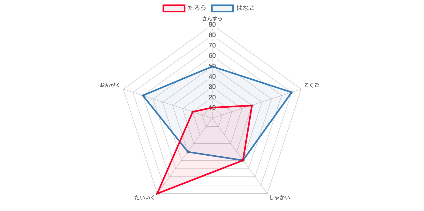
labels: ['さんすう', 'こくご', 'しゃかい', 'たいいく', 'おんがく'],
scores: [
{
name: 'たろう',
points: [10, 40, 50, 90, 20]
},
{
name: 'はなこ',
points: [50, 80, 50, 40, 70]
}
]
};
// 色を生成
const colors = palette('mpn65', sampleData.scores.length).map((hex) => {
return '#' + hex;
});
// サンプルデータと生成した色からデータセットを準備
const datasets = sampleData.scores.map((score, i, a) => {
return {
label: score.name,
data: score.points,
backgroundColor: colors[i] + '11', // 塗りは少し透明に
borderColor: colors[i],
pointRadius: 3,
pointHitRadius: 6
};
});
const type = 'radar';
const data = {
labels: sampleData.labels,
datasets: datasets
};
const options = {
scale: {
ticks: {
stepSize: 10,
beginAtZero: true
}
}
};
const ctx = document.getElementById('canvasId').getContext('2d');
const chart = new Chart(ctx, {
type: type,
data: data,
options: options
});