まずはじめに
Progateやドットインストールなどをやって、
次に何をすれば良いかわからない人向けに、簡単で分かりやすく、
実際に通用するコーディングを練習していこうという内容です。
全3回の内、今回はその3回目の記事です。1,2回目の記事↓
コーディング練習 ブログトップページ編 1 / 3
コーディング練習 ブログトップページ編 2 / 3
完成品
See the Pen Design_Blog-top by engineerhikaru (@engineerhikaru) on CodePen.
今回やっていくこと
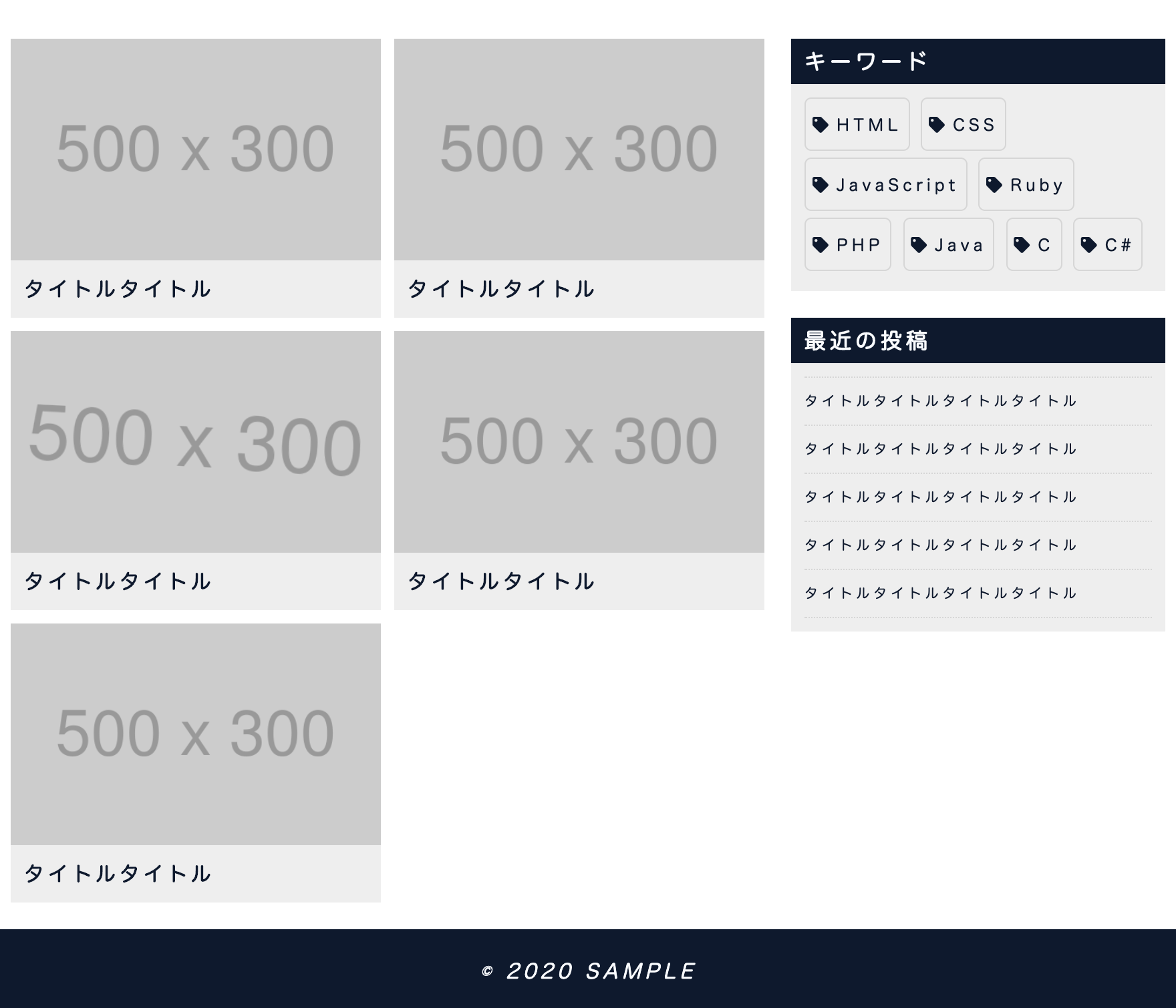
今回は、2カラムレイアウトの作成と、記事一覧と右サイドバーとフッターのコーディングまでやっていきます。
この部分を作っていきます↓
コーディング
2カラムレイアウト外枠
2カラムレイアウトにするための外枠となるHTMLを記述します。
折り返しありのflexboxのcontainerクラスと
要素の最大幅を決めたmax-widthクラスを使います。
<div class="container max-width">
  <!-- メインカラム (記事一覧) -->
  <!-- サイドカラム (右サイドバー) -->
</div>
containerクラスとmax-widthクラスのスタイルは、
最初に共通で使うCSSとして記述しているはずですので、
ここでは省略します。
コーディング練習 ブログトップページ編 1 / 3
メインカラム
メインの記事一覧を表示する部分を記述します。
<div class="layout-main">
  <div class="grid-container grid-bisection">
    <div class="blogcard"><a href="#">
      <figure class="img-effect"><img src="https://placehold.jp/500x300.png"></figure>
      <h3>タイトルタイトル</h3>
    </a></div>
    <div class="blogcard"><a href="#">
      <figure class="img-effect"><img src="https://placehold.jp/500x300.png"></figure>
      <h3>タイトルタイトル</h3>
    </a></div>
    <div class="blogcard"><a href="#">
      <figure class="img-effect"><img src="https://placehold.jp/500x300.png"></figure>
      <h3>タイトルタイトル</h3>
    </a></div>
    <div class="blogcard"><a href="#">
      <figure class="img-effect"><img src="https://placehold.jp/500x300.png"></figure>
      <h3>タイトルタイトル</h3>
    </a></div>
    <div class="blogcard"><a href="#">
      <figure class="img-effect"><img src="https://placehold.jp/500x300.png"></figure>
      <h3>タイトルタイトル</h3>
    </a></div>
  </div>
</div>
.layout-main{
  margin: 30px 0 20px;
  padding: 0 10px;
  flex: 1 1;
}
.grid-container{
  display: grid;
  grid-gap: 10px;
}
.grid-bisection{
  grid-template-columns: repeat(2, 1fr);
}
.blogcard{
  background: #eee;
}
.blogcard h3{
  padding: 10px;
  font-size: 15px;
  color: #0A192F;
}
@media screen and (max-width: 768px){
  .layout-main{
    margin: 10px 0 20px;
  }
}
@media screen and (max-width: 480px){
  .grid-bisection{
    grid-template-columns: repeat(1, 1fr);
  }
}
どういった記述がされているかというと、
- layout-mainクラスは、余白を少し空け、要素の比率を1にします。(flex: 1;だとIEのバグがあるので、flex: 1 1;にする)
- 参考 ( flex )
- grid-containerクラスは、gridlayoutを使います。
- 参考 ( grid-gap )
- grid-bisectionクラスは、等サイズの2カラムにしていきます。
- 参考 ( grid-template-columns )
- blogcardは、背景色を変えたり、文字色や余白など少し調整しています。
- メディアクエリで、余白の調整と、grid-bisectionを1カラムにしています。
ここで使っているgridlayoutは、格子状のレイアウトに向いています。
サイドカラム
右サイドバーの記述をしていきます。
ここでは、fontawesome(フォントオーサム)というアイコンを使用しますので、
まずはそれを使うためのheadタグ内でCSSを読み込みます。
このページ のall.min.cssを使います。
<head>
  <link rel="stylesheet" href="https://cdnjs.cloudflare.com/ajax/libs/font-awesome/5.12.0-2/css/all.min.css">
</head>
使いたいアイコンは、 こちら から選び、使いたい場所にHTML記述します。
fontawesomeを使うと何が良いかというと、CSSを適用させることができて色やサイズなどを変えられ、
ホバーエフェクトなどに対応しやすいので、画像でアイコンを用意するより効率的になる部分が良いです。
続いてサイドバーのHTMLとCSSを記述していきます。
<div class="layout-sidebar">
  <h3 class="sidebar-title">キーワード</h3>
  <ul class="sidebar-tag">
    <li><a href="#" class="char-effect"><i class="fas fa-tag"></i>HTML</a></li>
    <li><a href="#" class="char-effect"><i class="fas fa-tag"></i>CSS</a></li>
    <li><a href="#" class="char-effect"><i class="fas fa-tag"></i>JavaScript</a></li>
    <li><a href="#" class="char-effect"><i class="fas fa-tag"></i>Ruby</a></li>
    <li><a href="#" class="char-effect"><i class="fas fa-tag"></i>PHP</a></li>
    <li><a href="#" class="char-effect"><i class="fas fa-tag"></i>Java</a></li>
    <li><a href="#" class="char-effect"><i class="fas fa-tag"></i>C</a></li>
    <li><a href="#" class="char-effect"><i class="fas fa-tag"></i>C#</a></li>
  </ul>
  <h3 class="sidebar-title">最近の投稿</h3>
  <ul class="sidebar-list">
    <li><a href="#" class="char-effect3">タイトルタイトルタイトルタイトル</a></li>
    <li><a href="#" class="char-effect3">タイトルタイトルタイトルタイトル</a></li>
    <li><a href="#" class="char-effect3">タイトルタイトルタイトルタイトル</a></li>
    <li><a href="#" class="char-effect3">タイトルタイトルタイトルタイトル</a></li>
    <li><a href="#" class="char-effect3">タイトルタイトルタイトルタイトル</a></li>
  </ul>
</div>
.layout-sidebar{
  margin: 30px 0 20px;
  padding: 0 10px;
  width: 300px;
}
.sidebar-title{
  padding: 5px 10px;
  background: #0A192F;
  color: #F9FBFE;
  font-size: 16px;
}
.sidebar-tag,
.sidebar-list{
  margin-bottom: 20px;
  padding: 10px;
  background: #eee;
}
.sidebar-tag li{
  display: inline-block;
  font-size: 12px;
}
.sidebar-tag a{
  display: block;
  margin-bottom: 5px;
  border: 1px solid rgba(0,0,0,.1);
  border-radius: 5px;
  padding: 10px 5px;
  color: #0A192F;
}
.sidebar-tag i{
  margin-right: 3px;
}
.sidebar-list li{
  display: block;
  border-bottom: 1px dotted rgba(0,0,0,.1);
  padding: 10px 0;
  font-size: 10px;
}
.sidebar-list li:first-child{
  border-top: 1px dotted rgba(0,0,0,.1);
}
.sidebar-list a{
  color: #0A192F;
}
@media screen and (max-width: 768px){
  .layout-sidebar{
    margin: 10px 0 20px;
    width: 100%;
  }
}
どういった記述がされているかというと、
- layout-sidebarクラスは、769px以上では幅を300pxに固定し、768px以下の場合は幅を100%にし、1カラムになるようにします。
- その他は、良い感じの見た目になるよう余白や文字サイズ、色などを調整しています。
- sidebar-tag liのdisplay: inline-block;は、ul要素の横並びによく使用されます。
フッター
フッターの記述をしていきます。
今回はこの部分にコピーライトのみを記述します。(メニューやタイトルを表示したりもすることも多い)
コピーライトとは、著作権のことで書かなくても著作権保護されますが、つけることが一般的です。
書き方は、「© 最初に作成した年 著作権者の氏名など」のように書いていきます。
コピーライトは、smallタグを使って書いていきます。これはお決まりと思ってください。
<footer class="footer">
  <small class="copyright">© 2020 <a href="#">SAMPLE</a></small>
</footer>
.footer{
  background: #DCE4EC;
}
.copyright{
  display: block;
  padding: 20px 0;
  text-align: center;
  font-size: 15px;
  background: #0A192F;
  color: #F9FBFE;
}
.copyright a{
  color: #F9FBFE;
}
最終的なコード
今回までの全3回のコードを全て書くと下記のようなコードになります。
<!DOCTYPE html>
<html lang="ja">
<head>
  <meta charset="UTF-8">
  <meta name="viewport" content="width=device-width, initial-scale=1.0">
  <link rel="stylesheet" href="https://cdnjs.cloudflare.com/ajax/libs/bxslider/4.2.5/jquery.bxslider.css">
  <link rel="stylesheet" href="https://cdnjs.cloudflare.com/ajax/libs/font-awesome/5.12.0-2/css/all.min.css">
  <link rel="stylesheet" href="styles.css">
  <title>練習</title>
</head>
<body>
  <header class="header-normal">
    <div class="container max-width header-edge">
      <h1 class="title-normal"><a href="#">タイトル</a></h1>
      <input type="checkbox" id="hamb"/>
      <label class="sp-hamb" for="hamb"><span></span></label>
      <nav class="nav-normal">
        <ul class="container">
          <li><a href="#" class="char-effect2">HOME</a></li>
          <li><a href="#" class="char-effect2">ABOUT</a></li>
          <li><a href="#" class="char-effect2">CONTACT</a></li>
        </ul>
      </nav>
    </div>
  </header>
  <div class="bxslider">
    <div><img src="https://placehold.jp/1000x400.png"></div>
    <div><img src="https://placehold.jp/1000x400.png"></div>
    <div><img src="https://placehold.jp/1000x400.png"></div>
  </div>
  <div class="container max-width">
    <div class="layout-main">
      <div class="grid-container grid-bisection">
        <div class="blogcard"><a href="#">
          <figure class="img-effect"><img src="https://placehold.jp/500x300.png"></figure>
          <h3>タイトルタイトル</h3>
        </a></div>
        <div class="blogcard"><a href="#">
          <figure class="img-effect"><img src="https://placehold.jp/500x300.png"></figure>
          <h3>タイトルタイトル</h3>
        </a></div>
        <div class="blogcard"><a href="#">
          <figure class="img-effect"><img src="https://placehold.jp/500x300.png"></figure>
          <h3>タイトルタイトル</h3>
        </a></div>
        <div class="blogcard"><a href="#">
          <figure class="img-effect"><img src="https://placehold.jp/500x300.png"></figure>
          <h3>タイトルタイトル</h3>
        </a></div>
        <div class="blogcard"><a href="#">
          <figure class="img-effect"><img src="https://placehold.jp/500x300.png"></figure>
          <h3>タイトルタイトル</h3>
        </a></div>
      </div>
    </div>
    <div class="layout-sidebar">
      <h3 class="sidebar-title">キーワード</h3>
      <ul class="sidebar-tag">
        <li><a href="#" class="char-effect"><i class="fas fa-tag"></i>HTML</a></li>
        <li><a href="#" class="char-effect"><i class="fas fa-tag"></i>CSS</a></li>
        <li><a href="#" class="char-effect"><i class="fas fa-tag"></i>JavaScript</a></li>
        <li><a href="#" class="char-effect"><i class="fas fa-tag"></i>Ruby</a></li>
        <li><a href="#" class="char-effect"><i class="fas fa-tag"></i>PHP</a></li>
        <li><a href="#" class="char-effect"><i class="fas fa-tag"></i>Java</a></li>
        <li><a href="#" class="char-effect"><i class="fas fa-tag"></i>C</a></li>
        <li><a href="#" class="char-effect"><i class="fas fa-tag"></i>C#</a></li>
      </ul>
      <h3 class="sidebar-title">最近の投稿</h3>
      <ul class="sidebar-list">
        <li><a href="#" class="char-effect3">タイトルタイトルタイトルタイトル</a></li>
        <li><a href="#" class="char-effect3">タイトルタイトルタイトルタイトル</a></li>
        <li><a href="#" class="char-effect3">タイトルタイトルタイトルタイトル</a></li>
        <li><a href="#" class="char-effect3">タイトルタイトルタイトルタイトル</a></li>
        <li><a href="#" class="char-effect3">タイトルタイトルタイトルタイトル</a></li>
      </ul>
    </div>
  </div>
  <footer class="footer">
    <small class="copyright">© 2020 <a href="#">SAMPLE</a></small>
  </footer>
  <script src="https://cdnjs.cloudflare.com/ajax/libs/jquery/3.4.1/jquery.min.js"></script>
  <script src="https://cdn.jsdelivr.net/bxslider/4.2.12/jquery.bxslider.min.js"></script>
  <script>
    $('.bxslider').bxSlider({
      auto: true,
      pager: false
    });
  </script>
</body>
</html>
/* リセットCSS */
*{
  margin: 0;
  padding: 0;
  box-sizing: border-box;
}
body{
  letter-spacing: 3px;
  font-family: "Lato", "Hiragino Maru Gothic Pro", "Meiryo UI", Meiryo, "MS PGothic", sans-serif;
}
div{
  position: relative;
}
img{
  vertical-align: bottom;
  width: 100%;
  height: auto;
}
li{
  list-style: none;
}
a{
  text-decoration: none;
}
/* 共通CSS */
.container{
  display: flex;
  flex-wrap: wrap;
  align-items: flex-start;
}
.max-width{
  margin: auto;
  max-width: 1024px;
}
.char-effect,
.char-effect2::after,
.char-effect3,
.img-effect img{
  transition: all ease-in-out .5s;
}
.char-effect:hover{
  background: #DCE4EC;
  color: #2B536A;
}
.char-effect2{
  position: relative;
}
.char-effect2::after{
  content: '';
  position: absolute;
  bottom: 0;
  left: 0;
  width: 0;
  height: 2px;
  background: #2B536A;
}
.char-effect2:hover::after{
  width: 100%;
}
.char-effect3:hover{
  color: #2B536A;
}
.img-effect{
  overflow: hidden;
}
.img-effect:hover img{
  transform: scale(1.2) rotate(3deg);
}
/* ヘッダーパーツ */
.header-normal{
  height: 70px;
  background: #eee;
}
.header-edge{
  align-items: center;
  justify-content: space-between;
  height: 100%;
}
.title-normal{
  padding-left: 20px;
}
.title-normal a{
  color: #444;
}
.nav-normal ul{
  align-items: center;
  font-size: 14px;
}
.nav-normal a{
  display: block;
  padding: 0 10px;
  line-height: 70px;
  color: #444;
}
.nav-normal li:last-child a{
  margin-right: 20px;
}
@media screen and (min-width: 769px){
  /* 769px以上のスクリーン幅の場合はハンバーガーメニューは表示しない */
  #hamb,
  .sp-hamb{
    display: none;
  }
}
@media screen and (max-width: 768px){
  /* inputタグは表示しない */
  #hamb{
    display: none;
  }
  /* ハンバーガーメニューのアイコンもCSSだけで表現 */
  .sp-hamb{
    padding: 34px;
    cursor: pointer;
    z-index: 9999;
  }
  .sp-hamb span,
  .sp-hamb span::before,
  .sp-hamb span::after{
    display: block;
    width: 26px;
    height: 2px;
    background: #444;
    transition: all ease-in-out .5s;
  }
  .sp-hamb span::before,
  .sp-hamb span::after{
    content: '';
    position: absolute;
  }
  .sp-hamb span::before{
    margin-top: -8px;
  }
  .sp-hamb span::after{
    margin-top: 8px;
  }
  /* ハンバーガーメニューがクリックされたら、アイコンを×にする */
  #hamb:checked ~ .sp-hamb span{
    background: transparent;
  }
  #hamb:checked ~ .sp-hamb span::before,
  #hamb:checked ~ .sp-hamb span::after{
    margin-top: 0;
  }
  #hamb:checked ~ .sp-hamb span::before{
    transform: rotate(45deg);
  }
  #hamb:checked ~ .sp-hamb span::after{
    transform: rotate(-45deg);
  }
  /* ハンバーガーメニューがクリックされていなかったら、メニューは隠す */
  #hamb:not(:checked) ~ nav{
    overflow: hidden;
    width: 100%;
    height: 0;
  }
  /* ハンバーガーメニューがクリックされたら、メニューを表示する */
  #hamb:checked ~ nav{
    margin-top: -70px;
    padding-top: 70px;
    width: 100%;
    height: 100vh;
    z-index: 9998;
    background: #DCE4EC;
  }
  /* メニューは縦並びにする */
  .sp-hamb ~ nav li{
    width: 100%;
    text-align: center;
  }
  .sp-hamb ~ nav a{
    padding: 0 20px;
  }
}
/* bxsliderのカスタムCSS */
.bx-wrapper{
  margin: 0;
  border: none;
  box-shadow: none;
}
.bx-controls{
  position: absolute;
  top: 50%;
  transform: translateY(-50%);
  width: 100%;
}
.bx-controls-direction{
  display: flex;
  justify-content: space-between;
  padding: 0 10px;
}
/* メインカラム */
.layout-main{
  margin: 30px 0 20px;
  padding: 0 10px;
  flex: 1 1;
}
.grid-container{
  display: grid;
  grid-gap: 10px;
}
.grid-bisection{
  grid-template-columns: repeat(2, 1fr);
}
.blogcard{
  background: #eee;
}
.blogcard h3{
  padding: 10px;
  font-size: 15px;
  color: #0A192F;
}
@media screen and (max-width: 768px){
  .layout-main{
    margin: 10px 0 20px;
  }
}
@media screen and (max-width: 480px){
  .grid-bisection{
    grid-template-columns: repeat(1, 1fr);
  }
}
/* サイドバー */
.layout-sidebar{
  margin: 30px 0 20px;
  padding: 0 10px;
  width: 300px;
}
.sidebar-title{
  padding: 5px 10px;
  background: #0A192F;
  color: #F9FBFE;
  font-size: 16px;
}
.sidebar-tag,
.sidebar-list{
  margin-bottom: 20px;
  padding: 10px;
  background: #eee;
}
.sidebar-tag li{
  display: inline-block;
  font-size: 12px;
}
.sidebar-tag a{
  display: block;
  margin-bottom: 5px;
  border: 1px solid rgba(0,0,0,.1);
  border-radius: 5px;
  padding: 10px 5px;
  color: #0A192F;
}
.sidebar-tag i{
  margin-right: 3px;
}
.sidebar-list li{
  display: block;
  border-bottom: 1px dotted rgba(0,0,0,.1);
  padding: 10px 0;
  font-size: 10px;
}
.sidebar-list li:first-child{
  border-top: 1px dotted rgba(0,0,0,.1);
}
.sidebar-list a{
  color: #0A192F;
}
@media screen and (max-width: 768px){
  .layout-sidebar{
    margin: 10px 0 20px;
    width: 100%;
  }
}
/* フッター */
.footer{
  background: #DCE4EC;
}
.copyright{
  display: block;
  padding: 20px 0;
  text-align: center;
  font-size: 15px;
  background: #0A192F;
  color: #F9FBFE;
}
.copyright a{
  color: #F9FBFE;
}
まとめ
コーディング練習いかがだったでしょうか?
おそらく、素敵なブログデザインが出来上がったのではないかと思います(^^)
今回扱ったコードは、実際のコーディングの仕事でも使う部分も多く、
例えば、ヘッダーメニューやflexboxを使ったレイアウトやメディアクエリなど
本当によく使うので、今後は活用していって欲しいです!!!
今後もこうしたコーディング練習の記事投稿をしていこうと思います。
こんなデザインのサイトのコーディング練習したいという要望がありましたら、
こちらのQiitaのコメントか、Twitterでコメントなどしてください。
ENGINEER HIKARU | Twitter
またこちらのコーディング練習が完成したよって方は、Twitterで僕のアカウントを
タグ付けしてツイートしていただけると、今後もこのシリーズ増やそうという気になるので、
ツイートお願い致します。
この記事が良いと思った方は、LGTMをしていただければ嬉しいです!
フォローも是非お願い致します(^^)