The trend of Neumorphism was started by a designer named Alexander Plyuto. His goal was to see how contemporary apps might look if they still followed a prior-introduced design style, skeuomorphism.
To understand neumorphism, you first need to understand skeuomorphism. Skeuomorphism is a design approach where elements on the screen seem like their real-world counterparts. For example, a note-taking app designed with a Skeuomorphism style pattern is designed like a real-life notepad, with pages that seem like natural paper.
However, many designers have moved from skeuomorphism to more minimalistic design approaches in recent years. These newer styles often focus on simple shapes, bold colors and lack skeuomorphism's detailed, 3D-looking elements.
Designers always search for innovative ways and push the boundaries of UI design possibilities. On this ground, designers have accepted neumorphism to incorporate a fresh approach. Adopting such a design style has reduced the usage of flat design patterns. This allows designers of web design companies in New York to explore ways and design visually interesting interfaces.
Given its popularity, this article highlights how neumorphism can lend uniqueness to a travel website.
What is Neumorphism in Website Design?
Neumorphism in website design, also called Neumorphic design, is a design technique. It makes buttons, switches, and other elements appear to be coming out from the background.
Imagine you have a piece of soft clay. If you press a button shape into it, the button looks like it's part of the clay, right? It's not layered on top; it's part of the same material. That's what neumorphism is like.
This design style uses colors very similar to the background color, with subtle shadows and light effects. This creates a soft, minimalistic look. It's like a new way of making digital elements look natural while keeping everything simple and clean.
Fusing Realism with Minimalism: The Basis of Neumorphism
As smartphones became more popular and users got used to interacting with touchscreens. This made designers simplify their approach. The goal was to make things cleaner and easier to understand. At the same time, making the most of the smaller screens on mobile devices was crucial.
That's where skeuomorphism started to lose ground. The 3D elements and details imitating real-life objects make the mobile screen feel congested. So, the design world started moving towards flatter, more minimalistic designs. But then, a new trend emerged called neumorphism.
Imagine a flat design as a painting on a canvas and neumorphism as shapes gently rising from the canvas. The shapes in neumorphism are not as dramatically 3D as in skeuomorphism.
The actual basis of Neumorphsm is that it combines realism with minimalism. The following parameters validate the statement.
Monochromatic Color Scheme
Neumorphism typically uses a muted and monochromatic color style. This approach enhances the minimalist aspect of the design and attains a low-contrast soft look.
Light and Shadows
In neumorphism, the designer uses subtle shadows and light effects to replicate how light interacts with real objects. This contributes to the realistic yet minimalist aesthetic.
Balance
This design trend strikes a balance between minimalism and hyperrealism. It employs enough realism to make the interface feel tangible and engaging but not so much detail that it distracts users.
Depth
The use of depth in neumorphism makes elements appear interactive. This way, the web design company bridges the gap between the flat digital screen and the 3D physical space.
Subtlety
The subtle approach of neumorphism is how designers fuse minimalism and realism. They don’t mimic real-world materials, just like skeuomorphism design style. This makes the interface appear sleek and modern while also offering a familiar touch.
How to Make Neumorphism Design?
To understand how you can incorporate neumorphomism in UI design, let's take an example and create a ‘Click Me’ button using HTML and CSS.
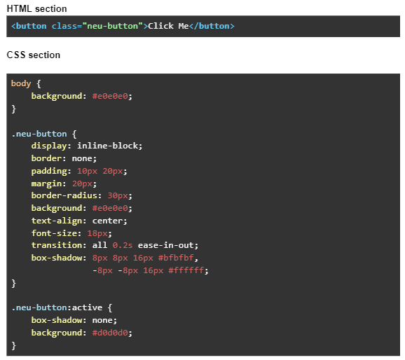
This code snippet creates a button in a way that it seems slightly raised from the screen. An inner glow design is added to indicate that it's made from a soft, plush material. On pressing the button, the shadow and glow will disappear. The user will get experience that the button will seem depressing into the page. Consider this design pattern as a real-world behavior of a soft material being pressed.
For this feel, a box shadow is added to the button.
The first value, 8px 8px 16px #bfbfbf, creates a shadow that is offset to the bottom-right of the button. It makes the button appear to be raised off the screen.
The second value, -8px -8px 16px #ffffff, creates a glow that is offset to the top-left of the button. It adds to the raised effect and also indicates that the button material is soft.
On the active state (i.e., when the user presses the button), the box shadow is removed and the background color is darkened, which makes the button appear to push into the screen.
Note: Neumorphic design is much more than the look it renders to website elements. It is also about the feel users experience while interacting with a neumorphism-based website element. So use transitions and animations to imitate real-world interactions.
Is Neumorphism Good for a Travel Website?
Applying neumorphic design principles to a travel website can provide a freshness. An experienced web design company can make your website engaging through incorporating a real and minimalist design style.
Here are a few ideas on how neumorphism can be implemented:
Interactive Maps
When presenting maps or locations, you can use a neumorphic design style. Focus on making the map element look as if it is gently pressing out from the webpage's surface.
Ratings and Reviews
Neumorphic star ratings or like/dislike buttons can be used for users to review places, hotels, or services.
Progress Bars
During multi-step processes, such as booking or checkout, display progress bars in a neumorphic style. It will indicate the user's current step in the journey.
Search and Filter Buttons
While adding elements like search boxes, sliders, and filter buttons, use the neumorphic design pattern. This gives a three-dimensional feel to the added UI elements.
Cards for Destinations
Displaying different destinations, offers, or packages as neumorphic cards can add a visual appeal to the website, making it more engaging.
Reservation and Booking Process
From selecting trip dates to reserving flights or accommodation, the booking process involves many user inputs. With neumorphic design, the input fields, buttons, and selectors can be more visually interactive.
Final Thoughts
Neumorphism, indeed, makes a travel website visually attractive. However, ensure you don't compromise the website's usability and accessibility. Further, compliment the design element with the website's functionality. It must enhance and not overwhelm the user experience.
Lastly, always test your website. This helps you spot any issues with design or function, making your website stylish and user-friendly.
Web Design Companies in New York: https://www.unifiedinfotech.net/services/web-design-new-york/