はじめに
今回は、Shopifyでセクションを自作していきましょう。
blocksでセクションを自作
クイックスタート
とりあえず挙動を確認していきましょう。
以下のコードです。
<div class="page-width">
  <div class="section-header text-center">
    <h2>
      {{section.settings.title}}
    </h2>
  </div>
  <ul class="grid grid--uniform grid--view-items">
    {% for block in section.blocks%}
    <li class="grid__item grid__item--featured-collections small--one-half medium-up--one-third">
      <div class="grid-view-item product-card">
        <img src="{{block.settings.image | img_url: "master"}}" style="width: 200px;">
        <p>{{block.setting.block-text}}</p>
      </div>
    </li>
    {% endfor %}
  </ul>
</div>

{% schema %}
  {
    "name": "Liquid Basics Example",
    "settings": [{
       "type" : "text",
       "id"  :  "title",
       "label": "Title",
       "default" : "Liquid Basics default"
    }],
    "blocks": [
    {
      "type" : "text",
      "name" : "Custom Blocks",
      "settings" : [
      {
        "type" : "richtext",
        "id" : "bloc-text",
        "label" : "Block Text"
      },
      {
        "type" : "image_picker",
        "id" : "image",
        "label" : "Pick an Image"
      }
      ]
    }
    ],
    "presets" : [
      {
        "name" : "Liquid Basics Example",
        "category" : "Image"
      }
    ]

  }
{% endschema %}
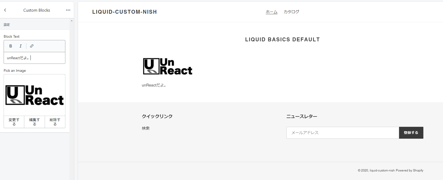
以下の挙動をします。
コード解説
前提
まず、大前提としてセクションを自作する場合はセクション直下にliquidファイルを作成しましょう。
見た目部分
先にHTNLコードの部分を見ていきましょう。
また、この見た目の部分を今回はviewと定義します。
<div class="page-width">
  <div class="section-header text-center">
    <h2>
      {{section.settings.title}}
    </h2>
  </div>
  <ul class="grid grid--uniform grid--view-items">
    {% for block in section.blocks%}
    <li class="grid__item grid__item--featured-collections small--one-half medium-up--one-third">
      <div class="grid-view-item product-card">
        <img src="{{block.settings.image | img_url: "master"}}" style="width: 200px;">
        <p>{{block.settings.block-text}}</p>
      </div>
    </li>
    {% endfor %}
  </ul>
</div>
特筆すべきコードを個別で解説していきます。
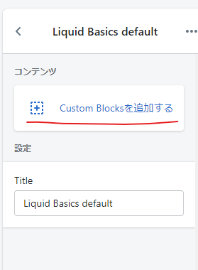
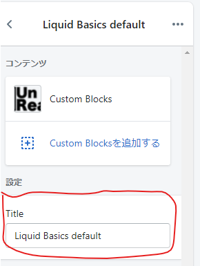
セクションのタイトルを表示
見た目の部分でセクションのタイトルを表示しているのは以下のコードです。・
{{section.settings.title}}
section.settin.titleで以下のSchemaで定義しているオブジェクトを抜き出しています。
ちなみに、SchemaとはShopifyにおいてユーザーがカスタマイズできる部分を実装するために用いられるオブジェクトである。
"settings": [{
       "type" : "text",
       "id"  :  "title",
       "label": "Title",
       "default" : "Liquid Basics default"
    }]
liquidにおいては、あくまでSchemaの中で定義したオブジェクトを指定することで、viewの中で使用しています。
Schimeの中の最小単位は、オブジェクト。この例で言えば以下の部分です。
{
     "type" : "text",
     "id"  :  "title",
     "label": "Title",
     "default" : "Liquid Basics default"
  }
section.setting.titleにより、上記のオブジェクトのidを指定することで、上記のオブジェクト自体を抜き出しています。
上記のオブジェクトのデータ構造としてはtext型であり、抜き出したオブジェクトをviewの中で記述すると、textが表示されることになります。
Shopifyにおいてユーザーがカスタマイズできる部分はSchemeの中で定義されており、オブジェクトが最小単位になります。
くどいようですが、以下のオブジェクトがShopify画面の以下の部分に対応しています。
{
     "type" : "text",
     "id"  :  "title",
     "label": "Title",
     "default" : "Liquid Basics default"
  }
オブジェクトの型の解説
type
オブジェクト内では、typeにより型を指定する。これはShopify側で既に予約されているものである。
上記のオブジェクトのように "type" : "text"とすると、text型のSchemaになる。
id
idは固有の値であり、viewの中でSchemaのオブジェクトを指定する際に指定する。注意が必要な点として、valueを指定することでオブジェクトを指定します。
今回の例ではsection.setting.titleとすることで、オブジェクトを指定している。この理由としては、section.settingまでは全てのオブジェクトで共通になってしまい、section.setting.idとしてもオブジェクトを一意に指定できないということが挙げられます。
label
labelはユーザーカスタマイズページのタイトルになる部分です。
今回の例では、以下がLabelにより指定されています。
default
defaultはユーザーが変更する部分の初期値です。
今回の例では、以下がdefaultにより指定されています。
view内でどのように見えるのか
もう一度、viewを確認しましょう。
<div class="page-width">
  <div class="section-header text-center">
    <h2>
      {{section.settings.title}}
    </h2>
  </div>
  <ul class="grid grid--uniform grid--view-items">
    {% for block in section.blocks%}
    <li class="grid__item grid__item--featured-collections small--one-half medium-up--one-third">
      <div class="grid-view-item product-card">
        <img src="{{block.settings.image | img_url: "master"}}" style="width: 200px;">
        <p>{{block.settings.block-text}}</p>
      </div>
    </li>
    {% endfor %}
  </ul>
</div>
先程まで解説したセクションのタイトルを表示するコードは、4行目の{{section.settings.title}}の部分です。
この部分が、以下のようにSchemaで定義されていました。
"settings": [{
       "type" : "text",
       "id"  :  "title",
       "label": "Title",
       "default" : "Liquid Basics default"
    }]
つまり、section.setting.titleにより、以下のオブジェクトが指定されていることが分かります。
{
     "type" : "text",
     "id"  :  "title",
     "label": "Title",
     "default" : "Liquid Basics default"
  }
section.setting.titleとは、実はこのオブジェクトそのものである。もう少し具体的に説明すると、text型でデフォルトの値が"Liquid Basics defaultであり、ユーザーにより書き換え可能な(Schemaがユーザーにより書き換え可能なものであるため)オブジェクトである。
つまり、実用的には以下の部分でユーザーが書き換えた値がそのままsection.setting.titleにぶちこまれ、viewで表示されることになります。
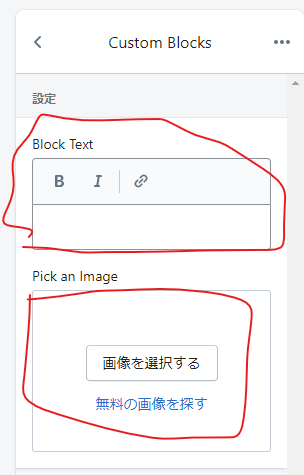
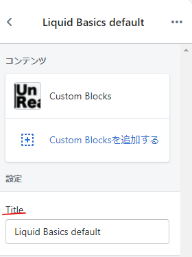
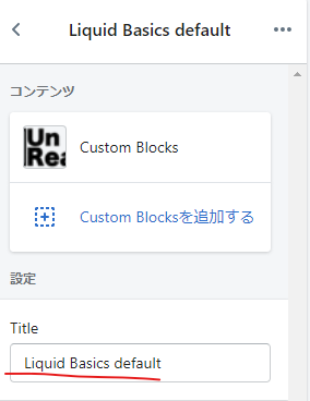
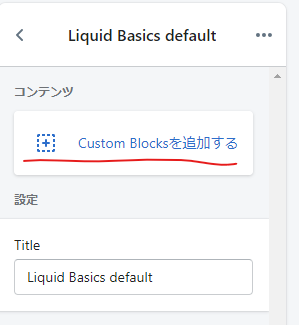
Custom Blocksの実装と表示
Custom Blocksとは以下の部分
中は以下のようになっています。
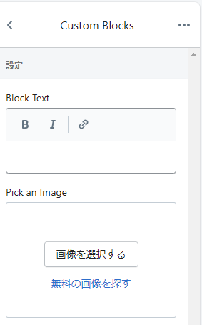
以下のSchemaでCustom Blocksを実装しています。
"blocks": [
    {
      "type" : "text",
      "name" : "Custom Blocks",
      "settings" : [
      {
        "type" : "richtext",
        "id" : "block-text",
        "label" : "Block Text"
      },
      {
        "type" : "image_picker",
        "id" : "image",
        "label" : "Pick an Image"
      }
      ]
    }
    ]
blocks自体がShopifyで予約されている単語である。これを用いることで初めて、Custom Blocksを実装できます。
blocksはvalueとして配列を持ち、その一つ一つがblockである。そして、blockのsettingsの中に、複数のオブジェクトが格納されています。
viewでは以下のコードで表示されています。
{% for block in section.blocks%}
    <li class="grid__item grid__item--featured-collections small--one-half medium-up--one-third">
      <div class="grid-view-item product-card">
        <img src="{{block.settings.image | img_url: "master"}}" style="width: 200px;">
        <p>{{block.settings.block-text}}</p>
      </div>
    </li>
{% endfor %}
viewのコードの解説
それではviewのコードを解説する。
{% for block in section.blocks%}の部分で、blocksからblockを取り出している。前述したが、blocksは配列であり、中に複数のblockが格納されている(今回は一つ)。
<img src="{{block.settings.image | img_url: "master"}}" style="width: 200px;">の部分で、blockからimageオブジェクトを取り出して、その画像を表示させています。
詳しく解説すると、 src="{{block.settings.image | img_url: "master"}}"の部分で、blockの中のimageオブジェクトをパイプでimg_urlに渡しすことでURLに変換している(img_urlはコンパイラのようなものである)。また、: "master"の部分で、画像の型を決めている。'master'を指定すると、良い感じに指定されるようである。別の指定方法として、: "1920px"などがあります。
<p>{{block.settings.block-text}}</p>の部分で、blockからtextオブジェクトを抜き出して、テキストを表示させています。
それでは次に、SchemaでCustom blocksを定義している部分を解説します。
schemaからCustom blocksを解説
以下のコードがblocksのschemaである。前述したが、blocksはShopifyの予約後であり、これによりCustom blocksが生成できます。
 "blocks": [
    {
      "type" : "text",
      "name" : "Custom Blocks",
      "settings" : [
      {
        "type" : "richtext",
        "id" : "block-text",
        "label" : "Block Text"
      },
      {
        "type" : "image_picker",
        "id" : "image",
        "label" : "Pick an Image"
      }
      ]
    }
    ]
blocksのvalueは配列であり、複数のblockを格納することができる。また、各々のblocksのsettingsに複数のオブジェクトを格納することができる。今回はrichtextオブジェクトとimage_pickerオブジェクトを格納しています。
上記のSchemaで定義したオブジェクトを、view内ではblock.setting.imageやblock.setting.block-textを用いて指定していました。
blocks内に複数のblockが存在する場合、ユーザーはどのブロックを使用するか選択することができる。まあ、その各々のblockに対して、複数のオブジェクトを使用することができます。
そして、view内で表示するのは、このオブジェクトの部分です。
presetsの設定
presetsの設定はSchema内で行う。以下のコードです。
"presets" : [
      {
        "name" : "Liquid Basics Example",
        "category" : "Image"
      }
    ]
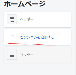
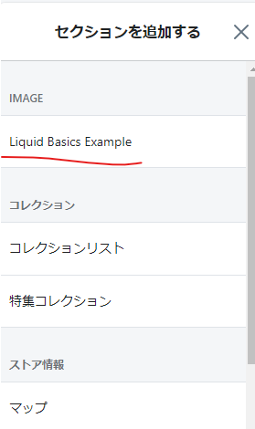
このPresetsで指定することで、ユーザーはセクションを追加するより作成したセクションを選択することができます。
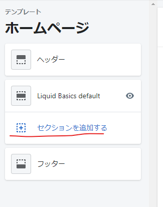
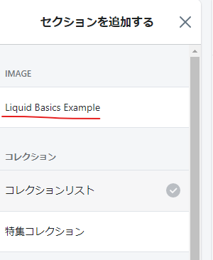
presetsはShopifyの予約後であり、nameにセクションの名前が(今回の場合はLiquid Basics Example)、categoryでセクションのカテゴリーを指定できる(今回の場合はIMAGE)。
基本的にはpresetsを指定しないと、ユーザーはセクションを追加することができません。
終わりに
今回の記事はここまでになります。
ここまで読んで頂きありがとうございました。
Shopify アプリのご紹介
Shopify アプリである、「商品ページ発売予告アプリ | リテリア Coming Soon」は、商品ページを買えない状態のまま、発売日時の予告をすることができるアプリです。Shopify で Coming Soon 機能を実現することができます。