English ver.
(英語版)
| 項番 | 目次 |
|---|---|
| 1 | 概要 |
| 2 | SARIMAモデル時系列解析結果 |
| 3 | 時系列解析結果の解説と考察 |
| 4 | 推移予測結果について |
| 5 | 時系列解析と予測結果の反省点 |
| 6 | 米国内事故件数EDA |
| 7 | 地域重大事故EDA |
概要
イントロダクション
自己紹介、作業環境、使用データと解析概要について
自己紹介:
学習院大学文学部英語英米文化学科卒業後、学校法人の大学部職員、塾業界大手企業で講師・営業・本社管理部門人事部を経験、と非の打ち所がないほどの文系です。
しかしながら現職ではNTTグループの会社にてレイヤー1物理層のインフラエンジニアをしております。英文学専攻であったので英語が得意ということもあり、China Telecomの上海NOC(Network Operation Centre)をはじめ東アジア~東南アジア圏の関係者と連絡を日々取り合いながら業務に当たっています。
プログラミングは当然のごとく初心者で2022年11月から学び始めました。学ぶきっかけとなったのはMax Tegmark(著)"Life 3.0: Being Human in the Age of Artificial Intelligence"を読み、人工知能やプログラミングについて強い興味を抱いたためです。
作業環境:
Python3
Google Colaboratory
OS Windows11
PC Thinkpad X1 13Nano
使用データ:
- US Accidents (2016 - 2021) A Countrywide Traffic Accident Dataset (2016 - 2021)
- population report (Economic Research Service U.S. DEPARTMENT OF AGRICULTURE)
解析予測概要:
本データは米国49州(ハワイ州、アラスカ州、プエルトリコ準州を除くいわゆる"Contiguous United States")2016年~2021年の期間における事故発生件数と事故が交通に与えた影響度、事故時の天候や知覚要因などが含まれたデータセットとなります。このデータセットを用いてSARIMAモデルを用いた時系列解析により2022年~2023年の事故発生件数の推移と、交通に重大な影響を与える事故(データ中の"Severity" "3", "4"に当たる事故)の件数推移の予測を行うというものです。
そのため、解析・予測対象は①米国全体での交通事故件数と②重大事故("Severity" "3", "4")件数に絞ったものの2つがあることになります。
EDA概要:
EDAでは上記2種類の時系列解析を行うにあたって、具体的に米国内のどの州が事故件数が多い州なのか、またこのデータセットのユニークなデータである事故時の天候や気温、湿度、気圧や事故発生場所、事故が起きる時間帯などのデータを2016年~2021年の期間での可視化を行います。こちらも米国全体と"Severity" "3", "4"に当たる重大事故の2種類にわけて行うほか、4地域(北東部、中西部、南部、西部)に分けて行います。
データの選定理由:
米国が世界の中心国家であると同時に先進国屈指の車社会であること、2020年からのコロナウイルス蔓延による影響とコロナショック後の交通事故件数推移の変化に際して単なる事故数の統計だけでなく発生事故の交通への影響度、発生時の天候、知覚的要因、事故発生場所の特徴など、一般的に国が公表する統計データに比べてより発生事由が詳細にデータとして提供されているため、ユニークな解析やEDAが実践できると考えたためです。
SARIMAモデル時系列解析結果
時系列解析の結果について
①SARIMAモデルを用いた2022年~2023年の米国の交通事故発生件数の予測
②重大交通事故("Severity"が"3","4"に該当する事故)のみに絞り込んだ同予測
※以降それぞれ①、②といたします
最初に、2種類の時系列解析結果と予測の結果について記述いたします。使用データセットに関するEDAについては分量が多い関係で後述で述べさせていただきますので、情報が前後してしまうことにご留意ください。
結論、データの内容自体に関しては2020年のコロナウイルスパンデミックの関係で2020年7月に交通事故件数は当該期間で最低を記録して以降、2016年~2020年上半期をはるかに超える事故件数を記録するという結果となっております。その影響で予測期間における推移についても、2022年~2023年の予測として多少の変動はありつつも大きく件数が増加し続けるという予測結果となりました。
解析に用いるデータの概要
以下、データの簡単な概要について確認します
~コードの流れ~
1.ライブラリのインポート
2.Gdriveのマウンティングとデータセットの読み込みーpd.read_csv()メソッド
3.row数確認(.shape[0])、column数確認(.shape[1])ー.shape()メソッド
4.データ全体の確認ー.info()メソッド
5.columnのリスト化と可視化ー.tolist()メソッド
6.column毎のNan含有率を確認ー.isnull().sum().sort_values(ascending=False)/len(data))*100
# 1.Import libraries
import numpy as np
from numpy import nan as na
import pandas as pd
from pandas import datetime
import matplotlib.pyplot as plt
import statsmodels.api as sm
import itertools
import warnings
warnings.simplefilter('ignore')
import seaborn as sns
%matplotlib inline

#Confirm the original information about data

#2.import csv file
from google.colab import drive
drive.mount('/content/drive')
US= pd.read_csv("/content/drive/MyDrive/Drivefolder/US_Accidents_Dec21_upda.csv")

# Basic information about the data
#3.How many rows and clumns exist in original data
print("rows")
print(US.shape[0])
print("columns")
print(US.shape[1])

#4. show all the columns and data types out
print(US.info)
#5. show all names of the columns
print("All names of colums")
print(US.columns.tolist())
#6. Show the percentage of missing Values and Columns
print("Total Nuns")
US_misvaco= (US.isnull().sum().sort_values(ascending=False)/len(US))*100
print(US_misvaco)
Output:クリックしてください
rows
2845342
columns
47
<bound method DataFrame.info of                 ID  Severity           Start_Time             End_Time  \
0              A-1         3  2016-02-08 00:37:08  2016-02-08 06:37:08
1              A-2         2  2016-02-08 05:56:20  2016-02-08 11:56:20
2              A-3         2  2016-02-08 06:15:39  2016-02-08 12:15:39
3              A-4         2  2016-02-08 06:51:45  2016-02-08 12:51:45
4              A-5         3  2016-02-08 07:53:43  2016-02-08 13:53:43
...            ...       ...                  ...                  ...
2845337  A-2845338         2  2019-08-23 18:03:25  2019-08-23 18:32:01
2845338  A-2845339         2  2019-08-23 19:11:30  2019-08-23 19:38:23
2845339  A-2845340         2  2019-08-23 19:00:21  2019-08-23 19:28:49
2845340  A-2845341         2  2019-08-23 19:00:21  2019-08-23 19:29:42
2845341  A-2845342         2  2019-08-23 18:52:06  2019-08-23 19:21:31

         Start_Lat   Start_Lng    End_Lat     End_Lng  Distance(mi)  \
0        40.108910  -83.092860  40.112060  -83.031870         3.230
1        39.865420  -84.062800  39.865010  -84.048730         0.747
2        39.102660  -84.524680  39.102090  -84.523960         0.055
3        41.062130  -81.537840  41.062170  -81.535470         0.123
4        39.172393  -84.492792  39.170476  -84.501798         0.500
...            ...         ...        ...         ...           ...
2845337  34.002480 -117.379360  33.998880 -117.370940         0.543
2845338  32.766960 -117.148060  32.765550 -117.153630         0.338
2845339  33.775450 -117.847790  33.777400 -117.857270         0.561
2845340  33.992460 -118.403020  33.983110 -118.395650         0.772
2845341  34.133930 -117.230920  34.137360 -117.239340         0.537

                                               Description  ...  Roundabout  \
0        Between Sawmill Rd/Exit 20 and OH-315/Olentang...  ...       False
1                       At OH-4/OH-235/Exit 41 - Accident.  ...       False
2                         At I-71/US-50/Exit 1 - Accident.  ...       False
3                          At Dart Ave/Exit 21 - Accident.  ...       False
4                       At Mitchell Ave/Exit 6 - Accident.  ...       False
...                                                    ...  ...         ...
2845337                           At Market St - Accident.  ...       False
2845338    At Camino Del Rio/Mission Center Rd - Accident.  ...       False
2845339  At Glassell St/Grand Ave - Accident. in the ri...  ...       False
2845340     At CA-90/Marina Fwy/Jefferson Blvd - Accident.  ...       False
2845341              At Highland Ave/Arden Ave - Accident.  ...       False

        Station   Stop Traffic_Calming Traffic_Signal Turning_Loop  \
0         False  False           False          False        False
1         False  False           False          False        False
2         False  False           False          False        False
3         False  False           False          False        False
4         False  False           False          False        False
...         ...    ...             ...            ...          ...
2845337   False  False           False          False        False
2845338   False  False           False          False        False
2845339   False  False           False          False        False
2845340   False  False           False          False        False
2845341   False  False           False          False        False

        Sunrise_Sunset Civil_Twilight Nautical_Twilight Astronomical_Twilight
0                Night          Night             Night                 Night
1                Night          Night             Night                 Night
2                Night          Night             Night                   Day
3                Night          Night               Day                   Day
4                  Day            Day               Day                   Day
...                ...            ...               ...                   ...
2845337            Day            Day               Day                   Day
2845338            Day            Day               Day                   Day
2845339            Day            Day               Day                   Day
2845340            Day            Day               Day                   Day
2845341            Day            Day               Day                   Day

[2845342 rows x 47 columns]>
All names of colums
['ID', 'Severity', 'Start_Time', 'End_Time', 'Start_Lat', 'Start_Lng', 'End_Lat', 'End_Lng', 'Distance(mi)', 'Description', 'Number', 'Street', 'Side', 'City', 'County', 'State', 'Zipcode', 'Country', 'Timezone', 'Airport_Code', 'Weather_Timestamp', 'Temperature(F)', 'Wind_Chill(F)', 'Humidity(%)', 'Pressure(in)', 'Visibility(mi)', 'Wind_Direction', 'Wind_Speed(mph)', 'Precipitation(in)', 'Weather_Condition', 'Amenity', 'Bump', 'Crossing', 'Give_Way', 'Junction', 'No_Exit', 'Railway', 'Roundabout', 'Station', 'Stop', 'Traffic_Calming', 'Traffic_Signal', 'Turning_Loop', 'Sunrise_Sunset', 'Civil_Twilight', 'Nautical_Twilight', 'Astronomical_Twilight']
Total Nuns
Number                   61.290031
Precipitation(in)        19.310789
Wind_Chill(F)            16.505678
Wind_Speed(mph)           5.550967
Wind_Direction            2.592834
Humidity(%)               2.568830
Weather_Condition         2.482514
Visibility(mi)            2.479350
Temperature(F)            2.434646
Pressure(in)              2.080593
Weather_Timestamp         1.783125
Airport_Code              0.335601
Timezone                  0.128596
Nautical_Twilight         0.100761
Civil_Twilight            0.100761
Sunrise_Sunset            0.100761
Astronomical_Twilight     0.100761
Zipcode                   0.046356
City                      0.004815
Street                    0.000070
Country                   0.000000
Junction                  0.000000
Start_Time                0.000000
End_Time                  0.000000
Start_Lat                 0.000000
Turning_Loop              0.000000
Traffic_Signal            0.000000
Traffic_Calming           0.000000
Stop                      0.000000
Station                   0.000000
Roundabout                0.000000
Railway                   0.000000
No_Exit                   0.000000
Crossing                  0.000000
Give_Way                  0.000000
Bump                      0.000000
Amenity                   0.000000
Start_Lng                 0.000000
End_Lat                   0.000000
End_Lng                   0.000000
Distance(mi)              0.000000
Description               0.000000
Severity                  0.000000
Side                      0.000000
County                    0.000000
State                     0.000000
ID                        0.000000
dtype: float64
読み込んだデータには"2845342 rows x 47 columns"とある通り、47の項目で合計2,845,342の行があります。
このデータは2016年~2021年までのアメリカ(ハワイ州、アラスカ州、プエルトリコ準州を除く)国内での交通事故件数を扱うものですが、1行1行が"2016-02-08 06:37:08"..."2019-08-23 18:52:06"などというように行数自体から発生件数そのものをカウントできる形になっております。
なお"Severity"に関しては事故による交通への影響の深刻度を4段階でレベル分けしたものとなっております(1が最小、4が最大となります)
※データの詳細やリファレンスについては後述しますが、各カラムが何を示しているかについてはデータ提供者のSobhan Moosavi氏が自身のホームページで解説しています。
データ提供者である同氏についても後述で解説します。
SARIMAモデルを用いた時系列解析のコード
下記に時系列解析の2つのコードを記します。
先ずは①にあたる「SARIMAモデルを用いた2022年~2023年の米国の交通事故発生件数の予測」についてのコードです。
①「SARIMAモデルを用いた2022年~2023年の米国の交通事故発生件数の予測」
~コードの流れ~
1.ライブラリのインポート
2.データ読み込み
3.データ整形"Start_Time"カラム中の"2016-02-08 00:37:08"などの各データの各要素をlambda関数で抽出→datetimeオブジェクトに変換(日付データを形成)
4.時系列解析に用いる必要データの抽出 (カラム"ID","State","yyyymm"を.loc[]メソッドで抽出)
5..groupby()によりUSaccident_prediction2の"yyyymm"毎にに事故数にあたる"ID"の個数をカウント→.rename()メソッドで"Counts"に名称変更
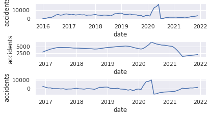
6.年月毎の交通事故発生件数推移データの可視化(以降、matplotlibによる可視化)
7."Counts"にカラムの名称を変更した変数USaccident_prediction2_cをnp.log()で対数変換
8.対数変換後のデータの可視化
9.原系列のグラフを可視化
10.移動平均を求める mov_diff_data = data-data_avg
11.移動平均のグラフを可視化
12.原系列-移動平均グラフの可視化
13.階差を求めるー.diff()メソッド
14.階差系列の可視化
15.自己相関ーfig = sm.graphics.tsa.plot_acf(data, lags=30, ax=ax1)・偏自己相関の可視化ーfig = sm.graphics.tsa.plot_pacf(USaccident_prediction2_c, lags=30, ax=ax2)
16.最適化関数の定義
17.SARIMAモデルの当てはめーbest_params = selectparameter(data, 30)・モデル構築ーSARIMA_data = sm.tsa.statespace.SARIMAX(data,order=(best_params[0]),seasonal_order=(best_params[1])).fit()
18.構築したモデルのBICを出力ーprint(SARIMA_data.bic)
19."pred"に予測データを代入ーpred = data.predict("2021-12-01", "2023-12-31")
20."pred"データともとの時系列データの可視化
# Machine Learning and Prediciton for vorality of the number of the accidents in all over the states
# (1)Import libraries
import numpy as np
import pandas as pd
import matplotlib.pyplot as plt
import statsmodels.api as sm
import itertools
import warnings
import seaborn as sns
warnings.simplefilter('ignore')
%matplotlib inline
sns.set(style="darkgrid")
# (2)import data
from google.colab import drive
drive.mount('/content/drive')
# import csv file
USaccident_prediction = pd.read_csv("/content/drive/MyDrive/Drivefolder/US_Accidents_Dec21_updated.csv", sep=",")
USaccident_prediction.head()
# (3)Organaise the data of days when accidents occured
USaccident_prediction["yyyymm"] = USaccident_prediction["Start_Time"].apply(lambda x:x[0:7])
USaccident_prediction["yyyymm"] = pd.to_datetime(USaccident_prediction["yyyymm"])
# (4)Extract data to use
USaccident_prediction2 = USaccident_prediction.loc[:,["ID","State","yyyymm"]]
print(USaccident_prediction2.shape)
# (5)Count number of the accidents by year and month
USaccident_prediction2_c = USaccident_prediction2.groupby('yyyymm').count()["ID"]
# Rename column(ID→Counts)
USaccident_prediction2_c.columns = ["Counts"]
print(USaccident_prediction2_c.shape)
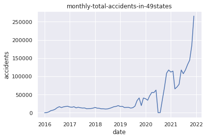
# (6)Plot the data of monthly total accidents in 49states
plt.title("monthly-total-accidents-in-49states")
plt.xlabel("date")
plt.ylabel("accidents")
plt.plot(USaccident_prediction2_c)
plt.show()
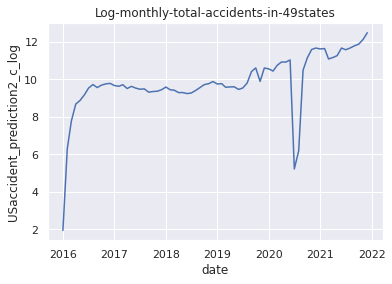
# (7)Apply np.log() method
USaccident_prediction2_c_log = np.log(USaccident_prediction2_c)
# (8)Plot the data after applying np.log() method
plt.title("Log-monthly-total-accidents-in-49states")
plt.xlabel("date")
plt.ylabel("USaccident_prediction2_c_log")
plt.plot(USaccident_prediction2_c_log)
plt.show()
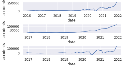
# (9)Plot Original series 1
plt.subplot(6, 1, 1)
plt.xlabel("date")
plt.ylabel("accidents")
plt.plot(USaccident_prediction2_c)
# (10)Specify moving average
USaccident_prediction2_c_avg = USaccident_prediction2_c.rolling(window=12).mean()
# (11)Plot graph of moving average
plt.subplot(6, 1, 3)
plt.xlabel("date")
plt.ylabel("accidents")
plt.plot(USaccident_prediction2_c_avg)
# (12)Plot graph of moving average and original series
plt.subplot(6, 1, 5)
plt.xlabel("date")
plt.ylabel("accidents")
mov_diff_USaccident_prediction2_c = USaccident_prediction2_c-USaccident_prediction2_c_avg
plt.plot(mov_diff_USaccident_prediction2_c)
plt.show()
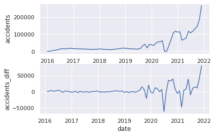
# (9)Plot Original series 2
plt.subplot(2, 1, 1)
plt.xlabel("date")
plt.ylabel("accidents")
plt.plot(USaccident_prediction2_c)
# (13)Specify series of differences
plt.subplot(2, 1, 2)
plt.xlabel("date")
plt.ylabel("accidents_diff")
USaccident_prediction2_c_diff = USaccident_prediction2_c.diff()
# (14)Plot series of differences
plt.plot(USaccident_prediction2_c_diff)
plt.show()
# (15)Plot auto-correlation and partial auto-correlation
fig=plt.figure(figsize=(12, 8))
# Plot graph of Autocorrelation Function
ax1 = fig.add_subplot(211)
fig = sm.graphics.tsa.plot_acf(USaccident_prediction2_c, lags=30, ax=ax1)
# Plot partial auto‐correlation coefficient
ax2 = fig.add_subplot(212)
fig = sm.graphics.tsa.plot_pacf(USaccident_prediction2_c, lags=30, ax=ax2)
plt.show()
# (16)Output best parameter by function
def selectparameter(DATA,seasonality):
p = d = q = range(0, 2)
pdq = list(itertools.product(p, d, q))
seasonal_pdq = [(x[0], x[1], x[2], seasonality) for x in list(itertools.product(p, d, q))]
parameters = []
BICs = np.array([])
for param in pdq:
for param_seasonal in seasonal_pdq:
try:
mod = sm.tsa.statespace.SARIMAX(DATA,
order=param,
seasonal_order=param_seasonal)
results = mod.fit()
parameters.append([param, param_seasonal, results.bic])
BICs = np.append(BICs,results.bic)
except:
continue
return parameters[np.argmin(BICs)]
# (17)Fit the SARIMA model
best_params = selectparameter(USaccident_prediction2_c, 30)
SARIMA_USaccident_prediction2_c = sm.tsa.statespace.SARIMAX(USaccident_prediction2_c,order=(best_params[0]),seasonal_order=(best_params[1])).fit()
# (18)Output BIC values of SARIMA model
print(SARIMA_USaccident_prediction2_c.bic)
# (19)Make a prediction for 2021-12-01 to 2023-12-31
pred = SARIMA_USaccident_prediction2_c.predict("2021-12-01", "2023-12-31")
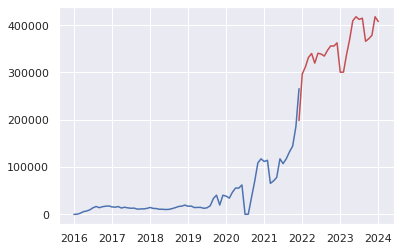
# (20)Plot the prediction and original time-series data
plt.plot(USaccident_prediction2_c)
plt.plot(pred, color="r")
plt.show()
Output:
6.データの可視化(年月毎の交通事故発生件数推移)
8.対数変換後のデータの可視化
11.移動平均のグラフを可視化
12.原系列-移動平均グラフの可視化
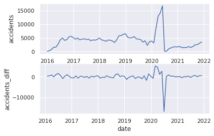
14.階差系列の可視化
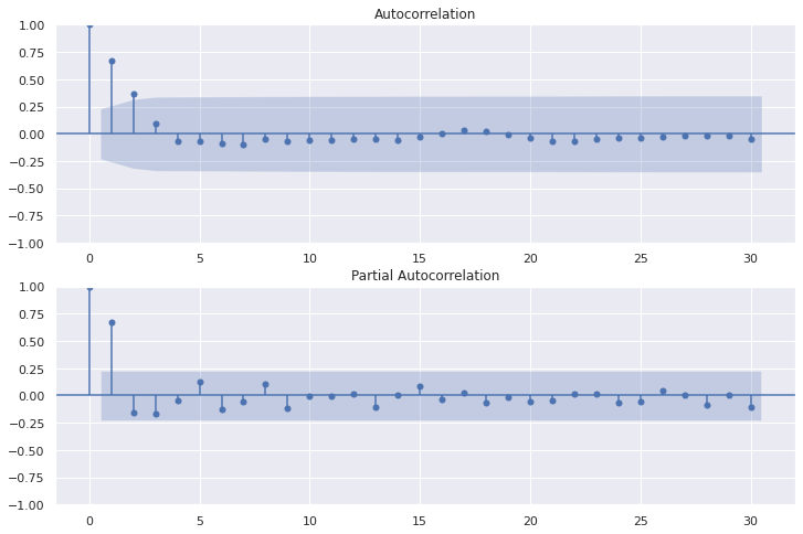
15.自己相関・偏自己相関の可視化
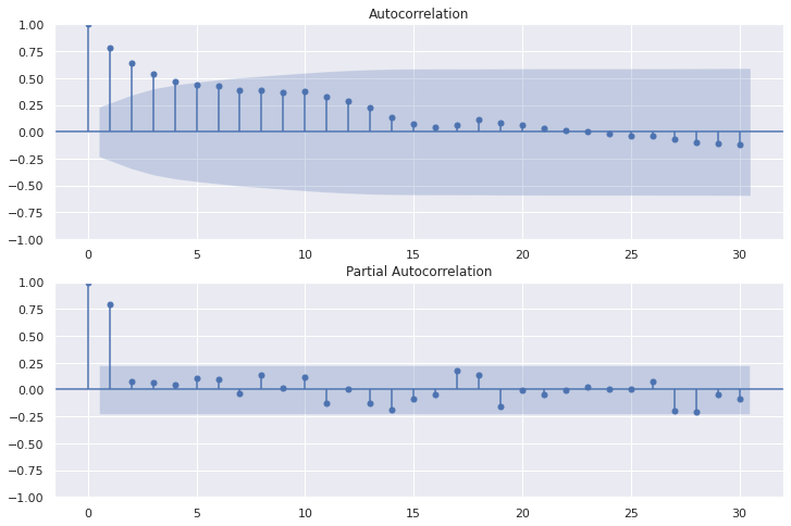
18.構築したモデルのBICを出力
945.8189432999685
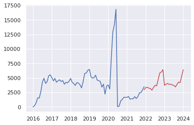
20."pred"データともとの時系列データの可視化
②重大事故("Severity"が"3","4"に該当する事故)に絞り込んだ同期間の予測
※"Severity"とは事故による交通への影響の深刻度を4段階でレベル分けしたもの(1が最小、4が最大)を示します。
Pandas query()メソッドを使用して"Severity"が"3","4"に該当する事故のみに絞り込んだこと以外は先述①のコードの流れと同じです。
#(4)
USseverity43=USseverity_data2.query("Severity in [4,3]")
# Machine Learning and Prediciton for vorality of the number of serious accidents(Severity 3 and 4) in 4region
# (2)import data
# "ID"=number of cases, "Start_Time" is the time when accidents occured(range from 2016-01-14 20:18:33 to 2021-12-31 23:30:00).
USseverity_data= pd.read_csv("/content/drive/MyDrive/Drivefolder/US_Accidents_Dec21_updated.csv")
# (3)Organise the time data
USseverity_data["yyyymm"] = USseverity_data["Start_Time"].apply(lambda x:x[0:7])
USseverity_data["yyyymm"] = pd.to_datetime(USseverity_data["yyyymm"])
# (4)Select out the data
USseverity_data2 = USseverity_data.loc[:,["ID","Severity","yyyymm"]]
print(USseverity_data2.shape)
USseverity43=USseverity_data2.query("Severity in [4,3]")
print(USseverity43.shape)
print(USseverity43.sort_values(by="yyyymm", ascending=True).tail(10))
# (5)Count accidents yearly and monthly
USseverity43_c = USseverity43.groupby('yyyymm').count()["ID"]
# Rename column (ID→Counts)
USseverity43_c.columns = ["Counts"]
print(USseverity43_c.shape)
# Visualisation of the data
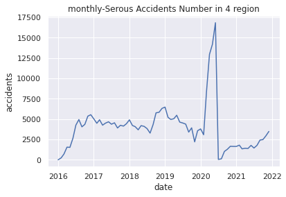
# (6)Plot monthly-Serous Accidents Number in 4 region
plt.title("monthly-Serous Accidents Number in 4 region")
plt.xlabel("date")
plt.ylabel("accidents")
plt.plot(USseverity43_c)
plt.show()
# (7)Apply np.log() method
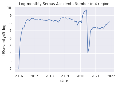
USseverity43_log = np.log(USseverity43_c)
# (8)Plot applied graph
plt.title("Log-monthly-Serous Accidents Number in 4 region")
plt.xlabel("date")
plt.ylabel("USseverity43_log")
plt.plot(USseverity43_log)
plt.show()
# (9)Plot Original series 1
plt.subplot(6, 1, 1)
plt.xlabel("date")
plt.ylabel("accidents")
plt.plot(USseverity43_c)
# (10)Specify moving average
USseverity43_c_avg = USseverity43_c.rolling(window=12).mean()
# (11)Plot graph of moving average
plt.subplot(6, 1, 3)
plt.xlabel("date")
plt.ylabel("accidents")
plt.plot(USseverity43_c_avg)
# (12)Plot graph of moving average and original series
plt.subplot(6, 1, 5)
plt.xlabel("date")
plt.ylabel("accidents")
mov_diff_USseverity43_c = USseverity43_c-USseverity43_c_avg
plt.plot(mov_diff_USseverity43_c)
plt.show()
# (9)Plot Original series 2
plt.subplot(2, 1, 1)
plt.xlabel("date")
plt.ylabel("accidents")
plt.plot(USseverity43_c)
# (13)Specify series of differences
plt.subplot(2, 1, 2)
plt.xlabel("date")
plt.ylabel("accidents_diff")
USseverity43_c_diff = USseverity43_c.diff()
# (14)Plot series of differences
plt.plot(USseverity43_c_diff)
plt.show()
# (15)Plot auto-correlation and partial auto-correlation
fig=plt.figure(figsize=(12, 8))
# Plot graph of Autocorrelation Function
ax1 = fig.add_subplot(211)
fig = sm.graphics.tsa.plot_acf(USseverity43_c, lags=30, ax=ax1)
# Plot partial auto‐correlation coefficient
ax2 = fig.add_subplot(212)
fig = sm.graphics.tsa.plot_pacf(USseverity43_c, lags=30, ax=ax2)
plt.show()
# (16)Output best parameter by function
def selectparameter(DATA,seasonality):
p = d = q = range(0, 2)
pdq = list(itertools.product(p, d, q))
seasonal_pdq = [(x[0], x[1], x[2], seasonality) for x in list(itertools.product(p, d, q))]
parameters = []
BICs = np.array([])
for param in pdq:
for param_seasonal in seasonal_pdq:
try:
mod = sm.tsa.statespace.SARIMAX(DATA,
order=param,
seasonal_order=param_seasonal)
results = mod.fit()
parameters.append([param, param_seasonal, results.bic])
BICs = np.append(BICs,results.bic)
except:
continue
return parameters[np.argmin(BICs)]
# (17)Fit the SARIMA model
best_params = selectparameter(USseverity43_c, 15)
SARIMA_USseverity43_c = sm.tsa.statespace.SARIMAX(USseverity43_c,order=(best_params[0]),seasonal_order=(best_params[1])).fit()
# (18)Output BIC values of SARIMA model
print(SARIMA_USseverity43_c.bic)
# (19)Make a prediction for 2021-12-01 to 2023-12-31
pred = SARIMA_USseverity43_c.predict("2021-12-01", "2023-12-31")
# (20)Plot the prediction and original time-series data
plt.plot(USseverity43_c)
plt.plot(pred, color="r")
plt.show()
Output:クリックしてください
(2845342, 3)
(286298, 3)
                ID  Severity     yyyymm
817337    A-817338         4 2021-12-01
1084687  A-1084688         4 2021-12-01
525546    A-525547         4 2021-12-01
817107    A-817108         4 2021-12-01
374245    A-374246         4 2021-12-01
525749    A-525750         4 2021-12-01
1085168  A-1085169         4 2021-12-01
525875    A-525876         4 2021-12-01
374728    A-374729         4 2021-12-01
779777    A-779778         4 2021-12-01
(72,)
6.データの可視化(年月毎の交通事故発生件数推移)
8.対数変換後のデータの可視化
11.移動平均のグラフを可視化
12.原系列-移動平均グラフの可視化
14.階差系列の可視化
15.自己相関・偏自己相関の可視化
18.構築したモデルのBICを出力
1050.7759312157807
20."pred"データともとの時系列データの可視化
時系列解析結果の解説と考察
2つの時系列解析結果の解説と考察
・2020年6月~8月頃の交通事故件数が極端に少ないことに関して(①②共通)
米国政府機関CDC(Centers for Disease Control and Prevention)がCovid-19パンデミックが起きた2020年のタイムラインを公表しているので以下に引用します。
CDC(Centers for Disease Control and Prevention)-CDC Museum COVID-19 Timeline
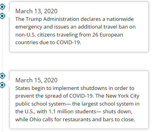


上記はデータ上で極端に事故発生件数が少ない2020年6月付近のタイムラインです。内容を見てみると、まず同年3月13日に政府による緊急事態宣言の発出、15日には各州において"shutdown"を行っております。"shutdown"とは中国やフランスなどで実施された"lockdown"とは異なり、あくまで自主的隔離にあたるものですが、同期間中に企業活動が停滞していたこと(5月9日時点で失業率14.7%)、6月10日に感染者数が合計で200万人を超えたこと、また6月30日にAnthony Fauci氏(chief medical advisor to the president)が米国は日単位で4万人~10万人の新規感染者が増えるとの警鐘をならしたことなど、不安材料が積み重なったことでこの6月~8月頃の期間は極端に私有車での外出者や運輸などの商業車、工事用車両などが少なく交通事故件数が激減していたのだと思われます。事実、後に述べます米国運輸省の統計データでは、3月~8月の期間での私有車での米国内走行距離数は激減しております。
(1)「SARIMAモデルを用いた2022年~2023年の米国の交通事故発生件数の予測」についての解説と考察
# Comfirm volatility of the accident numbers\ from 2016 to 2021
US= pd.read_csv("/content/drive/MyDrive/Drivefolder/US_Accidents_Dec21_updated.csv")

# Show near period of 3years

# Convert the Start_Time column to a datetime object and extract the year and month
US["Start_Time"] = pd.to_datetime(US["Start_Time"])
US["Year"] = US["Start_Time"].dt.year
US["Month"] = US["Start_Time"].dt.month

# Show volatility of whole periods 2016-2021

# Filter the data to year 2026-2021
US2016_2021 = US.loc[(US["Year"].isin([2016, 2017, 2018, 2019, 2020, 2021]))]

# Group the data by month and count the number of accidents in each month
UScounts2016_2021 = US2016_2021.groupby(["Year", "Month"]).size().reset_index(name="Accidents")

# Plot the data using Seaborn
sns.set(style="darkgrid")
sns.lineplot(data=UScounts2016_2021, x="Month", y="Accidents", hue="Year", palette="Set1")
plt.title("Volatility-Number of Accidents by Year-Month 2016-2021")
plt.xlabel("Month")
plt.ylabel("Number of Accidents")
plt.show()

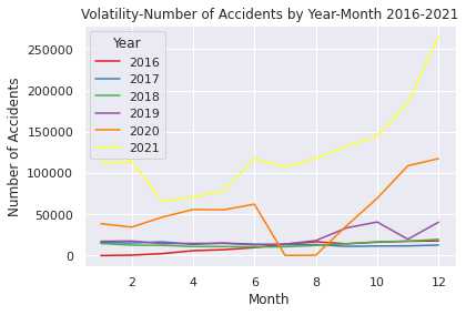
上記のコードは①のEDAとして作成したコードで2016年~2021年の各通年、月ごとに増加推移をグラフ化したコードです(オレンジが2020年です)。上述したCDCのタイムラインの流れと重ねると、各時点で起きた出来事の影響を受けており、それが交通事故件数に反映されていると考えられます。
・2020年8月以降の交通事故件数の急増について
米国の交通安全に関わるリサーチを行うAAA FOUNDATIONが以下のような調査結果を報告しています。
「パンデミック時に運転が増えたと答えたドライバーは、調査前の30日間に様々な危険な運転行為を行ったと答える可能性が最も高いことがわかりました。これらの行動には、テキストメッセージを読んだりタイプしたりすること、フリーウェイや住宅街でのスピード違反、故意の赤信号無視、強引な車線変更、飲酒運転、マリファナ使用後の運転などが含まれます。この差は、年齢、性別、運転頻度などのグループ差を考慮したうえでも同様でした。」
(引用元)
NBC newsでの同内容の掲載
このようにパンデミックを受けての"shutdown"や失業率の増加、さらなる感染者増加の兆しなどの社会不安を背景とした国内での社会的閉塞感が広がるなかで、そのストレスへの反動として法定速度を超える運転、飲酒運転や大麻を使用しての運転など危険運転が急増したのだと推察できると考えられます。
それゆえ、その後の2020年8月~2021年の交通事故件数が増加し続けると同時に当該データセットの期間5年間の中で最も事故件数が高いという結果になっていると考察ができます。
(2)「②重大交通事故("Severity"が"3","4"に該当する事故)のみに絞り込んだ同予測」についての解説と考察
上記の(1)での内容と大部分が重なりますが、細かな差異について考察していきます。
# Comfirm volatility of the accidents from 2016 to 2021 in Severity 3 and 4

USregion_severity= pd.read_csv("/content/drive/MyDrive/Drivefolder/US_Accidents_Dec21_updated.csv")

# Convert the Start_Time column to a datetime object and extract the year and month
USregion_severity["Start_Time"] = pd.to_datetime(USregion_severity["Start_Time"])
USregion_severity["Year"] = USregion_severity["Start_Time"].dt.year
USregion_severity["Month"] = USregion_severity["Start_Time"].dt.month

# Filter the data to include only Severity 3 and 4 from the years 2016 to 2021
Region2016_2021 = USregion_severity.loc[(USregion_severity["Severity"].isin([3, 4])) & (USregion_severity["Year"].between(2016, 2021))]

# Group the data by year and month and count the number of accidents in each year-month
counts2016_2021 = Region2016_2021.groupby(["Year", "Month"]).size().reset_index(name="Accidents")

# Plot the data
sns.set(style="darkgrid")
sns.lineplot(data=counts2016_2021, x="Month", y="Accidents", hue="Year", palette="Set1")
plt.title("Severity3&4-Volatility-Number of Accidents by Year-Month 2016-2021")
plt.xlabel("Month")
plt.ylabel("Number of Accidents")
plt.show()

②のデータ上、重大事故のみに絞り込んだ時系列解析では、2020年の原系列プロット結果を比較すると件数は当然異なりますが、そのうち同じ上昇傾向でも3月~5月頃の重大事故を扱う②の方では増加率が極端に高くなっており、かつ7月頃に急落、そしてその後の2020年8月~2021年はパンデミック発生前と比べても重大事故件数はより少ない水準で推移するという特徴的な結果が出ております。これは、"Severity"という項目は事故のうち人身事故に比重を置いているのではなく、事故における交通への影響度を表していることが要因であると思われます。

上記のように、データ提供者であるMoosavi氏は"Severity"の項目について、「1-4の数字は事故の重大さを表しており、1が交通への影響度が最も少ないこと(事故により交通に短い遅れが生じる)4は重大な影響を与えている(交通への長期的な遅れを生じさせている)。」と定義しております。
・重大事故件数の増加時期との差異と急増急落についての推論
②の重大事故に絞った事故件数の推移と①全体とを比べると、重大事故の増加時期が少し早く2020年2月~6月に急増しています。このことは主に先述したCDCタイムラインであった通り、3月に発出された緊急事態宣言と"shutdown"が原因であると思われます。また、米国のFederal HighwayAdministrationの統計では商用車でない個人レベルでの私有車の交通量は2019年比で3月からは約15%ほど減少していることが分かります。
(引用元)
一方で2月8日に中国武漢で初めてアメリカ人渡航者がコロナウイルスで死亡したニュースがあったことが、米国内パンデミックへの不安に現実味を与えたことも大きな要因になっていると思われます。特に企業活動における影響は甚大になるため、早めに在庫確保や工程材料確保のために商用車の交通量が増えた可能性もあるかと思われます。
これらを鑑みると、物流をはじめとした商用車や工事用車両の事故数が多かったのではないかと推察できると思います。またそのように仮定すると、運送用トラックや工事用車両など大型車であるとサイズが大きい車種の事故、はたまた化学薬品などの輸送車などの事故が起きればそれは必然的に交通に大きな影響を与えると考えられますので、個人が持つ私有車以外の事故の多くが"Severity"が"3","4"レベルの事故であると推察できるのではないでしょうか。裏付けるデータを発見できなかったので根拠として確立ができませんが、私有車の事故が減れば(そもそもの交通量が減れば)、自ずと商用車や工事用車両など重大事故が起きやすい車が多く走る状況に絞られるため重大事故の件数が跳ね上がったのではないかと考察しました。
そしてそれは、日々アップデートされるコロナウイルスに関する情報の中でパンデミックを予期しての企業側での早々の対応があり2月頃からの"Severity" "3", "4"の事故数の急増加につながっているのではないかと推測します。
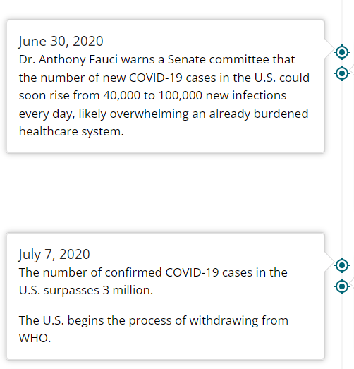
その後の7月、8月の重大事故件数急落については、6月10日に米国内の感染者が200万人を超えたこと、

そして先述しましたAnthony Fauci氏(chief medical advisor to the president)がその20日後に日単位で4万人~10万人の米国内新規感染者が増えるとの見込みを伝えたこと、そしてそれに続く形で7月7日、

コロナウイルス感染件数が300万人を超えたことで、パンデミックが悪化し続けることが確実視されるような状況となっていたと思われます。また、時のトランプ政権がWHO離脱を正式通告したことで、社会的混乱の影響が強まる要因となったのではないかと考えられます。それゆえに、この時点で運輸などで用いる商用車などの交通量が激減したのではないかと推測できるかと思われます。
その後の2020年8月~2021年の間で、パンデミック発生前よりも重大事故件数は低い水準で推移し続けていることについては、直接的に関連するデータを発見することが残念ながらできませんでした。労働者の生産性が2021年以降に蔓延前の水準に比べて下回り続けていることに関連性があると思われますが、確実な根拠は見つけ出すことができませんでした。
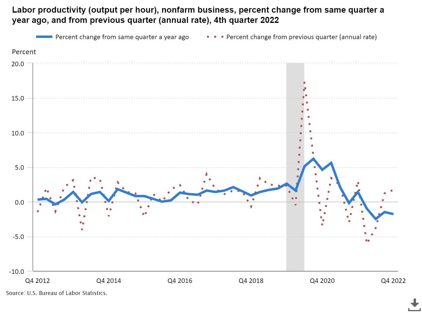
(引用元)
一方でデータセットのデータの収集という面で考えると、単純に上記のようなコロナショックによるデータ収集の偏りがデータセットにあるのかもしれませんが、これに関しては想像の域になってしまうので論拠としては成り立たないと思います。
推移予測結果について
上述の考察とSARIMAモデルを用いた2つの時系列解析2022年~2023年の予測結果について
(1)「SARIMAモデルを用いた2022年~2023年の米国の交通事故発生件数の予測」
上述の通りコードの出力結果として以下の2022年~2023年の米国49州内での事故件数予測ができました。
BIC値は945.8189432999685という形でモデル精度を客観的に確認できると思いますが、実態に則した精度の担保が必要だと思います。
なぜなら、使用データについてSobhan Moosavi氏が「本データセットは、米国49州をカバーする全国規模の交通事故データセットです。データは2016年2月から継続的に収集されており、流動的なトラフィックイベントのデータを提供する多様なAPIを含んだ複数のデータプロバイダを使用しています。これらのAPIは、米国や州の運輸省、法執行機関、交通カメラ、道路網内の交通センサーなど、さまざまな媒体が捉えた交通事象をブロードキャストしています。現在、このデータセットには約150万件の事故記録が登録されています」と説明しており、独自に収集したデータセットであるためです。
下画像は同様の趣旨が書かれた米国のCornell Universityのサイトに公表されている共著の論文です。
(引用元)
データセットの信憑性として、このように論文発表をしている点や
Moosavi氏がテヘラン大学で Computer Software Engineeringの博士号を取得しており、現在は米国のLyft社のシニア・データサイエンティストとして働いていることなどを鑑みて一定の信憑性があるデータセットだと判断できると思われます。(https://www.linkedin.com/in/sobhan-moosavi)
また、その一方でホームページや論文でも述べている通り、データセットは通常の事故件数や事故発生日にち時間をまとめているだけではなく、天候や知覚的要因、事故発生場所の詳細などより具体性があるデータとなっています。これはデータの希少性や多様性という面では非常に有用であると考えられますが、同時にこのデータセットを用いた予測結果の精度を担保する適格な材料がないということも事実かと思います。
そのため、難しいですが一般的な公的機関が公表する類似のデータなどで精度の担保を行う必要があると考えられます。しかしながら、結論として今回の予測データ(交通事故件数の予測)と比較するに足る、完全に合致するデータを発見することはできませんでした。
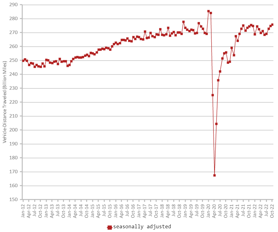
下記に米国運輸省の公表データを2つ引用しますが、これは車の走行距離の数量を統計化したデータと、米国内の交通死亡事故数のトレンドを示すデータとなり、時系列解析・予測した今回の結果である交通事故件数の推移予測とは完全には合致しません。
まず、米国運輸省が公表する2020年の車の走行距離のトレンド*を調べると、4月~8月の期間で米国内での走行距離大幅な下落があったことが分かります。
私有車では2019年同月比で4月-39.8%、5月 -25.5%、6月-12.9%、7月-11.1%、8月-11.8%それぞれ交通量に減少がありました。
全体の累積データではそれぞれ4月-14.9%、5月 -17.2%、6月-16.5%、7月-15.6%、8月-15.1%と高い水準での減少が続きました。
(引用元)
しかしながら、それ以降は急速にパンデミック以前の水準に戻って来ていることが分かります。以下は同じく運輸省公表の2012年~2022年10月までの約10年間での走行距離のトレンドを表したグラフとなります。
(引用元)
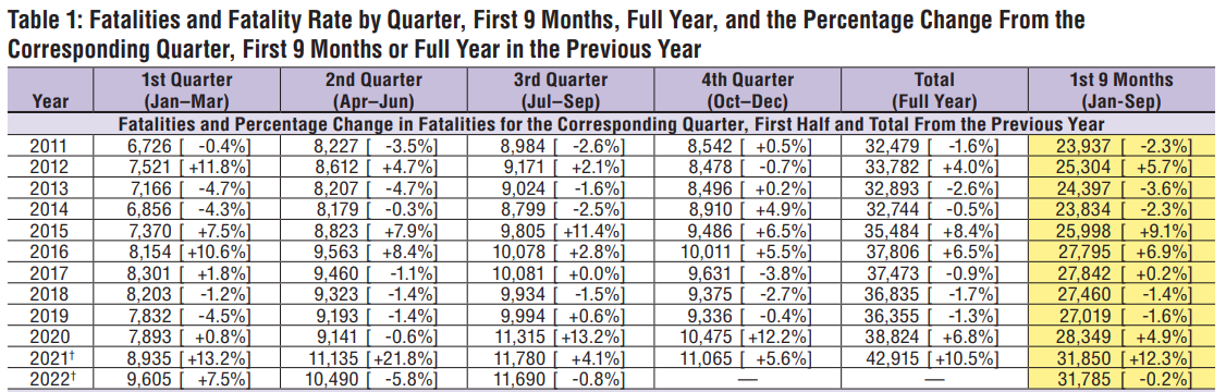
そして、以下は同じく運輸省公表の交通死亡事故数の集計データです。
(引用元)
実際の統計として上記の2つの米国運輸省の走行距離数のトレンド、交通死亡事故の公表データをみると、走行距離数については2022年1月以降は、コロナウイルスパンデミック前の水準に戻って来ていることが分かります。
そして交通死亡事故件数確認すると、交通死亡事故数は2020年に前年比+6.8%、2021年はさらにその増加量から+10.5%という流れとなり、データ上約10年間のなかでも比較的高い水準で増加し続けていることが分かります。
つまり、2021年から2022年、それ以降で交通量はコロナウイルスパンデミック前と同水準に戻りつつある中で死亡事故数は約10年間で比較しても高い水準が続き増加傾向であると考えられます。
そのため、上記(1)「SARIMAモデルを用いた2022年~2023年の米国の交通事故発生件数の予測」は、交通量は増加し(パンデミック前の水準まで戻る)死亡事故数は高い水準で増え続けている事実と突合させると、数字の面では元のデータセットとの差もあり不正確ですが、「事故件数が増加し続ける」という点では予測は合っているのではないかと思われます。
(2)「SARIMAモデルを用いた2022年~2023年の米国の交通事故発生件数の予測」
そして、②の2022年~2023年の重大事故件数の推移予測結果については
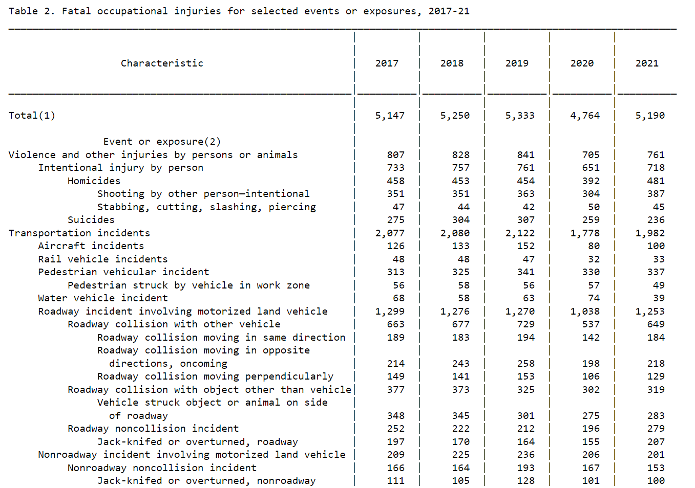
重大事故件数はコロナウイルスパンデミック前の水準に戻る形の予測となっておりますが、走行距離数のトレンドが同じくパンデミック前の水準に戻っていく流れになっていることを考えると、重大事故件数もそれに連動する形で2022年以降は以前の水準に戻る流れとなっているように見受けられます。
(引用元)
別のソースとして上図は米国労働省統計局が公表している交通事故に関するデータですが、やはり同じく死亡事故数のみを扱っているので「交通状況に重大な影響を及ぼした事故」の予測の精度を計るためには適切とは言えません。しかしながら、業務中の交通死亡事故数は2020年に減少し2021年にはパンデミック以前の水準に戻ってきております。一方で先述した通り、運輸省公表の交通死亡事故数の集計データでは死亡事故件数は大きく上昇しておりました。
それゆえ、精度を担保するための最適なデータとは言えませんが予測結果も米国の走行距離数に係るデータと運輸省と労働省による交通死亡事故数のデータを総合して鑑みると、正直なところ判断が非常に難しいのですが、「パンデミック以前の件数に戻る」という点では予測は合致していると思われます。
時系列解析と予測結果の反省点
2つの時系列解析とその予測の反省点
予測精度を担保できる政府機関公表データなどと比較しづらいデータセットを使用した点
そもそものデータセットが少し特殊であることが時系列解析と予測結果の精度を担保することを難しくしてしまったことが反省点です。
天候や事故発生場所、知覚的な要素など多様な項目が事故の1件1件に含まれるデータセットであるため、収集方法も特殊なものとなっている理由で政府機関などが公表するデータと合致しないという点が大きいと思います。このことは事故数の時系列解析や予測それ自体に対してはやはりズレが生じてしまうことになりました。何とか近いデータを引用しようとしてその数が多くなりすぎてしまったことも反省点です。しかし、一方では交通事故に重大な影響を及ぼした重大交通事故件数の分析と予測ができた点は良かったと感じております。これは通常では並行して解析予測することが難しいと思われるかつ、「交通に重大影響を及ぼす事故」の解析予測は他にはなかなか無いものであることも、今回根拠づけの際に様々なデータを検索していく中で分かりましたので、自信にはつながりました。結果は精度の担保という点で躓いてはしまいましたが、形にできたこと自体はやはり良かったです。
上述してきた通り、交通事故件数以外の多様な事故要因が含まれていることが本データセットの特徴でありますので、次の項目でEDAとして記述していきたいと思います。
米国内事故件数EDA
EDAの概要について
長々と考察や検証を立ててしまいましたが、以下からはそのような論考をするにあたり、もとである時系列解析をするための基礎部分となったEDAについて記述していきます。
内容としては先述した「①SARIMAモデルを用いた2022年~2023年の米国の交通事故発生件数の予測」と「②重大交通事故("Severity"が"3","4"に該当する事故)のみに絞り込んだ同予測」のEDAですが、具体的には米国内の交通事故発生件数と米国で定義されている4地域(北東部、中西部、南部、西部)で起きた"Severity" "3","4"の重大交通事故件数に関するEDAとなります。
なぜ②について4地域に分けたのかの理由ですが、今回のデータセットの特徴として天候・知覚的原因など、広大な面積をもつアメリカにそれぞれの気候に関する特色が事故要因として分かるのではないかと考えて4地域に分けました。
以下のEDAのコードについて
※以下、誠に申し訳ないのですがあまりにも量が多くなってしまった関係で、各コードで何をしているかについてはコメントアウトに入力しておりますのでそちらをご覧ください。
①のEDAについて
①SARIMAモデルを用いた2022年~2023年の米国の交通事故発生件数の予測に関するEDAについて
# Step1. EDA and Visualisation for data of US accidents 2016-2021
# Confirm total numbers of the accidents and US population in 2021
# Total Accident numbers By States 2016-2021
AbS = US.groupby(["State"]).size().reset_index(name="Severity")
# Sort the data
AbS_sort=AbS.sort_values("Severity",axis=0,ascending=True,inplace=False,kind="quicksort",na_position="last")
# Plot Total Accident numbers By States 2016-2021
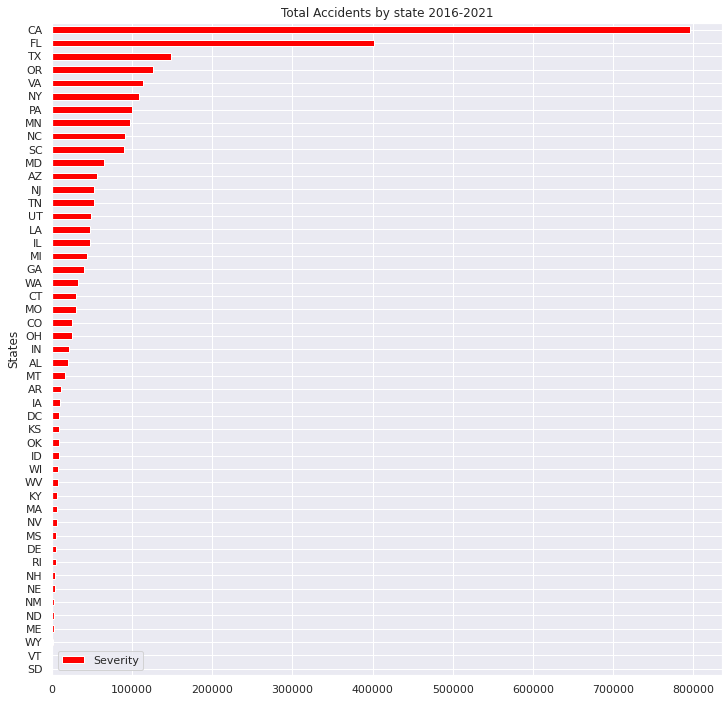
AbS_sort.plot(x="State", y="Severity", title='Total Accidents by state 2016-2021',xlabel="States",ylabel="Accidents",grid=True, colormap='hsv',kind="barh",figsize = (12, 12))
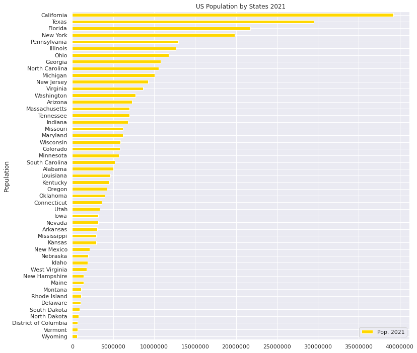
#US Population in 2021
# Import the other csv file as "US_population"
US_population = pd.read_excel("/content/drive/MyDrive/Drivefolder/PopulationReport.xlsx", skiprows=3, index_col=0)
# Check the Data US_population
US_population.info
# Delete all "Nan"
US_population.dropna(how = "all")
# US_population: DataFrame
US_population.reset_index(inplace=True)
# Count numbers of population by "State"
US.State.value_counts()
# Delete Not correspoing states of US_population, "Alaska","Hawaii","Puerto Rico"
US_population.drop(US_population.index[[0,2,12,52,53,54]], axis=0, inplace=True)
US_population.sort_values("Pop. 2021",axis=0,ascending=True,inplace=True,kind="quicksort")
# check the data correctly sorted
US_population.plot(x="Name", y="Pop. 2021", title='US Population by States 2021',xlabel="Population",ylabel="States",grid=True, colormap='hsv',kind="barh",color="gold",figsize = (12,12))
plt.ticklabel_format(style='plain',axis='x')
Output:
・2016年~2021年の州ごとの交通事故発生件数
・2021年米国各州の人口
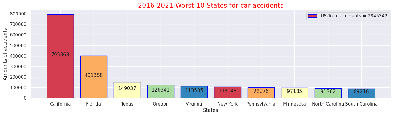
# States and Cities where worst and least numbers of Accidents in 2016-2021
#Top 10 states where the most accidents occured 2016-2021
# Pick up data "ID","State"
US_select = US.loc[:, ['ID','State']]
US_select.head()
# Count up number of accidents by states
US_ex = US_select.groupby('State').count()
# Rename columns(ID→Counts)
US_ex.columns = ["Counts"]
# Check following data
US_ex.head()
# Sort and check data
US_sort = US_ex.sort_values('Counts', ascending=False)
US_sort.head(10)
# Sum up all the number of accidents in US
total = US_sort["Counts"].sum()
# Pick up Worst 10 states
US_rep = US_sort.iloc[:10,:]
US_rep
# Plot the numbers on centre of bar chart
sns.set(style="darkgrid")
def add_value_label(x_list,y_list):
for i in range(0, len(x_list)):
plt.text(i,y_list[i]/2,y_list[i], ha="center")
# Select x-y axis and labels out of data
x = US_rep.index
y = US_rep["Counts"]
labels = ["California", "Florida", "Texas", "Oregon", "Virginia", "New York", "Pennsylvania", "Minnesota", "North Carolina", "South Carolina"]
# Create colour map instance
cm = plt.get_cmap("Spectral")
color_maps = [cm(0.1), cm(0.3), cm(0.5), cm(0.7), cm(0.9)]
#Fix graph size
plt.figure(dpi=100, figsize=(14,4))
# Fix details on bar graph
plt.bar(x, y, tick_label=labels, color=color_maps, edgecolor='blue')
add_value_label(x,y)
# Select legend
plt.legend(labels = [f"US-Total accidents = {total}"])
#Give the tilte for the plot
plt.title("2016-2021 Worst-10 States for car accidents",size=16,color="red")
#Name the x and y axis
plt.xlabel('States')
plt.ylabel('Amounts of accidents')
plt.show()
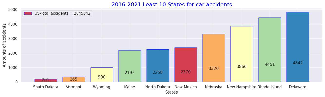
# 10 states in 2016-2021 data for Least numbers of accident occurences
USL_sort = US_ex.sort_values('Counts', ascending=True)
USL_sort.head(10)
# Pick up Worst 5 states
USL_rep = USL_sort.iloc[:10,:]
USL_rep
def add_value_label(x_list,y_list):
for i in range(0, len(x_list)):
plt.text(i,y_list[i]/4,y_list[i], ha="center")
x = USL_rep.index
y = USL_rep["Counts"]
labels = ["South Dakota", "Vermont", "Wyoming", "Maine", "North Dakota", "New Mexico", "Nebraska", "New Hampshire", "Rhode Island", "Delaware"]
#Create a colour map
cm = plt.get_cmap("Spectral")
color_maps = [cm(0.1), cm(0.3), cm(0.5), cm(0.7), cm(0.9)]
#Fixing graph size
plt.figure(dpi=100, figsize=(14,4))
#Setting bar plots
plt.bar(x, y, tick_label=labels, color=color_maps, edgecolor='blue')
add_value_label(x,y)
#Setting a legend
plt.legend(labels = [f"US-Total accidents = {total}"])
#Giving the tilte for the plot
plt.title("2016-2021 Least 10 States for car accidents",size=16, color="blue")
#Namimg the x and y axis
plt.xlabel('States')
plt.ylabel('Amounts of accidents')
plt.show()
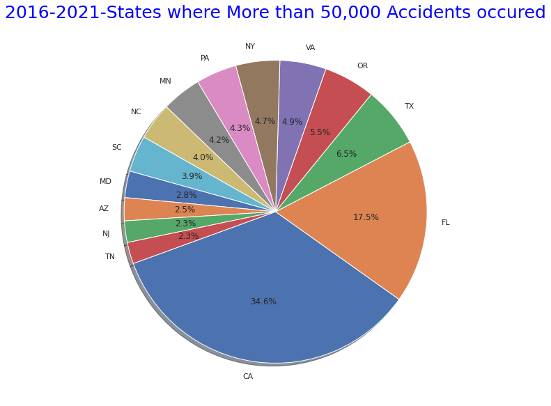
# States where More than 50,000 Accidents occured" pie graph
states_top = US.State.value_counts()
plt.figure(figsize=(10,10))
plt.title("2016-2021-States where More than 50,000 Accidents occured",size=25,y=1,color="blue")
labels= states_top[states_top>50000].index
plt.pie(states_top[states_top>50000],shadow=True, startangle=200, labels=labels, autopct = '%1.1f%%')
plt.show()
# States where More than 50,000 Accidents occured" pie graph
states_bottom = US.State.value_counts()
plt.figure(figsize=(10,10))
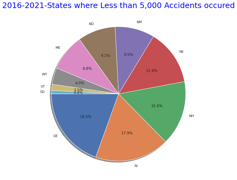
plt.title("2016-2021-States where Less than 5,000 Accidents occured",size=25,y=1,color="blue")
labels= states_bottom[states_bottom<5000].index
plt.pie(states_bottom[states_bottom<5000],shadow=True, startangle=180, labels=labels, autopct = '%1.1f%%')
explode = (0.1,0,0.05,0,0.05,0,0.05,0,0.05,0,0.05,0,0.05)
plt.show()
Output:
・2016年~2021年間で最も交通事故件数が多かった州ワースト10
・2016年~2021年間で最も交通事故件数が少なかった州トップ10
・同期間で事故総件数が5万件より多い州
・同期間で事故総件数が5万件より少ない州
#(2) Details for causes of the accidents - Accident Severity Level(1-4) Analysis with weather condions and perceptical factors
#Statics of perceptical facotrs by Severity levels
#Show all names of the columns
print(US.columns.tolist())
#Accidents caused by the factors relating to perception or situations
AWF = US.loc[:, ['State','Severity','Temperature(F)','Humidity(%)','Pressure(in)','Wind_Speed(mph)','Weather_Condition','Visibility(mi)']]
AWF.head()
AWF_sort = AWF.sort_values('Severity', ascending=False)
AWF_sort.head()
# Check the each Severity numbers exist
AWF_s= AWF_sort['Severity'].value_counts()
# Severity(4) Means of each caused factor
AWF4= AWF_sort.loc[AWF["Severity"]==4.0]
AW4= AWF4.mean().round(1)
print(AW4)
# Severity(4) Weather conditions
AWF4_weather=AWF4["Weather_Condition"].value_counts()
print(AWF4_weather.iloc[:30])
# Severity(3) Means of each caused factor
AWF3= AWF_sort.loc[AWF["Severity"]==3.0]
AWF3.fillna(0)
AW3= AWF3.mean().round(1)
print(AW3)
# Severity(3) Weather conditions
AWF3_weather=AWF3["Weather_Condition"].value_counts()
print(AWF3_weather.iloc[:15])
# Severity(2) Means of each caused factor
AWF2= AWF_sort.loc[AWF["Severity"]==2.0]
AW2= AWF2.mean().round(1)
print(AW2)
# Severity(2) Weather conditions
AWF2_weather=AWF2["Weather_Condition"].value_counts()
print(AWF2_weather.iloc[:15])
# Severity(1) Means of each caused factor
AWF1= AWF_sort.loc[AWF["Severity"]==1.0]
AW1= AWF1.mean().round(1)
print(AW1)
# Severity(1) Weather conditions
AWF1_weather=AWF1["Weather_Condition"].value_counts()
print(AWF1_weather.iloc[:15])
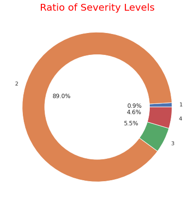
# ratio of each severity
severity1_4 = US.groupby('Severity').count()['ID']
severity1_4
fig, ax = plt.subplots(figsize=(6, 6), subplot_kw=dict(aspect="equal"))
label = [1,2,3,4]
plt.pie(severity1_4, labels=label,autopct='%1.1f%%', pctdistance=0.5)
circle = plt.Circle( (0,0), 0.7, color='white')
p=plt.gcf()
p.gca().add_artist(circle)
ax.set_title("Ratio of Severity Levels",color="red",fontdict={'fontsize': 20})
plt.tight_layout()
plt.show()
# Confirm "Description" column
SD= US.iloc[:,[1,9]]
SD_sort=SD.sort_values('Severity', ascending=True)
print(SD_sort.head)
Output:クリックしてください
['ID', 'Severity', 'Start_Time', 'End_Time', 'Start_Lat', 'Start_Lng', 'End_Lat', 'End_Lng', 'Distance(mi)', 'Description', 'Number', 'Street', 'Side', 'City', 'County', 'State', 'Zipcode', 'Country', 'Timezone', 'Airport_Code', 'Weather_Timestamp', 'Temperature(F)', 'Wind_Chill(F)', 'Humidity(%)', 'Pressure(in)', 'Visibility(mi)', 'Wind_Direction', 'Wind_Speed(mph)', 'Precipitation(in)', 'Weather_Condition', 'Amenity', 'Bump', 'Crossing', 'Give_Way', 'Junction', 'No_Exit', 'Railway', 'Roundabout', 'Station', 'Stop', 'Traffic_Calming', 'Traffic_Signal', 'Turning_Loop', 'Sunrise_Sunset', 'Civil_Twilight', 'Nautical_Twilight', 'Astronomical_Twilight']
Severity            4.0
Temperature(F)     58.3
Humidity(%)        67.5
Pressure(in)       29.6
Wind_Speed(mph)     8.0
Visibility(mi)      9.1
dtype: float64
Fair                            27765
Clear                           25261
Mostly Cloudy                   15688
Overcast                        13218
Cloudy                          11272
Partly Cloudy                   10164
Light Rain                       6029
Scattered Clouds                 5643
Light Snow                       3015
Fog                              1532
Rain                             1253
Haze                              791
Fair / Windy                      541
Light Drizzle                     495
Heavy Rain                        435
Snow                              433
Smoke                             265
Cloudy / Windy                    226
Mostly Cloudy / Windy             208
Thunder in the Vicinity           182
T-Storm                           178
Heavy Snow                        165
Drizzle                           162
Light Freezing Rain               153
Partly Cloudy / Windy             151
Wintry Mix                        140
Light Rain with Thunder           137
Light Thunderstorms and Rain      122
Light Rain / Windy                118
Thunder                           114
Name: Weather_Condition, dtype: int64
Severity            3.0
Temperature(F)     61.9
Humidity(%)        64.2
Pressure(in)       29.6
Wind_Speed(mph)     9.0
Visibility(mi)      9.4
dtype: float64
Clear               29924
Mostly Cloudy       24321
Fair                23426
Overcast            16150
Partly Cloudy       15930
Cloudy              11051
Scattered Clouds     8709
Light Rain           8573
Light Snow           2637
Rain                 1918
Haze                 1366
Fog                   940
Heavy Rain            734
Light Drizzle         576
Fair / Windy          416
Name: Weather_Condition, dtype: int64
Severity            2.0
Temperature(F)     61.9
Humidity(%)        64.4
Pressure(in)       29.5
Wind_Speed(mph)     7.3
Visibility(mi)      9.1
dtype: float64
Fair                1043277
Cloudy               323213
Mostly Cloudy        319525
Partly Cloudy        221358
Clear                118638
Light Rain           112504
Overcast              55514
Fog                   38575
Light Snow            38044
Haze                  34135
Scattered Clouds      30780
Rain                  27618
Fair / Windy          14028
Heavy Rain            10582
Smoke                  6817
Name: Weather_Condition, dtype: int64
Severity            1.0
Temperature(F)     71.3
Humidity(%)        50.0
Pressure(in)       29.0
Wind_Speed(mph)     8.4
Visibility(mi)      9.5
dtype: float64
Fair                       12726
Mostly Cloudy               4425
Cloudy                      3231
Partly Cloudy               2487
Light Rain                  1297
Rain                         255
Fair / Windy                 210
Fog                          179
Mostly Cloudy / Windy        126
Partly Cloudy / Windy         77
Heavy Rain                    73
Light Drizzle                 72
Light Rain with Thunder       63
Haze                          62
Cloudy / Windy                60
Name: Weather_Condition, dtype: int64
・各"Severity"のレベル別割合の可視化
# Each Severity with Weather conditions
#Severity4
AWF4_weather.iloc[:15].plot(kind="barh",colormap='hsv',title="Severity4-Weather Tendency",legend="legend",grid=True,color="red",figsize=(6,6))
#Severity3
AWF3_weather.iloc[:15].plot(kind="barh",colormap='hsv',title="Severity3-Weather Tendency",legend="legend",grid=True, color="orange",figsize=(6,6))
#Severity2
AWF2_weather.iloc[:15].plot(kind="barh",colormap='hsv',title="Severity2-Weather Tendency",legend="legend",grid=True,color="purple",figsize=(6,6))
plt.ticklabel_format(style='plain',axis='x')
#Severity1
AWF1_weather.iloc[:15].plot(kind="barh",colormap='hsv',title="Severity1-Weather Tendency",grid=True,legend="legend",color="green",figsize=(6,6))
Output:
・Severity"レベルごとの事故発生時の天候
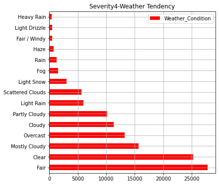
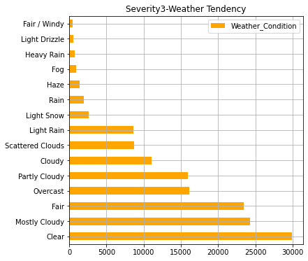
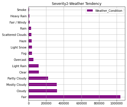
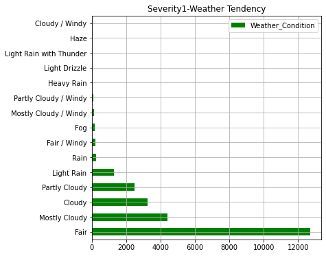
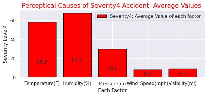
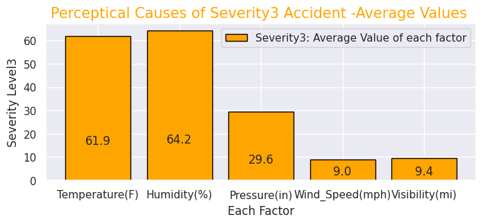
ここまでのグラフで事故発生件数が多い州ほど人口が多いことが分かります。また、事故の重大さでは"2"のレベル(一般的なレベル)の事故が約90%でほとんどなことが分かります。天候については「快晴・晴れ・曇り」が圧倒的に多いですが重大事故ほど「軽い雪・霧・雨・もや」などの割合が多くなっております
# Severity(1-4) with other factors
sns.set(style="darkgrid")
def add_value_label(x_list,y_list):
for i in range(0, len(x_list)):
plt.text(i,y_list[i]/4,y_list[i], ha="center")
x = [0, 1, 2, 3, 4]
y = [58.3, 67.5, 29.6,8.0,9.1]
labels = ["Temperature(F)","Humidity(%)","Pressure(in)","Wind_Speed(mph)","Visibility(mi)"]
#Create a colour map
cm = plt.get_cmap("Spectral")
color_maps = [cm(0.1), cm(0.3), cm(0.5), cm(0.7), cm(0.9)]
plt.figure(dpi=100, figsize=(8,3))
#Set bar plots
plt.bar(x, y, tick_label=labels, color="red", edgecolor='black')
add_value_label(x,y)
plt.legend(["Severity4: Average Value of each factor"])
#Give the tilte for the plot
plt.title("Perceptical Causes of Severity4 Accident -Average Values ",size=15,color="red",)
#Name the x and y axis
plt.xlabel('Each Factor')
plt.ylabel('Severity Level4')
plt.show()
#Severity(3)
x = [0, 1, 2, 3, 4]
y = [61.9, 64.2, 29.6, 9.0, 9.4]
labels = ["Temperature(F)","Humidity(%)","Pressure(in)","Wind_Speed(mph)","Visibility(mi)"]
#Create a colour map
cm = plt.get_cmap("Spectral")
color_maps = [cm(0.1), cm(0.3), cm(0.5), cm(0.7), cm(0.9)]
plt.figure(dpi=100, figsize=(8,3))
#Set bar plots
plt.bar(x, y, tick_label=labels, color="orange", edgecolor='black')
add_value_label(x,y)
plt.legend(["Severity3: Average Value of each factor"])
#Give the tilte for the plot
plt.title("Perceptical Causes of Severity3 Accident -Average Values ",size=15,color="orange",)
#Name the x and y axis
plt.xlabel('Each Factor')
plt.ylabel('Severity Level3')
plt.show()
#Severity(2)
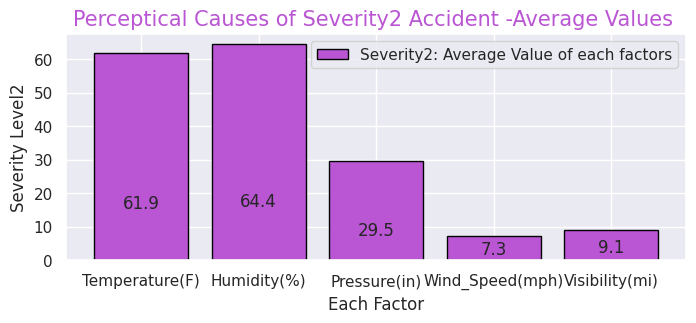
x = [0, 1, 2, 3, 4]
y = [61.9, 64.4, 29.5, 7.3, 9.1]
labels = ["Temperature(F)","Humidity(%)","Pressure(in)","Wind_Speed(mph)","Visibility(mi)"]
#Create a colour map
cm = plt.get_cmap("Spectral")
color_maps = [cm(0.1), cm(0.3), cm(0.5), cm(0.7), cm(0.9)]
plt.figure(dpi=100, figsize=(8,3))
#Set bar plots
plt.bar(x, y, tick_label=labels, color="mediumorchid", edgecolor='black')
add_value_label(x,y)
plt.legend(["Severity2: Average Value of each factors"])
#Give the tilte for the plot
plt.title("Perceptical Causes of Severity2 Accident -Average Values ",size=15,color="mediumorchid",)
#Name the x and y axis
plt.xlabel('Each Factor')
plt.ylabel('Severity Level2')
plt.show()
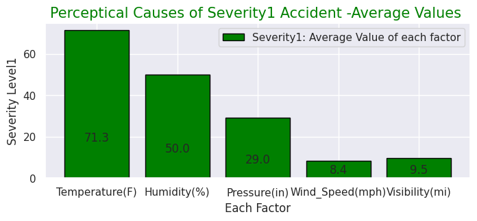
#Severity(1)
x = [0, 1, 2, 3, 4]
y = [71.3, 50.0, 29.0, 8.4, 9.5]
labels = ["Temperature(F)","Humidity(%)","Pressure(in)","Wind_Speed(mph)","Visibility(mi)"]
#Create a colour map
cm = plt.get_cmap("Spectral")
color_maps = [cm(0.1), cm(0.3), cm(0.5), cm(0.7), cm(0.9)]
plt.figure(dpi=100, figsize=(8,3))
#Set bar plots
plt.bar(x, y, tick_label=labels, color="green", edgecolor='black')
add_value_label(x,y)
plt.legend(["Severity1: Average Value of each factor"])
#Give the tilte for the plot
plt.title("Perceptical Causes of Severity1 Accident -Average Values ",size=15,color="green",)
#Name the x and y axis
plt.xlabel('Each Factor')
plt.ylabel('Severity Level1')
plt.show()
Output:
・"Severity"ごとの事故の知覚的要因(気温・湿度・気圧など)
# (3) Places where accidents frequently occured and Map where accidents occured
USplace= US.iloc[:, [30,31,32,33,34,35,36,37,38,39,40,41,42]]
print(USplace.columns.tolist())
# Accidents near Amenity shop
USP1=USplace["Amenity"].value_counts(True,dropna=())
USP1
# Accidents at Bump
USP2=USplace["Bump"].value_counts(True,dropna=())
USP2
# Accidents at Crossing
USP3=USplace["Crossing"].value_counts(True,dropna=())
USP3
# Accidents at Give_Way
USP4=USplace["Give_Way"].value_counts(True,dropna=())
USP4
# Accidents at Junction
USP5=USplace["Junction"].value_counts(True,dropna=())
USP5
# Accidents at No_Exit
USP6=USplace["No_Exit"].value_counts(True,dropna=())
USP6
# Accidents at No_Exit
USP7=USplace["Railway"].value_counts(True,dropna=())
USP7
# Accidents at Roundabout
USP8=USplace["Roundabout"].value_counts(True,dropna=())
USP8
# Accidents near Station
USP9=USplace["Station"].value_counts(True,dropna=())
USP9
# Accidents at Stop
USP10=USplace["Stop"].value_counts(True,dropna=())
USP10
# Accidents at Traffic_Calming
USP11=USplace["Traffic_Calming"].value_counts(True,dropna=())
USP11
# Accidents at Traffic_Signal
USP12=USplace["Traffic_Signal"].value_counts(True,dropna=())
USP12
# Accidents at Turning_Loop
USP13=USplace["Turning_Loop"].value_counts(True,dropna=())
USP13
# Plot ratio of Accidentical places
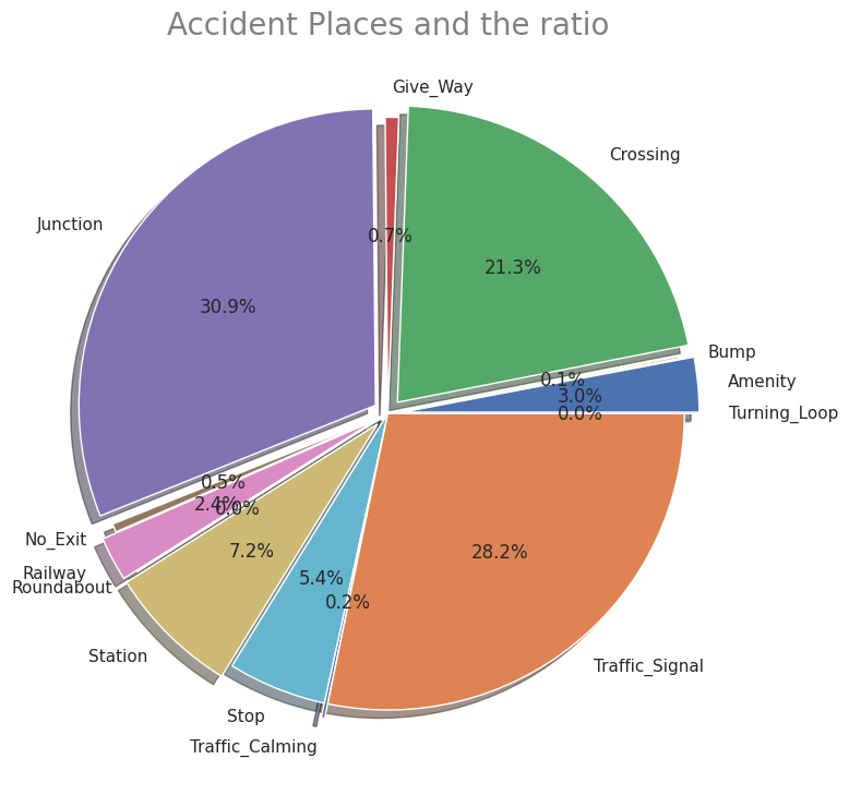
labels = ['Amenity', 'Bump', 'Crossing', 'Give_Way', 'Junction', 'No_Exit', 'Railway', 'Roundabout', 'Station', 'Stop', 'Traffic_Calming', 'Traffic_Signal', 'Turning_Loop']
sizes = np.array([0.009837, 0.000359, 0.070365, 0.002414, 0.102098, 0.001509, 0.007954, 0.000043, 0.023897, 0.017713, 0.000602, 0.093227, 0])
explode = (0.05,0,0.05,0,0.05,0,0.05,0,0.05,0,0.05,0,0.05)
plt.figure(dpi=100, figsize=(9,9))
# Create a pie chart
plt.pie(sizes, labels=labels, explode=explode, shadow=True,autopct = '%1.1f%%')
# Add a title
plt.title('Accident Places and the ratio',size=20, color="grey")
# Show the plot
plt.show()
Output:
・交通事故が発生した場所の割合
"Severity"ごとの事故の知覚的要因(気温・湿度・気圧など)・交通事故が発生した場所の割合
先述の通りこのデータセットの特徴的な項目です。"Severity"ごとにの知覚的要因を見ると重大事故発生時ほど気温が低く、湿度が高い傾向があります。その他の要因には大きな差はないようです。また、事故現場として多い場所はジャンクションが1番ですが、日本でいうジャンクションは高速道路でのものを指しますが、一般的には複数の車線がある大型十字路を指すようです。他は交差点、信号機設置場所が続いて多いことが分かります。他にも駅前や商業店舗敷地などユニークなデータもあります。
# Map showing the places where accidents occured in all over the states

# import folium module
import folium
from folium.plugins import HeatMap

USmap= US.sample(frac=0.25)
USmap2 = list(zip(USmap['Start_Lat'], USmap['Start_Lng']))

# Display the map
map=folium.Map(location=[37.0902, -95.7129],zoom_start=4,tiles="Stamen Terrain")
HeatMap(USmap2).add_to(map)
map
Output:
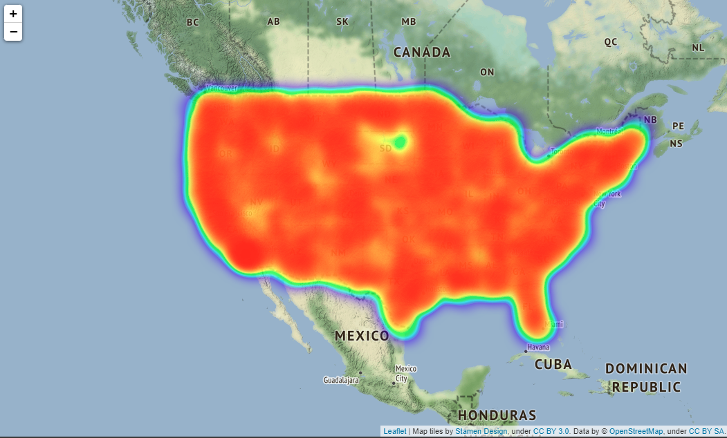
実際はfoliumで出力した地図を拡大縮小できるのですがQiitaに載せられないようなので見づらいですが拡大した時は
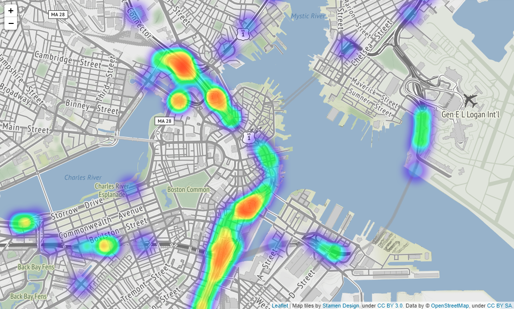
上図のようになります(場所はBostonです)。
folium.Map()メソッドでパラメーターにtiles="Stamen Terrain"を入れると、国名や州名、町の名前や大通りの名前などが地図上に表示されるようになるのでより事故発生場所が分かりやすくなります。
# (4) Statics about Time and Months of the accidents and the Volatirity

# Organaise the data for timely and monthly based
US['Start_Time'].value_counts().head()
US.Start_Time = pd.to_datetime(US.Start_Time)
US.Start_Time
USh =US.Start_Time.dt.hour.value_counts()
USh
UStm=US.Start_Time.dt.hour.value_counts()
UStm
USmonth=US.Start_Time.dt.month_name().value_counts()
USmonth

# plot time based bar chart
def add_value_label(x_list,y_list):
    for i in range(0, len(x_list)):
        plt.text(i,y_list[i]/4,y_list[i], ha="center")
sns.set(style="darkgrid")
plt.figure(figsize=(13,8))
sns.color_palette("rocket")
sns.barplot(x=UStm.index,y=UStm)
plt.title("US 2016-2021 Time when accidents occured",size=20,color="blue")
plt.xlabel("Occurence Time")
plt.ylabel("Amount of Accidents")

# plot monthly based bar chart
plt.figure(figsize=(13,8))
sns.barplot(x=USmonth.index,y=USmonth)
plt.title("US 2016-2021 Months when accidents occured",size=20,color="red")
plt.xlabel("Occurence Time")
plt.ylabel("Amount of Accidents")
Output:
・1日のうち時間ごとの事故数
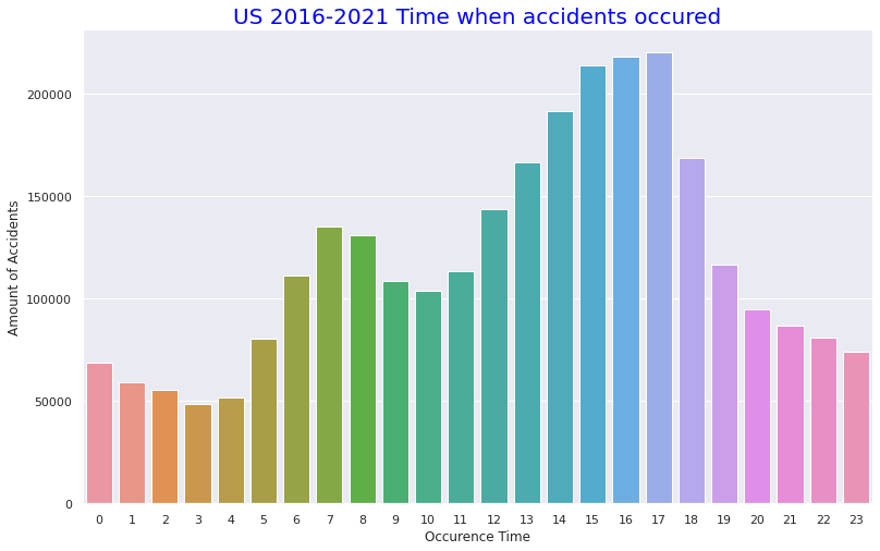
・月ごとの事故数
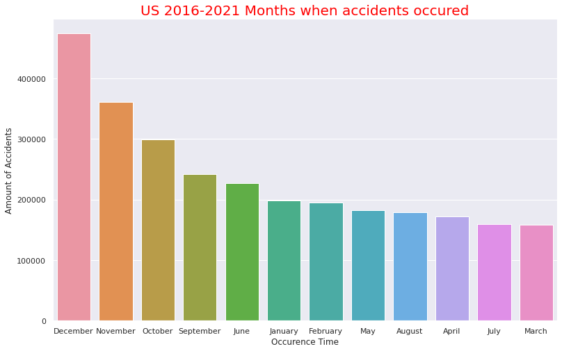
1日のうち時間ごとの事故数・月ごとの事故数
事故発生時間は13時~17時の午後に多いことが分かります。先述した事故時の天候で快晴や晴れの割合いが多いことと合致しそうです(おそらく夜での天候で快晴か晴れかの区別はそこまで重要視されないと思われるため)。月ごとの事故数の多さでは9月~12月という流れそのままに事故数が多いようです。これは重大事故ほど気温が低くなる傾向があることと合致します。12月はクリスマスがあるのも12月が1番事故数が多い要因かと思われます。
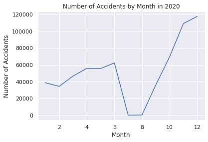
# Comfirm volatility of the accident numbers\ from 2016 to 2021
US= pd.read_csv("/content/drive/MyDrive/Drivefolder/US_Accidents_Dec21_updated.csv")
# Show near period of 3years
# Convert the Start_Time column to a datetime object and extract the year and month
US["Start_Time"] = pd.to_datetime(US["Start_Time"])
US["Year"] = US["Start_Time"].dt.year
US["Month"] = US["Start_Time"].dt.month
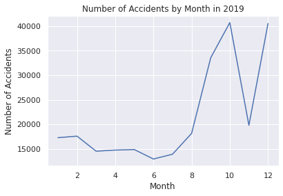
# Filter the data to year 2019
US2019 = US.loc[(US["Year"] == 2019)]
# Group the data by month and count the number of accidents in each month
UScounts2019 = US2019.groupby("Month").size().reset_index(name="Accidents")
# Plot the data using Seaborn
sns.set(style="darkgrid")
sns.lineplot(data=UScounts2019, x="Month", y="Accidents")
plt.title("Number of Accidents by Month in 2019")
plt.xlabel("Month")
plt.ylabel("Number of Accidents")
plt.show()
# Show the data count as a pandas DataFrame in 2019
print(UScounts2019)
# Filter the data to include only Severity 3 and 4 from the year 2020
US2020 = US.loc[(US["Year"] == 2020)]
# Group the data by month and count the number of accidents in each month
UScounts2020 = US2020.groupby("Month").size().reset_index(name="Accidents")
# Plot the data using Seaborn
sns.set(style="darkgrid")
sns.lineplot(data=UScounts2020, x="Month", y="Accidents")
plt.title("Number of Accidents by Month in 2020")
plt.xlabel("Month")
plt.ylabel("Number of Accidents")
plt.show()
# Show the data count as a pandas DataFrame in 2020
print(UScounts2020)
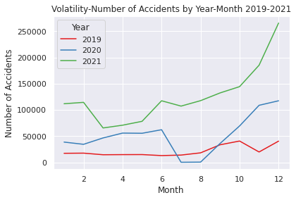
# Filter the data to year 2019-2021
US2019_2021 = US.loc[(US["Year"].isin([2019, 2020, 2021]))]
# Group the data by month and count the number of accidents in each month
UScounts2019_2021 = US2019_2021.groupby(["Year", "Month"]).size().reset_index(name="Accidents")
# Plot the data using Seaborn
sns.set(style="darkgrid")
sns.lineplot(data=UScounts2019_2021, x="Month", y="Accidents", hue="Year", palette="Set1")
plt.title("Volatility-Number of Accidents by Year-Month 2019-2021")
plt.xlabel("Month")
plt.ylabel("Number of Accidents")
plt.show()
# Show the data count as a pandas DataFrame in 2019-2021
print(UScounts2019_2021)
# Show volatility of whole periods 2016-2021
# Filter the data to year 2026-2021
US2016_2021 = US.loc[(US["Year"].isin([2016, 2017, 2018, 2019, 2020, 2021]))]
# Group the data by month and count the number of accidents in each month
UScounts2016_2021 = US2016_2021.groupby(["Year", "Month"]).size().reset_index(name="Accidents")
# Plot the data using Seaborn
sns.set(style="darkgrid")
sns.lineplot(data=UScounts2016_2021, x="Month", y="Accidents", hue="Year", palette="Set1")
plt.title("Volatility-Number of Accidents by Year-Month 2016-2021")
plt.xlabel("Month")
plt.ylabel("Number of Accidents")
plt.show()
# Show the data count as a pandas DataFrame in 2016-2021
print(UScounts2016_2021)
Output:クリックしてください
    Month  Accidents
0       1      17280
1       2      17597
2       3      14536
3       4      14763
4       5      14864
5       6      12942
6       7      13922
7       8      18161
8       9      33541
9      10      40694
10     11      19804
11     12      40511

    Month  Accidents
0       1      38681
1       2      34437
2       3      46604
3       4      55849
4       5      55504
5       6      62271
6       7        186
7       8        488
8       9      36050
9      10      69438
10     11     108873
11     12     117483

    Year  Month  Accidents
0   2019      1      17280
1   2019      2      17597
2   2019      3      14536
3   2019      4      14763
4   2019      5      14864
5   2019      6      12942
6   2019      7      13922
7   2019      8      18161
8   2019      9      33541
9   2019     10      40694
10  2019     11      19804
11  2019     12      40511
12  2020      1      38681
13  2020      2      34437
14  2020      3      46604
15  2020      4      55849
16  2020      5      55504
17  2020      6      62271
18  2020      7        186
19  2020      8        488
20  2020      9      36050
21  2020     10      69438
22  2020     11     108873
23  2020     12     117483
24  2021      1     111858
25  2021      2     114451
26  2021      3      65639
27  2021      4      70899
28  2021      5      78290
29  2021      6     117502
30  2021      7     107345
31  2021      8     117710
32  2021      9     132475
33  2021     10     144466
34  2021     11     185363
35  2021     12     265747

    Year  Month  Accidents
0   2016      1          7
1   2016      2        546
2   2016      3       2398
3   2016      4       5904
4   2016      5       7148
..   ...    ...        ...
67  2021      8     117710
68  2021      9     132475
69  2021     10     144466
70  2021     11     185363
71  2021     12     265747

[72 rows x 3 columns]
時系列解析・予測時に使用したEDAです。
2019年~2021年のパンデミック前とその後を見ると後者の方が多いことが分かります。
地域重大事故EDA
米国4地域・重大事故("Severity" "3", "4")に絞り込んだEDAです
基本的な流れは前述のEDAと同じになります。
# Step2 EDA for Serious Accidents (Severity 4 & 3, 2016-2021) following with Census Regions of United States
# (1) Import csv file and visualise basic information
from google.colab import drive
drive.mount('/content/drive')
import numpy as np
import pandas as pd
import matplotlib.pyplot as plt
import statsmodels.api as sm
import itertools
from pandas import datetime
import warnings
warnings.simplefilter('ignore')
import seaborn as sns
%matplotlib inline
USRD= pd.read_csv("/content/drive/MyDrive/Drivefolder/US_Accidents_Dec21_updated.csv")
# Census 4Regions of the United States
print("https://www.census.gov/programs-surveys/economic-census/guidance-geographies/levels.html")
print("Reffering to above")
from PIL import Image
img = Image.open("/content/drive/MyDrive/Drivefolder/Census_RegionUS.png")
img.show()
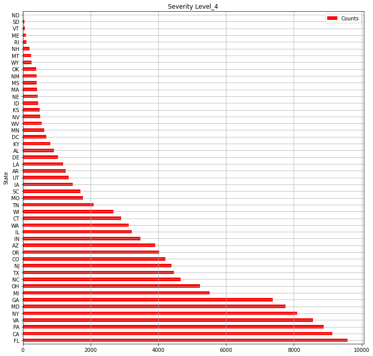
# Visualisation of High Severity (Level3-4) accidents in 2016-2021
# Numbers of the states where level 4 accidents occured in 2016-2021
print("【Severity_4】Numbers of the states where level 4 accidents occuredin 2016-2021")
# Severity4- Select out related columns out of whole data and organise the data
USsv = USRD.loc[:,["ID","State","Severity"]]
print(USsv.shape)
USsv4 = USsv.query("Severity == 4")
print(USsv4.shape)
USsv4_c = USsv4.groupby("State").count()["ID"]
USlv4= pd.DataFrame(USsv4_c).sort_values("ID", ascending=False)
USlv4.columns = ["Counts"]
print(USlv4.shape)
# Numbers of Level4 accidents in all the states
USlv4.plot(kind="barh",colormap='hsv',title="Severity Level_4",grid=True,legend="legend",color="red",figsize=(12,12))
#Numbers of the states where level 3 accidents occured in 2016-2021
print("【Severity_3】Numbers of the states where level 3 accidents occured in 2016-2021")
# Severity3- Select out related columns out of whole data and organise the data
USsv_2 = USRD.loc[:,["ID","State","Severity"]]
print(USsv_2.shape)
USsv3 = USsv_2.query("Severity == 3")
print(USsv3.shape)
print("Numbers of the states where level 4 accidents occured")
USsv3_c = USsv3.groupby("State").count()["ID"]
USlv3= pd.DataFrame(USsv3_c).sort_values("ID", ascending=False)
#print(pd.DataFrame(USlv3))
USlv3.columns = ["Counts"]
print(USlv3.shape)
# Numbers of Severity4 accidents in all the states
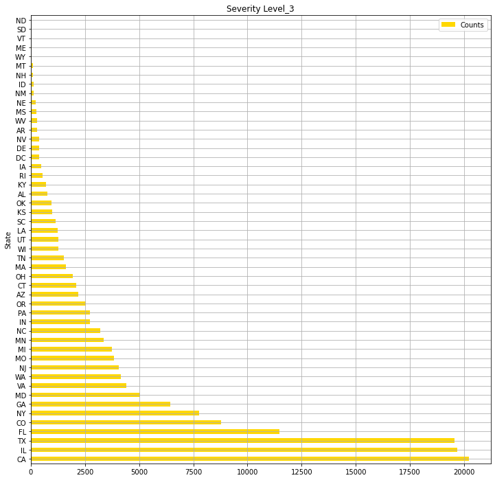
USlv3.plot(kind="barh",colormap='hsv',title="Severity Level_3",grid=True,legend="legend",color="gold",figsize=(12,12))
Output:クリックしてください
https://www.census.gov/programs-surveys/economic-census/guidance-geographies/levels.html
Reffering above
【Severity_4】Numbers of the states where level 4 accidents occuredin 2016-2021
(2845342, 3)
(131193, 3)
(49, 1)
【Severity_3】Numbers of the states where level 3 accidents occured in 2016-2021
(2845342, 3)
(155105, 3)
Numbers of the states where level 4 accidents occured
(49, 1)
<Axes: title={'center': 'Severity Level_3'}, ylabel='State'>
・米国4地域(Python Imaging Libraryを使用)

・各州の"Severity" "4"事故件数の総数
・各州の"Severity" "3"事故件数の総数
# (2) Organaise the basic data for EDA in 4 Region

# Select out the data of each Census Region

# Northeast-9 States
Northeast = USRD.query('State in ["ME","NH","VT","MA","CT","RI","NY","NJ","PA"]')
print("Northeast-9 States")
print(Northeast.shape)

# Midwest-12 States
Midwest = USRD.query('State in ["OH","MI","IN","WI","IL","MN","IA","MO","ND","SD","NE","KS"]')
print("Midwest- 12 States")
print(Midwest.shape)

# South-17 States
South = USRD.query('State in ["DE","MD","DC","WV","VA","NC","SC","GA","FL","KY","TN","AL","MS","AR","LA","OK","TX"]')
print("South-17 States")
print(South.shape)

# West-11 States
West = USRD.query('State in ["MT","WY","CO","NM","ID","UT","AZ","NV","WA","OR","CA"]')
print("West-11 States")
print(West.shape)
Output:クリックしてください
Northeast-9 States
(307955, 47)
Midwest- 12 States
(295340, 47)
South-17 States
(1122182, 47)
West-11 States
(1119865, 47)
Pandas quey()メソッドを使用して米国全体から4地域("Northeast","Midwest","South","West")にデータを分けています。
# (3) EDA and Visualisation for 4 Region 2016-2021
# Numbers of Severity 4-3 and the sum in 4 Region

# Extract data of Severity 4-3 from each region data

# Northeast Region
Northeast4 = Northeast.query("Severity == 4")
Northeast3 = Northeast.query("Severity == 3")
Northeast4 = Northeast4.groupby('Severity').count()['ID']
Northeast3 = Northeast3.groupby('Severity').count()['ID']
Northeast34 = int(Northeast4)+int(Northeast3)

# Midwest Region
Midwest4 = Midwest.query("Severity == 4")
Midwest3 = Midwest.query("Severity == 3")
Midwest4 = Midwest4.groupby('Severity').count()['ID']
Midwest3 = Midwest3.groupby('Severity').count()['ID']
Midwest34 = int(Midwest4)+int(Midwest3)

# South Region
South4 = South.query("Severity == 4")
South3 = South.query("Severity == 3")
South4 = South4.groupby('Severity').count()['ID']
South3 = South3.groupby('Severity').count()['ID']
South34 = int(South4)+int(South3)

# West Region
West4 = West.query("Severity == 4")
West3 = West.query("Severity == 3")
West4 = West4.groupby('Severity').count()['ID']
West3 = West3.groupby('Severity').count()['ID']
West34 = int(West4)+int(West3)


# Severity4- Numbers of accidents
sns.set(style="darkgrid")
def add_value_label(x_list,y_list):
    for i in range(0, len(x_list)):
        plt.text(i,y_list[i]/4,y_list[i], ha="center")

x = [0, 1, 2, 3]
y = [25152, 24950, 53468, 27623]
labels = ["Northeast","Midwest","South","West"]
cm = plt.get_cmap("Spectral")
color_maps = [cm(0.1), cm(0.3), cm(0.5), cm(0.7), cm(0.9)]
plt.figure(dpi=100, figsize=(8,3))
plt.bar(x, y, tick_label=labels, color="red", edgecolor='black')
add_value_label(x,y)
plt.legend(["Severity4 numbers in 4 Region"])
plt.title("Severity_Level 4 accindens in 4 Region ",size=15,color="red",)
plt.xlabel('')
plt.ylabel('Numbere of Severity4_accidents')
plt.show()


# Severity3- Numbers of accidents
def add_value_label(x_list,y_list):
    for i in range(0, len(x_list)):
        plt.text(i,y_list[i]/4,y_list[i], ha="center")

x = [0, 1, 2, 3]
y = [18922, 38226, 58033, 39924]
labels = ["Northeast","Midwest","South","West"]
cm = plt.get_cmap("Spectral")
color_maps = [cm(0.1), cm(0.3), cm(0.5), cm(0.7), cm(0.9)]
plt.figure(dpi=100, figsize=(8,3))
plt.bar(x, y, tick_label=labels, color="orange", edgecolor='black')
add_value_label(x,y)
plt.legend(["Severity3 numbers in 4 Region"])
plt.title("Severity_Level 3 accindens in 4 Region ",size=15,color="orange",)
plt.xlabel('')
plt.ylabel('Numbere of Severity3_accidents')
plt.show()


# Serious accidents(Serverity4&3-sum) numbers in 4 region
def add_value_label(x_list,y_list):
    for i in range(0, len(x_list)):
        plt.text(i,y_list[i]/4,y_list[i], ha="center")

x = [0, 1, 2, 3]
y = [44074, 63176, 111501, 67547]
labels = ["Northeast","Midwest","South","West"]
cm = plt.get_cmap("Spectral")
color_maps = [cm(0.1), cm(0.3), cm(0.5), cm(0.7), cm(0.9)]
plt.figure(dpi=100, figsize=(8,3))
plt.bar(x, y, tick_label=labels, color="pink", edgecolor='black')
add_value_label(x,y)
plt.legend(["Serious Accidents in 4 Region"])
plt.title("Serious Accidents(Total accidents of Severity4 & 3) in 4 Region ",size=15,color="purple",)
plt.xlabel('')
plt.ylabel('Numbere of Serious_accidents')
plt.show()


# Ratio of Serious accidents(Serverity4&3-sum)
labels = ["Northeast","Midwest","South","West"]
sizes = np.array([44074, 63176, 111501, 67547])
explode = (0.05,0,0.05,0)
plt.figure(dpi=100, figsize=(6,6))
plt.pie(sizes, labels=labels, explode=explode, shadow=True,autopct = '%1.1f%%')
plt.title("Ratio of Serious Accidents, Severity4 & 3 in 4 Region",size=20, color="red")
plt.show()
・4地域それぞれの重大事故"Severity""3","4"の割合を可視化
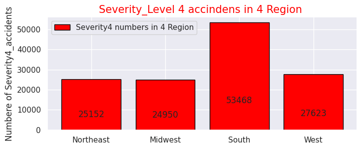
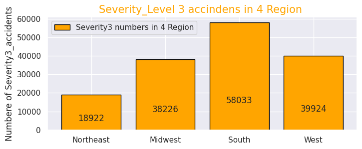
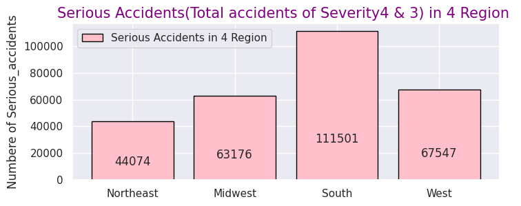
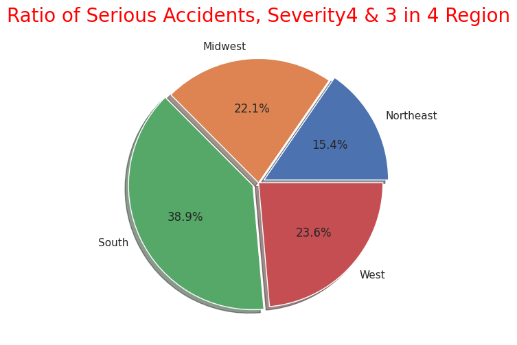
4地域の事故の交通に与える影響度数は前述の米国全体と同様に"Severity" "2"がほとんどなので、重大事故のみに絞り込みました。
事故総数ではカリフォルニア州(西部)、フロリダ州(南部)で半数を占めていましたが重大事故件数も西部と南部で半数以上を占めているので、事故件数の母数が多い地域ほど重大事故件数の件数も多く相関性があることが分かります。
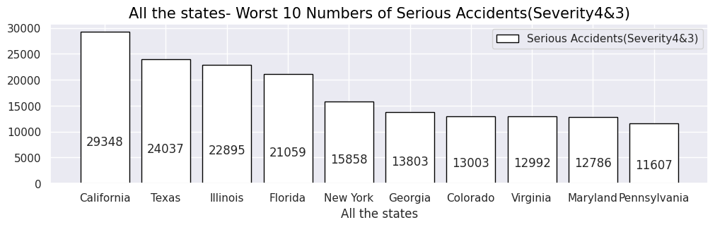
# Organise the data for Numbers of Serious accidents(Severity4&3) in cities of 4 region
# all over the 4 region
Region43=USRD.query("Severity in [4,3]")
Region43p=Region43["State"].value_counts().head(10)
print(Region43p.head(10))
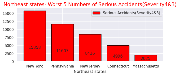
# Northeast-states
Northeast43 = Northeast.query("Severity in [4,3]")
Northeast43p= Northeast43["State"].value_counts().head(5)
print(Northeast43p.head(5))
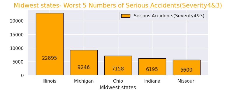
# Midwest-states
Midwest43 = Midwest.query("Severity in [4,3]")
Midwest43p= Midwest43["State"].value_counts().head(5)
print(Midwest43p.head(5))
# South-states
South43 = South.query("Severity in [4,3]")
South43p= South43["State"].value_counts().head(5)
print(South43p.head(5))
# West-states
West43 = West.query("Severity in [4,3]")
West43p= West43["State"].value_counts().head(5)
print(West43p.head(5))
Output:クリックしてください
CA    29348
TX    24037
IL    22895
FL    21059
NY    15858
GA    13803
CO    13003
VA    12992
MD    12786
PA    11607
Name: State, dtype: int64
NY    15858
PA    11607
NJ     8436
CT     4996
MA     2025
Name: State, dtype: int64
IL    22895
MI     9246
OH     7158
IN     6195
MO     5600
Name: State, dtype: int64
TX    24037
FL    21059
GA    13803
VA    12992
MD    12786
Name: State, dtype: int64
CA    29348
CO    13003
WA     7294
OR     6550
AZ     6089
Name: State, dtype: int64
# All the states in 4 region
# All the states- Worst 10 Numbers of Serious Accidents(Severity4&3)
sns.set(style="darkgrid")
def add_value_label(x_list,y_list):
for i in range(0, len(x_list)):
plt.text(i,y_list[i]/4,y_list[i], ha="center")
x = [0, 1, 2, 3, 4, 5, 6, 7, 8, 9]
y = [29348, 24037, 22895, 21059, 15858, 13803, 13003, 12992, 12786, 11607]
labels = ["California","Texas","Illinois","Florida","New York","Georgia","Colorado","Virginia","Maryland","Pennsylvania"]
cm = plt.get_cmap("Spectral")
color_maps = [cm(0.1), cm(0.3), cm(0.5), cm(0.7), cm(0.9)]
plt.figure(dpi=100, figsize=(12,3))
plt.bar(x, y, tick_label=labels, color="white", edgecolor='black')
add_value_label(x,y)
plt.legend(["Serious Accidents(Severity4&3)"])
plt.title("All the states- Worst 10 Numbers of Serious Accidents(Severity4&3)",size=15,color="black",)
plt.xlabel('All the states')
plt.ylabel('')
plt.show()
# Northeast- Worst 5 Numbers of Serious Accidents(Severity4&3)
x = [0, 1, 2, 3, 4]
y = [15858, 11607, 8436, 4996, 2025]
labels = ["New York","Pennsylvania","New Jersey","Connecticut","Massachusetts"]
cm = plt.get_cmap("Spectral")
color_maps = [cm(0.1), cm(0.3), cm(0.5), cm(0.7), cm(0.9)]
plt.figure(dpi=100, figsize=(8,3))
plt.bar(x, y, tick_label=labels, color="red", edgecolor='black')
add_value_label(x,y)
plt.legend(["Serious Accidents(Severity4&3)"])
plt.title("Northeast states- Worst 5 Numbers of Serious Accidents(Severity4&3)",size=15,color="red",)
plt.xlabel('Northeast states')
plt.ylabel('')
plt.show()
# Midwest- Worst 5 Numbers of Serious Accidents(Severity4&3)
x = [0, 1, 2, 3, 4]
y = [22895, 9246, 7158, 6195, 5600]
labels = ["Illinois","Michigan","Ohio","Indiana","Missouri"]
cm = plt.get_cmap("Spectral")
color_maps = [cm(0.1), cm(0.3), cm(0.5), cm(0.7), cm(0.9)]
plt.figure(dpi=100, figsize=(8,3))
plt.bar(x, y, tick_label=labels, color="orange", edgecolor='black')
add_value_label(x,y)
plt.legend(["Serious Accidents(Severity4&3)"])
plt.title("Midwest states- Worst 5 Numbers of Serious Accidents(Severity4&3)",size=15,color="orange",)
plt.xlabel('Midwest states')
plt.ylabel(' ')
plt.show()
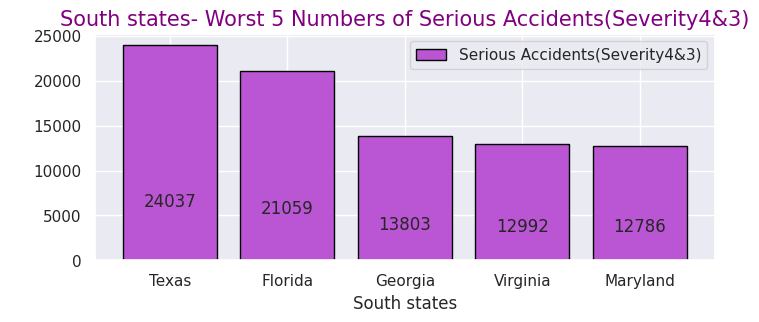
# South- Worst 5 Numbers of Serious Accidents(Severity4&3)
x = [0, 1, 2, 3, 4]
y = [24037, 21059, 13803, 12992, 12786]
labels = ["Texas","Florida","Georgia","Virginia","Maryland"]
cm = plt.get_cmap("Spectral")
color_maps = [cm(0.1), cm(0.3), cm(0.5), cm(0.7), cm(0.9)]
plt.figure(dpi=100, figsize=(8,3))
plt.bar(x, y, tick_label=labels, color="mediumorchid", edgecolor='black')
add_value_label(x,y)
plt.legend(["Serious Accidents(Severity4&3)"])
plt.title("South states- Worst 5 Numbers of Serious Accidents(Severity4&3)",size=15,color="purple",)
plt.xlabel('South states')
plt.ylabel(' ')
plt.show()
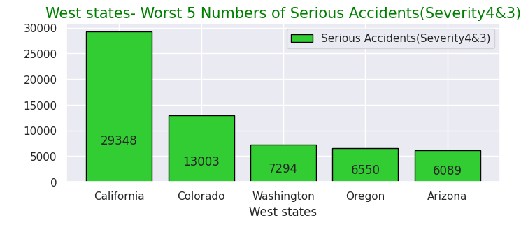
# West- Worst 5 Numbers of Serious Accidents(Severity4&3)
x = [0, 1, 2, 3, 4]
y = [29348, 13003, 7294, 6550, 6089]
labels = ["California","Colorado","Washington","Oregon","Arizona"]
cm = plt.get_cmap("Spectral")
color_maps = [cm(0.1), cm(0.3), cm(0.5), cm(0.7), cm(0.9)]
plt.figure(dpi=100, figsize=(8,3))
plt.bar(x, y, tick_label=labels, color="limegreen", edgecolor='black')
add_value_label(x,y)
plt.legend(["Serious Accidents(Severity4&3)"])
plt.title("West states- Worst 5 Numbers of Serious Accidents(Severity4&3)",size=15,color="green",)
plt.xlabel('West states')
plt.ylabel(' ')
plt.show()
Output:
・全州で重大事故件数が多い州ワースト10
・北東部での重大事故件数が多い州ワースト5
・中西部での重大事故件数が多い州ワースト5
・南部での重大事故件数が多い州ワースト5
・西部での重大事故件数が多い州ワースト5
# Northeast Severity4&3 as to condion
Northeast43 = Northeast.query("Severity in [4,3]")
# Nottheast Severity4&3 with means of each caused factor
Northeast43condi = Northeast43.loc[:, ['State','ID','Temperature(F)','Humidity(%)','Pressure(in)','Wind_Speed(mph)','Weather_Condition','Visibility(mi)']]
Northeast43fact= Northeast43condi.mean().round(1)
print(Northeast43fact)
# Northeast Severity4&3 Weather tendency
Northeast43_weather=Northeast43condi["Weather_Condition"].value_counts()
print(Northeast43_weather.iloc[:30])

# Midwest Severity4&3 as to condion
Midwest43 = Midwest.query("Severity in [4,3]")
# Midwast Severity4&3 with means of each caused factor
Midwest43condi = Midwest.loc[:, ['State','ID','Temperature(F)','Humidity(%)','Pressure(in)','Wind_Speed(mph)','Weather_Condition','Visibility(mi)']]
Midwest43fact= Midwest43condi.mean().round(1)
print(Midwest43fact)
# Midwest Severity4&3 Weather tendency
Midwest43_weather=Midwest43condi["Weather_Condition"].value_counts()
print(Midwest43_weather.iloc[:30])

# South Severity4&3 as to condion
South43 = South.query("Severity in [4,3]")
# South Severity4&3 with means of each caused factor
South43condi = South43.loc[:, ['State','ID','Temperature(F)','Humidity(%)','Pressure(in)','Wind_Speed(mph)','Weather_Condition','Visibility(mi)']]
South43fact= South43condi.mean().round(1)
print(South43fact)
# South Severity4&3 Weather tendency
South43_weather=South43condi["Weather_Condition"].value_counts()
print(South43_weather.iloc[:30])

# West Severity4&3 as to condion
West43 = West.query("Severity in [4,3]")
# Nottheast Severity4&3 with means of each caused factor
West43condi = West43.loc[:, ['State','ID','Temperature(F)','Humidity(%)','Pressure(in)','Wind_Speed(mph)','Weather_Condition','Visibility(mi)']]
West43fact= West43condi.mean().round(1)
print(West43fact)
# West Severity4&3 Weather tendency
West43_weather=West43condi["Weather_Condition"].value_counts()
print(West43_weather.iloc[:30])

# Northeast others Severity4&3 sum
print(245+175+173+149+142+142+130+120+80+75+67+66+52+50+49+35+31+26+18)
# Midwest others Severity4&3 sum
print(2082+2057+1816+1563+1214+964+946+758+717+693+495+483+440+361+333+312+310+269+257)
# South others Severity4&3 sum
print(461+383+380+293+240+236+236+219+215+209+159+155+130+109+109+101+94+65+62)
# West others Severity4&3 sum
print(439+333+321+257+156+124+119+118+92+83+65+59+57+57+54+51+45+45+32)
Output:クリックしてください
Temperature(F)     55.5
Humidity(%)        66.0
Pressure(in)       29.8
Wind_Speed(mph)     8.9
Visibility(mi)      9.0
dtype: float64
Fair                       8498
Mostly Cloudy              6393
Clear                      6353
Overcast                   4706
Cloudy                     4591
Partly Cloudy              3786
Light Rain                 3018
Scattered Clouds           1695
Light Snow                 1055
Rain                        585
Fog                         541
Light Drizzle               245
Mostly Cloudy / Windy       175
Heavy Rain                  173
Snow                        149
Fair / Windy                142
Cloudy / Windy              142
Haze                        130
Light Rain / Windy          120
Heavy Snow                   80
Partly Cloudy / Windy        75
T-Storm                      67
Light Freezing Rain          66
Wintry Mix                   52
Drizzle                      50
Light Rain with Thunder      49
Thunder in the Vicinity      35
Thunder                      31
Heavy T-Storm                26
Mist                         18
Name: Weather_Condition, dtype: int64
Temperature(F)     47.9
Humidity(%)        69.2
Pressure(in)       29.3
Wind_Speed(mph)     9.3
Visibility(mi)      8.7
dtype: float64
Fair                            83419
Cloudy                          42900
Mostly Cloudy                   31005
Clear                           27288
Overcast                        21506
Partly Cloudy                   20873
Light Snow                      19076
Light Rain                      12680
Scattered Clouds                 7389
Fog                              2872
Rain                             2588
Fair / Windy                     2082
Haze                             2057
Snow                             1816
Cloudy / Windy                   1563
Light Snow / Windy               1214
Wintry Mix                        964
Light Drizzle                     946
Heavy Rain                        758
Mostly Cloudy / Windy             717
T-Storm                           693
Partly Cloudy / Windy             495
N/A Precipitation                 483
Light Rain with Thunder           440
Light Rain / Windy                361
Light Freezing Rain               333
Thunder in the Vicinity           312
Light Thunderstorms and Rain      310
Heavy Snow                        269
Haze / Windy                      257
Name: Weather_Condition, dtype: int64
Temperature(F)     66.7
Humidity(%)        69.0
Pressure(in)       29.8
Wind_Speed(mph)     8.0
Visibility(mi)      9.2
dtype: float64
Fair                            21108
Clear                           19948
Mostly Cloudy                   16975
Partly Cloudy                   10996
Overcast                         9907
Cloudy                           7910
Scattered Clouds                 6828
Light Rain                       5365
Rain                             1468
Fog                              1017
Heavy Rain                        683
Light Drizzle                     461
Light Snow                        383
Haze                              380
T-Storm                           293
Light Thunderstorms and Rain      240
Thunder in the Vicinity           236
Thunderstorm                      236
Light Rain with Thunder           219
Fair / Windy                      215
Thunder                           209
Heavy T-Storm                     159
Mostly Cloudy / Windy             155
Drizzle                           130
Heavy Thunderstorms and Rain      109
Cloudy / Windy                    109
Partly Cloudy / Windy             101
Thunderstorms and Rain             94
Mist                               65
Light Rain / Windy                 62
Name: Weather_Condition, dtype: int64
Temperature(F)     59.6
Humidity(%)        57.4
Pressure(in)       28.9
Wind_Speed(mph)     8.1
Visibility(mi)      9.9
dtype: float64
Clear                      17068
Fair                       12591
Mostly Cloudy               8397
Partly Cloudy               6275
Overcast                    5498
Cloudy                      4565
Light Rain                  2848
Scattered Clouds            2753
Light Snow                  1402
Haze                        1228
Rain                         491
Fog                          439
Smoke                        333
Fair / Windy                 321
Snow                         257
Mostly Cloudy / Windy        156
Heavy Rain                   124
Partly Cloudy / Windy        119
Cloudy / Windy               118
Light Drizzle                 92
Heavy Snow                    83
Light Freezing Fog            65
Showers in the Vicinity       59
Thunder in the Vicinity       57
Light Rain with Thunder       57
Light Rain / Windy            54
Wintry Mix                    51
Mist                          45
Light Snow / Windy            45
T-Storm                       32
Name: Weather_Condition, dtype: int64
1825
16070
3856
2507
# Weather conditions and Perceptical factors of Serious Accidents, Severity4 & 3 in 4 Region

# Weather conditons of Serious Accidents

# Northeast- Weather conditon Ratio of Serious Accidents, Severity4 & 3
labels= ["Fair", "Mostly Cloudy ", "Clear","Overcast","Cloudy","Partly Cloudy","Light Rain","Scattered Clouds",
         "Light Snow ", "Rain","Fog", "Others"]

sizes = np.array([8498,6393,6353,4706,4591,3786,3018,1695,1055,585,541,1825])
plt.figure(dpi=100, figsize=(10,10))
explode = (0.05,0,0.05,0)
# Create a pie chart
plt.pie(sizes, labels=labels,shadow=True,autopct = '%1.1f%%')
# Add a title
plt.title("Northeast- Weather conditon Ratio of Serious Accidents, Severity4&3",size=20, color="orange")
# Show the plot
plt.show()

# Midwest- Weather conditon Ratio of Serious Accidents, Severity4&3
labels= ["Fair","Cloudy", "Mostly Cloudy ","Clear","Overcast","Partly Cloudy","Light Snow ",
"Light Rain","Scattered Clouds","Fog","Rain","Others"]

sizes = np.array([83419,42900,31005,27288,21506,20873,19076,12680,7389,2872,2588,16070])
plt.figure(dpi=100, figsize=(10,10))
explode = (0.05,0,0.05,0)
# Create a pie chart
plt.pie(sizes, labels=labels,shadow=True,autopct = '%1.1f%%')
# Add a title
plt.title("Midwest- Weather conditon Ratio of Serious Accidents, Severity4&3",size=20, color="red")


# South- Weather conditon Ratio of Serious Accidents, Severity4&3
labels= ["Fair","Clear","Mostly Cloudy ","Partly Cloudy","Overcast","Cloudy","Scattered Clouds","Light Rain",
         "Rain","Fog","Heavy Rain","Others"]

sizes = np.array([21108,19948,16975,10996,9907,7910,6828,5365,1468,1017,683,3856])
plt.figure(dpi=100, figsize=(10,10))
explode = (0.05,0,0.05,0)
# Create a pie chart
plt.pie(sizes, labels=labels,shadow=True,autopct = '%1.1f%%')
# Add a title
plt.title("South- Weather conditon Ratio of Serious Accidents, Severity4&3",size=20, color="green")

# West- Weather conditon Ratio of Serious Accidents, Severity4&3
labels= ["Clear","Fair","Mostly Cloudy ","Partly Cloudy","Overcast","Cloudy","Light Rain","Scattered Clouds",
         "Light Snow","Haze","Rain","Others"]

sizes = np.array([17068,12591,8397,6275,5498,4565,2848,2753,1402,1228,491,2507])
plt.figure(dpi=100, figsize=(10,10))
explode = (0.05,0,0.05,0)
# Create a pie chart
plt.pie(sizes, labels=labels,shadow=True,autopct = '%1.1f%%')
# Add a title
plt.title("West- Weather conditon Ratio of Serious Accidents, Severity4&3",size=20, color="blue")

# Perceptical causes of Serious Accidents in 4Region
sns.set(style="darkgrid")
def add_value_label(x_list,y_list):
    for i in range(0, len(x_list)):
        plt.text(i,y_list[i]/4,y_list[i], ha="center")

# Northeast
x = [0, 1, 2, 3, 4]
y = [55.5, 66.0, 29.8,8.9,9.0]
labels = ["Temperature(F)","Humidity(%)","Pressure(in)","Wind_Speed(mph)","Visibility(mi)"]

#Create a colour map
cm = plt.get_cmap("Spectral")
color_maps = [cm(0.1), cm(0.3), cm(0.5), cm(0.7), cm(0.9)]
plt.figure(dpi=100, figsize=(8,3))
plt.bar(x, y, tick_label=labels, color="red", edgecolor='black')
add_value_label(x,y)
plt.legend(["Average Value of each cause"])
plt.title("Northeast- Perceptical Causes of Serious Accident -Average Values",size=15,color="red",)
plt.xlabel('Each Factor')
plt.ylabel('')
plt.show()

# Midwest
x = [0, 1, 2, 3, 4]
y = [47.9, 69.2, 29.3, 9.3, 8.7]
labels = ["Temperature(F)","Humidity(%)","Pressure(in)","Wind_Speed(mph)","Visibility(mi)"]

#Create a colour map
cm = plt.get_cmap("Spectral")
color_maps = [cm(0.1), cm(0.3), cm(0.5), cm(0.7), cm(0.9)]
plt.figure(dpi=100, figsize=(8,3))
plt.bar(x, y, tick_label=labels, color="orange", edgecolor='black')
add_value_label(x,y)
plt.legend(["Average Value of each cause"])
plt.title("Midwest- Perceptical Causes of Serious Accident -Average Values",size=15,color="orange",)
plt.xlabel('Each Factor')
plt.ylabel(' ')
plt.show()

# South
x = [0, 1, 2, 3, 4]
y = [66.7, 69.0, 29.8, 8.0, 9.2]
labels = ["Temperature(F)","Humidity(%)","Pressure(in)","Wind_Speed(mph)","Visibility(mi)"]

#Create a colour map
cm = plt.get_cmap("Spectral")
color_maps = [cm(0.1), cm(0.3), cm(0.5), cm(0.7), cm(0.9)]
plt.figure(dpi=100, figsize=(8,3))
plt.bar(x, y, tick_label=labels, color="mediumorchid", edgecolor='black')
add_value_label(x,y)
plt.legend(["Average Value of each cause"])
plt.title("South- Perceptical Causes of Serious Accident -Average Values",size=15,color="mediumorchid",)
plt.xlabel('Each Factor')
plt.ylabel(' ')
plt.show()

# West
x = [0, 1, 2, 3, 4]
y = [59.6, 57.4, 28.9, 8.1, 9.9]
labels = ["Temperature(F)","Humidity(%)","Pressure(in)","Wind_Speed(mph)","Visibility(mi)"]

#Create a colour map
cm = plt.get_cmap("Spectral")
color_maps = [cm(0.1), cm(0.3), cm(0.5), cm(0.7), cm(0.9)]
plt.figure(dpi=100, figsize=(8,3))
plt.bar(x, y, tick_label=labels, color="green", edgecolor='black')
add_value_label(x,y)
plt.legend(["Average Value of each cause"])
plt.title("West- Perceptical Causes of Serious Accident -Average Values",size=15,color="green",)
plt.xlabel('Each Factor')
plt.ylabel(' ')
plt.show()
・4地域それぞれの重大事故発生時の天候の割合
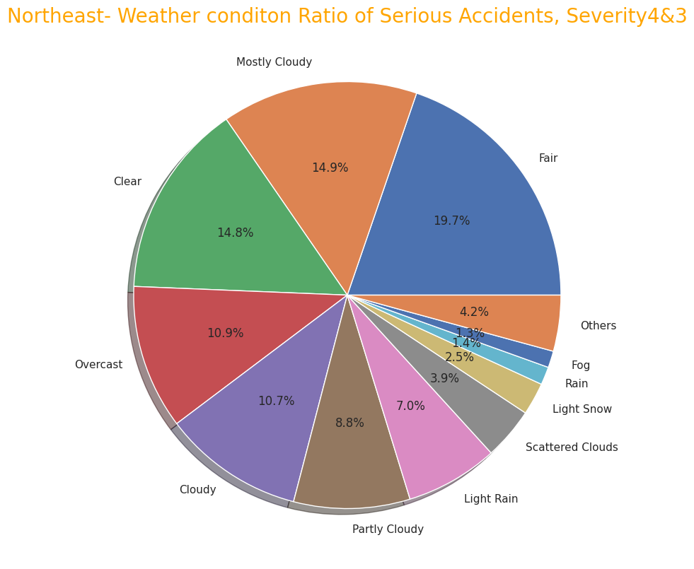
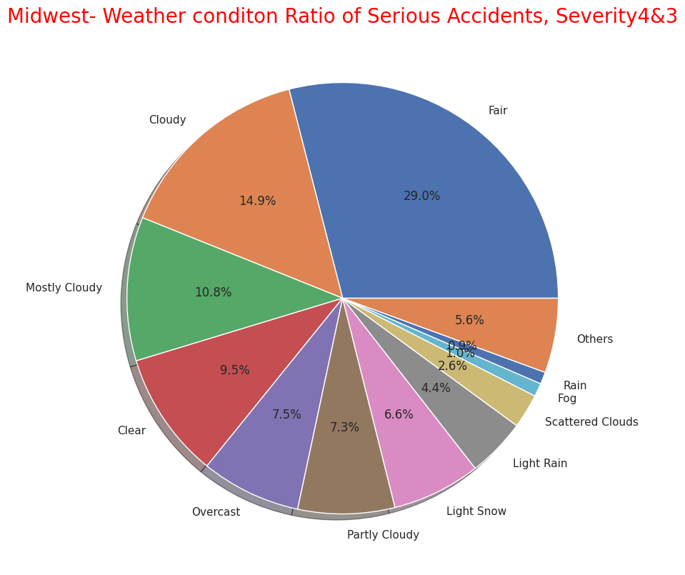
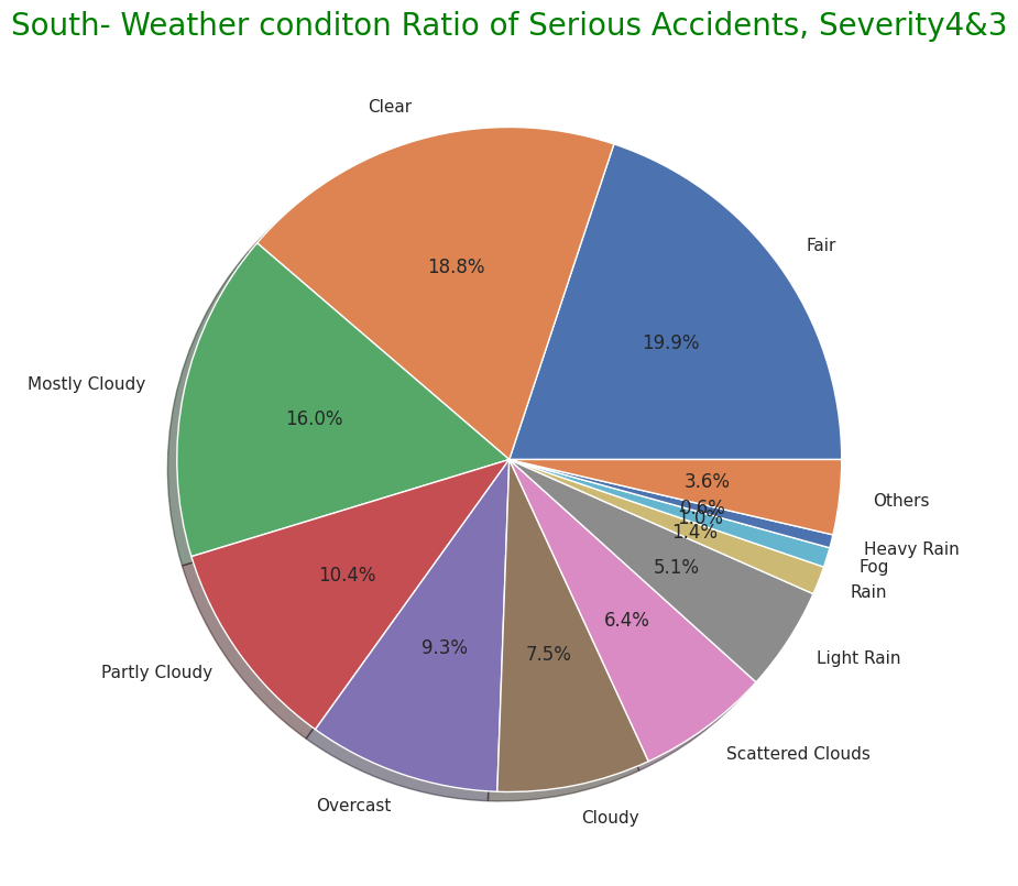
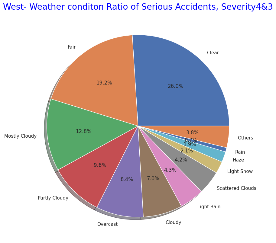
・4地域それぞれの重大事故発生時の気温・湿度・気圧など知覚的要因
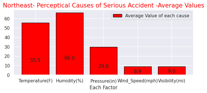
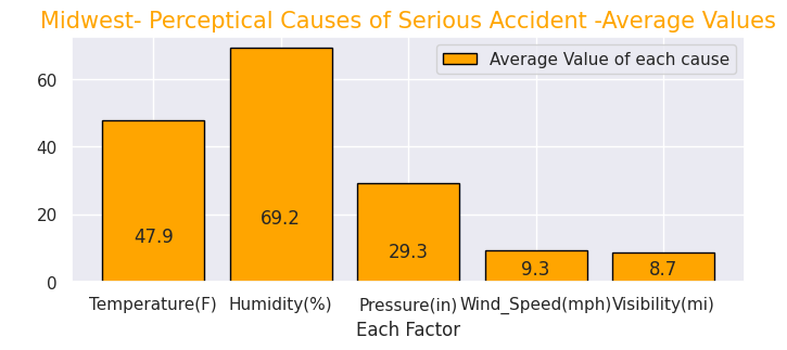

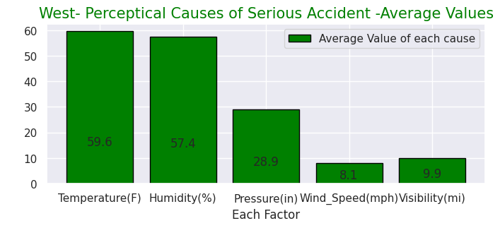
4地域ごとでの重大事故件数の天候・知覚的要因に関して、天候ではやはり快晴や晴れ、曇りが多い点は全体と共通していますが北東部、中西部では「小雨」や「軽い雪」の日が約10%を占めることが分かります。南部ではごく少数ですが「豪雨」があり西部では「もや(ちりや霧などの要因で視界が悪くなる)があるように各地域で天候に関する特徴があることが分かります。」
一方、知覚的要因では各地域で大きな差はあまりないように見えますが、内陸で北側に位置する中西部では重大事故発生日の平均気温が他地域と比べると大幅に低いです。
# Northeast-Map showing the locations where the accidents occured
# (4) Maps in 4region whire severe accidents occured
# import folium library
import folium
from folium.plugins import HeatMap

# Display map
Northeastmap= Northeast.sample(frac=0.25)
Northeastmap2 = list(zip(Northeastmap['Start_Lat'], Northeastmap['Start_Lng']))
map=folium.Map(location=[43.000000, -75.000000],zoom_start=5,tiles="Stamen Terrain")
HeatMap(Northeastmap2).add_to(map)
map

# Midwest-Map showing the locations where the accidents occured

Midwestmap= Midwest.sample(frac=0.25)
Midwest2 = list(zip(Midwestmap['Start_Lat'], Midwestmap['Start_Lng']))
map=folium.Map(location=[42.032974, -93.581543],zoom_start=5,tiles="Stamen Terrain")
HeatMap(Midwest2).add_to(map)
map

# South-Map showing the locations where the accidents occured

Southmap= South.sample(frac=0.25)
South2 = list(zip(Southmap['Start_Lat'], Southmap['Start_Lng']))
map=folium.Map(location=[32.318230, -86.902298],zoom_start=5,tiles="Stamen Terrain")
HeatMap(South2).add_to(map)
map

# West-Map showing the locations where the accidents occured

Westmap= West.sample(frac=0.25)
West2 = list(zip(Westmap['Start_Lat'], Westmap['Start_Lng']))
map=folium.Map(location=[39.419220, -111.950684],zoom_start=5,tiles="Stamen Terrain")
HeatMap(West2).add_to(map)
map
・北東部の重大事故マップ
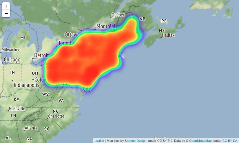
・中西部の重大事故マップ
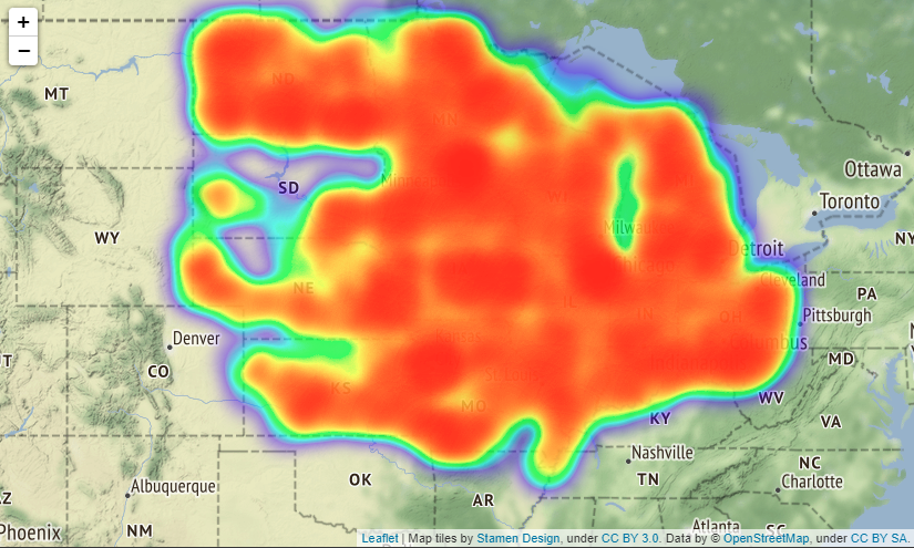
・南部の重大事故マップ
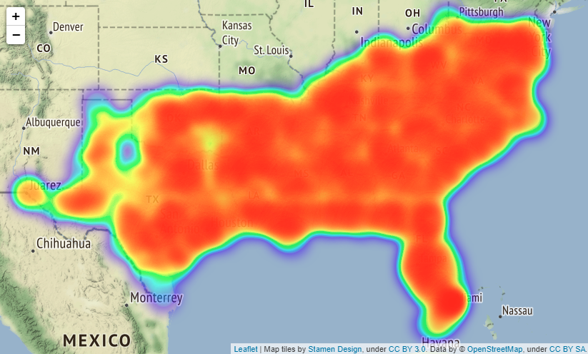
・西部の重大事故マップ
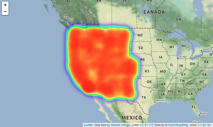
US_place=USRD.query("Severity in [4,3]")

US_place43=US_place.loc[:,['Amenity', 'Bump', 'Crossing', 'Give_Way', 'Junction', 'No_Exit', 'Railway', 'Roundabout', 'Station', 'Stop', 'Traffic_Calming', 'Traffic_Signal', 'Turning_Loop']]

# Accidents near Amenity shop
USP1=US_place43["Amenity"].value_counts(True,dropna=())
# Accidents at Bump
USP2=US_place43["Bump"].value_counts(True,dropna=())
# Accidents at Crossing
USP3=US_place43["Crossing"].value_counts(True,dropna=())
# Accidents at Give_Way
USP4=US_place43["Give_Way"].value_counts(True,dropna=())
# Accidents at Junction
USP5=US_place43["Junction"].value_counts(True,dropna=())
# Accidents at No_Exit
USP6=US_place43["No_Exit"].value_counts(True,dropna=())
# Accidents at No_Exit
USP7=US_place43["Railway"].value_counts(True,dropna=())
# Accidents at Roundabout
USP8=US_place43["Roundabout"].value_counts(True,dropna=())
# Accidents near Station
USP9=US_place43["Station"].value_counts(True,dropna=())
# Accidents at Stop
USP10=US_place43["Stop"].value_counts(True,dropna=())
# Accidents at Traffic_Calming
USP11=US_place43["Traffic_Calming"].value_counts(True,dropna=())
# Accidents at Traffic_Signal
USP12=US_place43["Traffic_Signal"].value_counts(True,dropna=())
# Accidents at Turning_Loop
USP13=US_place43["Turning_Loop"].value_counts(True,dropna=())

# Plot ratio of Accidentical places in "Severity3,4"
labels = ['Amenity', 'Bump', 'Crossing', 'Give_Way', 'Junction', 'No_Exit', 'Railway', 'Roundabout', 'Station', 'Stop', 'Traffic_Calming', 'Traffic_Signal', 'Turning_Loop']
sizes = np.array([0.008669, 0.000143, 0.054789, 0.003702, 0.161025, 0.001533, 0.000024, 0.016196, 0.014562, 0.000402, 0.10465, 0.093227, 0])
explode = (0.05,0,0.05,0,0.05,0,0.05,0,0.05,0,0.05,0,0.05)
plt.figure(dpi=150, figsize=(9,9))
# Create a pie chart
plt.pie(sizes, labels=labels, explode=explode, shadow=True,autopct = '%1.1f%%')
# Add a title
plt.title('Accident Places and the ratio in "Severity3,4"',size=20, color="green")
# Show the plot
plt.show()
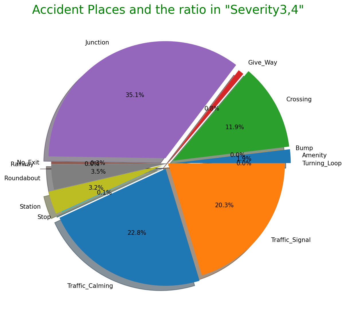
# Organaise the data for timely and monthly based
Region43['Start_Time'].value_counts().head()
Region43.Start_Time = pd.to_datetime(Region43.Start_Time)
Region43.Start_Time
Region43h =Region43.Start_Time.dt.hour.value_counts()
Region43m=Region43.Start_Time.dt.hour.value_counts()
Region43month=Region43.Start_Time.dt.month_name().value_counts()

# plot time based bar chart
def add_value_label(x_list,y_list):
    for i in range(0, len(x_list)):
        plt.text(i,y_list[i]/4,y_list[i], ha="center")
sns.set(style="darkgrid")
plt.figure(figsize=(13,8))
sns.color_palette("rocket")
sns.barplot(x=Region43h.index,y=Region43h)
plt.title("Sevrity4&3 2016-2021 Time when accidents occured",size=20,color="blue")
plt.xlabel("Occurence Time")
plt.ylabel("Amount of Accidents")

# plot monthly based bar chart
plt.figure(figsize=(13,8))
sns.barplot(x=Region43month.index,y=Region43month)
plt.title("Sevrity4&3 2016-2021 months when accidents occured",size=20,color="red")
plt.xlabel("Occurence months")
plt.ylabel("Amount of Accidents")
・重大事故発生時間
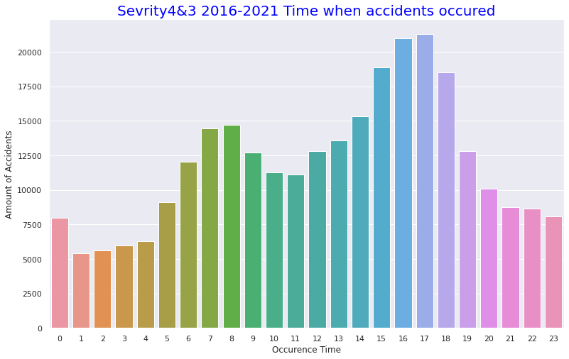
・重大事故発生月
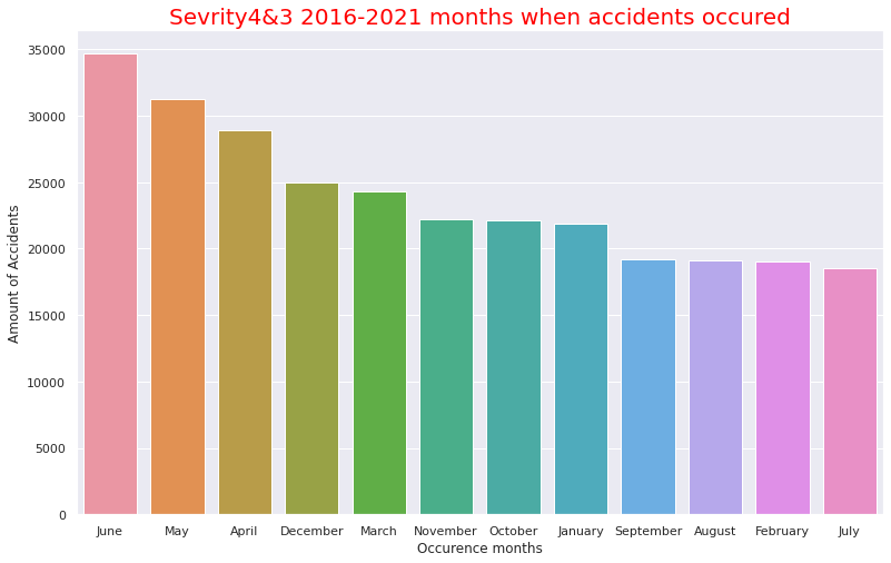
重大事故が発生する場所は概ね全体の割合と同じですが、全体では0.2%であった"Traffic_calming"(減速指示の標識がある道路)は22.8%に跳ね上がっていることは特徴的です。
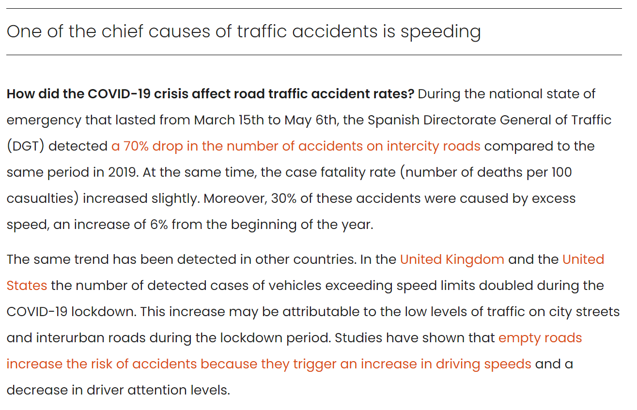
(引用元)
https://www.isglobal.org/en/healthisglobal/-/custom-blog-portlet/-por-que-se-continuaron-produciendo-accidentes-de-trafico-en-las-ciudades-durante-el-confinamiento-y-como-prevenirlos-/7793677/0
上記は"Barcelona Institute for Global Health (ISGlobal)"というスペインの機関で掲載された記事ですが、コロナウイルス蔓延により交通量が減ると、道路が空くため運転手がスピードを上げてしまう要因となるとの旨が説明されています。法定速度違反で検挙された数は英国や米国で2倍となったこともあげられています。
また、重大事故発生時間は全体事故発生件数と同じく13時~17時頃が多いようですが、月ごとのデータを見ると、4月~6月が最も多く、全体事故件数が10月~12月が多かったことに比べると気温が高くなる時期に重大事故が起きやすくなっていることが分かります。
# Comfirm volatility of the accidents from 2016 to 2021 in Severity 3 and 4

USregion_severity= pd.read_csv("/content/drive/MyDrive/Drivefolder/US_Accidents_Dec21_updated.csv")

# Convert the Start_Time column to a datetime object and extract the year and month
USregion_severity["Start_Time"] = pd.to_datetime(USregion_severity["Start_Time"])
USregion_severity["Year"] = USregion_severity["Start_Time"].dt.year
USregion_severity["Month"] = USregion_severity["Start_Time"].dt.month

# Filter the data to include only Severity 3 and 4 from the year 2019
Region2019 = USregion_severity.loc[(USregion_severity["Severity"].isin([3, 4])) & (USregion_severity["Year"] == 2019)]

# Group the data by month and count the number of accidents in each month
counts2019 = Region2019.groupby("Month").size().reset_index(name="Accidents")

# Plot the data
sns.set(style="darkgrid")
sns.lineplot(data=counts2019, x="Month", y="Accidents")
plt.title("Severity3&4- Number of Accidents by Month in 2019")
plt.xlabel("Month")
plt.ylabel("Number of Accidents")
plt.show()

# Show the data count in 2019
print(counts2019)

# Filter the data to include only Severity 3 and 4 from the year 2020
Region2020 = USregion_severity.loc[(USregion_severity["Severity"].isin([3, 4])) & (USregion_severity["Year"] == 2020)]

# Group the data by month and count the number of accidents in each month
counts2020 = Region2020.groupby("Month").size().reset_index(name="Accidents")

# Plot the data using Seaborn
sns.set(style="darkgrid")
sns.lineplot(data=counts2020, x="Month", y="Accidents")
plt.title("Severity3&4- Number of Accidents by Month in 2020")
plt.xlabel("Month")
plt.ylabel("Number of Accidents")
plt.show()

# Show the data count in 2020
print(counts2020)

# Filter the data to include only Severity 3 and 4 from the year 2021
Region2021 = USregion_severity.loc[(USregion_severity["Severity"].isin([3, 4])) & (USregion_severity["Year"] == 2021)]

counts2021 = Region2021.groupby("Month").size().reset_index(name="Accidents")

# Plot the data
sns.lineplot(data=counts2021, x="Month", y="Accidents")
plt.title("Severity3&4- Number of Accidents by Month in 2021")
plt.xlabel("Month")
plt.ylabel("Number of Accidents")
plt.show()

# Show the data count in 2021
print(counts2021)

# Filter the data to include only Severity 3 and 4 from the years 2019-2021
Region2019_2021 = USregion_severity.loc[(USregion_severity["Severity"].isin([3, 4])) & (USregion_severity["Year"].isin([2019, 2020, 2021]))]

# Group the data by month and count the number of accidents in each month
counts2019_2021 = Region2019_2021.groupby("Month").size().reset_index(name="Accidents")

# Plot the data
sns.set(style="darkgrid")
sns.lineplot(data=counts2019_2021, x="Month", y="Accidents")
plt.title("Severity3&4- Number of Accidents by Month in 2019_2021")
plt.xlabel("Month")
plt.ylabel("Number of Accidents")
plt.show()

# Filter the data to include only Severity 3 and 4 from the years 2016 to 2021
Region2016_2021 = USregion_severity.loc[(USregion_severity["Severity"].isin([3, 4])) & (USregion_severity["Year"].between(2016, 2021))]

# Group the data by year and month and count the number of accidents in each year-month
counts2016_2021 = Region2016_2021.groupby(["Year", "Month"]).size().reset_index(name="Accidents")

# Plot the data
sns.set(style="darkgrid")
sns.lineplot(data=counts2016_2021, x="Month", y="Accidents", hue="Year", palette="Set1")
plt.title("Severity3&4-Volatility-Number of Accidents by Year-Month 2016-2021")
plt.xlabel("Month")
plt.ylabel("Number of Accidents")
plt.show()

# Show the data count
print(counts2016_2021)
Output:クリックしてください
    Month  Accidents
0       1       6477
1       2       5218
2       3       4961
3       4       5043
4       5       5477
5       6       4633
6       7       4530
7       8       4390
8       9       3410
9      10       3931
10     11       2211
11     12       3575

    Month  Accidents
0       1       3799
1       2       3085
2       3       8307
3       4      12947
4       5      14175
5       6      16827
6       7         56
7       8        128
8       9       1038
9      10       1299
10     11       1669
11     12       1653

    Month  Accidents
0       1       1651
1       2       1807
2       3       1353
3       4       1429
4       5       1400
5       6       1780
6       7       1456
7       8       1780
8       9       2433
9      10       2491
10     11       2960
11     12       3492

    Year  Month  Accidents
0   2019      1       6477
1   2019      2       5218
2   2019      3       4961
3   2019      4       5043
4   2019      5       5477
5   2019      6       4633
6   2019      7       4530
7   2019      8       4390
8   2019      9       3410
9   2019     10       3931
10  2019     11       2211
11  2019     12       3575
12  2020      1       3799
13  2020      2       3085
14  2020      3       8307
15  2020      4      12947
16  2020      5      14175
17  2020      6      16827
18  2020      7         56
19  2020      8        128
20  2020      9       1038
21  2020     10       1299
22  2020     11       1669
23  2020     12       1653
24  2021      1       1651
25  2021      2       1807
26  2021      3       1353
27  2021      4       1429
28  2021      5       1400
29  2021      6       1780
30  2021      7       1456
31  2021      8       1780
32  2021      9       2433
33  2021     10       2491
34  2021     11       2960
35  2021     12       3492

    Year  Month  Accidents
0   2016      1          7
1   2016      2        245
2   2016      3        720
3   2016      4       1562
4   2016      5       1537
..   ...    ...        ...
67  2021      8       1780
68  2021      9       2433
69  2021     10       2491
70  2021     11       2960
71  2021     12       3492

[72 rows x 3 columns]
・2019年の重大事故件数推移
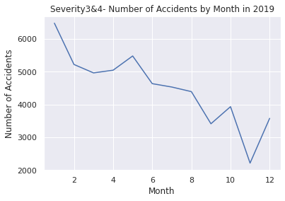
・2020年の重大事故件数推移
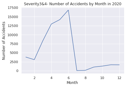
・2021年の重大事故件数推移
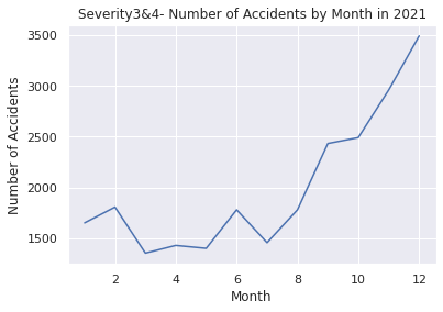
・2019年~2021年の重大事故件数推移
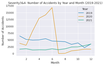
・2016年~2021年の重大事故件数推移
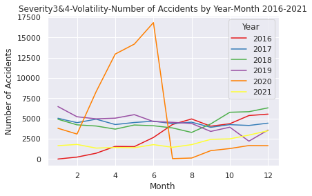
以上となります
かなり長くなってしまいましたがお目通しいただき誠にありがとうございました![]()
今回、EDAとSARIMAモデルを用いた時系列解析と予測に挑戦し形にすることができましたので今後はまた別のデータセットを用いて様々なジャンルのEDA、解析や予測にさらに挑戦を続けていきたいと思います。精度の担保という課題も出来る限り解決できるようにしていきたいです。