Japanese ver.
(日本語版)
Overview
Introduction
About me:
I work as an engineer of submarine cable Landing Station in NTT Group company. As I majored in English literature, I work in English with China Telecom's Shanghai NOC (Network Operation Centre) and other Landing station staffs in East Asia and South-East Asia.
I am a beginner in programming and have been learning Python3 since November 2022. I was inspired for the learning after reading Max Tegmark's book "Life 3.0: Being Human in the Age of Artificial Intelligence", which sparked a strong interest in artificial intelligence and programming.
Work Environment:
Python3
Google Colaboratory
OS Windows11
PC Thinkpad X1 13Nano
Dataset:
- US Accidents (2016 - 2021) A Countrywide Traffic Accident Dataset (2016 - 2021)
- population report (Economic Research Service U.S. DEPARTMENT OF AGRICULTURE)
Overview of predicitons:
This data set includes the number of crashes, the impact of crashes on traffic, the weather at the time of the crash, and perceptical factors for the period of 2016-2021 in 49 US states ( so-called "Contiguous United States" excluding Hawaii, Alaska and Puerto Rico). With this data set, a time series analysis by SARIMA model is used to predict the evolution of the number of accidents in the period 2022-2023 and the transition of the number of accidents with severe impacts on traffic (As "Severity" "3", "4" in the data).
Therefore, there will be analysis and forecasting targeting: (1) the number of road traffic accidents in the US as a whole and (2) those focused specifically in "Severity" "3" and "4".
Overview of EDA:
EDA visualizes the above two types of time series analysis specifically which states in the United States have the higher number of accidents, as well as the unique data of this dataset, such as weather, temperature, humidity, air pressure, accident locations, and time of day when the accidents occurred, for the period 2016 to 2021. This will also be divided into two types: the entire United States and the serious accidents belonging to "Severity", "3", and "4", and will be divided into four regions (Northeast, Midwest, South, and West).
The reason why choosing this dataset:
The United States is the world's central country and one of the leading car societies in developed countries, and the dataset includes impacts of the spread of coronavirus from 2020 with the change in the number of traffic accidents after the corona shock. It also includes not only the number of car accidents, but also the degree of impact of the accidents on traffic, the weather at the time of occurrence, perceptual factors, characteristics of the places where the accident occurred, etc. This is because the reasons for occurrence are provided as more detailed data than statistical data generally published by the government, so I thought that unique analysis and EDA would be done.
Outcome of Analysis by SARIMA
About the results of time series analysis
(1) Prediction of the number of traffic accidents in the United States in 2022~2023 using the SARIMA model
(2) The same prediction which narrows down to only serious traffic accidents (accidents belonging to "Severity" "3" and "4")
Hereinafter (1) and (2), respectively
Firstly, I will describe the results of two types of time series analysis and forecasting. Please note that EDA related to datasets will be described later due to the large volume, so note that the information will be back and forth.
In conclusion, the data itself shows that the number of traffic accidents reached its lowest point in July 2020 due to the coronavirus pandemic in 2020, and since then, the number of accidents has far exceeded that of the first half of the period from 2016 to 2020. The prediction for the period from 2022 to 2023 shows that the number of accidents will continue to increase significantly with some fluctuations.
Below is simple overview of contents in dataset
Work flow
- Import Library
- Gdrive mounting and loading datasets – pd.read_csv() method
- Row number check (.shape[0]), column number check (.shape[1]) - .shape() method
- Checking the entire data - .info() method
- visualize columns – .tolist() method
- Check the "Nan" in each columnー.isnull().sum().sort_values(ascending=False)/len(data))*100
# 1.Import libraries
import numpy as np
from numpy import nan as na
import pandas as pd
from pandas import datetime
import matplotlib.pyplot as plt
import statsmodels.api as sm
import itertools
import warnings
warnings.simplefilter('ignore')
import seaborn as sns
%matplotlib inline

#Confirm the original information about data

#2.import csv file
from google.colab import drive
drive.mount('/content/drive')
US= pd.read_csv("/content/drive/MyDrive/Drivefolder/US_Accidents_Dec21_upda.csv")

# Basic information about the data
#3.How many rows and clumns exist in original data
print("rows")
print(US.shape[0])
print("columns")
print(US.shape[1])

#4. show all the columns and data types out
print(US.info)
#5. show all names of the columns
print("All names of colums")
print(US.columns.tolist())
#6. Show the percentage of missing Values and Columns
print("Total Nuns")
US_misvaco= (US.isnull().sum().sort_values(ascending=False)/len(US))*100
print(US_misvaco)
Output: Click
rows
2845342
columns
47
<bound method DataFrame.info of                 ID  Severity           Start_Time             End_Time  \
0              A-1         3  2016-02-08 00:37:08  2016-02-08 06:37:08
1              A-2         2  2016-02-08 05:56:20  2016-02-08 11:56:20
2              A-3         2  2016-02-08 06:15:39  2016-02-08 12:15:39
3              A-4         2  2016-02-08 06:51:45  2016-02-08 12:51:45
4              A-5         3  2016-02-08 07:53:43  2016-02-08 13:53:43
...            ...       ...                  ...                  ...
2845337  A-2845338         2  2019-08-23 18:03:25  2019-08-23 18:32:01
2845338  A-2845339         2  2019-08-23 19:11:30  2019-08-23 19:38:23
2845339  A-2845340         2  2019-08-23 19:00:21  2019-08-23 19:28:49
2845340  A-2845341         2  2019-08-23 19:00:21  2019-08-23 19:29:42
2845341  A-2845342         2  2019-08-23 18:52:06  2019-08-23 19:21:31

         Start_Lat   Start_Lng    End_Lat     End_Lng  Distance(mi)  \
0        40.108910  -83.092860  40.112060  -83.031870         3.230
1        39.865420  -84.062800  39.865010  -84.048730         0.747
2        39.102660  -84.524680  39.102090  -84.523960         0.055
3        41.062130  -81.537840  41.062170  -81.535470         0.123
4        39.172393  -84.492792  39.170476  -84.501798         0.500
...            ...         ...        ...         ...           ...
2845337  34.002480 -117.379360  33.998880 -117.370940         0.543
2845338  32.766960 -117.148060  32.765550 -117.153630         0.338
2845339  33.775450 -117.847790  33.777400 -117.857270         0.561
2845340  33.992460 -118.403020  33.983110 -118.395650         0.772
2845341  34.133930 -117.230920  34.137360 -117.239340         0.537

                                               Description  ...  Roundabout  \
0        Between Sawmill Rd/Exit 20 and OH-315/Olentang...  ...       False
1                       At OH-4/OH-235/Exit 41 - Accident.  ...       False
2                         At I-71/US-50/Exit 1 - Accident.  ...       False
3                          At Dart Ave/Exit 21 - Accident.  ...       False
4                       At Mitchell Ave/Exit 6 - Accident.  ...       False
...                                                    ...  ...         ...
2845337                           At Market St - Accident.  ...       False
2845338    At Camino Del Rio/Mission Center Rd - Accident.  ...       False
2845339  At Glassell St/Grand Ave - Accident. in the ri...  ...       False
2845340     At CA-90/Marina Fwy/Jefferson Blvd - Accident.  ...       False
2845341              At Highland Ave/Arden Ave - Accident.  ...       False

        Station   Stop Traffic_Calming Traffic_Signal Turning_Loop  \
0         False  False           False          False        False
1         False  False           False          False        False
2         False  False           False          False        False
3         False  False           False          False        False
4         False  False           False          False        False
...         ...    ...             ...            ...          ...
2845337   False  False           False          False        False
2845338   False  False           False          False        False
2845339   False  False           False          False        False
2845340   False  False           False          False        False
2845341   False  False           False          False        False

        Sunrise_Sunset Civil_Twilight Nautical_Twilight Astronomical_Twilight
0                Night          Night             Night                 Night
1                Night          Night             Night                 Night
2                Night          Night             Night                   Day
3                Night          Night               Day                   Day
4                  Day            Day               Day                   Day
...                ...            ...               ...                   ...
2845337            Day            Day               Day                   Day
2845338            Day            Day               Day                   Day
2845339            Day            Day               Day                   Day
2845340            Day            Day               Day                   Day
2845341            Day            Day               Day                   Day

[2845342 rows x 47 columns]>
All names of colums
['ID', 'Severity', 'Start_Time', 'End_Time', 'Start_Lat', 'Start_Lng', 'End_Lat', 'End_Lng', 'Distance(mi)', 'Description', 'Number', 'Street', 'Side', 'City', 'County', 'State', 'Zipcode', 'Country', 'Timezone', 'Airport_Code', 'Weather_Timestamp', 'Temperature(F)', 'Wind_Chill(F)', 'Humidity(%)', 'Pressure(in)', 'Visibility(mi)', 'Wind_Direction', 'Wind_Speed(mph)', 'Precipitation(in)', 'Weather_Condition', 'Amenity', 'Bump', 'Crossing', 'Give_Way', 'Junction', 'No_Exit', 'Railway', 'Roundabout', 'Station', 'Stop', 'Traffic_Calming', 'Traffic_Signal', 'Turning_Loop', 'Sunrise_Sunset', 'Civil_Twilight', 'Nautical_Twilight', 'Astronomical_Twilight']
Total Nuns
Number                   61.290031
Precipitation(in)        19.310789
Wind_Chill(F)            16.505678
Wind_Speed(mph)           5.550967
Wind_Direction            2.592834
Humidity(%)               2.568830
Weather_Condition         2.482514
Visibility(mi)            2.479350
Temperature(F)            2.434646
Pressure(in)              2.080593
Weather_Timestamp         1.783125
Airport_Code              0.335601
Timezone                  0.128596
Nautical_Twilight         0.100761
Civil_Twilight            0.100761
Sunrise_Sunset            0.100761
Astronomical_Twilight     0.100761
Zipcode                   0.046356
City                      0.004815
Street                    0.000070
Country                   0.000000
Junction                  0.000000
Start_Time                0.000000
End_Time                  0.000000
Start_Lat                 0.000000
Turning_Loop              0.000000
Traffic_Signal            0.000000
Traffic_Calming           0.000000
Stop                      0.000000
Station                   0.000000
Roundabout                0.000000
Railway                   0.000000
No_Exit                   0.000000
Crossing                  0.000000
Give_Way                  0.000000
Bump                      0.000000
Amenity                   0.000000
Start_Lng                 0.000000
End_Lat                   0.000000
End_Lng                   0.000000
Distance(mi)              0.000000
Description               0.000000
Severity                  0.000000
Side                      0.000000
County                    0.000000
State                     0.000000
ID                        0.000000
dtype: float64
As shown, there are 47 items for a total of 2,845,342 rows in the imported data.
This data deals with the number of traffic accidents in the United States (excluding Hawaii, Alaska, and Puerto Rico) from 2016 to 2021 and each line is "2016-02-08 06:37:08"..."2019-08-23 18:52:06", etc.
"Severity" has four levels of severity of the impact on traffic caused by an accident (1 is the minimum, 4 is the maximum).
Details and references of the data will be described later. Data provider Sobhan Moosavi explains what each column represents on his website.
Time-series analysis by SARIMA model
Below is the code for (1)"Prediction of the number of traffic accidents in the United States in 2022~2023 using the SARIMA model".
(1)"Prediction of the number of traffic accidents in the United States in 2022~2023 using the SARIMA model"
Work flow
1.Import libraries
2.import data
3.Organaise the data of days when accidents occured
4.Extract data to use
5.Count number of the accidents by year and month
6.Plot the data of monthly total accidents in 49states
7.Apply np.log() method
8.Plot the data after applying np.log() method
9.Plot Original series
10.Specify moving average
11.Plot graph of moving average
12.Plot graph of moving average and original series
13.Specify series of differences
14.Plot series of differences
15.Plot auto-correlation and partial auto-correlation
16.Output best parameter by function
17.Fit the SARIMA model
18.Output BIC values of SARIMA model
19.Make a prediction for 2021-12-01 to 2023-12-31
20.Plot the prediction and original time-series data
# Machine Learning and Prediciton for vorality of the number of the accidents in all over the states
# (1)Import libraries
import numpy as np
import pandas as pd
import matplotlib.pyplot as plt
import statsmodels.api as sm
import itertools
import warnings
import seaborn as sns
warnings.simplefilter('ignore')
%matplotlib inline
sns.set(style="darkgrid")
# (2)import data
from google.colab import drive
drive.mount('/content/drive')
# import csv file
USaccident_prediction = pd.read_csv("/content/drive/MyDrive/Drivefolder/US_Accidents_Dec21_updated.csv", sep=",")
USaccident_prediction.head()
# (3)Organaise the data of days when accidents occured
USaccident_prediction["yyyymm"] = USaccident_prediction["Start_Time"].apply(lambda x:x[0:7])
USaccident_prediction["yyyymm"] = pd.to_datetime(USaccident_prediction["yyyymm"])
# (4)Extract data to use
USaccident_prediction2 = USaccident_prediction.loc[:,["ID","State","yyyymm"]]
print(USaccident_prediction2.shape)
# (5)Count number of the accidents by year and month
USaccident_prediction2_c = USaccident_prediction2.groupby('yyyymm').count()["ID"]
# Rename column(ID→Counts)
USaccident_prediction2_c.columns = ["Counts"]
print(USaccident_prediction2_c.shape)
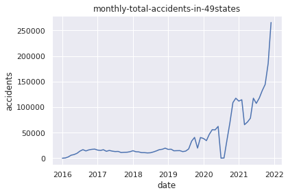
# (6)Plot the data of monthly total accidents in 49states
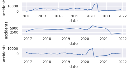
plt.title("monthly-total-accidents-in-49states")
plt.xlabel("date")
plt.ylabel("accidents")
plt.plot(USaccident_prediction2_c)
plt.show()
# (7)Apply np.log() method
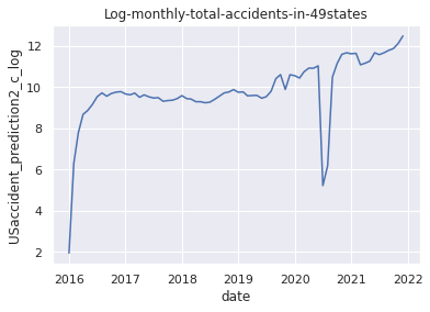
USaccident_prediction2_c_log = np.log(USaccident_prediction2_c)
# (8)Plot the data after applying np.log() method
plt.title("Log-monthly-total-accidents-in-49states")
plt.xlabel("date")
plt.ylabel("USaccident_prediction2_c_log")
plt.plot(USaccident_prediction2_c_log)
plt.show()
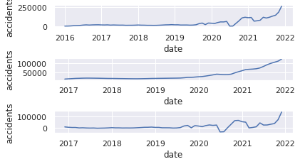
# (9)Plot Original series 1
plt.subplot(6, 1, 1)
plt.xlabel("date")
plt.ylabel("accidents")
plt.plot(USaccident_prediction2_c)
# (10)Specify moving average
USaccident_prediction2_c_avg = USaccident_prediction2_c.rolling(window=12).mean()
# (11)Plot graph of moving average
plt.subplot(6, 1, 3)
plt.xlabel("date")
plt.ylabel("accidents")
plt.plot(USaccident_prediction2_c_avg)
# (12)Plot graph of moving average and original series
plt.subplot(6, 1, 5)
plt.xlabel("date")
plt.ylabel("accidents")
mov_diff_USaccident_prediction2_c = USaccident_prediction2_c-USaccident_prediction2_c_avg
plt.plot(mov_diff_USaccident_prediction2_c)
plt.show()
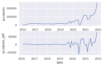
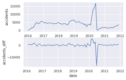
# (9)Plot Original series 2
plt.subplot(2, 1, 1)
plt.xlabel("date")
plt.ylabel("accidents")
plt.plot(USaccident_prediction2_c)
# (13)Specify series of differences
plt.subplot(2, 1, 2)
plt.xlabel("date")
plt.ylabel("accidents_diff")
USaccident_prediction2_c_diff = USaccident_prediction2_c.diff()
# (14)Plot series of differences
plt.plot(USaccident_prediction2_c_diff)
plt.show()
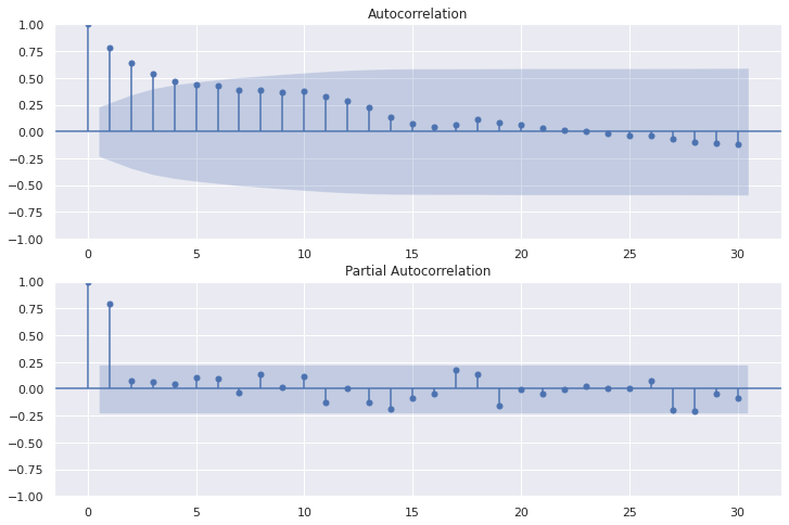
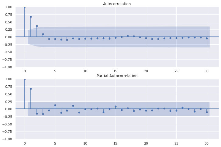
# (15)Plot auto-correlation and partial auto-correlation
fig=plt.figure(figsize=(12, 8))
# Plot graph of Autocorrelation Function
ax1 = fig.add_subplot(211)
fig = sm.graphics.tsa.plot_acf(USaccident_prediction2_c, lags=30, ax=ax1)
# Plot partial auto‐correlation coefficient
ax2 = fig.add_subplot(212)
fig = sm.graphics.tsa.plot_pacf(USaccident_prediction2_c, lags=30, ax=ax2)
plt.show()
# (16)Output best parameter by function
def selectparameter(DATA,seasonality):
p = d = q = range(0, 2)
pdq = list(itertools.product(p, d, q))
seasonal_pdq = [(x[0], x[1], x[2], seasonality) for x in list(itertools.product(p, d, q))]
parameters = []
BICs = np.array([])
for param in pdq:
for param_seasonal in seasonal_pdq:
try:
mod = sm.tsa.statespace.SARIMAX(DATA,
order=param,
seasonal_order=param_seasonal)
results = mod.fit()
parameters.append([param, param_seasonal, results.bic])
BICs = np.append(BICs,results.bic)
except:
continue
return parameters[np.argmin(BICs)]
# (17)Fit the SARIMA model
best_params = selectparameter(USaccident_prediction2_c, 30)
SARIMA_USaccident_prediction2_c = sm.tsa.statespace.SARIMAX(USaccident_prediction2_c,order=(best_params[0]),seasonal_order=(best_params[1])).fit()
# (18)Output BIC values of SARIMA model
print(SARIMA_USaccident_prediction2_c.bic)
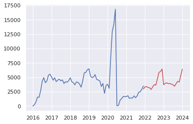
# (19)Make a prediction for 2021-12-01 to 2023-12-31
pred = SARIMA_USaccident_prediction2_c.predict("2021-12-01", "2023-12-31")
# (20)Plot the prediction and original time-series data
plt.plot(USaccident_prediction2_c)
plt.plot(pred, color="r")
plt.show()
Output:
6.Plot the data of changes in the number of traffic accidents by year and month
8.Plot the data after applying np.log() method
11.Plot graph of moving average
12.Plot graph of moving average and original series
14.Plot series of differences
15.Plot auto-correlation and partial auto-correlation
18.Output BIC values of SARIMA model
945.8189432999685
20.Plot the prediction and original time-series data
(2) The same prediction which narrows down to only serious traffic accidents belonging to "Severity" "3" and "4"
"Severity" has four levels of severity of the impact on traffic caused by an accident (1 is the minimum, 4 is the maximum).
Work flow is same bove other than by using Pandas query() filtering "3" and "4" in "Severity" column.
#(4)USseverity43=USseverity_data2.query("Severity in [4,3]")
# Machine Learning and Prediciton for vorality of the number of serious accidents(Severity 3 and 4) in 4region
# (2)import data
# "ID"=number of cases, "Start_Time" is the time when accidents occured(range from 2016-01-14 20:18:33 to 2021-12-31 23:30:00).
USseverity_data= pd.read_csv("/content/drive/MyDrive/Drivefolder/US_Accidents_Dec21_updated.csv")
# (3)Organise the time data
USseverity_data["yyyymm"] = USseverity_data["Start_Time"].apply(lambda x:x[0:7])
USseverity_data["yyyymm"] = pd.to_datetime(USseverity_data["yyyymm"])
# (4)Select out the data
USseverity_data2 = USseverity_data.loc[:,["ID","Severity","yyyymm"]]
print(USseverity_data2.shape)
USseverity43=USseverity_data2.query("Severity in [4,3]")
print(USseverity43.shape)
print(USseverity43.sort_values(by="yyyymm", ascending=True).tail(10))
# (5)Count accidents yearly and monthly
USseverity43_c = USseverity43.groupby('yyyymm').count()["ID"]
# Rename column (ID→Counts)
USseverity43_c.columns = ["Counts"]
print(USseverity43_c.shape)
# Visualisation of the data
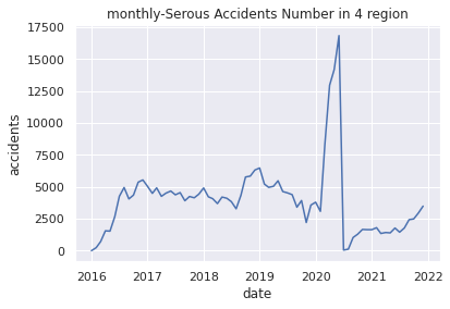
# (6)Plot monthly-Serous Accidents Number in 4 region
plt.title("monthly-Serous Accidents Number in 4 region")
plt.xlabel("date")
plt.ylabel("accidents")
plt.plot(USseverity43_c)
plt.show()
# (7)Apply np.log() method
USseverity43_log = np.log(USseverity43_c)
# (8)Plot applied graph
plt.title("Log-monthly-Serous Accidents Number in 4 region")
plt.xlabel("date")
plt.ylabel("USseverity43_log")
plt.plot(USseverity43_log)
plt.show()
# (9)Plot Original series 1
plt.subplot(6, 1, 1)
plt.xlabel("date")
plt.ylabel("accidents")
plt.plot(USseverity43_c)
# (10)Specify moving average
USseverity43_c_avg = USseverity43_c.rolling(window=12).mean()
# (11)Plot graph of moving average
plt.subplot(6, 1, 3)
plt.xlabel("date")
plt.ylabel("accidents")
plt.plot(USseverity43_c_avg)
# (12)Plot graph of moving average and original series
plt.subplot(6, 1, 5)
plt.xlabel("date")
plt.ylabel("accidents")
mov_diff_USseverity43_c = USseverity43_c-USseverity43_c_avg
plt.plot(mov_diff_USseverity43_c)
plt.show()
# (9)Plot Original series 2
plt.subplot(2, 1, 1)
plt.xlabel("date")
plt.ylabel("accidents")
plt.plot(USseverity43_c)
# (13)Specify series of differences
plt.subplot(2, 1, 2)
plt.xlabel("date")
plt.ylabel("accidents_diff")
USseverity43_c_diff = USseverity43_c.diff()
# (14)Plot series of differences
plt.plot(USseverity43_c_diff)
plt.show()
# (15)Plot auto-correlation and partial auto-correlation
fig=plt.figure(figsize=(12, 8))
# Plot graph of Autocorrelation Function
ax1 = fig.add_subplot(211)
fig = sm.graphics.tsa.plot_acf(USseverity43_c, lags=30, ax=ax1)
# Plot partial auto‐correlation coefficient
ax2 = fig.add_subplot(212)
fig = sm.graphics.tsa.plot_pacf(USseverity43_c, lags=30, ax=ax2)
plt.show()
# (16)Output best parameter by function
def selectparameter(DATA,seasonality):
p = d = q = range(0, 2)
pdq = list(itertools.product(p, d, q))
seasonal_pdq = [(x[0], x[1], x[2], seasonality) for x in list(itertools.product(p, d, q))]
parameters = []
BICs = np.array([])
for param in pdq:
for param_seasonal in seasonal_pdq:
try:
mod = sm.tsa.statespace.SARIMAX(DATA,
order=param,
seasonal_order=param_seasonal)
results = mod.fit()
parameters.append([param, param_seasonal, results.bic])
BICs = np.append(BICs,results.bic)
except:
continue
return parameters[np.argmin(BICs)]
# (17)Fit the SARIMA model
best_params = selectparameter(USseverity43_c, 15)
SARIMA_USseverity43_c = sm.tsa.statespace.SARIMAX(USseverity43_c,order=(best_params[0]),seasonal_order=(best_params[1])).fit()
# (18)Output BIC values of SARIMA model
print(SARIMA_USseverity43_c.bic)
# (19)Make a prediction for 2021-12-01 to 2023-12-31
pred = SARIMA_USseverity43_c.predict("2021-12-01", "2023-12-31")
# (20)Plot the prediction and original time-series data
plt.plot(USseverity43_c)
plt.plot(pred, color="r")
plt.show()
Output: Click
(2845342, 3)
(286298, 3)
                ID  Severity     yyyymm
817337    A-817338         4 2021-12-01
1084687  A-1084688         4 2021-12-01
525546    A-525547         4 2021-12-01
817107    A-817108         4 2021-12-01
374245    A-374246         4 2021-12-01
525749    A-525750         4 2021-12-01
1085168  A-1085169         4 2021-12-01
525875    A-525876         4 2021-12-01
374728    A-374729         4 2021-12-01
779777    A-779778         4 2021-12-01
(72,)
6.Plot the data of changes in the number of traffic accidents by year and month
8.Plot the data after applying np.log() method
11.Plot graph of moving average
12.Plot graph of moving average and original series
14.Plot series of differences
15.Plot auto-correlation and partial auto-correlation
18.Output BIC values of SARIMA model
1050.7759312157807
20.Plot the prediction and original time-series data
Explanation and thought of the results of two time series analyses
Explanation and thought of the results of two time series analyses
・Regarding the extremely low number of traffic accidents around June-August 2020 (common to (1) and (2))
The Centers for Disease Control and Prevention (CDC), a U.S. government agency, has published a timeline for 2020 when the Covid-19 pandemic occurred as is quoted below.
CDC(Centers for Disease Control and Prevention)-CDC Museum COVID-19 Timeline
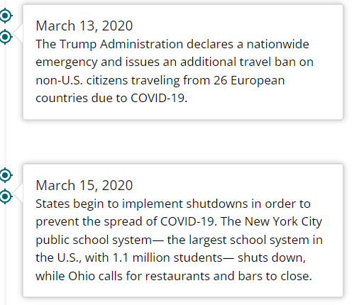


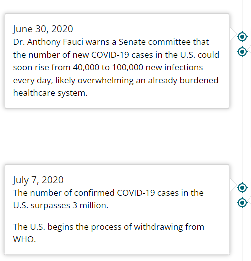
The above is a timeline around June 2020 when the number of accidents was extremely low in the data. Looking at the details, the government declared a state of emergency on 13 March of the same year and "shutdowns" were implemented in each state on 15 March. Unlike the "lockdowns" implemented in China, France and other countries, the "shutdown" was a voluntary quarantine, but it was not the only one, as business activity was stagnant during the same period (unemployment rate of 14.7% as of 9 May), the total number of infected people exceeded 2 million on 10 June and the number of people infected exceeded 2 million in total on 10 June, and on 30 June Anthony Fauci who is a chief medical advisor to the president, warned that the US could see an increase of 40,000 to 100,000 new infections on a daily basis. The number of road traffic accidents was probably drastically reduced due to the extremely low number of private motorists, transport and other commercial vehicles, and construction vehicles during the period from June to August. In fact, according to statistics from the US Department of Transportation, which will be descrived later, the number of miles driven in the USA by privately-owned vehicles during the period from March to August fell dramatically.
Result and Thought of (1)"Prediction of the number of traffic accidents in the United States in 2022~2023 using the SARIMA model"
# Comfirm volatility of the accident numbers\ from 2016 to 2021
US= pd.read_csv("/content/drive/MyDrive/Drivefolder/US_Accidents_Dec21_updated.csv")

# Show near period of 3years

# Convert the Start_Time column to a datetime object and extract the year and month
US["Start_Time"] = pd.to_datetime(US["Start_Time"])
US["Year"] = US["Start_Time"].dt.year
US["Month"] = US["Start_Time"].dt.month

# Show volatility of whole periods 2016-2021

# Filter the data to year 2026-2021
US2016_2021 = US.loc[(US["Year"].isin([2016, 2017, 2018, 2019, 2020, 2021]))]

# Group the data by month and count the number of accidents in each month
UScounts2016_2021 = US2016_2021.groupby(["Year", "Month"]).size().reset_index(name="Accidents")

# Plot the data using Seaborn
sns.set(style="darkgrid")
sns.lineplot(data=UScounts2016_2021, x="Month", y="Accidents", hue="Year", palette="Set1")
plt.title("Volatility-Number of Accidents by Year-Month 2016-2021")
plt.xlabel("Month")
plt.ylabel("Number of Accidents")
plt.show()

Above code is EDA of (1) which shows the increase in each year and month of 2016 to 2021 (orange line is 2020)
・About drastic increase of number of traffic accidents from August in 2020
AAA FOUNDATION, trffic safety agency in US reported a result of the investigation as below.
"A 2020 survey from the AAA Foundation for Traffic Safety found that people who drove more than usual during the pandemic were more likely to engage in riskier behaviors, including reading text messages, speeding, running red lights on purpose, aggressively changing lanes, not wearing seat belts or driving after having consumed alcohol or cannabis."
(citation)
In response to the pandemic, as a social sense of stagnation spreads in US relating to the background of social unrest such as "shutdown", an increase in the unemployment rate, and signs of a further increase in the number of infected people, it can seem that dangerous driving such as driving exceeding the legal speed, driving under the influence of alcohol, and driving with cannabis has increased sharply as a reaction to their stress.
Therefore, it can be considered that the number of traffic accidents in August 2020 to 2021 continued to increase after the first period of coronavirus pandemic, and the number of accidents was the highest in the 5-year period of the dataset.
(2) The same prediction which narrows down to only serious traffic accidents belonging to "Severity" "3" and "4"
The content is almost same as (1), but comfirm the differences.
# Comfirm volatility of the accidents from 2016 to 2021 in Severity 3 and 4

USregion_severity= pd.read_csv("/content/drive/MyDrive/Drivefolder/US_Accidents_Dec21_updated.csv")

# Convert the Start_Time column to a datetime object and extract the year and month
USregion_severity["Start_Time"] = pd.to_datetime(USregion_severity["Start_Time"])
USregion_severity["Year"] = USregion_severity["Start_Time"].dt.year
USregion_severity["Month"] = USregion_severity["Start_Time"].dt.month

# Filter the data to include only Severity 3 and 4 from the years 2016 to 2021
Region2016_2021 = USregion_severity.loc[(USregion_severity["Severity"].isin([3, 4])) & (USregion_severity["Year"].between(2016, 2021))]

# Group the data by year and month and count the number of accidents in each year-month
counts2016_2021 = Region2016_2021.groupby(["Year", "Month"]).size().reset_index(name="Accidents")

# Plot the data
sns.set(style="darkgrid")
sns.lineplot(data=counts2016_2021, x="Month", y="Accidents", hue="Year", palette="Set1")
plt.title("Severity3&4-Volatility-Number of Accidents by Year-Month 2016-2021")
plt.xlabel("Month")
plt.ylabel("Number of Accidents")
plt.show()

In the time series analysis that narrows down to only serious accidents on the data in (2), the number of cases is naturally different comparing with the original series plot results for 2020. But even if it is the same upward trend, The increase rate is extremely high in (2), which deals with serious accidents around March to May, and it plunged around July. After that, in August 2020 to 2021, the number of serious accidents remained at a lower level than before the pandemic. This may be caused by the fact that the item "Severity" does not place more weight on personal injury among accidents, but Indicates the degree of impact on traffic in the accident.

As mentioned above, the data provider Moosavi defines that Severity "item as "the numbers 1-4 indicate the severity of the accident, 1 has the least impact on traffic (the accident causes short delays in traffic), and 4 has a significant impact (causes long-term delays to traffic)."
・About the difference in (1) and the sharp decline
Comparing the transition in the number of accidents focused on (2) with (1) as a whole, the period of increase in serious accidents increased a little earlier in February to June 2020. This is mainly due to the state of emergency and "shutdown" issued in March, as described in the CDC timeline. In addition, according to statistics from the Federal Highway Administration in US, the traffic volume of private cars at the individual level which is not a commercial vehicle, had decreased by about 15% since March compared to 2019.
(citation)
On the other hand, the news of the first death of an American traveler from the coronavirus in Wuhan, China, on February 8 may have been a major factor which makes the anxiety about the pandemic in US in reality. Particularly, the impact on corporate activities would be enormous, so it is possible that the traffic volume of commercial vehicles increased in order to secure inventory and materials early.
Considering these factors, it can be inferred that the number of accidents involving commercial, logistic and construction vehicles, was high. Also, if an accident occurs involving large vehicles such as a transport truck or construction vehicle, or transport vehicles loading chemicals, it will inevitably have a significant impact on traffic. So it can be inferred that many accidents other than private cars are ones with "Severity" at the level of "3" or "4". I could not establish the evidence because of not finding any supporting data, but I consider that if the number of accidents involving private cars decreases or if its traffic volume decreases, the number of serious accidents will naturally increase because the number of serious accidents will naturally increase because it will be narrowed down to a situation where many cars that are prone to serious accidents such as commercial vehicles and construction vehicles running.
And I guess that the early response by companies with anticipation of the pandemic in the information on the coronavirus that was updated daily led to a rapid increase in the number of accidents of "Severity" "3" and "4" from around February.
As for the sharp drop in the number of serious accidents in July and August, it could be caused by the number of infected people in the United States exceeded 2 million on June 10.

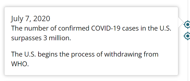
And Anthony Fauci reported that the number of new infections in US is expected to increase by 40,000 to 100,000 on a daily basis. and then on July 7, the number of coronavirus infections exceeded 3 million. It seemed certain that the pandemic would continue to be worse at this time. In addition, the Trump administration officially announced its withdrawal from the WHO, which may have intensified the impact of social turmoil. Therefore, it can be inferred that the traffic volume of commercial, logistic and construction vehicles used for transportation has decreased sharply at this point.
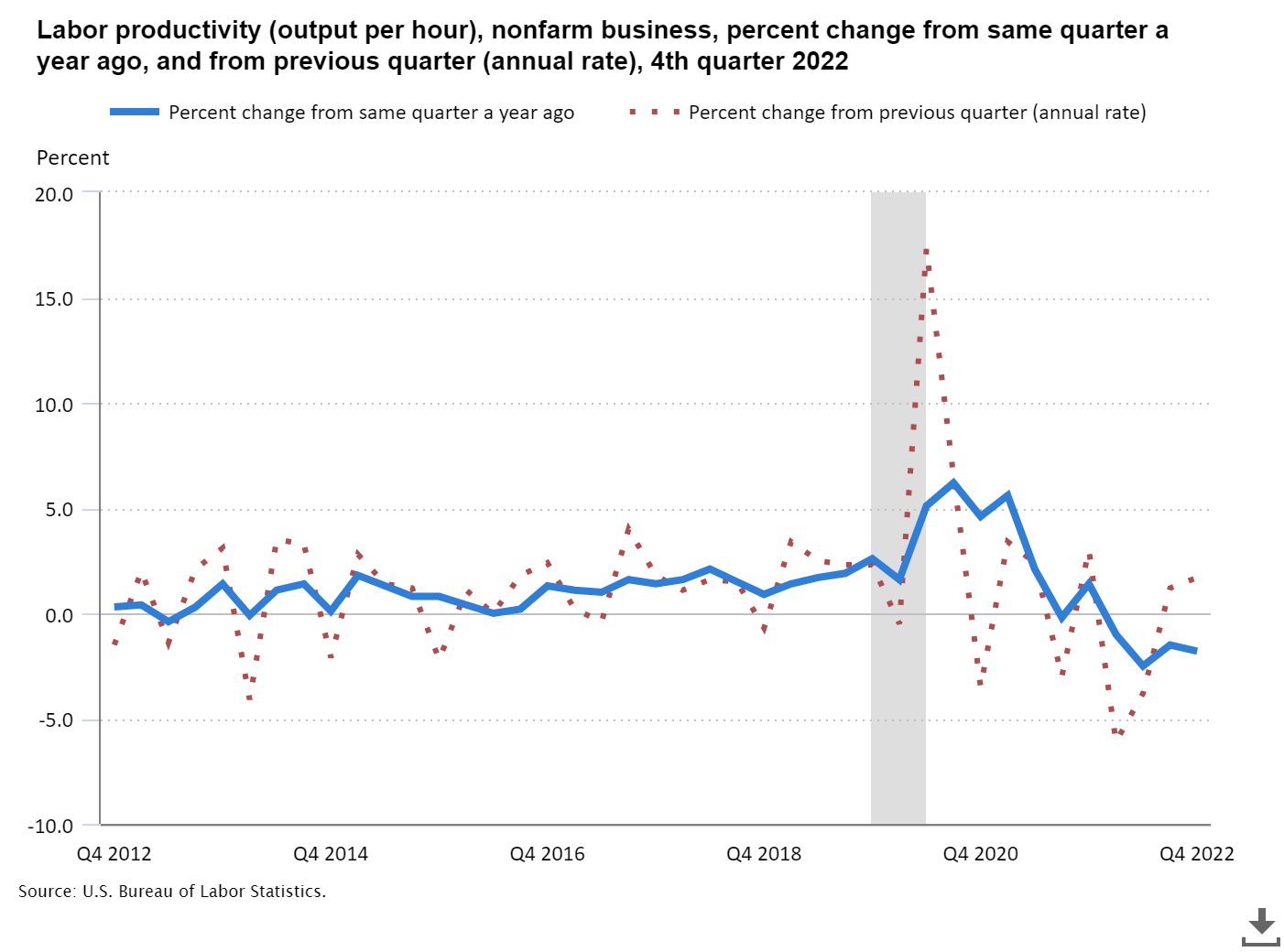
Since then, between August 2020 to 2021, the number of serious accidents remained at a lower level than before the pandemic. Unfortunately I could not find directly related data. It may be related to the fact that worker productivity has remained below pre-epidemic levels since 2021, but I coulud not find solid evidences.
 (citation)
In terms of data collection of the dataset, there may simply be a bias in the way of data collection due to the corona shock as described above, but I think that this can not be a valid argument because it is just imagination.
Results of the transitional prediction
About results of the transitional prediction for 2022 to 2023.
(1)"Prediction of the number of traffic accidents in the United States in 2022~2023 using the SARIMA model"
Although BIC shows 945.8189432999685, it could need more evidences of acccuracy because Sobhan Moosavi descrives the dataset as below.
"The data is continuously being collected from February 2016, using several data providers, including multiple APIs that provide streaming traffic event data. These APIs broadcast traffic events captured by a variety of entities, such as the US and state departments of transportation, law enforcement agencies, traffic cameras, and traffic sensors within the road-networks. Currently, there are about 1.5 million accident records in this dataset."
The image below is a part of co-authored paper published on the Cornell University website in US about the dataset.
(citation)
As for the credibility of the dataset, it can be judged that the dataset has a certain degree of credibility considering that he published a paper in this way and that Moosavi received a Ph.D. in Computer Software Engineering from the University of Tehran and is currently working as a senior data scientist at Lyft in US.(https://www.linkedin.com/in/sobhan-moosavi)
On the other hand, as stated on the website and in the paper, the dataset not only summarizes the number of accidents and the date and time of the accident, but also provides more specific data such as weather coditions, perceptual factors, and details of the location of the accident. This is very useful in terms of the rarity and diversity of the data, but it is also true that there are no qualified materials to ensure the accuracy of the prediction results using this dataset.
Therefore, although it's difficult, it is considered necessary to ensure accuracy with similar data published by public institutions. However, I can not find data that matched perfectly enough to compare with the data of prediction of the number of traffic accidents.
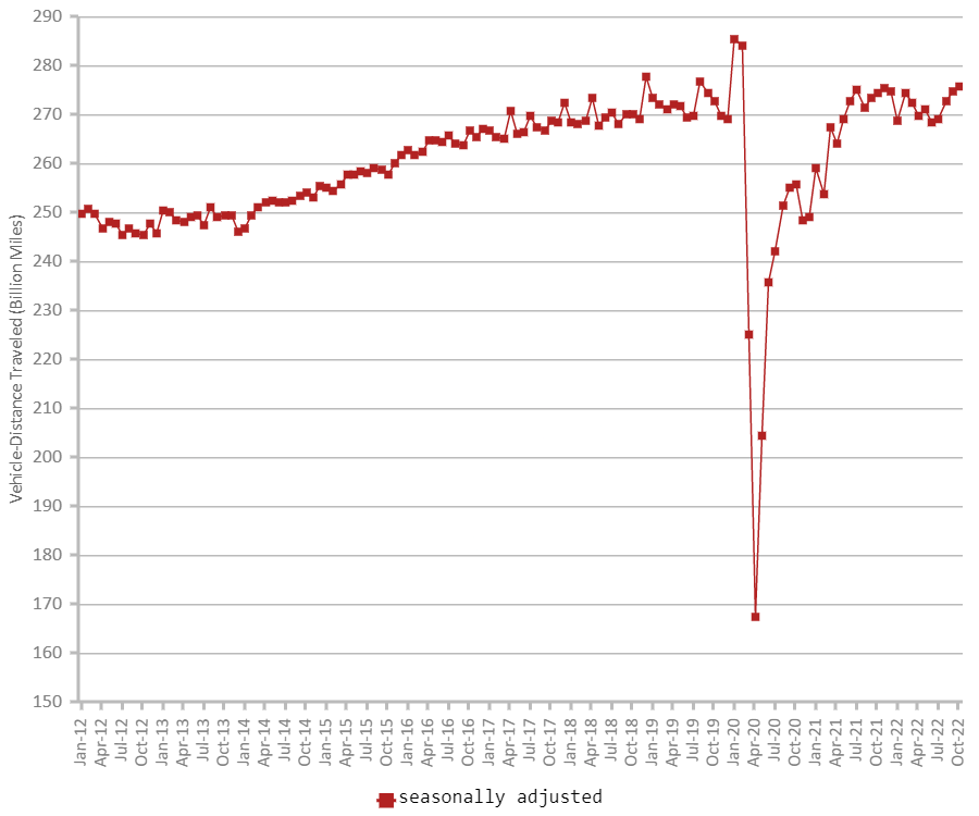
The following are two data published by the US Department of Transportation, but these are data that statistically shows the amount of car mileage and that shows the trend of the number of traffic fatalities in the US. these data does not completely match the trend forecast of the number of traffic accidents that is the result of this analysis and prediction over time.
Firstly, looking at the trend of car mileage in 2020 published by the US Department of Transportation, you can see that there was a significant drop in mileage in US during the period from April to August. Private vehicles saw a decrease in traffic volume by -39.8% in April, -25.5% in May, -12.9% in June, -11.1% in July, and -11.8% in August compared to the same month in 2019. Cumulative data continued to decline at a high level in April, -17.2% in May, -16.5% in June, -15.6% in July, and -15.1% in August, respectively.
(citation)
Since then, however, it has rapidly returned to before-pandemic levels. The following is a graph showing the trend of mileage over about 10 years from 2012 to October 2022 which is also published by the Ministry of Transport.
 (citation)
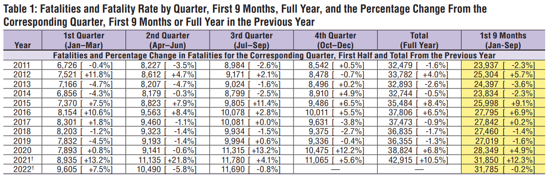
And the following is the aggregate data of the number of traffic fatalities, also published by it.
(citation)
As actual statistics, on the above two US Department of Transportation mileage trends and published data on traffic fatalities, the mileage trends show that the number of miles traveled has returned to before-coronavirus pandemic levels since January 2022. Looking at the number of traffic fatalities, the number of traffic fatalities was +6.8% year-on-year in 2020 and +10.5% in 2021, indicating that the data continues to increase at a relatively high level for about 10 years.
In other words, volume of traffic is returning to before-coronavirus levels from 2021 to 2022 and the later, while the number of fatal accidents will continue to be at a high level compared to about 10 years. And it will be on an upward trend.
Therefore, if we compare (1) above with the fact that traffic volume is increasing (returning to pre-pandemic levels) and the number of fatal accidents continues to increase at a high level and the number of accidents is inaccurate due to the difference from the original data set. But the prediction seems to be correct in that "the number of accidents will continue to increase."
(2) The same prediction which narrows down to only serious traffic accidents (accidents belonging to "Severity" "3" and "4")
The number of serious accidents is expected to return to before-pandemic levels, but considering that the trend in mileage is also returning to pre-pandemic levels it seems that the number of serious accidents is also returning to the previous level after 2022 in conjunction with it.
(citation)
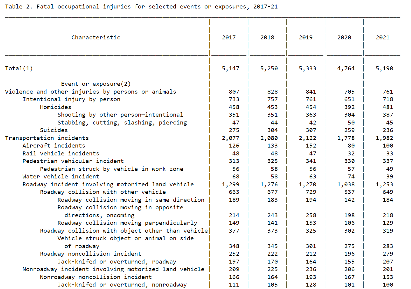
As another source, the above chart is data on traffic accidents published by the Bureau of Statistics of the US Department of Labor, but it is also only dealing with the number of fatal accidents, so it is not appropriate to measure the accuracy of predictions of "accidents that had a significant impact on traffic conditions". However, the number of traffic fatalities on the job decreased in 2020 and returned to before-pandemic levels in 2021. On the other hand, as mentioned earlier, the aggregate data on the number of traffic fatalities published by the Ministry of Transport showed a significant increase in the number of fatal accidents.
Therefore, although it is not the optimal data to ensure accuracy, the prediction results are honestly very difficult to judge based on the data on the number of mileage traveled in the United States and the data on the number of traffic fatalities by the Department of Transportation and the Department of Labor, but it seems that the prediction is consistent in terms of returning to the before-pandemic number of cases.
Self review for the results
Self review for the results of two predictions
The use of datasets that are difficult to compare with data published by government agencies that can ensure prediction accuracy
It is regrettable that the data set is too unique, which made it difficult to ensure the accuracy of time series analysis and prediction results. Since various items such as weather, accident location, and perceptual factors are included in each accident data, the collection method is also special and does not match the data published by government agencies. This caused a discrepancy in the time series analysis of the number of accidents and the forecast itself. It is also regrettable that the number of them became too large in an attempt to somehow cite close data. However, I feel that it was good that I could analyze and predict the number of serious traffic accidents that had a significant impact on traffic accidents. This is something that would normally be difficult to analyze and predict in parallel, and that there are few other analysis predictions for "accidents that have a significant impact on traffic," which led to my confidence as I realised it while searching for various data to rationalise. As a result, I stumbled in terms of ensuring accuracy, but it was good to be able to give it shape.
EDA for US car accidents
Overview of EDA
In the following, I will describe EDA, which is the basis for analysis and prediction.
The contents are the EDA of (1) and (2) mentioned above. Specifically, the EDA is based on the number of traffic accidents in US and the number of serious traffic accidents in the four regions as defined in US (Northeast, Midwest, South, and West) with "Severity" "3" and "4".
As for the reason why (2) is divided into four regions, I divided this dataset into four regions because I thought that the characteristics of each climate in US which has a vast area such as weather and perceptual causes could be understood as accident causes.
On EDA of (1)
(1) Prediction of the number of traffic accidents in the United States in 2022~2023 using the SARIMA model
# Step1. EDA and Visualisation for data of US accidents 2016-2021
# Confirm total numbers of the accidents and US population in 2021
# Total Accident numbers By States 2016-2021
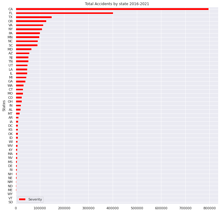
AbS = US.groupby(["State"]).size().reset_index(name="Severity")
# Sort the data
AbS_sort=AbS.sort_values("Severity",axis=0,ascending=True,inplace=False,kind="quicksort",na_position="last")
# Plot Total Accident numbers By States 2016-2021
AbS_sort.plot(x="State", y="Severity", title='Total Accidents by state 2016-2021',xlabel="States",ylabel="Accidents",grid=True, colormap='hsv',kind="barh",figsize = (12, 12))
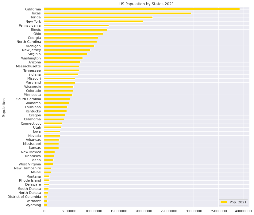
#US Population in 2021
# Import the other csv file as "US_population"
US_population = pd.read_excel("/content/drive/MyDrive/Drivefolder/PopulationReport.xlsx", skiprows=3, index_col=0)
# Check the Data US_population
US_population.info
# Delete all "Nan"
US_population.dropna(how = "all")
# US_population: DataFrame
US_population.reset_index(inplace=True)
# Count numbers of population by "State"
US.State.value_counts()
# Delete Not correspoing states of US_population, "Alaska","Hawaii","Puerto Rico"
US_population.drop(US_population.index[[0,2,12,52,53,54]], axis=0, inplace=True)
US_population.sort_values("Pop. 2021",axis=0,ascending=True,inplace=True,kind="quicksort")
# check the data correctly sorted
US_population.plot(x="Name", y="Pop. 2021", title='US Population by States 2021',xlabel="Population",ylabel="States",grid=True, colormap='hsv',kind="barh",color="gold",figsize = (12,12))
plt.ticklabel_format(style='plain',axis='x')
Output:
・Number of traffic accidents by state in 2016 to 2021
・Population of each state in the United States in 2021
# States and Cities where worst and least numbers of Accidents in 2016-2021
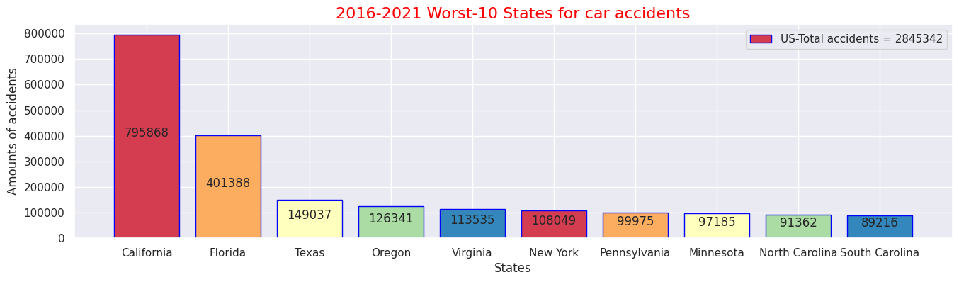
#Top 10 states where the most accidents occured 2016-2021
# Pick up data "ID","State"
US_select = US.loc[:, ['ID','State']]
US_select.head()
# Count up number of accidents by states
US_ex = US_select.groupby('State').count()
# Rename columns(ID→Counts)
US_ex.columns = ["Counts"]
# Check following data
US_ex.head()
# Sort and check data
US_sort = US_ex.sort_values('Counts', ascending=False)
US_sort.head(10)
# Sum up all the number of accidents in US
total = US_sort["Counts"].sum()
# Pick up Worst 10 states
US_rep = US_sort.iloc[:10,:]
US_rep
# Plot the numbers on centre of bar chart
sns.set(style="darkgrid")
def add_value_label(x_list,y_list):
for i in range(0, len(x_list)):
plt.text(i,y_list[i]/2,y_list[i], ha="center")
# Select x-y axis and labels out of data
x = US_rep.index
y = US_rep["Counts"]
labels = ["California", "Florida", "Texas", "Oregon", "Virginia", "New York", "Pennsylvania", "Minnesota", "North Carolina", "South Carolina"]
# Create colour map instance
cm = plt.get_cmap("Spectral")
color_maps = [cm(0.1), cm(0.3), cm(0.5), cm(0.7), cm(0.9)]
#Fix graph size
plt.figure(dpi=100, figsize=(14,4))
# Fix details on bar graph
plt.bar(x, y, tick_label=labels, color=color_maps, edgecolor='blue')
add_value_label(x,y)
# Select legend
plt.legend(labels = [f"US-Total accidents = {total}"])
#Give the tilte for the plot
plt.title("2016-2021 Worst-10 States for car accidents",size=16,color="red")
#Name the x and y axis
plt.xlabel('States')
plt.ylabel('Amounts of accidents')
plt.show()
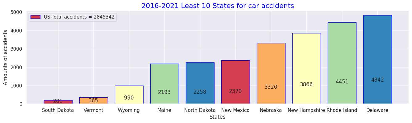
# 10 states in 2016-2021 data for Least numbers of accident occurences
USL_sort = US_ex.sort_values('Counts', ascending=True)
USL_sort.head(10)
# Pick up Worst 5 states
USL_rep = USL_sort.iloc[:10,:]
USL_rep
def add_value_label(x_list,y_list):
for i in range(0, len(x_list)):
plt.text(i,y_list[i]/4,y_list[i], ha="center")
x = USL_rep.index
y = USL_rep["Counts"]
labels = ["South Dakota", "Vermont", "Wyoming", "Maine", "North Dakota", "New Mexico", "Nebraska", "New Hampshire", "Rhode Island", "Delaware"]
#Create a colour map
cm = plt.get_cmap("Spectral")
color_maps = [cm(0.1), cm(0.3), cm(0.5), cm(0.7), cm(0.9)]
#Fixing graph size
plt.figure(dpi=100, figsize=(14,4))
#Setting bar plots
plt.bar(x, y, tick_label=labels, color=color_maps, edgecolor='blue')
add_value_label(x,y)
#Setting a legend
plt.legend(labels = [f"US-Total accidents = {total}"])
#Giving the tilte for the plot
plt.title("2016-2021 Least 10 States for car accidents",size=16, color="blue")
#Namimg the x and y axis
plt.xlabel('States')
plt.ylabel('Amounts of accidents')
plt.show()
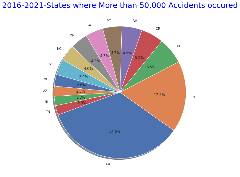
# States where More than 50,000 Accidents occured" pie graph
states_top = US.State.value_counts()
plt.figure(figsize=(10,10))
plt.title("2016-2021-States where More than 50,000 Accidents occured",size=25,y=1,color="blue")
labels= states_top[states_top>50000].index
plt.pie(states_top[states_top>50000],shadow=True, startangle=200, labels=labels, autopct = '%1.1f%%')
plt.show()
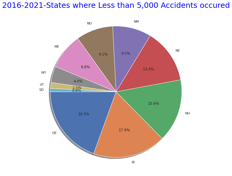
# States where More than 50,000 Accidents occured" pie graph
states_bottom = US.State.value_counts()
plt.figure(figsize=(10,10))
plt.title("2016-2021-States where Less than 5,000 Accidents occured",size=25,y=1,color="blue")
labels= states_bottom[states_bottom<5000].index
plt.pie(states_bottom[states_bottom<5000],shadow=True, startangle=180, labels=labels, autopct = '%1.1f%%')
explode = (0.1,0,0.05,0,0.05,0,0.05,0,0.05,0,0.05,0,0.05)
plt.show()
Output:
・ 10 worst states with the highest number of traffic accidents in 2016 to 2021
・Top 10 states with the lowest number of traffic accidents in 2016 to 2021
・States with more than 50,000 total accidents over the same period
・States with fewer than 50,000 total accidents over the same period
#(2) Details for causes of the accidents - Accident Severity Level(1-4) Analysis with weather condions and perceptical factors
#Statics of perceptical facotrs by Severity levels
#Show all names of the columns
print(US.columns.tolist())
#Accidents caused by the factors relating to perception or situations
AWF = US.loc[:, ['State','Severity','Temperature(F)','Humidity(%)','Pressure(in)','Wind_Speed(mph)','Weather_Condition','Visibility(mi)']]
AWF.head()
AWF_sort = AWF.sort_values('Severity', ascending=False)
AWF_sort.head()
# Check the each Severity numbers exist
AWF_s= AWF_sort['Severity'].value_counts()
# Severity(4) Means of each caused factor
AWF4= AWF_sort.loc[AWF["Severity"]==4.0]
AW4= AWF4.mean().round(1)
print(AW4)
# Severity(4) Weather conditions
AWF4_weather=AWF4["Weather_Condition"].value_counts()
print(AWF4_weather.iloc[:30])
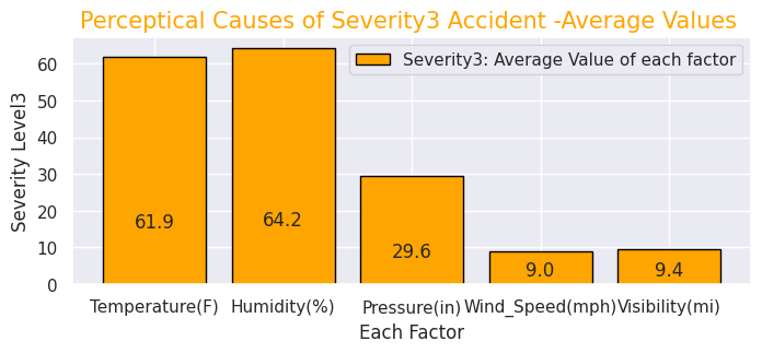
# Severity(3) Means of each caused factor
AWF3= AWF_sort.loc[AWF["Severity"]==3.0]
AWF3.fillna(0)
AW3= AWF3.mean().round(1)
print(AW3)
# Severity(3) Weather conditions
AWF3_weather=AWF3["Weather_Condition"].value_counts()
print(AWF3_weather.iloc[:15])
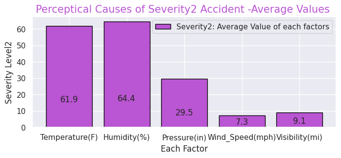
# Severity(2) Means of each caused factor
AWF2= AWF_sort.loc[AWF["Severity"]==2.0]
AW2= AWF2.mean().round(1)
print(AW2)
# Severity(2) Weather conditions
AWF2_weather=AWF2["Weather_Condition"].value_counts()
print(AWF2_weather.iloc[:15])
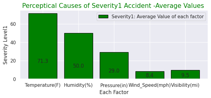
# Severity(1) Means of each caused factor
AWF1= AWF_sort.loc[AWF["Severity"]==1.0]
AW1= AWF1.mean().round(1)
print(AW1)
# Severity(1) Weather conditions
AWF1_weather=AWF1["Weather_Condition"].value_counts()
print(AWF1_weather.iloc[:15])
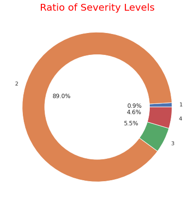
# ratio of each severity
severity1_4 = US.groupby('Severity').count()['ID']
severity1_4
fig, ax = plt.subplots(figsize=(6, 6), subplot_kw=dict(aspect="equal"))
label = [1,2,3,4]
plt.pie(severity1_4, labels=label,autopct='%1.1f%%', pctdistance=0.5)
circle = plt.Circle( (0,0), 0.7, color='white')
p=plt.gcf()
p.gca().add_artist(circle)
ax.set_title("Ratio of Severity Levels",color="red",fontdict={'fontsize': 20})
plt.tight_layout()
plt.show()
# Confirm "Description" column
SD= US.iloc[:,[1,9]]
SD_sort=SD.sort_values('Severity', ascending=True)
print(SD_sort.head)
Output: Click
['ID', 'Severity', 'Start_Time', 'End_Time', 'Start_Lat', 'Start_Lng', 'End_Lat', 'End_Lng', 'Distance(mi)', 'Description', 'Number', 'Street', 'Side', 'City', 'County', 'State', 'Zipcode', 'Country', 'Timezone', 'Airport_Code', 'Weather_Timestamp', 'Temperature(F)', 'Wind_Chill(F)', 'Humidity(%)', 'Pressure(in)', 'Visibility(mi)', 'Wind_Direction', 'Wind_Speed(mph)', 'Precipitation(in)', 'Weather_Condition', 'Amenity', 'Bump', 'Crossing', 'Give_Way', 'Junction', 'No_Exit', 'Railway', 'Roundabout', 'Station', 'Stop', 'Traffic_Calming', 'Traffic_Signal', 'Turning_Loop', 'Sunrise_Sunset', 'Civil_Twilight', 'Nautical_Twilight', 'Astronomical_Twilight']
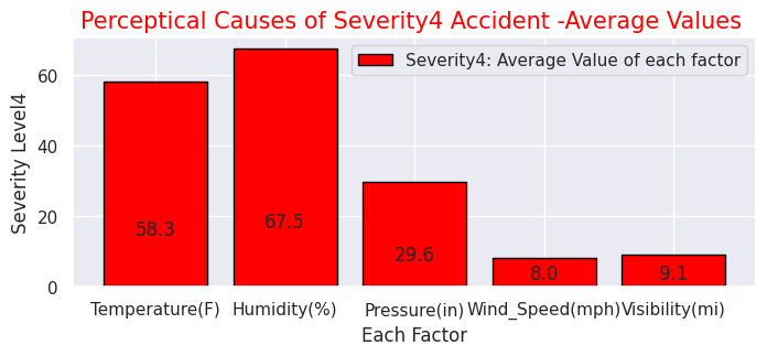
Severity 4.0
Temperature(F) 58.3
Humidity(%) 67.5
Pressure(in) 29.6
Wind_Speed(mph) 8.0
Visibility(mi) 9.1
dtype: float64
Fair 27765
Clear 25261
Mostly Cloudy 15688
Overcast 13218
Cloudy 11272
Partly Cloudy 10164
Light Rain 6029
Scattered Clouds 5643
Light Snow 3015
Fog 1532
Rain 1253
Haze 791
Fair / Windy 541
Light Drizzle 495
Heavy Rain 435
Snow 433
Smoke 265
Cloudy / Windy 226
Mostly Cloudy / Windy 208
Thunder in the Vicinity 182
T-Storm 178
Heavy Snow 165
Drizzle 162
Light Freezing Rain 153
Partly Cloudy / Windy 151
Wintry Mix 140
Light Rain with Thunder 137
Light Thunderstorms and Rain 122
Light Rain / Windy 118
Thunder 114
Name: Weather_Condition, dtype: int64
Severity 3.0
Temperature(F) 61.9
Humidity(%) 64.2
Pressure(in) 29.6
Wind_Speed(mph) 9.0
Visibility(mi) 9.4
dtype: float64
Clear 29924
Mostly Cloudy 24321
Fair 23426
Overcast 16150
Partly Cloudy 15930
Cloudy 11051
Scattered Clouds 8709
Light Rain 8573
Light Snow 2637
Rain 1918
Haze 1366
Fog 940
Heavy Rain 734
Light Drizzle 576
Fair / Windy 416
Name: Weather_Condition, dtype: int64
Severity 2.0
Temperature(F) 61.9
Humidity(%) 64.4
Pressure(in) 29.5
Wind_Speed(mph) 7.3
Visibility(mi) 9.1
dtype: float64
Fair 1043277
Cloudy 323213
Mostly Cloudy 319525
Partly Cloudy 221358
Clear 118638
Light Rain 112504
Overcast 55514
Fog 38575
Light Snow 38044
Haze 34135
Scattered Clouds 30780
Rain 27618
Fair / Windy 14028
Heavy Rain 10582
Smoke 6817
Name: Weather_Condition, dtype: int64
Severity 1.0
Temperature(F) 71.3
Humidity(%) 50.0
Pressure(in) 29.0
Wind_Speed(mph) 8.4
Visibility(mi) 9.5
dtype: float64
Fair 12726
Mostly Cloudy 4425
Cloudy 3231
Partly Cloudy 2487
Light Rain 1297
Rain 255
Fair / Windy 210
Fog 179
Mostly Cloudy / Windy 126
Partly Cloudy / Windy 77
Heavy Rain 73
Light Drizzle 72
Light Rain with Thunder 63
Haze 62
Cloudy / Windy 60
Name: Weather_Condition, dtype: int64
・Visualise ratio of "Severity" levels
# Each Severity with Weather conditions
#Severity4
AWF4_weather.iloc[:15].plot(kind="barh",colormap='hsv',title="Severity4-Weather Tendency",legend="legend",grid=True,color="red",figsize=(6,6))
#Severity3
AWF3_weather.iloc[:15].plot(kind="barh",colormap='hsv',title="Severity3-Weather Tendency",legend="legend",grid=True, color="orange",figsize=(6,6))
#Severity2
AWF2_weather.iloc[:15].plot(kind="barh",colormap='hsv',title="Severity2-Weather Tendency",legend="legend",grid=True,color="purple",figsize=(6,6))
plt.ticklabel_format(style='plain',axis='x')
#Severity1
AWF1_weather.iloc[:15].plot(kind="barh",colormap='hsv',title="Severity1-Weather Tendency",grid=True,legend="legend",color="green",figsize=(6,6))
Output:
・Weather at the time of accident by "Severity" level
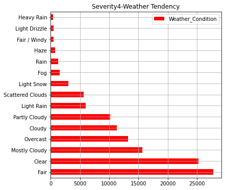
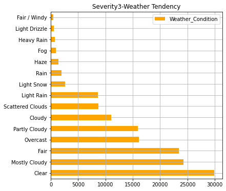
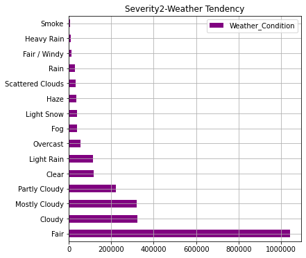
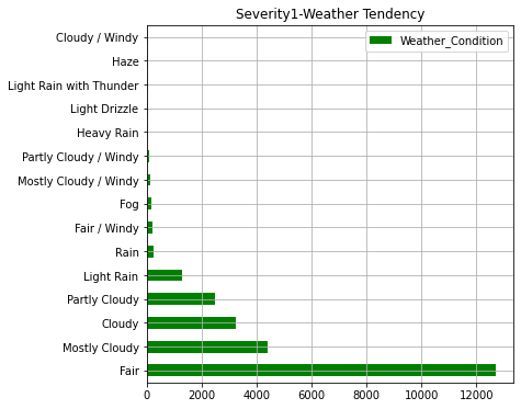
In the graph so far, we can see that states with a higher number of accidents have a larger population. In addition, in terms of the severity of accidents, it can be seen that about 90% of accidents are at the level of "2" (general level). As for the weather, "Clear, Fair, Cloudy" is overwhelmingly common, but the ratio of "light snow, fog, rain, haze" is higher for serious accidents.
# Severity(1-4) with other factors

sns.set(style="darkgrid")
def add_value_label(x_list,y_list):
    for i in range(0, len(x_list)):
        plt.text(i,y_list[i]/4,y_list[i], ha="center")

x = [0, 1, 2, 3, 4]
y = [58.3, 67.5, 29.6,8.0,9.1]
labels = ["Temperature(F)","Humidity(%)","Pressure(in)","Wind_Speed(mph)","Visibility(mi)"]

#Create a colour map
cm = plt.get_cmap("Spectral")
color_maps = [cm(0.1), cm(0.3), cm(0.5), cm(0.7), cm(0.9)]
plt.figure(dpi=100, figsize=(8,3))
#Set bar plots
plt.bar(x, y, tick_label=labels, color="red", edgecolor='black')
add_value_label(x,y)
plt.legend(["Severity4: Average Value of each factor"])
#Give the tilte for the plot
plt.title("Perceptical Causes of Severity4 Accident -Average Values ",size=15,color="red",)
#Name the x and y axis
plt.xlabel('Each Factor')
plt.ylabel('Severity Level4')
plt.show()

#Severity(3)
x = [0, 1, 2, 3, 4]
y = [61.9, 64.2, 29.6, 9.0, 9.4]
labels = ["Temperature(F)","Humidity(%)","Pressure(in)","Wind_Speed(mph)","Visibility(mi)"]

#Create a colour map
cm = plt.get_cmap("Spectral")
color_maps = [cm(0.1), cm(0.3), cm(0.5), cm(0.7), cm(0.9)]
plt.figure(dpi=100, figsize=(8,3))
#Set bar plots
plt.bar(x, y, tick_label=labels, color="orange", edgecolor='black')
add_value_label(x,y)
plt.legend(["Severity3: Average Value of each factor"])
#Give the tilte for the plot
plt.title("Perceptical Causes of Severity3 Accident -Average Values ",size=15,color="orange",)
#Name the x and y axis
plt.xlabel('Each Factor')
plt.ylabel('Severity Level3')
plt.show()

#Severity(2)
x = [0, 1, 2, 3, 4]
y = [61.9, 64.4, 29.5, 7.3, 9.1]
labels = ["Temperature(F)","Humidity(%)","Pressure(in)","Wind_Speed(mph)","Visibility(mi)"]
#Create a colour map
cm = plt.get_cmap("Spectral")
color_maps = [cm(0.1), cm(0.3), cm(0.5), cm(0.7), cm(0.9)]
plt.figure(dpi=100, figsize=(8,3))
#Set bar plots
plt.bar(x, y, tick_label=labels, color="mediumorchid", edgecolor='black')
add_value_label(x,y)
plt.legend(["Severity2: Average Value of each factors"])
#Give the tilte for the plot
plt.title("Perceptical Causes of Severity2 Accident -Average Values ",size=15,color="mediumorchid",)
#Name the x and y axis
plt.xlabel('Each Factor')
plt.ylabel('Severity Level2')
plt.show()

#Severity(1)
x = [0, 1, 2, 3, 4]
y = [71.3, 50.0, 29.0, 8.4, 9.5]
labels = ["Temperature(F)","Humidity(%)","Pressure(in)","Wind_Speed(mph)","Visibility(mi)"]
#Create a colour map
cm = plt.get_cmap("Spectral")
color_maps = [cm(0.1), cm(0.3), cm(0.5), cm(0.7), cm(0.9)]
plt.figure(dpi=100, figsize=(8,3))
#Set bar plots
plt.bar(x, y, tick_label=labels, color="green", edgecolor='black')
add_value_label(x,y)
plt.legend(["Severity1: Average Value of each factor"])
#Give the tilte for the plot
plt.title("Perceptical Causes of Severity1 Accident -Average Values ",size=15,color="green",)
#Name the x and y axis
plt.xlabel('Each Factor')
plt.ylabel('Severity Level1')
plt.show()
Output:
・Perceptual factors (temperature, humidity, air pressure, etc.) of accidents for each "Severity"
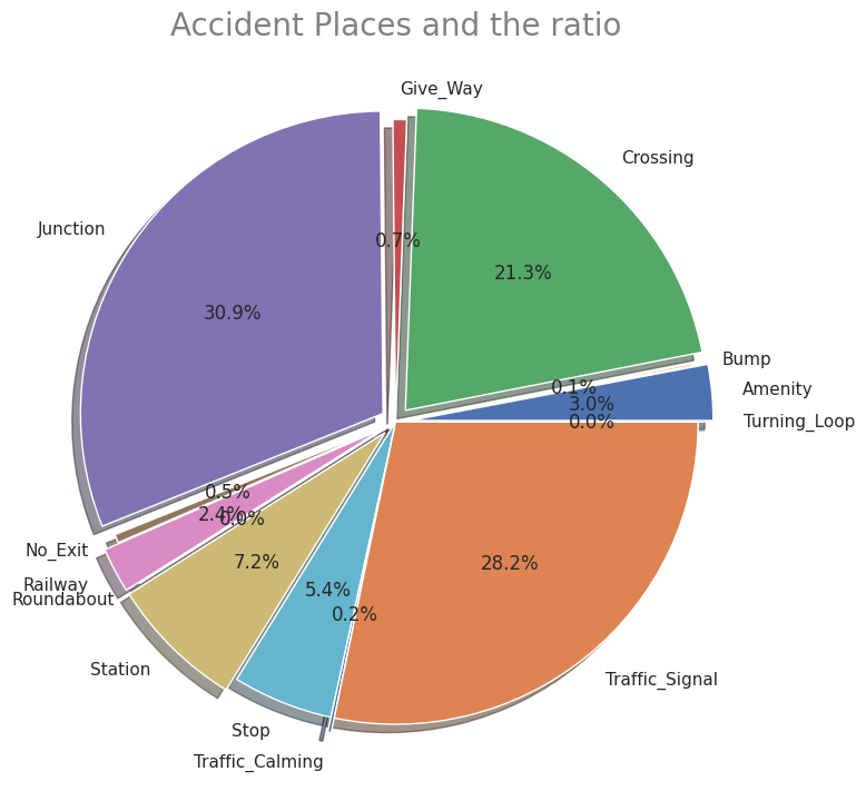
# (3) Places where accidents frequently occured and Map where accidents occured

USplace= US.iloc[:, [30,31,32,33,34,35,36,37,38,39,40,41,42]]
print(USplace.columns.tolist())

# Accidents near Amenity shop
USP1=USplace["Amenity"].value_counts(True,dropna=())
USP1
# Accidents at Bump
USP2=USplace["Bump"].value_counts(True,dropna=())
USP2
# Accidents at Crossing
USP3=USplace["Crossing"].value_counts(True,dropna=())
USP3
# Accidents at Give_Way
USP4=USplace["Give_Way"].value_counts(True,dropna=())
USP4
# Accidents at Junction
USP5=USplace["Junction"].value_counts(True,dropna=())
USP5
# Accidents at No_Exit
USP6=USplace["No_Exit"].value_counts(True,dropna=())
USP6
# Accidents at No_Exit
USP7=USplace["Railway"].value_counts(True,dropna=())
USP7
# Accidents at Roundabout
USP8=USplace["Roundabout"].value_counts(True,dropna=())
USP8
# Accidents near Station
USP9=USplace["Station"].value_counts(True,dropna=())
USP9
# Accidents at Stop
USP10=USplace["Stop"].value_counts(True,dropna=())
USP10
# Accidents at Traffic_Calming
USP11=USplace["Traffic_Calming"].value_counts(True,dropna=())
USP11
# Accidents at Traffic_Signal
USP12=USplace["Traffic_Signal"].value_counts(True,dropna=())
USP12
# Accidents at Turning_Loop
USP13=USplace["Turning_Loop"].value_counts(True,dropna=())
USP13

# Plot ratio of Accidentical places
labels = ['Amenity', 'Bump', 'Crossing', 'Give_Way', 'Junction', 'No_Exit', 'Railway', 'Roundabout', 'Station', 'Stop', 'Traffic_Calming', 'Traffic_Signal', 'Turning_Loop']
sizes = np.array([0.009837, 0.000359, 0.070365, 0.002414, 0.102098, 0.001509, 0.007954, 0.000043, 0.023897, 0.017713, 0.000602, 0.093227, 0])
explode = (0.05,0,0.05,0,0.05,0,0.05,0,0.05,0,0.05,0,0.05)
plt.figure(dpi=100, figsize=(9,9))
# Create a pie chart
plt.pie(sizes, labels=labels, explode=explode, shadow=True,autopct = '%1.1f%%')
# Add a title
plt.title('Accident Places and the ratio',size=20, color="grey")
# Show the plot
plt.show()
Output:
・Ratio of places where accidents occured
"Perceptual factors (temperature, humidity, air pressure, etc.) and percentage of traffic accident locations for each "Severity"
As mentioned above, it is a characteristic item of this dataset. Looking at the perceptual factors for each "Severity", when a serious accident occurs the temperature tends to be lower and the humidity does higher. There doesn't seem to be much difference in other factors. In addition, junctions are the worst place where accidents often occures. The others are intersections and traffic light installation locations. There is also unique data such as stations and amenity stores.
# Map showing the places where accidents occured in all over the states

# import folium module
import folium
from folium.plugins import HeatMap

USmap= US.sample(frac=0.25)
USmap2 = list(zip(USmap['Start_Lat'], USmap['Start_Lng']))

# Display the map
map=folium.Map(location=[37.0902, -95.7129],zoom_start=4,tiles="Stamen Terrain")
HeatMap(USmap2).add_to(map)
map
Output:
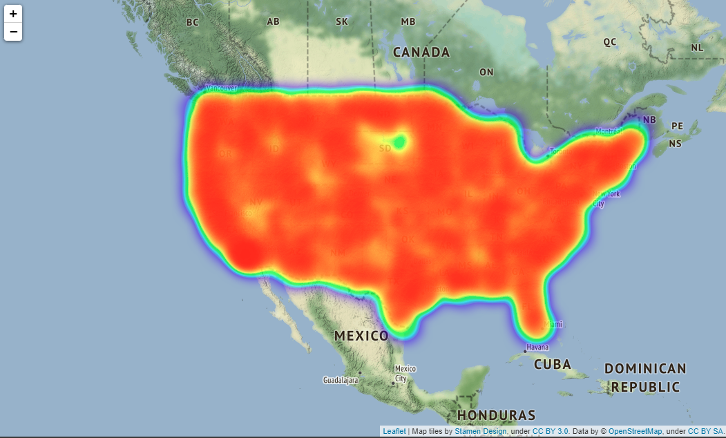
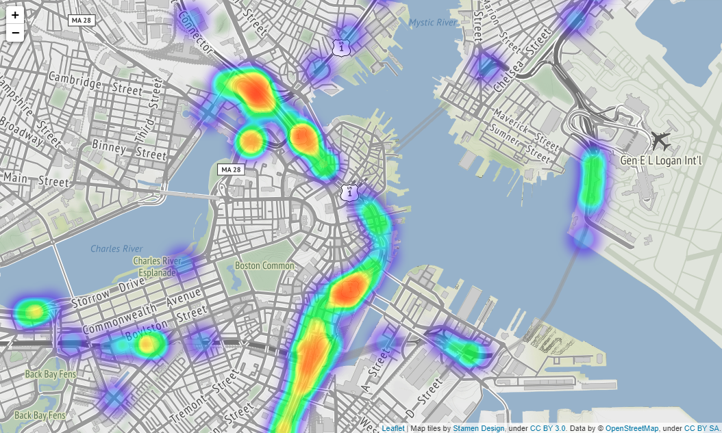
Actually, you can scale the map output by folium, but it seems that it cannot be put on Qiita, so it is difficult to see, it is output as shown in the image below. The location of image below is Boston.
If you put tiles="Stamen Terrain" as a parameter in folium.Map() method, the names of countries, states, towns, main streets, etc. will be displayed on the map making it easier to understand where the accident occurred.
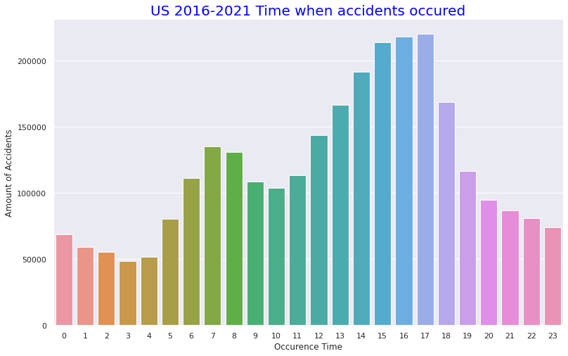
# (4) Statics about Time and Months of the accidents and the Volatirity
# Organaise the data for timely and monthly based
US['Start_Time'].value_counts().head()
US.Start_Time = pd.to_datetime(US.Start_Time)
US.Start_Time
USh =US.Start_Time.dt.hour.value_counts()
USh
UStm=US.Start_Time.dt.hour.value_counts()
UStm
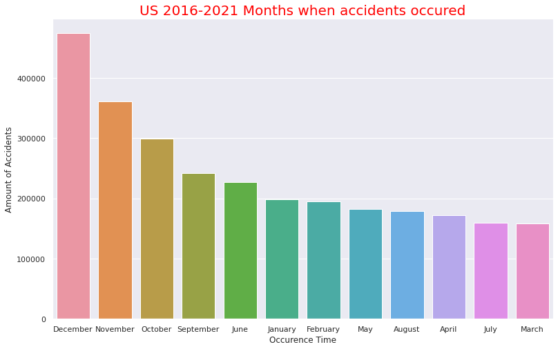
USmonth=US.Start_Time.dt.month_name().value_counts()
USmonth
# plot time based bar chart
def add_value_label(x_list,y_list):
for i in range(0, len(x_list)):
plt.text(i,y_list[i]/4,y_list[i], ha="center")
sns.set(style="darkgrid")
plt.figure(figsize=(13,8))
sns.color_palette("rocket")
sns.barplot(x=UStm.index,y=UStm)
plt.title("US 2016-2021 Time when accidents occured",size=20,color="blue")
plt.xlabel("Occurence Time")
plt.ylabel("Amount of Accidents")
# plot monthly based bar chart
plt.figure(figsize=(13,8))
sns.barplot(x=USmonth.index,y=USmonth)
plt.title("US 2016-2021 Months when accidents occured",size=20,color="red")
plt.xlabel("Occurence Time")
plt.ylabel("Amount of Accidents")
Output:
・Number of accidents per time in one day
・Accidents by month
Number of accidents per time in one day and accidents by month
It can be seen that accidents occured most often in the afternoon of 13:00 to 17:00. It seems to be consistent with high percentage of Clear and Fine weather at the time of the accident (probably because the distinction between Clear and fine weather at night is not so important) as mentioned above. The number of accidents per month seems to be high as it is in September to December. This is consistent with the fact that the more serious the accident occures the cooler the temperature it is. The fact that there is Christmas in December seems to be the reason why December has the highest number of accidents.
# Comfirm volatility of the accident numbers\ from 2016 to 2021
US= pd.read_csv("/content/drive/MyDrive/Drivefolder/US_Accidents_Dec21_updated.csv")
# Show near period of 3years
# Convert the Start_Time column to a datetime object and extract the year and month
US["Start_Time"] = pd.to_datetime(US["Start_Time"])
US["Year"] = US["Start_Time"].dt.year
US["Month"] = US["Start_Time"].dt.month
# Filter the data to year 2019
US2019 = US.loc[(US["Year"] == 2019)]
# Group the data by month and count the number of accidents in each month
UScounts2019 = US2019.groupby("Month").size().reset_index(name="Accidents")
# Plot the data using Seaborn
sns.set(style="darkgrid")
sns.lineplot(data=UScounts2019, x="Month", y="Accidents")
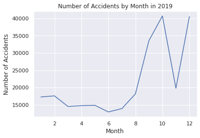
plt.title("Number of Accidents by Month in 2019")
plt.xlabel("Month")
plt.ylabel("Number of Accidents")
plt.show()
# Show the data count as a pandas DataFrame in 2019
print(UScounts2019)
# Filter the data to include only Severity 3 and 4 from the year 2020
US2020 = US.loc[(US["Year"] == 2020)]
# Group the data by month and count the number of accidents in each month
UScounts2020 = US2020.groupby("Month").size().reset_index(name="Accidents")
# Plot the data using Seaborn
sns.set(style="darkgrid")
sns.lineplot(data=UScounts2020, x="Month", y="Accidents")
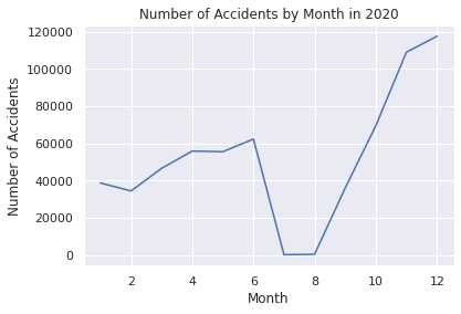
plt.title("Number of Accidents by Month in 2020")
plt.xlabel("Month")
plt.ylabel("Number of Accidents")
plt.show()
# Show the data count as a pandas DataFrame in 2020
print(UScounts2020)
# Filter the data to year 2019-2021
US2019_2021 = US.loc[(US["Year"].isin([2019, 2020, 2021]))]
# Group the data by month and count the number of accidents in each month
UScounts2019_2021 = US2019_2021.groupby(["Year", "Month"]).size().reset_index(name="Accidents")
# Plot the data using Seaborn
sns.set(style="darkgrid")
sns.lineplot(data=UScounts2019_2021, x="Month", y="Accidents", hue="Year", palette="Set1")
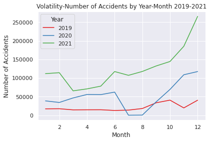
plt.title("Volatility-Number of Accidents by Year-Month 2019-2021")
plt.xlabel("Month")
plt.ylabel("Number of Accidents")
plt.show()
# Show the data count as a pandas DataFrame in 2019-2021
print(UScounts2019_2021)
# Show volatility of whole periods 2016-2021
# Filter the data to year 2026-2021
US2016_2021 = US.loc[(US["Year"].isin([2016, 2017, 2018, 2019, 2020, 2021]))]
# Group the data by month and count the number of accidents in each month
UScounts2016_2021 = US2016_2021.groupby(["Year", "Month"]).size().reset_index(name="Accidents")
# Plot the data using Seaborn
sns.set(style="darkgrid")
sns.lineplot(data=UScounts2016_2021, x="Month", y="Accidents", hue="Year", palette="Set1")
plt.title("Volatility-Number of Accidents by Year-Month 2016-2021")
plt.xlabel("Month")
plt.ylabel("Number of Accidents")
plt.show()
# Show the data count as a pandas DataFrame in 2016-2021
print(UScounts2016_2021)
Output: Click
    Month  Accidents
0       1      17280
1       2      17597
2       3      14536
3       4      14763
4       5      14864
5       6      12942
6       7      13922
7       8      18161
8       9      33541
9      10      40694
10     11      19804
11     12      40511

    Month  Accidents
0       1      38681
1       2      34437
2       3      46604
3       4      55849
4       5      55504
5       6      62271
6       7        186
7       8        488
8       9      36050
9      10      69438
10     11     108873
11     12     117483

    Year  Month  Accidents
0   2019      1      17280
1   2019      2      17597
2   2019      3      14536
3   2019      4      14763
4   2019      5      14864
5   2019      6      12942
6   2019      7      13922
7   2019      8      18161
8   2019      9      33541
9   2019     10      40694
10  2019     11      19804
11  2019     12      40511
12  2020      1      38681
13  2020      2      34437
14  2020      3      46604
15  2020      4      55849
16  2020      5      55504
17  2020      6      62271
18  2020      7        186
19  2020      8        488
20  2020      9      36050
21  2020     10      69438
22  2020     11     108873
23  2020     12     117483
24  2021      1     111858
25  2021      2     114451
26  2021      3      65639
27  2021      4      70899
28  2021      5      78290
29  2021      6     117502
30  2021      7     107345
31  2021      8     117710
32  2021      9     132475
33  2021     10     144466
34  2021     11     185363
35  2021     12     265747

    Year  Month  Accidents
0   2016      1          7
1   2016      2        546
2   2016      3       2398
3   2016      4       5904
4   2016      5       7148
..   ...    ...        ...
67  2021      8     117710
68  2021      9     132475
69  2021     10     144466
70  2021     11     185363
71  2021     12     265747

[72 rows x 3 columns]
This EDA is used for time series analysis and prediction.
Looking before and after the 2019 to 2021 pandemic, you can see that the latter is higher.
EDA for Serious Accident by Region
EDA narrowed down to 4 regions in US and serious accidents ("Severity" "3", "4")
The basic flow is the same as the EDA described above.
# Step2 EDA for Serious Accidents (Severity 4 & 3, 2016-2021)  following with Census Regions of United States

# (1) Import csv file and visualise basic information

from google.colab import drive
drive.mount('/content/drive')

import numpy as np
import pandas as pd
import matplotlib.pyplot as plt
import statsmodels.api as sm
import itertools
from pandas import datetime
import warnings
warnings.simplefilter('ignore')
import seaborn as sns
%matplotlib inline

USRD= pd.read_csv("/content/drive/MyDrive/Drivefolder/US_Accidents_Dec21_updated.csv")

# Census 4Regions of the United States
print("https://www.census.gov/programs-surveys/economic-census/guidance-geographies/levels.html")
print("Reffering to above")
from PIL import Image
img = Image.open("/content/drive/MyDrive/Drivefolder/Census_RegionUS.png")
img.show()

# Visualisation of High Severity (Level3-4) accidents in 2016-2021

# Numbers of the states where level 4 accidents occured in 2016-2021
print("【Severity_4】Numbers of the states where level 4 accidents occuredin 2016-2021")

# Severity4- Select out related columns out of whole data and organise the data
USsv = USRD.loc[:,["ID","State","Severity"]]
print(USsv.shape)
USsv4 = USsv.query("Severity == 4")
print(USsv4.shape)

USsv4_c = USsv4.groupby("State").count()["ID"]
USlv4= pd.DataFrame(USsv4_c).sort_values("ID", ascending=False)
USlv4.columns = ["Counts"]
print(USlv4.shape)

# Numbers of Level4 accidents in all the states
USlv4.plot(kind="barh",colormap='hsv',title="Severity Level_4",grid=True,legend="legend",color="red",figsize=(12,12))

#Numbers of the states where level 3 accidents occured in 2016-2021
print("【Severity_3】Numbers of the states where level 3 accidents occured in 2016-2021")

# Severity3- Select out related columns out of whole data and organise the data
USsv_2 = USRD.loc[:,["ID","State","Severity"]]
print(USsv_2.shape)
USsv3 = USsv_2.query("Severity == 3")
print(USsv3.shape)

print("Numbers of the states where level 4 accidents occured")
USsv3_c = USsv3.groupby("State").count()["ID"]
USlv3= pd.DataFrame(USsv3_c).sort_values("ID", ascending=False)
#print(pd.DataFrame(USlv3))
USlv3.columns = ["Counts"]
print(USlv3.shape)

# Numbers of Severity4 accidents in all the states
USlv3.plot(kind="barh",colormap='hsv',title="Severity Level_3",grid=True,legend="legend",color="gold",figsize=(12,12))
Output: Click
https://www.census.gov/programs-surveys/economic-census/guidance-geographies/levels.html
Reffering above
【Severity_4】Numbers of the states where level 4 accidents occuredin 2016-2021
(2845342, 3)
(131193, 3)
(49, 1)
【Severity_3】Numbers of the states where level 3 accidents occured in 2016-2021
(2845342, 3)
(155105, 3)
Numbers of the states where level 4 accidents occured
(49, 1)
<Axes: title={'center': 'Severity Level_3'}, ylabel='State'>
・4 region in US displayed by Python Imaging Library
・Total number of "Severity" "4" accidents in each state
・Total number of "Severity" "3" accidents in each state
# (2) Organaise the basic data for EDA in 4 Region

# Select out the data of each Census Region

# Northeast-9 States
Northeast = USRD.query('State in ["ME","NH","VT","MA","CT","RI","NY","NJ","PA"]')
print("Northeast-9 States")
print(Northeast.shape)

# Midwest-12 States
Midwest = USRD.query('State in ["OH","MI","IN","WI","IL","MN","IA","MO","ND","SD","NE","KS"]')
print("Midwest- 12 States")
print(Midwest.shape)

# South-17 States
South = USRD.query('State in ["DE","MD","DC","WV","VA","NC","SC","GA","FL","KY","TN","AL","MS","AR","LA","OK","TX"]')
print("South-17 States")
print(South.shape)

# West-11 States
West = USRD.query('State in ["MT","WY","CO","NM","ID","UT","AZ","NV","WA","OR","CA"]')
print("West-11 States")
print(West.shape)
Output: Click
Northeast-9 States
(307955, 47)
Midwest- 12 States
(295340, 47)
South-17 States
(1122182, 47)
West-11 States
(1119865, 47)
Pandas quey() method is used to divide the data from the entire United States into four locations: "Northeast", "Midwest", "South", and "West".
# (3) EDA and Visualisation for 4 Region 2016-2021
# Numbers of Severity 4-3 and the sum in 4 Region

# Extract data of Severity 4-3 from each region data

# Northeast Region
Northeast4 = Northeast.query("Severity == 4")
Northeast3 = Northeast.query("Severity == 3")
Northeast4 = Northeast4.groupby('Severity').count()['ID']
Northeast3 = Northeast3.groupby('Severity').count()['ID']
Northeast34 = int(Northeast4)+int(Northeast3)

# Midwest Region
Midwest4 = Midwest.query("Severity == 4")
Midwest3 = Midwest.query("Severity == 3")
Midwest4 = Midwest4.groupby('Severity').count()['ID']
Midwest3 = Midwest3.groupby('Severity').count()['ID']
Midwest34 = int(Midwest4)+int(Midwest3)

# South Region
South4 = South.query("Severity == 4")
South3 = South.query("Severity == 3")
South4 = South4.groupby('Severity').count()['ID']
South3 = South3.groupby('Severity').count()['ID']
South34 = int(South4)+int(South3)

# West Region
West4 = West.query("Severity == 4")
West3 = West.query("Severity == 3")
West4 = West4.groupby('Severity').count()['ID']
West3 = West3.groupby('Severity').count()['ID']
West34 = int(West4)+int(West3)


# Severity4- Numbers of accidents
sns.set(style="darkgrid")
def add_value_label(x_list,y_list):
    for i in range(0, len(x_list)):
        plt.text(i,y_list[i]/4,y_list[i], ha="center")

x = [0, 1, 2, 3]
y = [25152, 24950, 53468, 27623]
labels = ["Northeast","Midwest","South","West"]
cm = plt.get_cmap("Spectral")
color_maps = [cm(0.1), cm(0.3), cm(0.5), cm(0.7), cm(0.9)]
plt.figure(dpi=100, figsize=(8,3))
plt.bar(x, y, tick_label=labels, color="red", edgecolor='black')
add_value_label(x,y)
plt.legend(["Severity4 numbers in 4 Region"])
plt.title("Severity_Level 4 accindens in 4 Region ",size=15,color="red",)
plt.xlabel('')
plt.ylabel('Numbere of Severity4_accidents')
plt.show()


# Severity3- Numbers of accidents
def add_value_label(x_list,y_list):
    for i in range(0, len(x_list)):
        plt.text(i,y_list[i]/4,y_list[i], ha="center")

x = [0, 1, 2, 3]
y = [18922, 38226, 58033, 39924]
labels = ["Northeast","Midwest","South","West"]
cm = plt.get_cmap("Spectral")
color_maps = [cm(0.1), cm(0.3), cm(0.5), cm(0.7), cm(0.9)]
plt.figure(dpi=100, figsize=(8,3))
plt.bar(x, y, tick_label=labels, color="orange", edgecolor='black')
add_value_label(x,y)
plt.legend(["Severity3 numbers in 4 Region"])
plt.title("Severity_Level 3 accindens in 4 Region ",size=15,color="orange",)
plt.xlabel('')
plt.ylabel('Numbere of Severity3_accidents')
plt.show()


# Serious accidents(Serverity4&3-sum) numbers in 4 region
def add_value_label(x_list,y_list):
    for i in range(0, len(x_list)):
        plt.text(i,y_list[i]/4,y_list[i], ha="center")

x = [0, 1, 2, 3]
y = [44074, 63176, 111501, 67547]
labels = ["Northeast","Midwest","South","West"]
cm = plt.get_cmap("Spectral")
color_maps = [cm(0.1), cm(0.3), cm(0.5), cm(0.7), cm(0.9)]
plt.figure(dpi=100, figsize=(8,3))
plt.bar(x, y, tick_label=labels, color="pink", edgecolor='black')
add_value_label(x,y)
plt.legend(["Serious Accidents in 4 Region"])
plt.title("Serious Accidents(Total accidents of Severity4 & 3) in 4 Region ",size=15,color="purple",)
plt.xlabel('')
plt.ylabel('Numbere of Serious_accidents')
plt.show()


# Ratio of Serious accidents(Serverity4&3-sum)
labels = ["Northeast","Midwest","South","West"]
sizes = np.array([44074, 63176, 111501, 67547])
explode = (0.05,0,0.05,0)
plt.figure(dpi=100, figsize=(6,6))
plt.pie(sizes, labels=labels, explode=explode, shadow=True,autopct = '%1.1f%%')
plt.title("Ratio of Serious Accidents, Severity4 & 3 in 4 Region",size=20, color="red")
plt.show()
・Visualise the ratio of serious accidents "Severity" "3" and "4" in each of the four regions
As with the entire US, most of the frequency of accidents affecting traffic in the four regions is "Severity" and "2" as mentioned above, so I narrowed it down to only serious accidents.
In terms of the total number of accidents, California (west) and Florida (southern) occupy for half of the total number of accidents, but the number of serious accidents also accounted for more than half in the western and southern regions. So it can be seen that the region with the highest number has a higher number of accidents and a correlation with it.
# Organise the data for Numbers of Serious accidents(Severity4&3) in cities of 4 region

# all over the 4 region
Region43=USRD.query("Severity in [4,3]")
Region43p=Region43["State"].value_counts().head(10)
print(Region43p.head(10))
# Northeast-states
Northeast43 = Northeast.query("Severity in [4,3]")
Northeast43p= Northeast43["State"].value_counts().head(5)
print(Northeast43p.head(5))
# Midwest-states
Midwest43 = Midwest.query("Severity in [4,3]")
Midwest43p= Midwest43["State"].value_counts().head(5)
print(Midwest43p.head(5))
# South-states
South43 = South.query("Severity in [4,3]")
South43p= South43["State"].value_counts().head(5)
print(South43p.head(5))
# West-states
West43 = West.query("Severity in [4,3]")
West43p= West43["State"].value_counts().head(5)
print(West43p.head(5))
Output: Click
CA    29348
TX    24037
IL    22895
FL    21059
NY    15858
GA    13803
CO    13003
VA    12992
MD    12786
PA    11607
Name: State, dtype: int64
NY    15858
PA    11607
NJ     8436
CT     4996
MA     2025
Name: State, dtype: int64
IL    22895
MI     9246
OH     7158
IN     6195
MO     5600
Name: State, dtype: int64
TX    24037
FL    21059
GA    13803
VA    12992
MD    12786
Name: State, dtype: int64
CA    29348
CO    13003
WA     7294
OR     6550
AZ     6089
Name: State, dtype: int64
# All the states in 4 region

# All the states- Worst 10 Numbers of Serious Accidents(Severity4&3)
sns.set(style="darkgrid")
def add_value_label(x_list,y_list):
    for i in range(0, len(x_list)):
        plt.text(i,y_list[i]/4,y_list[i], ha="center")

x = [0, 1, 2, 3, 4, 5, 6, 7, 8, 9]
y = [29348, 24037, 22895, 21059, 15858, 13803, 13003, 12992, 12786, 11607]
labels = ["California","Texas","Illinois","Florida","New York","Georgia","Colorado","Virginia","Maryland","Pennsylvania"]
cm = plt.get_cmap("Spectral")
color_maps = [cm(0.1), cm(0.3), cm(0.5), cm(0.7), cm(0.9)]
plt.figure(dpi=100, figsize=(12,3))
plt.bar(x, y, tick_label=labels, color="white", edgecolor='black')
add_value_label(x,y)
plt.legend(["Serious Accidents(Severity4&3)"])
plt.title("All the states- Worst 10 Numbers of Serious Accidents(Severity4&3)",size=15,color="black",)
plt.xlabel('All the states')
plt.ylabel('')
plt.show()

# Northeast- Worst 5 Numbers of Serious Accidents(Severity4&3)
x = [0, 1, 2, 3, 4]
y = [15858, 11607, 8436, 4996, 2025]
labels = ["New York","Pennsylvania","New Jersey","Connecticut","Massachusetts"]
cm = plt.get_cmap("Spectral")
color_maps = [cm(0.1), cm(0.3), cm(0.5), cm(0.7), cm(0.9)]
plt.figure(dpi=100, figsize=(8,3))
plt.bar(x, y, tick_label=labels, color="red", edgecolor='black')
add_value_label(x,y)
plt.legend(["Serious Accidents(Severity4&3)"])
plt.title("Northeast states- Worst 5 Numbers of Serious Accidents(Severity4&3)",size=15,color="red",)
plt.xlabel('Northeast states')
plt.ylabel('')
plt.show()

# Midwest- Worst 5 Numbers of Serious Accidents(Severity4&3)
x = [0, 1, 2, 3, 4]
y = [22895, 9246, 7158, 6195, 5600]
labels = ["Illinois","Michigan","Ohio","Indiana","Missouri"]
cm = plt.get_cmap("Spectral")
color_maps = [cm(0.1), cm(0.3), cm(0.5), cm(0.7), cm(0.9)]
plt.figure(dpi=100, figsize=(8,3))
plt.bar(x, y, tick_label=labels, color="orange", edgecolor='black')
add_value_label(x,y)
plt.legend(["Serious Accidents(Severity4&3)"])
plt.title("Midwest states- Worst 5 Numbers of Serious Accidents(Severity4&3)",size=15,color="orange",)
plt.xlabel('Midwest states')
plt.ylabel(' ')
plt.show()

# South- Worst 5 Numbers of Serious Accidents(Severity4&3)
x = [0, 1, 2, 3, 4]
y = [24037, 21059, 13803, 12992, 12786]
labels = ["Texas","Florida","Georgia","Virginia","Maryland"]
cm = plt.get_cmap("Spectral")
color_maps = [cm(0.1), cm(0.3), cm(0.5), cm(0.7), cm(0.9)]
plt.figure(dpi=100, figsize=(8,3))
plt.bar(x, y, tick_label=labels, color="mediumorchid", edgecolor='black')
add_value_label(x,y)
plt.legend(["Serious Accidents(Severity4&3)"])
plt.title("South states- Worst 5 Numbers of Serious Accidents(Severity4&3)",size=15,color="purple",)
plt.xlabel('South states')
plt.ylabel(' ')
plt.show()

# West- Worst 5 Numbers of Serious Accidents(Severity4&3)
x = [0, 1, 2, 3, 4]
y = [29348, 13003, 7294, 6550, 6089]
labels = ["California","Colorado","Washington","Oregon","Arizona"]
cm = plt.get_cmap("Spectral")
color_maps = [cm(0.1), cm(0.3), cm(0.5), cm(0.7), cm(0.9)]
plt.figure(dpi=100, figsize=(8,3))
plt.bar(x, y, tick_label=labels, color="limegreen", edgecolor='black')
add_value_label(x,y)
plt.legend(["Serious Accidents(Severity4&3)"])
plt.title("West states- Worst 5 Numbers of Serious Accidents(Severity4&3)",size=15,color="green",)
plt.xlabel('West states')
plt.ylabel(' ')
plt.show()
Output:
・ 10 worst states with the highest number of serious accidents in all states
・The 5 worst states with the serious accidents in the Northeast
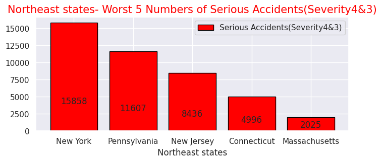
・The 5 worst states with the serious accidents in the Midwest
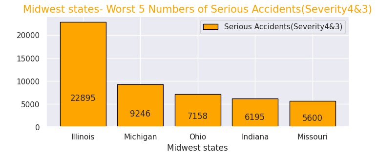
・The 5 worst states with the serious accidents in the south
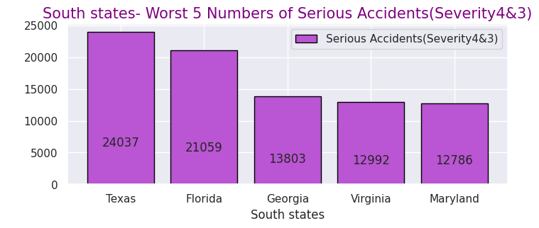
・The 5 worst states with the serious accidents in the West
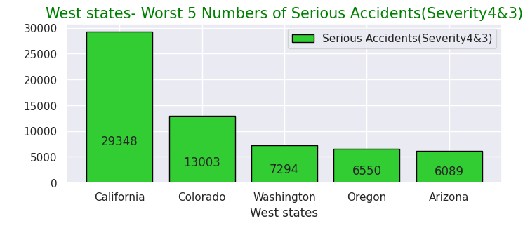
# Northeast Severity4&3 as to condion
Northeast43 = Northeast.query("Severity in [4,3]")
# Nottheast Severity4&3 with means of each caused factor
Northeast43condi = Northeast43.loc[:, ['State','ID','Temperature(F)','Humidity(%)','Pressure(in)','Wind_Speed(mph)','Weather_Condition','Visibility(mi)']]
Northeast43fact= Northeast43condi.mean().round(1)
print(Northeast43fact)
# Northeast Severity4&3 Weather tendency
Northeast43_weather=Northeast43condi["Weather_Condition"].value_counts()
print(Northeast43_weather.iloc[:30])

# Midwest Severity4&3 as to condion
Midwest43 = Midwest.query("Severity in [4,3]")
# Midwast Severity4&3 with means of each caused factor
Midwest43condi = Midwest.loc[:, ['State','ID','Temperature(F)','Humidity(%)','Pressure(in)','Wind_Speed(mph)','Weather_Condition','Visibility(mi)']]
Midwest43fact= Midwest43condi.mean().round(1)
print(Midwest43fact)
# Midwest Severity4&3 Weather tendency
Midwest43_weather=Midwest43condi["Weather_Condition"].value_counts()
print(Midwest43_weather.iloc[:30])

# South Severity4&3 as to condion
South43 = South.query("Severity in [4,3]")
# South Severity4&3 with means of each caused factor
South43condi = South43.loc[:, ['State','ID','Temperature(F)','Humidity(%)','Pressure(in)','Wind_Speed(mph)','Weather_Condition','Visibility(mi)']]
South43fact= South43condi.mean().round(1)
print(South43fact)
# South Severity4&3 Weather tendency
South43_weather=South43condi["Weather_Condition"].value_counts()
print(South43_weather.iloc[:30])

# West Severity4&3 as to condion
West43 = West.query("Severity in [4,3]")
# Nottheast Severity4&3 with means of each caused factor
West43condi = West43.loc[:, ['State','ID','Temperature(F)','Humidity(%)','Pressure(in)','Wind_Speed(mph)','Weather_Condition','Visibility(mi)']]
West43fact= West43condi.mean().round(1)
print(West43fact)
# West Severity4&3 Weather tendency
West43_weather=West43condi["Weather_Condition"].value_counts()
print(West43_weather.iloc[:30])

# Northeast others Severity4&3 sum
print(245+175+173+149+142+142+130+120+80+75+67+66+52+50+49+35+31+26+18)
# Midwest others Severity4&3 sum
print(2082+2057+1816+1563+1214+964+946+758+717+693+495+483+440+361+333+312+310+269+257)
# South others Severity4&3 sum
print(461+383+380+293+240+236+236+219+215+209+159+155+130+109+109+101+94+65+62)
# West others Severity4&3 sum
print(439+333+321+257+156+124+119+118+92+83+65+59+57+57+54+51+45+45+32)
Output: Click
Temperature(F)     55.5
Humidity(%)        66.0
Pressure(in)       29.8
Wind_Speed(mph)     8.9
Visibility(mi)      9.0
dtype: float64
Fair                       8498
Mostly Cloudy              6393
Clear                      6353
Overcast                   4706
Cloudy                     4591
Partly Cloudy              3786
Light Rain                 3018
Scattered Clouds           1695
Light Snow                 1055
Rain                        585
Fog                         541
Light Drizzle               245
Mostly Cloudy / Windy       175
Heavy Rain                  173
Snow                        149
Fair / Windy                142
Cloudy / Windy              142
Haze                        130
Light Rain / Windy          120
Heavy Snow                   80
Partly Cloudy / Windy        75
T-Storm                      67
Light Freezing Rain          66
Wintry Mix                   52
Drizzle                      50
Light Rain with Thunder      49
Thunder in the Vicinity      35
Thunder                      31
Heavy T-Storm                26
Mist                         18
Name: Weather_Condition, dtype: int64
Temperature(F)     47.9
Humidity(%)        69.2
Pressure(in)       29.3
Wind_Speed(mph)     9.3
Visibility(mi)      8.7
dtype: float64
Fair                            83419
Cloudy                          42900
Mostly Cloudy                   31005
Clear                           27288
Overcast                        21506
Partly Cloudy                   20873
Light Snow                      19076
Light Rain                      12680
Scattered Clouds                 7389
Fog                              2872
Rain                             2588
Fair / Windy                     2082
Haze                             2057
Snow                             1816
Cloudy / Windy                   1563
Light Snow / Windy               1214
Wintry Mix                        964
Light Drizzle                     946
Heavy Rain                        758
Mostly Cloudy / Windy             717
T-Storm                           693
Partly Cloudy / Windy             495
N/A Precipitation                 483
Light Rain with Thunder           440
Light Rain / Windy                361
Light Freezing Rain               333
Thunder in the Vicinity           312
Light Thunderstorms and Rain      310
Heavy Snow                        269
Haze / Windy                      257
Name: Weather_Condition, dtype: int64
Temperature(F)     66.7
Humidity(%)        69.0
Pressure(in)       29.8
Wind_Speed(mph)     8.0
Visibility(mi)      9.2
dtype: float64
Fair                            21108
Clear                           19948
Mostly Cloudy                   16975
Partly Cloudy                   10996
Overcast                         9907
Cloudy                           7910
Scattered Clouds                 6828
Light Rain                       5365
Rain                             1468
Fog                              1017
Heavy Rain                        683
Light Drizzle                     461
Light Snow                        383
Haze                              380
T-Storm                           293
Light Thunderstorms and Rain      240
Thunder in the Vicinity           236
Thunderstorm                      236
Light Rain with Thunder           219
Fair / Windy                      215
Thunder                           209
Heavy T-Storm                     159
Mostly Cloudy / Windy             155
Drizzle                           130
Heavy Thunderstorms and Rain      109
Cloudy / Windy                    109
Partly Cloudy / Windy             101
Thunderstorms and Rain             94
Mist                               65
Light Rain / Windy                 62
Name: Weather_Condition, dtype: int64
Temperature(F)     59.6
Humidity(%)        57.4
Pressure(in)       28.9
Wind_Speed(mph)     8.1
Visibility(mi)      9.9
dtype: float64
Clear                      17068
Fair                       12591
Mostly Cloudy               8397
Partly Cloudy               6275
Overcast                    5498
Cloudy                      4565
Light Rain                  2848
Scattered Clouds            2753
Light Snow                  1402
Haze                        1228
Rain                         491
Fog                          439
Smoke                        333
Fair / Windy                 321
Snow                         257
Mostly Cloudy / Windy        156
Heavy Rain                   124
Partly Cloudy / Windy        119
Cloudy / Windy               118
Light Drizzle                 92
Heavy Snow                    83
Light Freezing Fog            65
Showers in the Vicinity       59
Thunder in the Vicinity       57
Light Rain with Thunder       57
Light Rain / Windy            54
Wintry Mix                    51
Mist                          45
Light Snow / Windy            45
T-Storm                       32
Name: Weather_Condition, dtype: int64
1825
16070
3856
2507
# Weather conditions and Perceptical factors of Serious Accidents, Severity4 & 3 in 4 Region

# Weather conditons of Serious Accidents

# Northeast- Weather conditon Ratio of Serious Accidents, Severity4 & 3
labels= ["Fair", "Mostly Cloudy ", "Clear","Overcast","Cloudy","Partly Cloudy","Light Rain","Scattered Clouds",
         "Light Snow ", "Rain","Fog", "Others"]

sizes = np.array([8498,6393,6353,4706,4591,3786,3018,1695,1055,585,541,1825])
plt.figure(dpi=100, figsize=(10,10))
explode = (0.05,0,0.05,0)
# Create a pie chart
plt.pie(sizes, labels=labels,shadow=True,autopct = '%1.1f%%')
# Add a title
plt.title("Northeast- Weather conditon Ratio of Serious Accidents, Severity4&3",size=20, color="orange")
# Show the plot
plt.show()

# Midwest- Weather conditon Ratio of Serious Accidents, Severity4&3
labels= ["Fair","Cloudy", "Mostly Cloudy ","Clear","Overcast","Partly Cloudy","Light Snow ",
"Light Rain","Scattered Clouds","Fog","Rain","Others"]

sizes = np.array([83419,42900,31005,27288,21506,20873,19076,12680,7389,2872,2588,16070])
plt.figure(dpi=100, figsize=(10,10))
explode = (0.05,0,0.05,0)
# Create a pie chart
plt.pie(sizes, labels=labels,shadow=True,autopct = '%1.1f%%')
# Add a title
plt.title("Midwest- Weather conditon Ratio of Serious Accidents, Severity4&3",size=20, color="red")


# South- Weather conditon Ratio of Serious Accidents, Severity4&3
labels= ["Fair","Clear","Mostly Cloudy ","Partly Cloudy","Overcast","Cloudy","Scattered Clouds","Light Rain",
         "Rain","Fog","Heavy Rain","Others"]

sizes = np.array([21108,19948,16975,10996,9907,7910,6828,5365,1468,1017,683,3856])
plt.figure(dpi=100, figsize=(10,10))
explode = (0.05,0,0.05,0)
# Create a pie chart
plt.pie(sizes, labels=labels,shadow=True,autopct = '%1.1f%%')
# Add a title
plt.title("South- Weather conditon Ratio of Serious Accidents, Severity4&3",size=20, color="green")

# West- Weather conditon Ratio of Serious Accidents, Severity4&3
labels= ["Clear","Fair","Mostly Cloudy ","Partly Cloudy","Overcast","Cloudy","Light Rain","Scattered Clouds",
         "Light Snow","Haze","Rain","Others"]

sizes = np.array([17068,12591,8397,6275,5498,4565,2848,2753,1402,1228,491,2507])
plt.figure(dpi=100, figsize=(10,10))
explode = (0.05,0,0.05,0)
# Create a pie chart
plt.pie(sizes, labels=labels,shadow=True,autopct = '%1.1f%%')
# Add a title
plt.title("West- Weather conditon Ratio of Serious Accidents, Severity4&3",size=20, color="blue")

# Perceptical causes of Serious Accidents in 4Region
sns.set(style="darkgrid")
def add_value_label(x_list,y_list):
    for i in range(0, len(x_list)):
        plt.text(i,y_list[i]/4,y_list[i], ha="center")

# Northeast
x = [0, 1, 2, 3, 4]
y = [55.5, 66.0, 29.8,8.9,9.0]
labels = ["Temperature(F)","Humidity(%)","Pressure(in)","Wind_Speed(mph)","Visibility(mi)"]

#Create a colour map
cm = plt.get_cmap("Spectral")
color_maps = [cm(0.1), cm(0.3), cm(0.5), cm(0.7), cm(0.9)]
plt.figure(dpi=100, figsize=(8,3))
plt.bar(x, y, tick_label=labels, color="red", edgecolor='black')
add_value_label(x,y)
plt.legend(["Average Value of each cause"])
plt.title("Northeast- Perceptical Causes of Serious Accident -Average Values",size=15,color="red",)
plt.xlabel('Each Factor')
plt.ylabel('')
plt.show()

# Midwest
x = [0, 1, 2, 3, 4]
y = [47.9, 69.2, 29.3, 9.3, 8.7]
labels = ["Temperature(F)","Humidity(%)","Pressure(in)","Wind_Speed(mph)","Visibility(mi)"]

#Create a colour map
cm = plt.get_cmap("Spectral")
color_maps = [cm(0.1), cm(0.3), cm(0.5), cm(0.7), cm(0.9)]
plt.figure(dpi=100, figsize=(8,3))
plt.bar(x, y, tick_label=labels, color="orange", edgecolor='black')
add_value_label(x,y)
plt.legend(["Average Value of each cause"])
plt.title("Midwest- Perceptical Causes of Serious Accident -Average Values",size=15,color="orange",)
plt.xlabel('Each Factor')
plt.ylabel(' ')
plt.show()

# South
x = [0, 1, 2, 3, 4]
y = [66.7, 69.0, 29.8, 8.0, 9.2]
labels = ["Temperature(F)","Humidity(%)","Pressure(in)","Wind_Speed(mph)","Visibility(mi)"]

#Create a colour map
cm = plt.get_cmap("Spectral")
color_maps = [cm(0.1), cm(0.3), cm(0.5), cm(0.7), cm(0.9)]
plt.figure(dpi=100, figsize=(8,3))
plt.bar(x, y, tick_label=labels, color="mediumorchid", edgecolor='black')
add_value_label(x,y)
plt.legend(["Average Value of each cause"])
plt.title("South- Perceptical Causes of Serious Accident -Average Values",size=15,color="mediumorchid",)
plt.xlabel('Each Factor')
plt.ylabel(' ')
plt.show()

# West
x = [0, 1, 2, 3, 4]
y = [59.6, 57.4, 28.9, 8.1, 9.9]
labels = ["Temperature(F)","Humidity(%)","Pressure(in)","Wind_Speed(mph)","Visibility(mi)"]

#Create a colour map
cm = plt.get_cmap("Spectral")
color_maps = [cm(0.1), cm(0.3), cm(0.5), cm(0.7), cm(0.9)]
plt.figure(dpi=100, figsize=(8,3))
plt.bar(x, y, tick_label=labels, color="green", edgecolor='black')
add_value_label(x,y)
plt.legend(["Average Value of each cause"])
plt.title("West- Perceptical Causes of Serious Accident -Average Values",size=15,color="green",)
plt.xlabel('Each Factor')
plt.ylabel(' ')
plt.show()
・Ratio of weather conditions at the time of serious accidents in each of the four regions
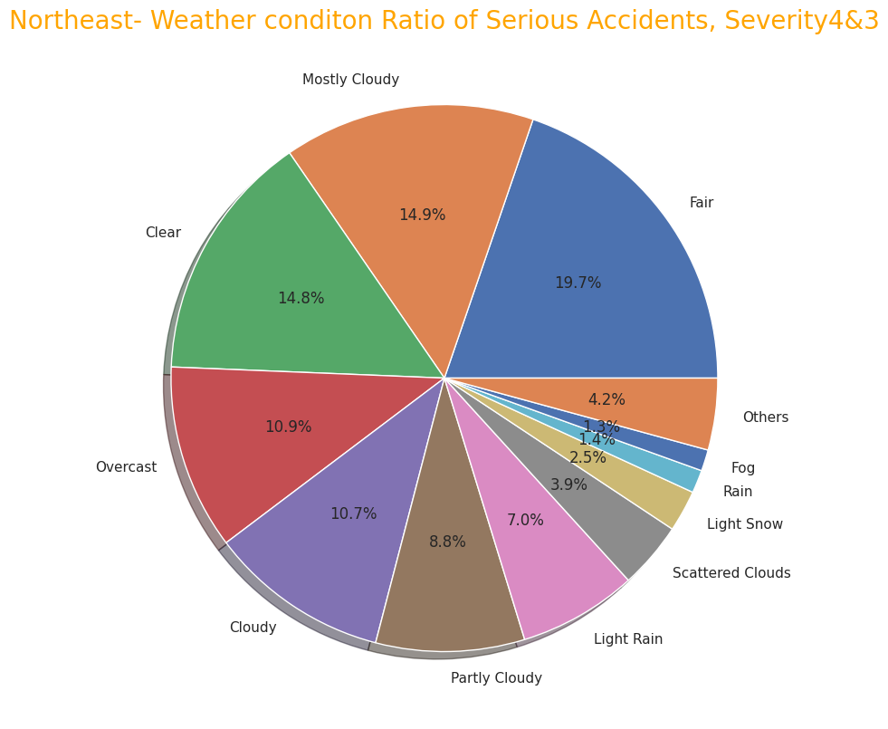
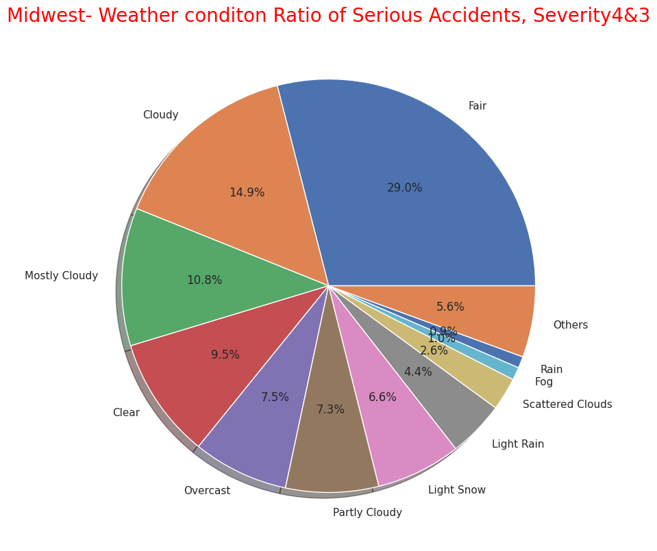
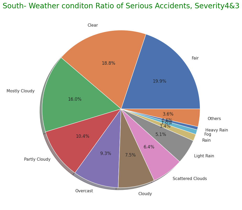
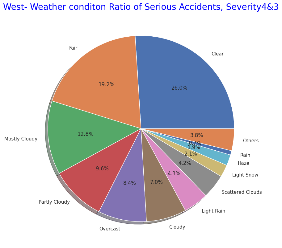
・Perceptual factors such as temperature, humidity, and air pressure at the time of serious accidents in each of the four region
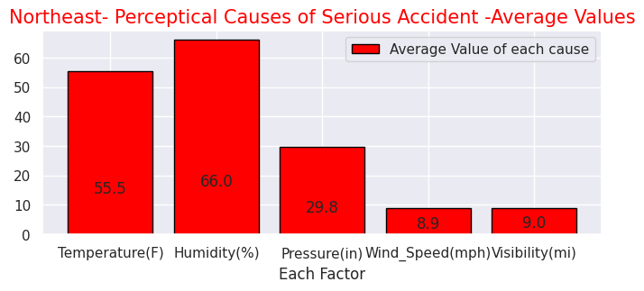
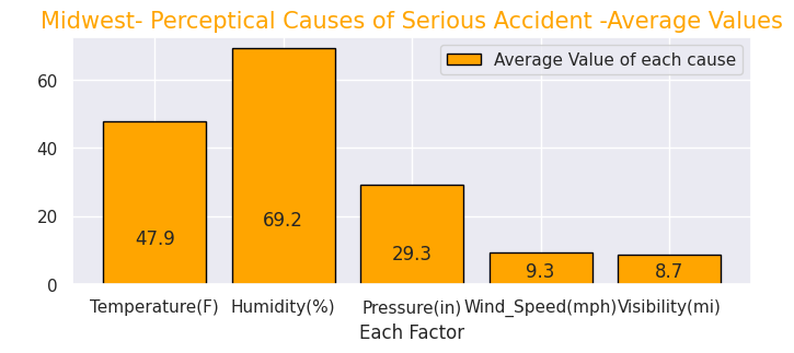

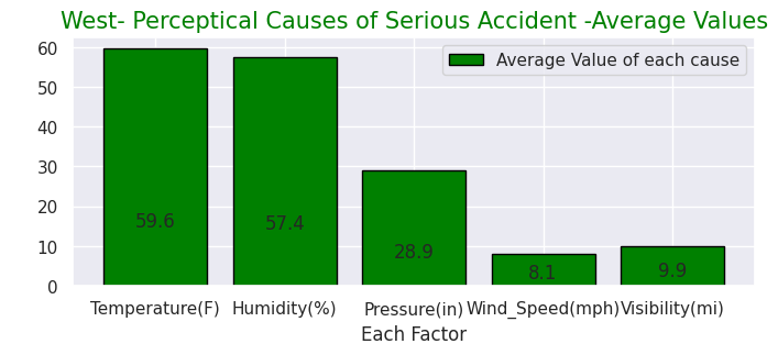
Regarding weather conditions and perceptual factors in the number of serious accidents in each of the four regions, it can be seen that the weather conditions Clear, Fine, and Cloudy are common. But in the northeast and midwest, "light rain" and "light snow" account for about 10%. In the south, there are "heavy rains" and in the west "haze". it can be seen that there are weather characteristics in each region."
On the other hand, in terms of perceptual factors, there does not seem to be much difference between regions, but in the Midwest which is located inland to the north, the average temperature on the day of a serious accident is significantly lower than in other regions.
# Northeast-Map showing the locations where the accidents occured
# (4) Maps in 4region whire severe accidents occured
# import folium library
import folium
from folium.plugins import HeatMap

# Display map
Northeastmap= Northeast.sample(frac=0.25)
Northeastmap2 = list(zip(Northeastmap['Start_Lat'], Northeastmap['Start_Lng']))
map=folium.Map(location=[43.000000, -75.000000],zoom_start=5,tiles="Stamen Terrain")
HeatMap(Northeastmap2).add_to(map)
map

# Midwest-Map showing the locations where the accidents occured

Midwestmap= Midwest.sample(frac=0.25)
Midwest2 = list(zip(Midwestmap['Start_Lat'], Midwestmap['Start_Lng']))
map=folium.Map(location=[42.032974, -93.581543],zoom_start=5,tiles="Stamen Terrain")
HeatMap(Midwest2).add_to(map)
map

# South-Map showing the locations where the accidents occured

Southmap= South.sample(frac=0.25)
South2 = list(zip(Southmap['Start_Lat'], Southmap['Start_Lng']))
map=folium.Map(location=[32.318230, -86.902298],zoom_start=5,tiles="Stamen Terrain")
HeatMap(South2).add_to(map)
map

# West-Map showing the locations where the accidents occured

Westmap= West.sample(frac=0.25)
West2 = list(zip(Westmap['Start_Lat'], Westmap['Start_Lng']))
map=folium.Map(location=[39.419220, -111.950684],zoom_start=5,tiles="Stamen Terrain")
HeatMap(West2).add_to(map)
map
・Serious accident map of the Northeast
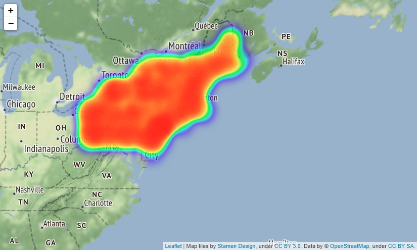
・Serious accident map of the Midwest
・Serious accident map of the South
・Serious accident map of the West
US_place=USRD.query("Severity in [4,3]")

US_place43=US_place.loc[:,['Amenity', 'Bump', 'Crossing', 'Give_Way', 'Junction', 'No_Exit', 'Railway', 'Roundabout', 'Station', 'Stop', 'Traffic_Calming', 'Traffic_Signal', 'Turning_Loop']]

# Accidents near Amenity shop
USP1=US_place43["Amenity"].value_counts(True,dropna=())
# Accidents at Bump
USP2=US_place43["Bump"].value_counts(True,dropna=())
# Accidents at Crossing
USP3=US_place43["Crossing"].value_counts(True,dropna=())
# Accidents at Give_Way
USP4=US_place43["Give_Way"].value_counts(True,dropna=())
# Accidents at Junction
USP5=US_place43["Junction"].value_counts(True,dropna=())
# Accidents at No_Exit
USP6=US_place43["No_Exit"].value_counts(True,dropna=())
# Accidents at No_Exit
USP7=US_place43["Railway"].value_counts(True,dropna=())
# Accidents at Roundabout
USP8=US_place43["Roundabout"].value_counts(True,dropna=())
# Accidents near Station
USP9=US_place43["Station"].value_counts(True,dropna=())
# Accidents at Stop
USP10=US_place43["Stop"].value_counts(True,dropna=())
# Accidents at Traffic_Calming
USP11=US_place43["Traffic_Calming"].value_counts(True,dropna=())
# Accidents at Traffic_Signal
USP12=US_place43["Traffic_Signal"].value_counts(True,dropna=())
# Accidents at Turning_Loop
USP13=US_place43["Turning_Loop"].value_counts(True,dropna=())

# Plot ratio of Accidentical places in "Severity3,4"
labels = ['Amenity', 'Bump', 'Crossing', 'Give_Way', 'Junction', 'No_Exit', 'Railway', 'Roundabout', 'Station', 'Stop', 'Traffic_Calming', 'Traffic_Signal', 'Turning_Loop']
sizes = np.array([0.008669, 0.000143, 0.054789, 0.003702, 0.161025, 0.001533, 0.000024, 0.016196, 0.014562, 0.000402, 0.10465, 0.093227, 0])
explode = (0.05,0,0.05,0,0.05,0,0.05,0,0.05,0,0.05,0,0.05)
plt.figure(dpi=150, figsize=(9,9))
# Create a pie chart
plt.pie(sizes, labels=labels, explode=explode, shadow=True,autopct = '%1.1f%%')
# Add a title
plt.title('Accident Places and the ratio in "Severity3,4"',size=20, color="green")
# Show the plot
plt.show()
# Organaise the data for timely and monthly based
Region43['Start_Time'].value_counts().head()
Region43.Start_Time = pd.to_datetime(Region43.Start_Time)
Region43.Start_Time
Region43h =Region43.Start_Time.dt.hour.value_counts()
Region43m=Region43.Start_Time.dt.hour.value_counts()
Region43month=Region43.Start_Time.dt.month_name().value_counts()

# plot time based bar chart
def add_value_label(x_list,y_list):
    for i in range(0, len(x_list)):
        plt.text(i,y_list[i]/4,y_list[i], ha="center")
sns.set(style="darkgrid")
plt.figure(figsize=(13,8))
sns.color_palette("rocket")
sns.barplot(x=Region43h.index,y=Region43h)
plt.title("Sevrity4&3 2016-2021 Time when accidents occured",size=20,color="blue")
plt.xlabel("Occurence Time")
plt.ylabel("Amount of Accidents")

# plot monthly based bar chart
plt.figure(figsize=(13,8))
sns.barplot(x=Region43month.index,y=Region43month)
plt.title("Sevrity4&3 2016-2021 months when accidents occured",size=20,color="red")
plt.xlabel("Occurence months")
plt.ylabel("Amount of Accidents")
・Time of occurrence of serious accident
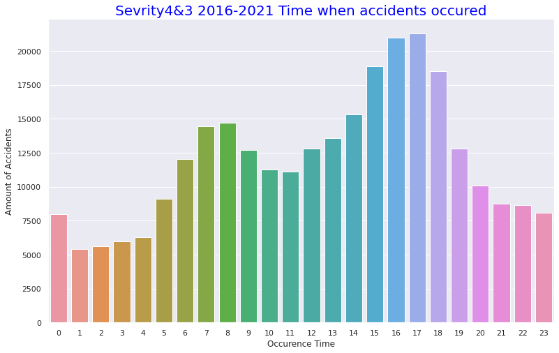
・Month of occurrence of serious accident
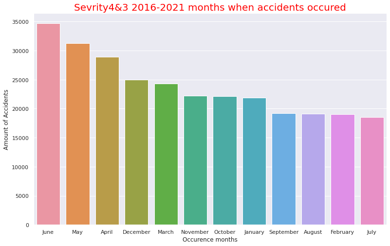
The percentage of places where serious accidents occur is roughly the same as the total one, but it is characteristic that the percentage of "Traffic_calming" (roads with signs indicating deceleration) jumped from 0.2% to 22.8%.
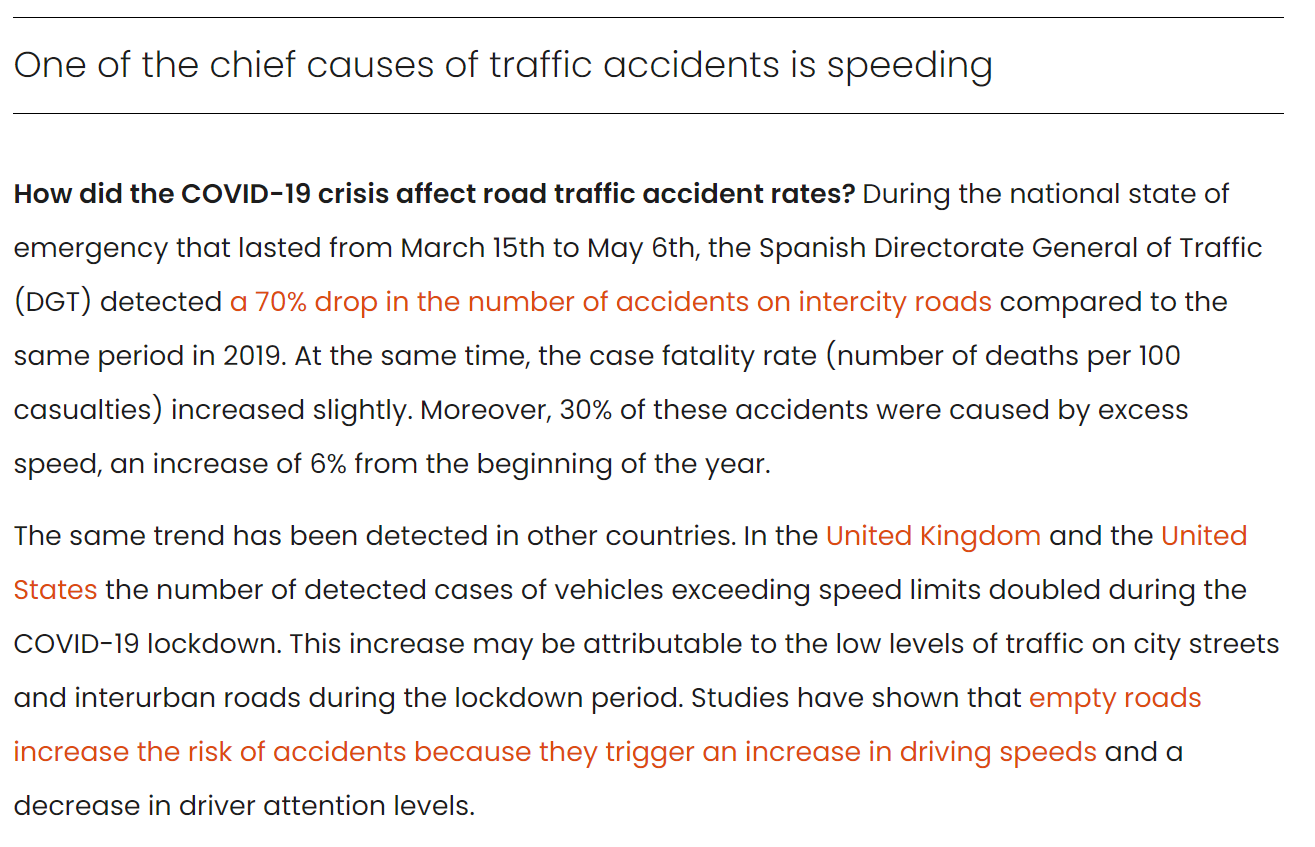
(citation)
The above article was published by the Spanish agency "Barcelona Institute for Global Health (ISGlobal)" and explains that when traffic decreases due to the spread of the coronavirus, it is a factor that it causes drivers to speed up because of the empty roads. The number of people arrested for over legal speeding has doubled in the UK and US.
In addition, the time of occurrence of serious accidents seems to be around 13:00 to 17:00 as well as the overall number of accidents, but if you look at the monthly data, you can see that April to June is the highest, and serious accidents are more likely to occur when the temperature is higher compared with October to December.
# Comfirm volatility of the accidents from 2016 to 2021 in Severity 3 and 4

USregion_severity= pd.read_csv("/content/drive/MyDrive/Drivefolder/US_Accidents_Dec21_updated.csv")

# Convert the Start_Time column to a datetime object and extract the year and month
USregion_severity["Start_Time"] = pd.to_datetime(USregion_severity["Start_Time"])
USregion_severity["Year"] = USregion_severity["Start_Time"].dt.year
USregion_severity["Month"] = USregion_severity["Start_Time"].dt.month

# Filter the data to include only Severity 3 and 4 from the year 2019
Region2019 = USregion_severity.loc[(USregion_severity["Severity"].isin([3, 4])) & (USregion_severity["Year"] == 2019)]

# Group the data by month and count the number of accidents in each month
counts2019 = Region2019.groupby("Month").size().reset_index(name="Accidents")

# Plot the data
sns.set(style="darkgrid")
sns.lineplot(data=counts2019, x="Month", y="Accidents")
plt.title("Severity3&4- Number of Accidents by Month in 2019")
plt.xlabel("Month")
plt.ylabel("Number of Accidents")
plt.show()

# Show the data count in 2019
print(counts2019)

# Filter the data to include only Severity 3 and 4 from the year 2020
Region2020 = USregion_severity.loc[(USregion_severity["Severity"].isin([3, 4])) & (USregion_severity["Year"] == 2020)]

# Group the data by month and count the number of accidents in each month
counts2020 = Region2020.groupby("Month").size().reset_index(name="Accidents")

# Plot the data using Seaborn
sns.set(style="darkgrid")
sns.lineplot(data=counts2020, x="Month", y="Accidents")
plt.title("Severity3&4- Number of Accidents by Month in 2020")
plt.xlabel("Month")
plt.ylabel("Number of Accidents")
plt.show()

# Show the data count in 2020
print(counts2020)

# Filter the data to include only Severity 3 and 4 from the year 2021
Region2021 = USregion_severity.loc[(USregion_severity["Severity"].isin([3, 4])) & (USregion_severity["Year"] == 2021)]

counts2021 = Region2021.groupby("Month").size().reset_index(name="Accidents")

# Plot the data
sns.lineplot(data=counts2021, x="Month", y="Accidents")
plt.title("Severity3&4- Number of Accidents by Month in 2021")
plt.xlabel("Month")
plt.ylabel("Number of Accidents")
plt.show()

# Show the data count in 2021
print(counts2021)

# Filter the data to include only Severity 3 and 4 from the years 2019-2021
Region2019_2021 = USregion_severity.loc[(USregion_severity["Severity"].isin([3, 4])) & (USregion_severity["Year"].isin([2019, 2020, 2021]))]

# Group the data by month and count the number of accidents in each month
counts2019_2021 = Region2019_2021.groupby("Month").size().reset_index(name="Accidents")

# Plot the data
sns.set(style="darkgrid")
sns.lineplot(data=counts2019_2021, x="Month", y="Accidents")
plt.title("Severity3&4- Number of Accidents by Month in 2019_2021")
plt.xlabel("Month")
plt.ylabel("Number of Accidents")
plt.show()

# Filter the data to include only Severity 3 and 4 from the years 2016 to 2021
Region2016_2021 = USregion_severity.loc[(USregion_severity["Severity"].isin([3, 4])) & (USregion_severity["Year"].between(2016, 2021))]

# Group the data by year and month and count the number of accidents in each year-month
counts2016_2021 = Region2016_2021.groupby(["Year", "Month"]).size().reset_index(name="Accidents")

# Plot the data
sns.set(style="darkgrid")
sns.lineplot(data=counts2016_2021, x="Month", y="Accidents", hue="Year", palette="Set1")
plt.title("Severity3&4-Volatility-Number of Accidents by Year-Month 2016-2021")
plt.xlabel("Month")
plt.ylabel("Number of Accidents")
plt.show()

# Show the data count
print(counts2016_2021)
Output: Click
    Month  Accidents
0       1       6477
1       2       5218
2       3       4961
3       4       5043
4       5       5477
5       6       4633
6       7       4530
7       8       4390
8       9       3410
9      10       3931
10     11       2211
11     12       3575

    Month  Accidents
0       1       3799
1       2       3085
2       3       8307
3       4      12947
4       5      14175
5       6      16827
6       7         56
7       8        128
8       9       1038
9      10       1299
10     11       1669
11     12       1653

    Month  Accidents
0       1       1651
1       2       1807
2       3       1353
3       4       1429
4       5       1400
5       6       1780
6       7       1456
7       8       1780
8       9       2433
9      10       2491
10     11       2960
11     12       3492

    Year  Month  Accidents
0   2019      1       6477
1   2019      2       5218
2   2019      3       4961
3   2019      4       5043
4   2019      5       5477
5   2019      6       4633
6   2019      7       4530
7   2019      8       4390
8   2019      9       3410
9   2019     10       3931
10  2019     11       2211
11  2019     12       3575
12  2020      1       3799
13  2020      2       3085
14  2020      3       8307
15  2020      4      12947
16  2020      5      14175
17  2020      6      16827
18  2020      7         56
19  2020      8        128
20  2020      9       1038
21  2020     10       1299
22  2020     11       1669
23  2020     12       1653
24  2021      1       1651
25  2021      2       1807
26  2021      3       1353
27  2021      4       1429
28  2021      5       1400
29  2021      6       1780
30  2021      7       1456
31  2021      8       1780
32  2021      9       2433
33  2021     10       2491
34  2021     11       2960
35  2021     12       3492

    Year  Month  Accidents
0   2016      1          7
1   2016      2        245
2   2016      3        720
3   2016      4       1562
4   2016      5       1537
..   ...    ...        ...
67  2021      8       1780
68  2021      9       2433
69  2021     10       2491
70  2021     11       2960
71  2021     12       3492

[72 rows x 3 columns]
・Changes in the number of serious accidents in 2019
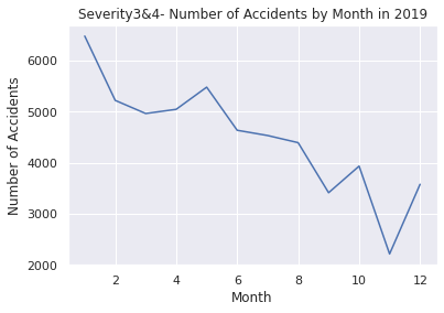
・Changes in the number of serious accidents in 2020
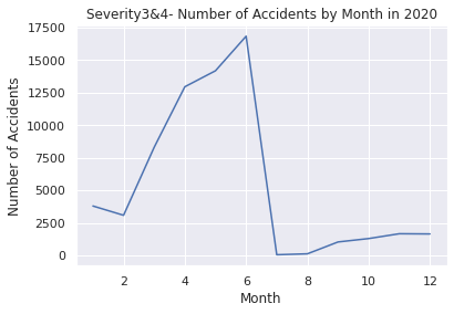
・Changes in the number of serious accidents in 2021
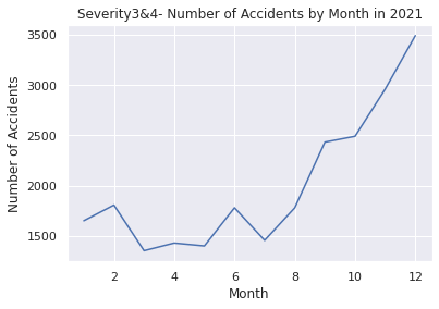
・Changes in the number of serious accidents in 2019 to 2021
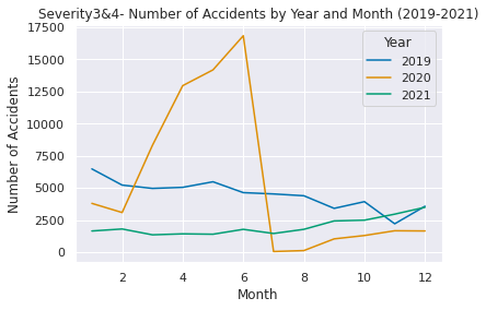
・Changes in the number of serious accidents in 2016 to 2021
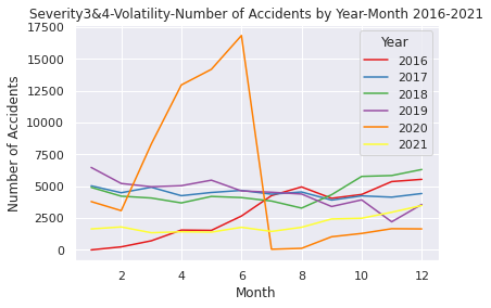
That' all!
I appreciate you for reading my first coding blog!