概要
Google Chartを使って計測したデータのグラフを改善する際にはまったことを共有したいと思います。
https://developers.google.com/chart/
変更前のグラフ
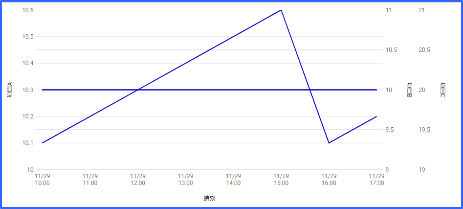
このグラフでは項目Aの値の変化はすごく少ないのに、大きく変動しているように見えてしまうので改善を試みました。
対応内容
・最小値、最大値を設定してスケールを統一する。
下記のサイトを参考にしながら、hAxis.minValue,hAxis.maxValueを指定しました。
ただ、「Material Line Charts」ではこのオプションが未対応で設定できなかったため、従来のグラフを使うように変更しました。
https://developers.google.com/chart/interactive/docs/gallery/linechart
参考:「Material Line Charts」と従来のグラフ「Normal Line Charts」
// Material Line Charts
var chart = new google.charts.Line(document.getElementById('chart_div'));
chart.draw(data, google.charts.Line.convertOptions(options));
// Normal Line Charts
var chart = new google.visualization.LineChart(document.getElementById('chart_div'));
chart.draw(data,  options);
・ここで別問題が発生、「Normal line Charts」ではminValueは反映されるがY軸項目3個目の項目表示がうまくいかない。
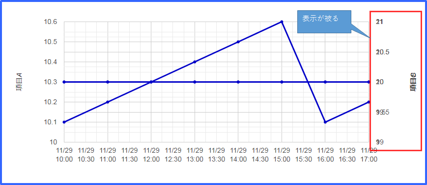
・結局、「Material Line Charts」がminValueなどのオプションに対応されるのを期待しつつ、今回はY軸の項目が2個までは「Normal Line Charts」のほうを使い、3個以上の場合はスケール統一できないままではありますが、「Material Line Charts」を使うことにしました。
おまけ
・Google Chartの上下の余白が大きすぎるので調整しました。
chartArea:{top:20,height:"85%"}
・X軸の日付型文字列をはじめ'2018-11-29 10:00'とハイフンで区切りを使用していましたが、Safariでグラフが表示されない問題が発生しました。 区切りを"/"に変更して対応しました。
参考:http://ux.nu/U9V1h
window.onload = function() {
    google.charts.load('current', {'packages': ['corechart','line']});
    google.charts.setOnLoadCallback(drawCharts);
}


// グラフを描画する
function drawCharts() {
    var tSeries = {};
    var tVAxes = {};
    var tColors = [];

    var vAxes = {
            // Adds titles to each axis.
            0: {title: '温度', format:'decimal',color:'#0000cd',minValue:10,maxValue:40 }
        };

    plots = [
        [new Date('2018/11/29 10:00'),10.1],
        [new Date('2018/11/29 11:00'),10.2],
        [new Date('2018/11/29 12:00'),10.3],
        [new Date('2018/11/29 13:00'),10.4],
        [new Date('2018/11/29 14:00'),10.5],
        [new Date('2018/11/29 15:00'),10.6],
        [new Date('2018/11/29 16:00'),10.1],
        [new Date('2018/11/29 17:00'),10.2]
    ];

    var offset = 0;

    var vAxesLength = Object.keys(vAxes).length;

    var data = new google.visualization.DataTable();
    data.addColumn('datetime', '時刻');
    for(var i = 0;i < vAxesLength;i++){
        data.addColumn('number', vAxes[i].title);
    }

    data.addRows(plots);

    for(var idx = 0;idx < vAxesLength;idx++){
        tSeries[idx] = {type: 'line',targetAxisIndex: idx,pointSize: 4,lineWidth :3 };
        tVAxes[idx] = vAxes[idx];
        tColors[idx] = vAxes[idx].color;
    }

    var options = {
        legend: { position: 'none', alignment: 'end' },
        width: '100%',
        height: 400,
        series: tSeries,
        colors: tColors,
        vAxes: tVAxes,
        chartArea:{top:20,height:"85%"},
        hAxis: {
            format: 'MM/dd\nHH:mm'
        }
    };

    // Creating Material Line Charts
    var chart = new google.charts.Line(document.getElementById('chart_div'));
    chart.draw(data, google.charts.Line.convertOptions(options));

    /*
    var chart = new google.visualization.LineChart(document.getElementById('chart_div'));
    chart.draw(data,  options);
    */
}