今更という感じではあるが、最近相関係数に触れる機会がいくつかあったので、備忘録を兼ねてまとめてみる。
環境
今回使用した環境は次の通り。
 $sw_vers
ProductName:	Mac OS X
ProductVersion:	10.13.6
BuildVersion:	17G7024
 $python3 --version
Python 3.7.4
相関係数とは
様々な統計の教科書などで紹介されているように、相関係数 $r$ は次のように定義される。
r =
\frac{Cov(x,  y)}{\sigma_{x} \sigma_{y}}
ここで $Cov(x, y)$ と $\sigma_{x}$ はそれぞれ次で表される。
Cov(x, y) = \frac{1}{n} \sum_{i=1}^{n} (x_{i} - \bar{x})(y_{i} - \bar{y}) \\
\sigma_{x} = \sqrt{ \frac{1}{n} \sum_{i=1}^{n} (x_{i} - \bar{x})^{2} }
ただし、$\bar{x}$、$\bar{y}$はそれぞれ$x$、$y$の平均値である。
例えば、相関係数が正とは、変数 $x(y)$ の値が大きいとき、変数 $y(x)$ の値が大きいということを意味する。相関係数が負とは、変数 $x(y)$ の値が大きいとき、変数 $y(x)$ の値が小さいということになる。図に表すと下のようになる。
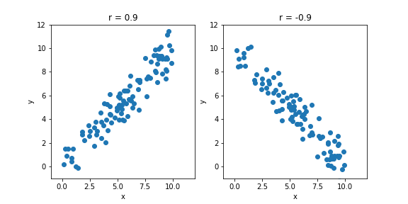
上で示したプロットのソースコードは以下の通り。
import numpy as np
from matplotlib import pyplot as plt

N = 100
x = np.random.rand(N) * 10.0
y1 = x + np.random.normal(size=x.shape)
y2 = 10.0 - y1
corr1=np.corrcoef(x, y1)[0][1]
corr2=np.corrcoef(x, y2)[0][1]

plt.figure( figsize=(8, 4))
xmin=-1
xmax=12
ymin=-1
ymax=12

ax1 = plt.subplot( 121 )
ax1.scatter(x, y1)
ax1.set_xlim(xmin, xmax)
ax1.set_ylim(ymin, ymax)
ax1.set_xlabel('x')
ax1.set_ylabel('y')
ax1.set_title('r = {:.1f}'.format(corr1) )

ax2 = plt.subplot( 122 )
ax2.scatter(x, y2)
ax2.set_xlim(xmin, xmax)
ax2.set_ylim(ymin, ymax)
ax2.set_xlabel('x')
ax2.set_ylabel('y')
ax2.set_title('r = {:.1f}'.format(corr2))
plt.savefig( 'corrcoef_example.png')
相関係数の値の基準
では、相関係数がいくつなら「相関がある」と言えるのか。
統計的には、求められた相関係数が無相関を示す0とconsistentか否かを調べればよい。要するに、下図にあるように統計的なふらつきによって相関係数が0となりうるかを調べればいい。
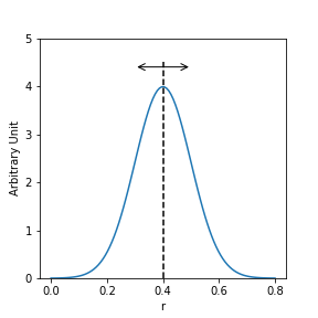
上図のプロットのコードは次の通り。
import scipy.stats as stats

mu=0.4
sigma=0.1
x=np.linspace(0,0.8,100)

plt.figure(figsize=(4,4))
ax1 = plt.subplot(111)
plt.plot(x, stats.norm.pdf(x, mu, sigma))
plt.plot([0.4,0.4], [0, 4.5], 'k--')
arrow_dict = dict(arrowstyle = '<->', color = "black")
ax1.annotate('', xy = (0.3, 4.4), size = 15, xytext = (0.5, 4.4), color = "black", arrowprops = arrow_dict)
ax1.set_xlabel('r')
ax1.set_ylabel('Arbitrary Unit')
ax1.set_ylim(0, 5)
plt.savefig('correff_flactuation.png')
どのくらいふらつきうるかは、次で表される標準誤差 $\Delta r$ で表される。
(https://bellcurve.jp/statistics/course/9591.html)
\Delta r = \sqrt{ \frac{1-r^{2}}{n-2} }
ここで、$n$ はデータ点の数を表す。
あとは、求められた相関関係 $r$ と比べたい値 $\mu$ の差が、標準誤差 $\Delta r$ に対してどの程度大きいかを表す変数 $t$ を求める。
t = \frac{ r - \mu }{ \Delta r } = \frac{ r }{ \Delta r} \ \ \ (\mu = 0)
変数 $t$ は $t$ 分布に従うので、ある有意水準 $\alpha$ の $t$ 分布の値 $t_{\alpha}(n-1)$ と比較することで、相関の有無が分かる。
例えば、あるデータ ($n = 102$) から求めた相関係数が $r = 0.6$ だったとき、標準誤差は上式より $\Delta r = 0.08$ と求められる。このとき $t = 0.6 / 0.08 = 7.5$となる。有意水準を5%とすると、片側検定で$t_{\alpha}(n-1) = t_{0.05}(101) \sim 1.6 \ll 7.5$なので、無相関 ($\mu = 0$)という帰無仮説を棄却して、相関があるということになる。
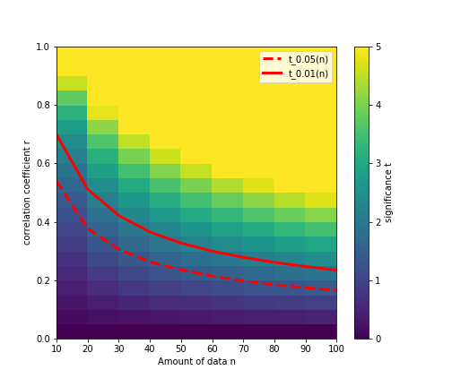
いちいち上の例のように数値を求めるのは面倒なので、あるデータ量 $n$ で相関係数 $r$ を得たときの変数 $t$ の値を図にまとめると下図のようになる。
例えば、データ点が $n=10$ しかないとき、求められた相関係数 $r$ が大きくなるにつれて変数 $t$ が大きくなり、$r = 0.5$ あたりで有意水準 5% の線(赤点線)を上回り、「相関がある」と言えるようになってくる。
$t$ 分布の有意水準 5% と 1% の値はページ下部に記載した書籍を参考にした。
ただし、全ての値が記載されているわけではなく、統計の処理については他にも考慮しないといけないことがあるかもしれないので、あくまでご参考まで。
上図のコードは次の通り。
なお、コーディングの際には1次のスプライン補間を使って、$t = t_{\alpha=0.05}(n)$ となる相関係数 $r$を求めている。その際には下記URLを参考にした。
https://org-technology.com/posts/univariate-interpolation.html
import math
from scipy import interpolate

#        10    20    30    40    50(*) 60    70(*) 80(*) 90(*) 100(*)
t_001 = [2.76, 2.53, 2.46, 2.42, 2.40, 2.39, 2.39, 2.39, 2.39, 2.39 ]
t_005 = [1.81, 1.73, 1.70, 1.68, 1.68, 1.67, 1.66, 1.66, 1.66, 1.66 ]
# *...not written in the book, assuming approx. values

def f(r, n):
  return r / np.sqrt( (1.0 - (r*r)) / (n-2) )

def c(r, n, t, t_005):
  v = []
  for j in range(t.shape[1]):
    x_t = []
    y_r = []
    for i in range(t.shape[0]):
      x_t.append(t[i][j])
      y_r.append(r[i][j])
    ftr = interpolate.interp1d(x_t, y_r, kind="slinear")
    v.append( ftr(t_005[j]) )
  return v


r, n = np.mgrid[ 0:21:1, 1:11:1]

r = r*0.05
n = n*10
t = f(r, n)
for i in range(t.shape[0]):
  for j in range(t.shape[1]):
    if t[i][j] > 5.0 or math.isinf( t[i][j] ):
      t[i][j] = 5

lim001 = c(r, n, t, t_001)
lim005 = c(r, n, t, t_005)

plt.figure(figsize=(7,6))
ax1 = plt.subplot(111)
plt.pcolormesh( n, r, t )
cb = plt.colorbar()
cb.ax.set_ylabel('significance t')
plt.plot( n[0], lim005, 'r--', linewidth = 3.0, label = 't_0.05(n)' )
plt.plot( n[0], lim001, 'r-', linewidth = 3.0, label = 't_0.01(n)' )
ax1.set_xlabel("Amount of data n")
ax1.set_ylabel("correlation coefficient r")
plt.legend()
plt.savefig('corrcoef_significance.png')
pandasの相関係数
pandasではcorr()という関数で相関係数行列を求められる。
https://pandas.pydata.org/pandas-docs/stable/reference/api/pandas.DataFrame.corr.html
corr()の引数を見ると、パラメータmethodには主に3つのオプションがある。
- pearson (デフォルト)
- kendall
- spearman
デフォルトであるpearsonは「ピアソンの積率相関係数」というもので、本記事で記載した相関係数の計算式である。
kendallあるいはspearmanはいずれも順位相関係数というもので、データを変数の大小で並べたときに、何番目にくるかを比べて相関を出しているとのこと。
https://ja.wikipedia.org/wiki/%E3%82%B9%E3%83%94%E3%82%A2%E3%83%9E%E3%83%B3%E3%81%AE%E9%A0%86%E4%BD%8D%E7%9B%B8%E9%96%A2%E4%BF%82%E6%95%B0
実装については例えばこちらの記事が参考になるかと。
https://note.nkmk.me/python-pandas-corr/
プログラム上で相関係数の統計検定をするには
色々調べてみると、相関係数自体を算出する関数はpandasやnumpyにあるが、相関係数の標準誤差を出す関数は案外用意されていない。線形回帰の有意度で代用するという方法はあるそう。
https://stackoverflow.com/questions/25571882/pandas-columns-correlation-with-statistical-significance
scipyのscipy.stats.pearsonrであればp-valueを出してくれるので、統計的に有意かは分かるのだが、scipyのドキュメント(https://docs.scipy.org/doc/scipy-0.14.0/reference/generated/scipy.stats.pearsonr.html)
によると、
The p-values are not entirely reliable but are probably reasonable for datasets larger than 500 or so.
ということで、データ量が多くないと信用できないそう。
実装は次のようだが、pandasのcorr()関数とは違い相関係数行列を出してくれるわけではないので、使い方には注意が必要。
pvalue, corrcoef = stats.pearsonr( x, y1 )
print( "Correlation coefficient = {:.1f}".format(corrcoef))
print( "p-value = {}".format(pvalue))
# Correlation coefficient = 0.9
# p-value = 0.009281610631924387
まとめ
相関係数について気になったことをまとめてみた。
コーディングのことを考えれば、pandasやnumpyで相関係数を簡単に出せるものの、
その値が統計的に優位かは出力されないので、有意水準を決めておいて、データ量から相関係数の閾値を決めておいた方がよさそう。
参考
- 日本統計学会編「日本統計学会公式認定統計検定2級対応 統計学基礎」東京図書株式会社(2018年)
- https://bellcurve.jp/statistics/course/9591.html
- https://org-technology.com/posts/univariate-interpolation.html
- https://ja.wikipedia.org/wiki/%E7%9B%B8%E9%96%A2%E4%BF%82%E6%95%B0
- https://note.nkmk.me/python-pandas-corr/
- https://stackoverflow.com/questions/25571882/pandas-columns-correlation-with-statistical-significance