CSS animation day2 です。
本日は、波を表現してみたいと思います。
1. 完成版

2. なぜ wave か?
2019 年のデザインは、流体デザインがくると思います。
こちら の記事をご参照ください。
このデザイン、なんて心が落ち着くのでしょうか・・・。
医療現場ではストレスフルな状況なので、自然を少しでも感じて癒せるように、柔らかい表現をしてみたいと思いました。アニメーションを取り入れることで、流動的になり、なんとも言えぬ癒しがあります。
3. 参考文献
youtube; 6分で波ができる!わかりやすい動画
こちらもわかりやすいです
4. 分解してみる
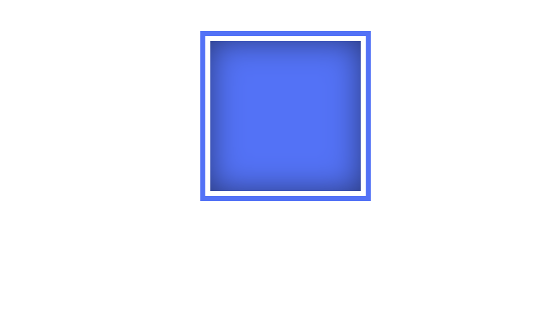
まず、box を作ります。

index.html
<!DOCTYPE html>
<html lang="ja">

<head>
    <meta charset="UTF-8">
    <link rel="stylesheet" href="css/styles.css">
    <style>
    </style>
</head>
<body>
    <div class="box">
        <div class="wave"></div>
    </div>
</body>
</html>
styles.css
.box{
    position: absolute;
    width: 150px;
    height: 150px;
    top: 50%;
    left: 50%;
    transform: translate(-50%, -50%);
    background: #000;
    border: 5px solid #fff;
    box-shadow: 0 0 0 5px #4973ff;
}
次に、四角の中のwave を作って行きます。
styles.css
.box{
    position: absolute;
    width: 150px;
    height: 150px;
    top: 50%;
    left: 50%;
    transform: translate(-50%, -50%);
    background: #000;
    border: 5px solid #fff;
    box-shadow: 0 0 0 5px #4973ff;

}

.wave{
    position: relative;
    width: 100%;
    height: 100%;
    background: #4973ff;
    box-shadow: inset 0 0 50px rgba(0,0,0,.5)
}
ここからがポイントです!!
波をどう表現するかですが、この四角形の上半分に重なるように、別の四角形を重ねます。
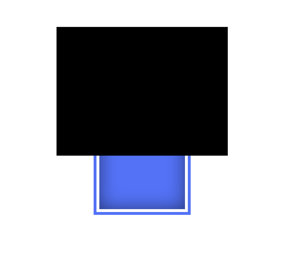
styles.css
.wave:before,
.wave:after{
    content: '';
    position: absolute;
    width: 200%;
    height: 150%;
    top:0;
    left: 50%;
    transform: translate(-50%, -75%);
    background: #000;
}
この黒い四角形を色を白くして、回転させます。

styles.css
.wave:before,
.wave:after{
    content: '';
    position: absolute;
    width: 200%;
    height: 150%;
    top:0;
    left: 50%;
    transform: translate(-50%, -75%);
    background: #fff;
}


.wave:before{
    background: #fff;
    animation: rotation 5s linear infinite;
}

@keyframes rotation{
    0%{
        transform: translate(-50%, -75%) rotate(0deg);
    }
    100%{
        transform: translate(-50%, -75%) rotate(180deg);
    }
}
四角形を、border-radius で丸くします。
そして、2つ重ねます。

styles.css
.wave:before{
    background: #fff;
    animation: rotation 5s linear infinite;
    border-radius: 40%;
}

.wave:after{
    background: #fff;
    opacity: 0.5;
    animation: rotation 5s linear infinite;
    border-radius: 45%;
}


@keyframes rotation{
    0%{
        transform: translate(-50%, -75%) rotate(0deg);
    }
    100%{
        transform: translate(-50%, -75%) rotate(180deg);
    }
}
枠も一緒に動いているので、box のoverflow をhidden にします
styles.css
.box{
    position: absolute;
    width: 150px;
    height: 150px;
    top: 50%;
    left: 50%;
    transform: translate(-50%, -50%);
    background: #000;
    border: 5px solid #fff;
    box-shadow: 0 0 0 5px #4973ff;
    overflow: hidden;
}
ちょっとぎこちないですが、完成しました。
他にもいろんなやり方で波が作れると思いますが、初心者中の初心者なので、大目にみてください(ノД`)
それではまた!