CSS animation day23 となりました。
昨日のカーテンの出来に納得がいかなかったため、別のアニメーションで表現します。
1. 完成版

See the Pen Curtain Open by hiroya iizuka (@hiroyaiizuka) on CodePen.
2. 参考文献
3. 分解してみる
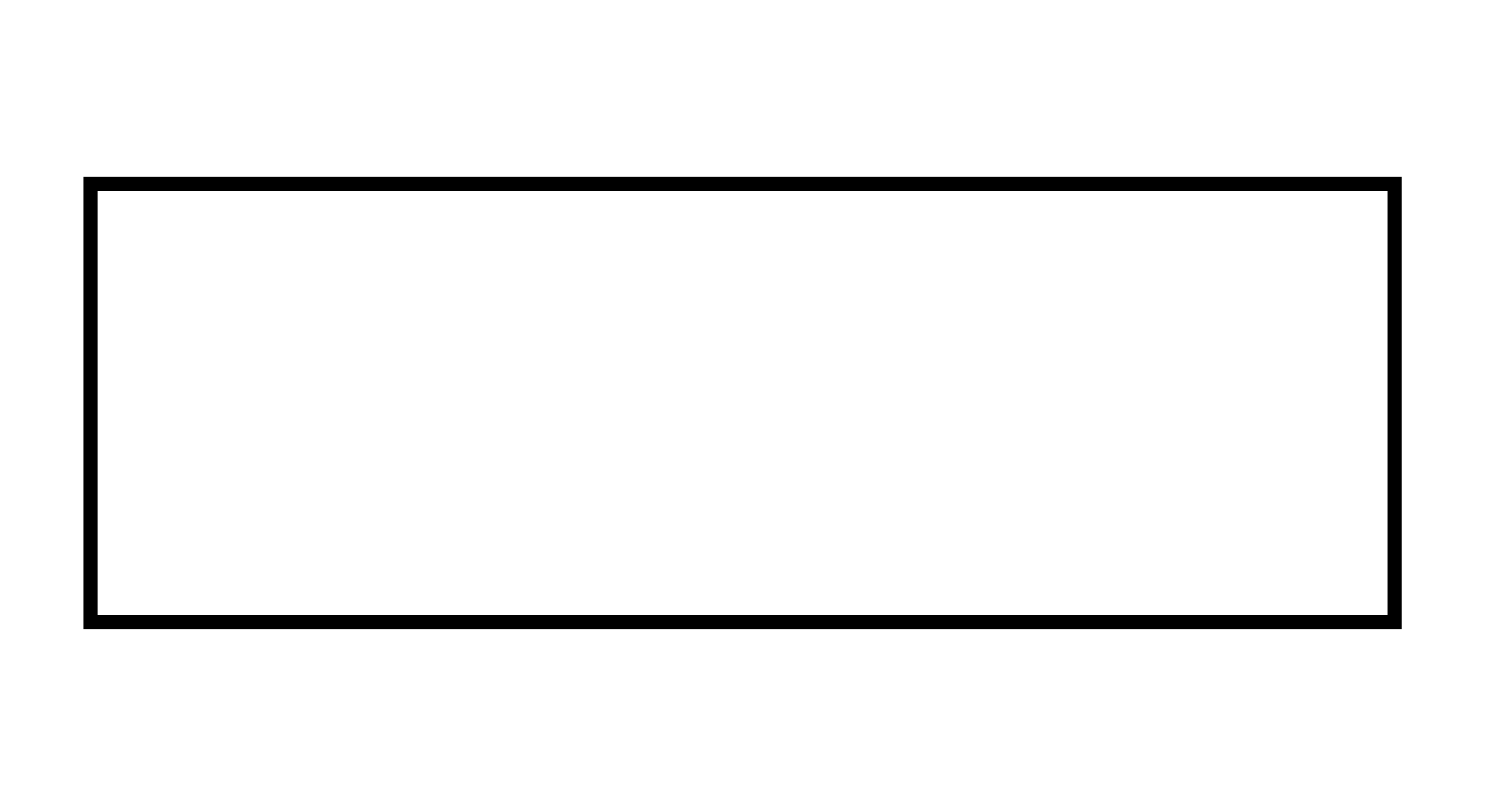
❶.
まず、スクリーンの枠を作ります。
<!DOCTYPE html>
<html lang="ja">
  <head>
    <meta charset="UTF-8" />
    <link rel="stylesheet" href="css/styles.css" />
  </head>
  <body>
    <div class="theatre">
      <div class="curtain-left"></div>
      <div class="curtain-right"></div>
    </div>
  </body>
</html>
body {
  margin: 0px;
  padding: 0px;
  background: #fff;
  display: flex;
  justify-content: center;
  overflow: hidden;
}

.theatre {
  border: inset #000 10px;
  margin: 50vh auto;
  transform: translateY(-50%);
  height: 300px;
  width: 80%;
}
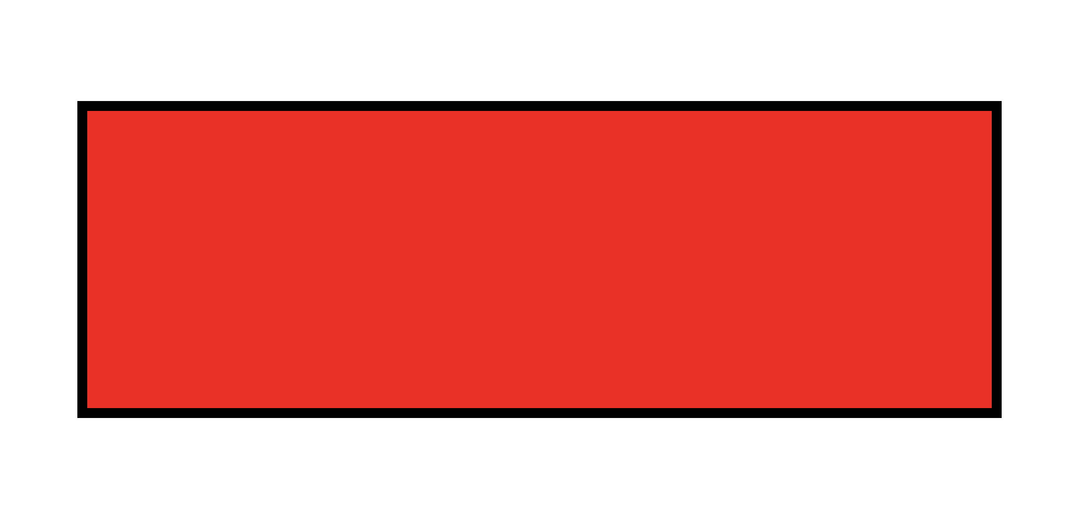
❷.
カーテンを入れる
.theatre {
  border: inset #000 10px;
  margin: 50vh auto;
  transform: translateY(-50%);
  height: 300px;
  width: 80%;
  position: relative;
  overflow: hidden;
}

.curtain-left,
.curtain-right {
  position: absolute;
  top: -30px;
  bottom: -30px;
  width: 61%;
  background-color: rgb(255, 0, 10);
}

なお、theatre にoverflow: hidden をつけることで、赤いカーテン(仮)が枠を超えずに、黒いborder内におさまります。
❸.
カーテンを左右別に配置する。
.curtain-left {
  left: -10%;
}

.curtain-right {
  right: -10%;
}
ぴったりおさまりました。
続いて、カーテンの模様を、linear-gradient プロパティで、表現します。
.curtain-left,
.curtain-right {
  position: absolute;
  top: -30px;
  bottom: -30px;
  width: 61%;
  background-color: rgb(255, 0, 10);
  background-image: linear-gradient(
    90deg,
    rgba(204, 0, 10, 1) 30%,
    transparent 50%,
    rgba(204, 0, 10, 1) 80%,
    transparent 100%
  );
  background-size: 90px;
}
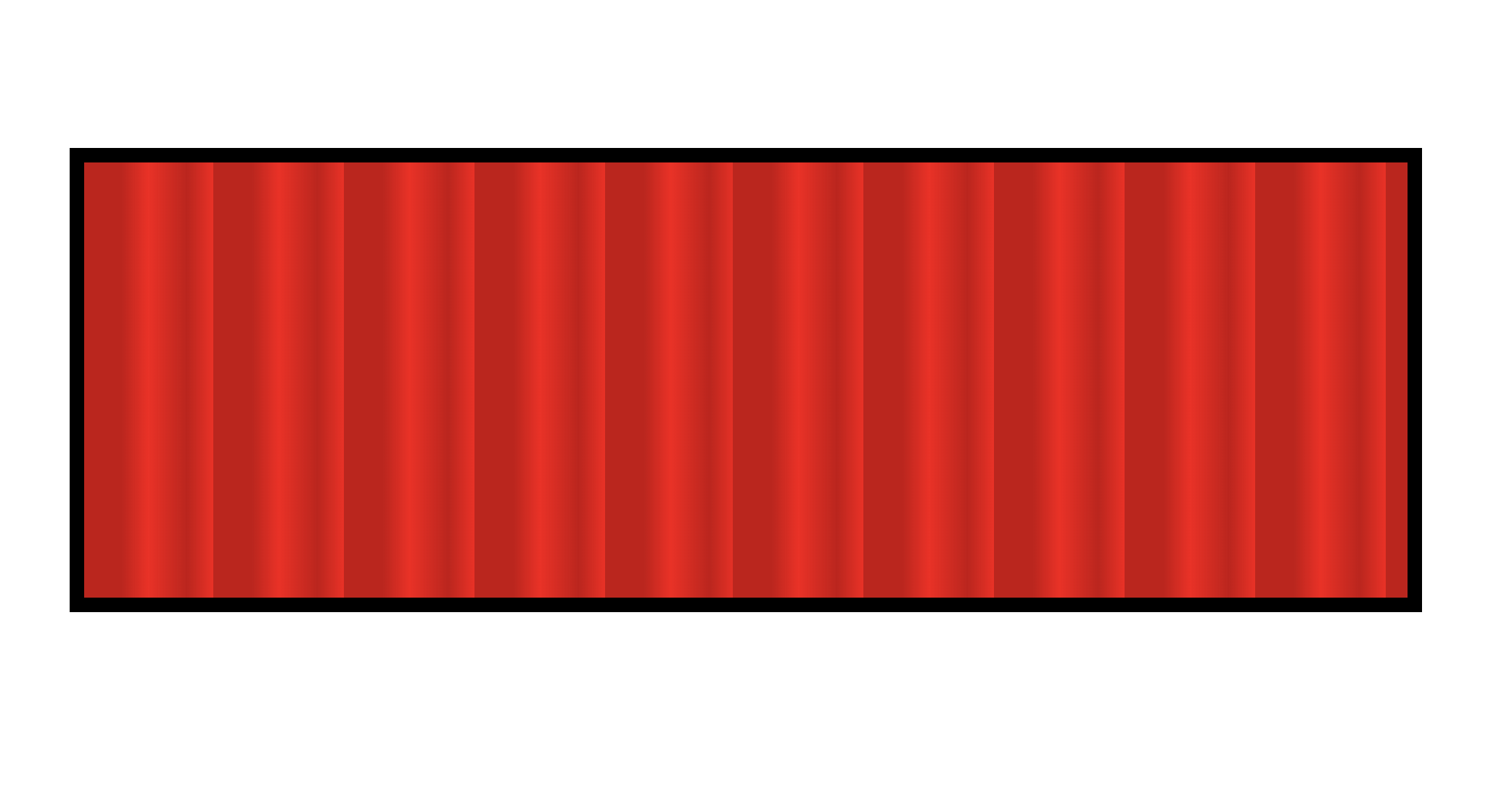
linear-gradient: 90deg でグラデーションを縦線にし、濃い目の赤で影を表現しております。この辺は、自由にデザインできるところでしょう。
グラデーションの指定サイズを決めるために、background-sizeを使用しております。詳しくは こちら にわかりやすくのっております。
❹.
では、hover してアニメーションを発動させましょう。
.theatre:hover .curtain-left {
  transform: translateX(-100%);
  transition: all 3s ease;
}

.theatre:hover .curtain-right {
  transform: translateX(100%);
  transition: all 3s ease;
}

昨日と全く同じアニメーションをつけましたが、なんかまだ物足りません。左のカーテンに、rotate をつけてみましょう。

少しいい感じになりました。
カーテンのtop が足りないたので、-300px にします。
.curtain-left,
.curtain-right {
  position: absolute;
  top: -300px;
  bottom: -30px;
そして、アニメーションがbottom を中心に動くようにします。
わかりづらいですが、左が修正後、右が修正前です。
.theatre:hover .curtain-left {
  transform: translateX(-100%) rotate(15deg);
  transition: all 3s ease;
  transform-origin: 50% bottom;
}

.theatre:hover .curtain-right {
  transform: translateX(100%) rotate(-15deg);
  transition: all 3s ease;
}

いい感じです!
ただ、まだ、カーテンの内側の動きが硬いですね。
ここは、filter でshadow をつけてみます。
左が修正後、右が修正前です。
.curtain-left {
  left: -10%;
  filter: drop-shadow(1px 6px 6px black);
}

.curtain-right {
  right: -10%;
}

いいですね!
そろそろ仕上げます。劇場のカーテンをイメージし、box-shadow inset で、カーテン全体に影をつけましょう。
.curtain-left {
  left: -10%;
  filter: drop-shadow(1px 6px 6px black);
  box-shadow: -2px 0px 6px rgba(255, 255, 255, 0.4) inset,
    0px 320px 40px rgba(0, 0, 0, 0.5) inset;
}

.curtain-right {
  right: -10%;
  filter: drop-shadow(1px 6px 6px black);
  box-shadow: 2px 0px 6px rgba(255, 255, 255, 0.4) inset,
    -0px 320px 40px rgba(0, 0, 0, 0.5) inset;
}

完成しました!
昨日よりはいい出来になりましたが、もっと丸まったアニメーションを取り入れたりまだまだ改良の余地はありそうです。
それでは、また明日!