CSS animation day8 となりました。
最近寒いですね。
ということで、本日は、雪を表現したいと思います。
1. 完成版

See the Pen snow village by hiroya iizuka (@hiroyaiizuka) on CodePen.
2. なぜか?
自然のアニメーションを取り入れることで、季節に応じた、デザインを取り入れることができるためです。
3. 参考文献
https://www.youtube.com/watch?v=Ifzyhj9nHKQ&t=1s
雪の無料画像
4. 分解してみる
❶.
まず背景を作ります。
index.html
<!DOCTYPE html>
<html lang="ja">
  <head>
    <meta charset="UTF-8" />
    <link rel="stylesheet" href="css/styles.css" />
  </head>
  <body>
    <section>
      <div class="snow1"></div>
      <div class="snow2"></div>
    </section>
  </body>
</html>
styles.css
body {
  margin: 0;
  padding: 0;
  background: linear-gradient(black, gray);
}

section {
  background: url("../img/back.png") no-repeat;
  background-size: cover;
  width: 100%;
  height: 100vh;
  position: relative;
  overflow: hidden;
}
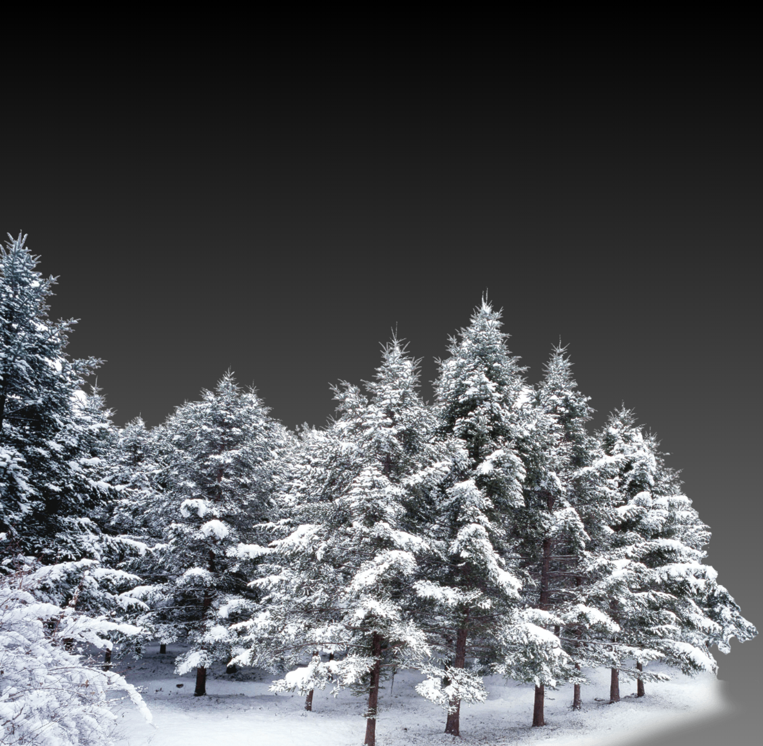
ちょっと凝って、グラデーションをつけました。
❷.
雪を載せます。
styles.css
.snow1 {
  background-size: cover;
  background: url("../img/snow.png");
  width: 100%;
  height: 100vh;
  position: absolute;
  opacity: 0.6;
  z-index: -1;
  top: 0;
  left: 0;
}

.snow2 {
  background-size: 100px;
  background: url("../img/snow2.png");
  width: 100%;
  height: 100vh;
  position: absolute;
  top: 0;
  left: 0;
}

雪に奥行きをつけるために、snow.png のopacityを下げ、z-index で木にかぶらないようにしてます。
❸. では、アニメーションをつけましょう。
styles.css
.snow1 {
  background-size: cover;
  background: url("../img/snow.png");
  width: 100%;
  height: 100vh;
  position: absolute;
  opacity: 0.4;
  z-index: -1;
  top: 0;
  left: 0;
  filter: blur(3px);
  animation: snow1 30s infinite linear;
}

.snow2 {
  background-size: cover;
  background: url("../img/snow2.png");
  width: 100%;
  height: 100vh;
  position: absolute;
  top: 0;
  left: 0;
  animation: snow2 10s infinite linear;
}

@keyframes snow1 {
  0% {
    backgroud-position: 0px 0px;
  }
  100% {
    background-position: 0px 2400px;
  }
}

@keyframes snow2 {
  0% {
    backgroud-position: 0px 0px;
  }
  100% {
    background-position: 0px 1417px;
  }
}

・ポイントは2つ
-
遠近感を出すために、遠くのsnow.png にblur をかけて、落ちてくる2つの雪の速度に差をつけて、パララックス効果を出す。
2.それぞれの画像の縦幅を、keyframesのbackground-positionに設定し、animation iteration count を infiniteにすることで、ガクガクしない一連のアニメーションを作る。
では、また明日!