CSS animation day33 となりました。
本日は、translate Zを使って、パララックスを表現したいと思います。
パララックスの実装方法は他にもいくつか存在しておりますが、なるべくシンプルで簡単なものをご紹介したいと思います。
1. 完成版
See the Pen Parallax Text Animation by hiroya iizuka (@hiroyaiizuka) on CodePen.
2. なぜか?
パララックスとは、なんでしょうか?
こちら の記事を抜粋します。
Webデザインにおけるパララックスは、スクロールなどの動作に応じて、複数のレイヤー(層)にある要素を異なるスピードで動かすことで、「立体感や奥行きを演出」、「フェード・拡大縮小・回転などの視覚的エフェクト」を演出する手法を指します
デザインに取り入れることで、よりrich で華やかな表現をすることができるでしょう。今回から数回にわたり、この効果を検証していきたいと思います。
3. 参考文献
Kazlgu Sandbox
KeithClark
ワンゴジュウゴ
4. 分解してみる
❶. まずは、参考文献の通り、translateZ を使って、パララックスに挑みます。 マークアップしましょう。
<!DOCTYPE html>
<html lang="ja">
  <head>
    <meta charset="UTF-8" />
    <link rel="stylesheet" href="css/styles.css" />
  </head>
  <body>
    <div class="container">
      <div class="parallax1">あいうえお</div>
      <div class="parallax2">かきくけこ</div>
      <div class="parallax3">さしすせそ</div>
    </div>
  </body>
</html>
body {
  background: #fff;
  margin: 0;
  padding: 0;
}

.container {
  perspective: 100px;
  height: 100vh;
  transform-style: preserve-3d;
  overflow-y: scroll;
  overflow-x: hidden;
}

.parallax1 {
  transform: translateZ(-100px);
}

.parallax2 {
  transform: translateZ(-50px);
}

.parallax3 {
  transform: translateZ(0px);
}
See the Pen bzXVVv by hiroya iizuka (@hiroyaiizuka) on CodePen.
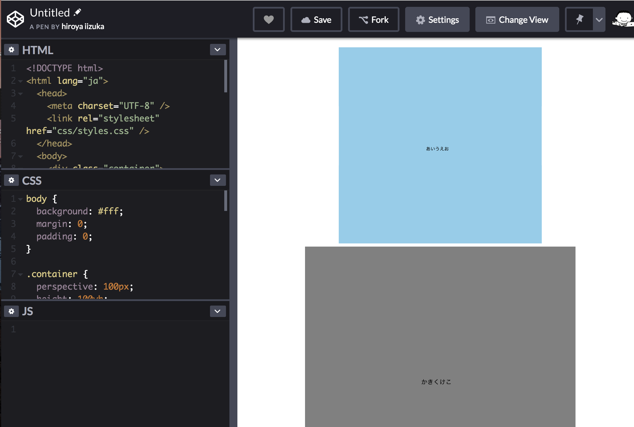
あれれ、パララックス効果のまったくない、ただの静止画になってしまいました。
Z座標がずれていることは、こちらからも確認できてますが、どこがまちがっていたでしょうか?
・・・
結論から言うと、
層を意識していないがために、この現象は起こりました。
つまり、あいうえお、かきくけこ、さしすせそは、それぞれただの __文字列__として、空間上にポツンと存在してます。文字列だけでなく、各々に層を作り、hight と color をつけてみましょう。
<!DOCTYPE html>
<html lang="ja">
  <head>
    <meta charset="UTF-8" />
    <link rel="stylesheet" href="css/styles.css" />
  </head>
  <body>
    <div class="container">
        <div class="parallax1">
           <p class="text">あいうえお</p>
        </div>
        <div class="parallax2">
           <p class="text">かきくけこ</p>
        </div>
        <div class="parallax3">
           <p class="text">さしすせそ</p>
        </div>
    </div>
  </body>
</html>
body {
  background: #fff;
  margin: 0;
  padding: 0;
}

.container {
  perspective: 100px;
  height: 100vh;
  width: 100vw;
  transform-style: preserve-3d;
  overflow-y: scroll;
  overflow-x: hidden;
}

.parallax1 {
  transform: translateZ(-100px);
  height: 100vh;
  background: skyblue;
}

.parallax2 {
  transform: translateZ(-50px);
  height: 100vh;
  background: gray;
}

.parallax3 {
  transform: translateZ(0px);
  height: 100vh;
  background: gold;
}
See the Pen NoQxdK by hiroya iizuka (@hiroyaiizuka) on CodePen.
できました!
実は、最初のcodepenの時点で既に、パララックスは付いていたんですね。こうして、層を視覚化することで、わかりやすくなりますね。
❷.
この各々の層のテキストを、中央寄せにしましょう。
body {
  background: #fff;
  margin: 0;
  padding: 0;
}

.container {
  perspective: 100px;
  height: 100vh;
  width: 100vw;
  transform-style: preserve-3d;
  overflow-y: scroll;
  overflow-x: hidden;
}


.parallax1 {
  transform: translateZ(-100px);
  height: 100vh;
  background: skyblue;
}

.parallax2 {
  transform: translateZ(-50px);
  height: 100vh;
  background: gray;
}

.parallax3 {
  transform: translateZ(0px);
  height: 100vh;
  background: gold;
}

.text {
  width: 100px;
  height: 100px;
  position: absolute;
  top: 50%;
  botttom: 0;
  left:0;
  right:0;
  margin: auto;
}
文字が中央寄せされました!
最後に、このカラフルな層を、絶対配置で一箇所にまとめましょう。
重なって見えなくなるので、background の色を消し、margin-Top をつけて少しずらして配置します。層のheight も130vh に増やします。
body {
  background: #fff;
  margin: 0;
  padding: 0;
}

.container {
  perspective: 100px;
  height: 100vh;
  width: 100vw;
  transform-style: preserve-3d;
  overflow-y: scroll;
  overflow-x: hidden;
}


.parallax1 {
  transform: translateZ(-100px);
  height: 130vh;
  position: absolute;
  top: 0;
  bottom:0;
  left:0;
  right:0;
  margin-top: 100px;
}

.parallax2 {
  transform: translateZ(-50px);
  height: 130vh;
  position: absolute;
  top: 0;
  bottom:0;
  left:0;
  right:0;
  margin-top: 100px;
}

.parallax3 {
  transform: translateZ(0px);
  height: 130vh;
  position: absolute;
  top: 0;
  bottom:0;
  left:0;
  right:0;
  margin-top: 100px;
}

.text {
  width: 100px;
  height: 100px;
  position: absolute;
  top: 50%;
  left:0;
  right:0;
  margin: auto;
}
See the Pen qgebRp by hiroya iizuka (@hiroyaiizuka) on CodePen.
これで、文字のパララックス効果が、完成しました。
❸.
テキストの大きさが小さいままなので、汎用性がありません。
scaleを変えて、全てのテキストを同じ大きさにしましょう。
こちら の記事によると、scale は以下の計算をすれば良さそうです。
sacaleの大きさ = 1 + (translateZ * -1) / perspective
なぜこうなるかは知りません笑
今回の場合、translateZ が -100, -50, 0、perspective が100pxなので、
scaleは、2, 1.5, 1となります。
.parallax1 {
  transform: translateZ(-100px) scale(2);
  height: 130vh;
  position: absolute;
  top: 0;
  bottom:0;
  left:0;
  right:0;
  margin-top: 100px;
}

.parallax2 {
  transform: translateZ(-50px) scale(1.5);
  height: 130vh;
  position: absolute;
  top: 0;
  bottom:0;
  left:0;
  right:0;
  margin-top: 100px;
}

.parallax3 {
  transform: translateZ(0px) scale(1);
  height: 130vh;
  position: absolute;
  top: 0;
  bottom:0;
  left:0;
  right:0;
  margin-top: 100px;
}

これで、テキストが全て同じ大きさのまま、パララックス効果が出せました。
❹.
このテキストが、上へ移動するスピードをコントロールしましょう。
このスピードは、2つのパラメーターによって、規定されます。
1. perspective の値
2. transform: translateZ() の値
では、2をいじってみましょう。
Z軸がプラスになればなるほど、スピードは速くなります。
試しに、Zの値を半分にしましょう。scaleの値も再計算してください。
.parallax1 {
  transform: translateZ(-50px) scale(1.5);
  height: 130vh;
  position: absolute;
  top: 0;
  bottom:0;
  left:0;
  right:0;
  margin-top: 100px;
}

.parallax2 {
  transform: translateZ(0px) scale(1);
  position: absolute;
  top: 0;
  bottom:0;
  left:0;
  right:0;
  margin-top: 100px;
}

.parallax3 {
  transform: translateZ(50px) scale(0.5);
  height: 130vh;
  position: absolute;
  top: 0;
  bottom:0;
  left:0;
  right:0;
  margin-top: 100px;
}
See the Pen Parallax Text Animation by hiroya iizuka (@hiroyaiizuka) on CodePen.
移動スピードが上がりました。
実際のWebサイトでは、この辺をうまく調整すると良さそうですね。
❺.
最後に、パララックスとは関係ないのですが、テキストを使ったものすごい3D表現の作品を見つけました。
See the Pen 3D hover plane effect by Rian Ariona (@ariona) on CodePen.
JQury のプラグイン、hover3D と言うものですが、嫉妬を覚えるくらい、すごい作品です。
複利効果で毎日コツコツ何かをアウトプットしていけば、いつしかこのような作品も作れる日が来る(来ないかも?)ことを信じて、明日も明後日も投稿していきます。
それではまた〜