CSS animation day9 となりました。
本日は、泡を表現したいと思います。
1. 完成版
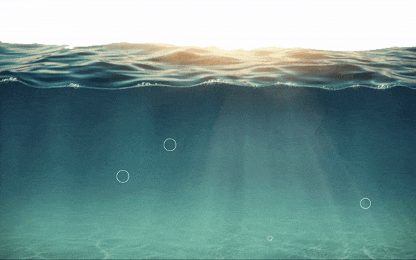
See the Pen bubble-s! by hiroya iizuka (@hiroyaiizuka) on CodePen.
2. 参考文献
https://www.youtube.com/watch?v=Ifzyhj9nHKQ&t=1s
https://www.youtube.com/watch?v=QtDwAcHDVfw
背景画像
3. 分解してみる
❶.
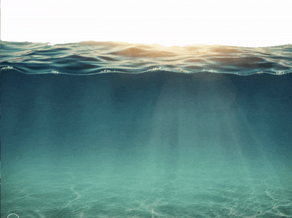
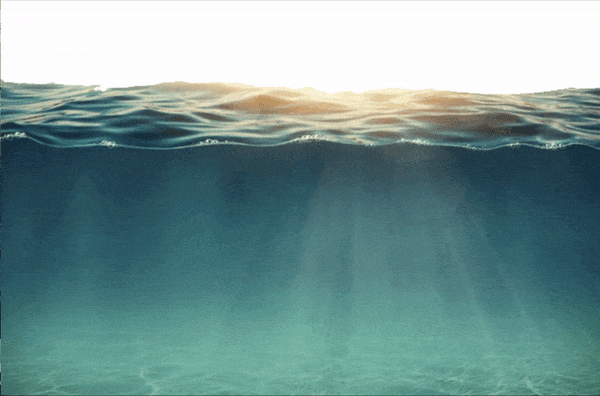
まずは背景を作ります。
index.html
<!DOCTYPE html>
<html lang="ja">
  <head>
    <meta charset="UTF-8" />
    <link rel="stylesheet" href="css/styles.css" />
  </head>
  <body>
    <div class="bubbles">
      <div class="bubble"></div>
      <div class="bubble"></div>
      <div class="bubble"></div>
      <div class="bubble"></div>
      <div class="bubble"></div>
      <div class="bubble"></div>
      <div class="bubble"></div>
    </div>
  </body>
</html>
styles.css
body {
  margin: 0;
  padding: 0;
  background: url("../img/sea.png");
  background-size: cover;
  height: 100vh;
  width: 100%;
}

❷. 泡を作って動かします
styles.css
.bubble {
  position: absolute;
  bottom: 0;
  width: 40px;
  height: 40px;
  background-color: transparent;
  border: 1px solid #fff;
  border-radius: 50%;
  animation: bubble 10s ease-in infinite;
}

@keyframes bubble {
  0% {
    bottom: -100px;
    transform: translateX(0);
  }
  50% {
    transform: translateX(100px);
  }
  100% {
    bottom: 1000px;
  }
}
ポイントは1つ
・transform: keyframe 50% を、translateX() することによって、この泡のような動きを表現できます。
❸. 複数泡を作ります
styles.css
.bubble {
  position: absolute;
  bottom: 0;
  width: 40px;
  height: 40px;
  background-color: transparent;
  border: 1px solid #fff;
  border-radius: 50%;
  animation: bubble 10s ease-in infinite;
}

.bubble:nth-child(1) {
  width: 20px;
  height: 20px;
  left: 10%;
  animation: bubble 5s ease-in infinite;
}
ポイントは1つ
・bubbles の子要素を設定するときに、 [nth:child] (https://developer.mozilla.org/ja/docs/Web/CSS/:nth-child)
擬似クラス を設定する。
これを設定することで、keyframe のanimation の記述は1つだけで、子要素のパラメーター (animation delay 、animation durationなど ) をいじるだけで、それぞれのアニメーションの設定を追加できます。コードがスッキリしますね。
❹.
泡を増やす
styles.css
.bubble:nth-child(1) {
  width: 20px;
  height: 20px;
  left: 10%;
  animation-duration: 5s;
}

.bubble:nth-child(2) {
  width: 30px;
  height: 30px;
  left: 20%;
  animation-delay: 1s;
}

.bubble:nth-child(3) {
  width: 30px;
  height: 30px;
  left: 30%;
  animation-duration: 3s;
}

.bubble:nth-child(4) {
  width: 50px;
  height: 50px;
  left: 45%;
  animation-duration: 6s;
  animation-delay: 2s;
}

.bubble:nth-child(5) {
  width: 10px;
  height: 10px;
  left: 60%;
  animation-duration: 3.5s;
}

.bubble:nth-child(6) {
  width: 30px;
  height: 30px;
  left: 70%;
  animation-duration: 5s;
}

.bubble:nth-child(7) {
  width: 25px;
  height: 25px;
  left: 80%;
  animation-duration: 4s;
}

以上となります。
では、また明日〜!