CSS animation day3 となりました。
本日は、ボタンで拍動を表現し、注目を集めるデザインを作りたいと思います。
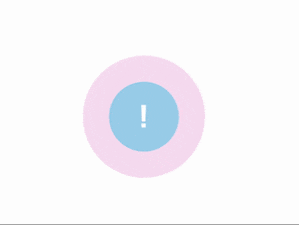
1. 完成版
2. なぜ、Attention か?
以前の記事の通りですが、Google material design のFabボタンを、なんとか目立たせたいです。
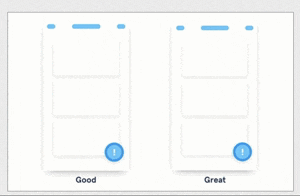
こういうマイクロインタラクションは、ユーザー体験を向上させますね、デザインは奥深いです。。。。
3. どうやるか?
こちらを参考にしました。
4. 分解してみる
ではやっていきましょう!
まずは、中央に丸ボタンを作ります。
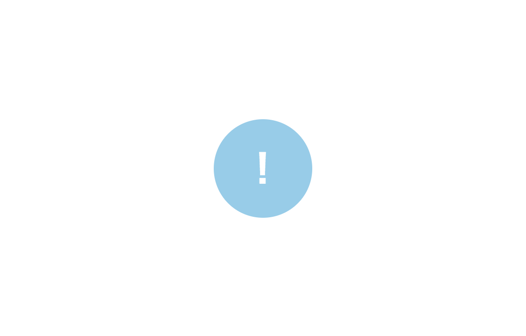
inde.html
<!DOCTYPE html>
<html lang="ja">
<head>
    <meta charset="UTF-8">
    <link rel="stylesheet" href="css/styles.css">
    <style>
    </style>
</head>
<body>
    <div class="center">
        <div class="pulse">!</div>
    </div>
</body>
</html>
styles.css
body{
    margin: 0;
    padding: 0;
}

.center{
    position: absolute;
    top: 50%;
    left:50%;
    transform: translate(-50%, -50%);
}

.pulse{
    width: 100px;
    height: 100px;
    background: skyblue;
    border-radius: 50%;
    text-align: center;
    line-height: 100px;
    font-size: 40px;
    font-weight: bold;
    color: #fff;
}
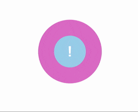
次がポイントとなります。 ボタンの周りの波動を表現するにはどうしたら良いでしょうか?
・・・
影をつけるプロパティを、全方向へ使えばいい・・・
そうです、box shadow プロパティです!
MDN を読むと、 box shadow の4つめの に、値を設定し、animationをつければ良さそうです!
styles.css
.pulse{
    width: 100px;
    height: 100px;
    background: skyblue;
    border-radius: 50%;
    text-align: center;
    line-height: 100px;
    font-size: 40px;
    font-weight: bold;
    color: #fff;
    animation: pulsation 3s linear infinite;
}


@keyframes pulsation{
    0%{
        box-shadow: 0 0 0 0 rgba(225, 0, 178, .7)
      }
    40%{
        box-shadow: 0 0 0 50px rgba(225, 0, 178, .7)
       }
    80%{
        box-shadow: 0 0 0 50px rgba(225, 0, 178, .7)
       }
    100%{
        box-shadow: 0 0 0 0 rgba(225, 0, 178, .7)
       }
}
rgba の透明度を変化しましょう

styles.css
@keyframes pulsation{
    0%{
        box-shadow: 0 0 0 0 rgba(225, 0, 178, .7)
      }
    40%{
        box-shadow: 0 0 0 50px rgba(225, 0, 178, 0)
       }
    80%{
        box-shadow: 0 0 0 50px rgba(225, 0, 178, 0)
       }
    100%{
        box-shadow: 0 0 0 0 rgba(225, 0, 178, 0)
       }
}
最後に、keyframe を複数設定し、拍動しているような表現をつけます。

styles.css
@keyframes pulsation{
    0%{
        box-shadow: 0 0 0 0 rgba(225, 0, 178, .7), 0 0 0 0 rgba(225, 0, 178, .7)
      }
    40%{
        box-shadow: 0 0 0 50px rgba(225, 0, 178, 0), 0 0 0 0 rgba(225, 0, 178, .7)
       }
    80%{
        box-shadow: 0 0 0 50px rgba(225, 0, 178, 0), 0 0 0 30px rgba(225, 0, 178, 0)
       }
    100%{
        box-shadow: 0 0 0 0 rgba(225, 0, 178, 0),0 0 0 30px rgba(225, 0, 178, 0)
       }
}
spread radius に異なる値をつけて強弱を表現することで、あたかも、拍動しているかのように見えますね。大変興味深い動きです。
こうした一見複雑に見える表現も、分解することでわかりやすくなりますね。
それでは、また〜