CSS animation day 46 となりました。
本日は、codepen で大変素晴らしい Gooey Effect の作品を見つけたので、アレンジしてお届けします。Gooey Effect ってなんだ??という方は、こちらをご覧ください。
1. 完成版

See the Pen Gooey Loading by hiroya iizuka (@hiroyaiizuka) on CodePen.
2. なぜか?
先日、codepen を見ていたら、腰が抜けるほどすごい作品を見つけ、早速twitter で作者Chris Gannon さんに連絡を取ってみました。


こんな、デザインの神様でも、数年間そして今も毎日作り続けている。
そして、コピーして自分の手を動かすのが、最良で最短の道だとおっしゃられている・・・
コピーはやがて、オリジナルになる。
守破離ですね。最高だ。
千里の道も一歩から。
複利効果を意識し、毎日コツコツがんばって、山を登っていけば。
数年後、あなたのデザインはとてつもないレベルに上がり、世界を変えることができるかもしれません。
お互い頑張っていきましょうね。
3. 参考文献
Goo Loader
- 涙- Gooey Effect with SVG filter
4. 分解してみる
❶.
マークアップしましょう。
Gooey Effect には、SVG フィルター を使います。
<!DOCTYPE html>
<html lang="ja">
  <head>
    <meta charset="UTF-8" />
    <link rel="stylesheet" href="css/styles.css" />
    <link
      rel="stylesheet"
      href="https://use.fontawesome.com/releases/v5.7.1/css/all.css"
      integrity="sha384-fnmOCqbTlWIlj8LyTjo7mOUStjsKC4pOpQbqyi7RrhN7udi9RwhKkMHpvLbHG9Sr"
      crossorigin="anonymous"
    />
  </head>
  <body>
    <div class="circles">
      <div class="circle-center"></div>
      <div class="circle"></div>
      <div class="circle"></div>
      <div class="circle"></div>
      <div class="circle"></div>
      <div class="circle"></div>
      <div class="circle"></div>
    </div>

    <svg xmlns="http://www.w3.org/2000/svg" version="1.1">
      <defs>
        <filter id="filter">
          <feGaussianBlur in="SourceGraphic" stdDeviation="20" result="blur" />
          <feColorMatrix
            in="blur"
            mode="matrix"
            values="1 0 0 0 0  0 1 0 0 0  0 0 1 0 0  0 0 0 18 -7"
            result="filter"
          />
          <feBlend in="SourceGraphic" in2="filter" />
        </filter>
      </defs>
    </svg>
  </body>
</html>
body {
  margin: 0;
  padding: 0;
  background: #000;
}

.container {
  position: relative;
  width: 100%;
  height: 100vh;
  display: flex;
  align-items: center;
  justify-content: center;
}

.circles {
  width: 100%;
  height: 100vh;
  margin: 0 auto;
  filter: url("#filter");
  position: relative;
}

.circle-center {
  position: absolute;
  top: 50%;
  left: 50%;
  transform: translate(-50%, -50%);
  width: 50px;
  height: 50px;
  border-radius: 50%;
  background: #fff000;
}

.circle {
  position: absolute;
  top: 50%;
  left: 50%;
  transform: translate(-50%, -50%);
  width: 50px;
  height: 50px;
  border-radius: 50%;
  background: #fff000;
}
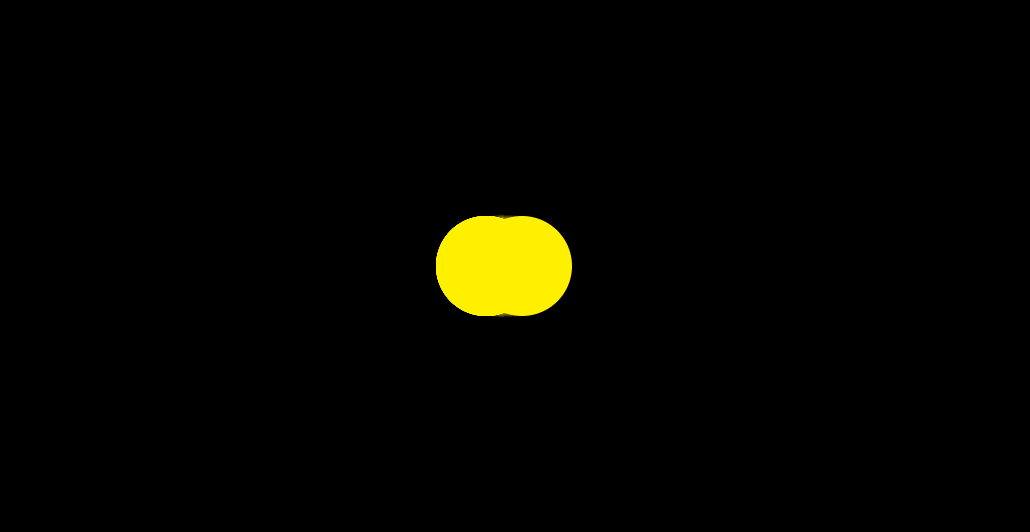
いい感じです。
❷.
2つのアニメーションを設定しましょう。
1: 中心の円の大きさが、変化する。
2: その他の複数の円 が動く
1: からやりましょう。
.circle-center {
     ・・・
  animation: grow 3s linear infinite;
}

@keyframes grow {
  0% {
    transform: translate(-50%, -50%) scale(0);
  }

  50% {
    transform: translate(-50%, -50%) scale(2);
  }

  100% {
    transform: translate(-50%, -50%) scale(0);
  }
}

なんの面白みのないアニメーションができました。
次に、2: のアニメーションを設定します。(1のアニメーションも合わせて、微調整します。)
.circle {
        ・・・
  animation: move 3s ease-out infinite;
}

@keyframes grow {
  0% {
    transform: translate(-50%, -50%) scale(1);
  }

  25%,
  65% {
    transform: translate(-50%, -50%) scale(0);
  }

  100% {
    transform: translate(-50%, -50%) scale(1);
  }
}

@keyframes move {
  0% {
    transform: translate(-50%, -50%) scale(0.8);
  }

  25% {
    transform: translate(200%, -50%) scale(0.4);
  }

  50% {
    transform: translate(-50%, -50%) scale(0.1);
  }

  75% {
    transform: translate(-300%, -50%) scale(0.2);
  }

  100% {
    transform: translate(-50%, -50%) scale(0.8);
  }
}

元のオリジナルと比べると、だいぶ劣化した動きですが。
ここから表現を上げていきましょう。(上がるのか・・・?汗)
❸.
SCSSループ文で増やします。
circle {
         ・・・
  @for $i from 1 through 6 {
    &:nth-child(#{$i}) {
      animation-delay: $i * 0.2 + s;
    }
  }
}
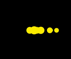
ちょっと、ましになってきました。
中心の円は、だんだん球が移動して離れると小さくなり、集まってくると、大きくなるという効果をつけます。
まず、circle クラスにanimation-delayがついているので、circle-centerにも、同じ値をつけます。
次に、@keyframes grow の計算をします。
animation-delay が0.2s なので、中心の円が大きくなる速度は、3s → 100% なので、
0.2s → 7%ずつ、keyframe で設定すれば良さそうです。
最後に、最初の小さな円が中心に戻る時間は、3s かかり、このgrow animationは1.2s のanimation-delayがついているので
60% からgrow のkeyframeを設定すれば良さそうです。
.circle-center {
      ・・・
  animation: grow 3s ease 1.2s infinite;
}

@keyframes grow {
  0% {
    transform: translate(-50%, -50%) scale(0);
  }

  10% {
    transform: translate(-50%, -50%) scale(0);
  }

  25%,
  52% {
    transform: translate(-50%, -50%) scale(0);
  }

  60%,
  67% {
    transform: translate(-50%, -50%) scale(1, 0.8);
  }
  67%,
  74% {
    transform: translate(-50%, -50%) scale(1.2, 1.2);
  }
  74%,
  81% {
    transform: translate(-50%, -50%) scale(1.4, 1.4);
  }
  81%,
  88% {
    transform: translate(-50%, -50%) scale(1.2, 1.2);
  }
  88%,
  95% {
    transform: translate(-50%, -50%) scale(0.9, 0.9);
  }
  100% {
    transform: translate(-50%, -50%) scale(0);
  }
}

いい感じです。
❹.
最後にこのアニメーションを滑らかにするために、move と grow の微調整を行います。Gooey 効果がもっと出るように、ためを意識して調整します。
@keyframes grow {
  0% {
    transform: translate(-50%, -50%) scale(0);
  }

  10% {
    transform: translate(-50%, -50%) scale(0);
  }

  45%,
  52% {
    transform: translate(-50%, -50%) scale(0);
  }

  60%,
  67% {
    transform: translate(-50%, -50%) scale(1, 0.8);
  }
  67%,
  74% {
    transform: translate(-50%, -50%) scale(1.2, 1.2);
  }
  74%,
  81% {
    transform: translate(-50%, -50%) scale(1.4, 1.4);
  }
  81%,
  86% {
    transform: translate(-50%, -50%) scale(1.6, 1.6);
  }
  86%,
  88% {
    transform: translate(-50%, -50%) scale(1.4, 1.4);
  }
  88%,
  90% {
    transform: translate(-50%, -50%) scale(1.2, 1.2);
  }
  90%,
  92% {
    transform: translate(-50%, -50%) scale(1, 1);
  }
  92%,
  94% {
    transform: translate(-50%, -50%) scale(1, 1);
  }
  95% {
    transform: translate(-50%, -50%) scale(0.9, 0.9);
  }

  100% {
    transform: translate(-50%, -50%) scale(0.8, 0.8);
  }
}

@keyframes move {
  0%,
  5% {
    transform: translate(-50%, -50%) scale(0.6);
  }

  25% {
    transform: translate(200%, -50%) scale(0.5);
  }

  40%,
  50% {
    transform: translate(-50%, -50%) scale(0.1);
  }
  51% {
    transform: translate(-100%, -50%) scale(0.1);
  }

  75% {
    transform: translate(-250%, -50%) scale(0.1);
  }

  95%,
  100% {
    transform: translate(-50%, -50%) scale(0.8);
  }
}

ついに、完成しました。
オリジナルと比べると、どうしても見劣りしますが、勘弁してください。
いつかもっと Quality を上げられるように、これからも精進してまいります。
それでは、また明日〜