CSS animation day 42となりました。
本日もローディングを作っていきます。
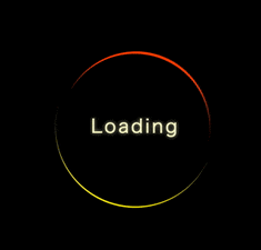
1. 完成版
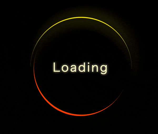
See the Pen Sun Loading by hiroya iizuka (@hiroyaiizuka) on CodePen.
2. 参考文献
Glowing Loader Ring Animation - Pure CSS Animation Effects - How To Create CSS3 Spinning Preloader
3. 分解してみる
❶.
マークアップしましょう。
index.html
<!DOCTYPE html>
<html lang="ja">
  <head>
    <meta charset="UTF-8" />
    <link rel="stylesheet" href="css/styles.css" />
  </head>
  <body>
    <div class="loading">
      Loading
      <span></span>
    </div>
  </body>
</html>
styles.scss
body {
  margin: 0;
  padding: 0;
  background: #000;
}

.loading {
  position: absolute;
  top: 50%;
  left: 50%;
  transform: translate(-50%, -50%);
  width: 300px;
  height: 300px;
  background: transparent;
  border: 3px solid #fffccc;
  border-radius: 50%;
  text-align: center;
  line-height: 300px;
  font-size: 42px;
  letter-spacing: 4px;
  text-shadow: 0 0 10px #fffccc;
  color: #fffccc;
}
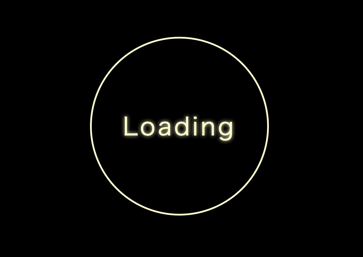
・ポイントとして、text-shadowで影をつけることによって、ネオンの光のような光を表現できます。
❷.
周りの円周にそって、アニメーションが動くようにしましょう。
styles.scss
.loading:before {
  content: "";
  position: absolute;
  top: 0;
  left: 0;
  width: 100%;
  height: 100%;
  border: 3px solid transparent;
  border-top: 3px solid #fff000;
}
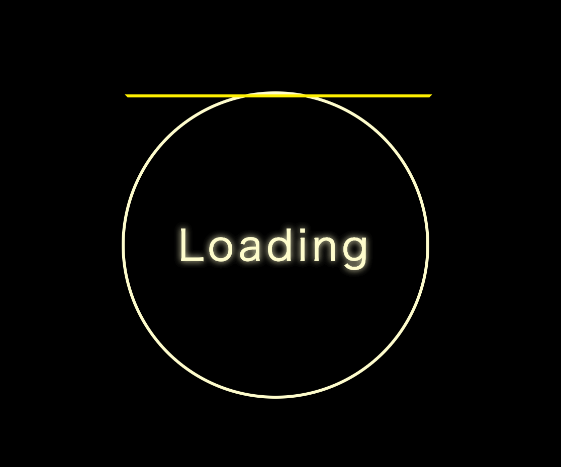
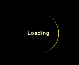
擬似クラスで、境界の上だけborder が出るようにしました。
では、こいつを丸くして、 .loadingの境界を背景色(黒)にしましょう。
styles.scss
.loading {

     ・・・

  border: 3px solid #000;

}

.loading:before {
   ・・・
  border-radius: 50%;

}
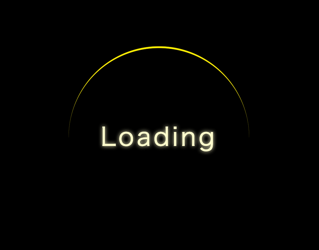
三日月のようで綺麗ですね。
❸.
アニメーションをつけましょう。
styles.scss
.loading:before {
   ・・・
  border-radius: 50%;
  animation: move 2s linear infinite;
}

@keyframes move {
  100% {
    transform: rotate(360deg);
  }
}
いい感じですね!
❹.
表現力をあげます。
もう一つ、逆回転で回る円を作りましょう。
styles.scss
span {
  display: block;
  position: absolute;
  top: 50%;
  left: 50%;
  transform: translate(-50%, -50%);
  width: 280px;
  height: 280px;
  background: transparent;
  border: 3px solid #000;
  border-radius: 50%;
}

span:before {
  content: "";
  position: absolute;
  top: 0;
  left: 0;
  width: 100%;
  height: 100%;
  border-radius: 50%;
  border-bottom: 5px solid #ff4500;
  animation: move 2s linear infinite;
}
いい感じですね!
もうちょっと表現力をあげます。
animation-timing-function を、ease-in/ease-out でずらします。
さらに、blur をかけましょう。
styles.scss
.loading:before {
  content: "";
  position: absolute;
  top: 0;
  left: 0;
  width: 100%;
  height: 100%;
  border-radius: 50%;
  border-top: 3px solid #fff000;
  animation: move 2s ease-in infinite;
}

.loading:after {
  content: "";
  position: absolute;
  top: 0;
  left: 0;
  width: 100%;
  height: 100%;
  border-radius: 50%;
  border-top: 5px solid #fff000;
  box-shadow: 0 0 10px #fff000;
  filter: blur(20px);
  animation: move 2s ease-in infinite;
}

span {
  display: block;
  position: absolute;
  top: 50%;
  left: 50%;
  transform: translate(-50%, -50%);
  width: 280px;
  height: 280px;
  background: transparent;
  border: 3px solid #000;
  border-radius: 50%;
}

span:before {
  content: "";
  position: absolute;
  top: 0;
  left: 0;
  width: 100%;
  height: 100%;
  border-radius: 50%;
  border-bottom: 5px solid #ff4500;
  animation: move 2s ease-out infinite;
}
リファクタリングして、完成です!
styles.scss
@mixin pos {
  content: "";
  position: absolute;
  top: 0;
  left: 0;
  width: 100%;
  height: 100%;
  border-radius: 50%;
}

body {
  margin: 0;
  padding: 0;
  background: #000;
}

.loading {
  position: absolute;
  top: 50%;
  left: 50%;
  transform: translate(-50%, -50%);
  width: 300px;
  height: 300px;
  background: transparent;
  border: 3px solid #000;
  border-radius: 50%;
  text-align: center;
  line-height: 300px;
  font-size: 35px;
  letter-spacing: 4px;
  text-shadow: 0 0 10px #fffccc;
  color: #fffccc;

  &:before {
    @include pos;
    border-top: 3px solid #fff000;
    animation: move 2s ease-in infinite;
  }

  &:after {
    @include pos;
    border-top: 5px solid #fff000;
    box-shadow: 0 0 10px #fff000;
    filter: blur(20px);
    animation: move 2s ease-in infinite;
  }
}

span {
  display: block;
  position: absolute;
  top: 50%;
  left: 50%;
  transform: translate(-50%, -50%);
  width: 280px;
  height: 280px;
  background: transparent;
  border: 3px solid #000;
  border-radius: 50%;

  &:before {
    @include pos;
    border-bottom: 5px solid #ff4500;
    animation: move 2s ease-out infinite;
  }
}

@keyframes move {
  100% {
    transform: rotate(360deg);
  }
}

いい感じですね!
それではまた明日〜