CSS animation day 55 となりました。
本日は、conic-gradient を使ったアニメーションを作成します。
1. 完成版
See the Pen Conic Glowing Loader by hiroya iizuka (@hiroyaiizuka) on CodePen.
2. 参考文献
1 element rainbow spinner 2017
CSS animation で遊び倒す - Glowing Loading -
3. 分解してみる
❶.
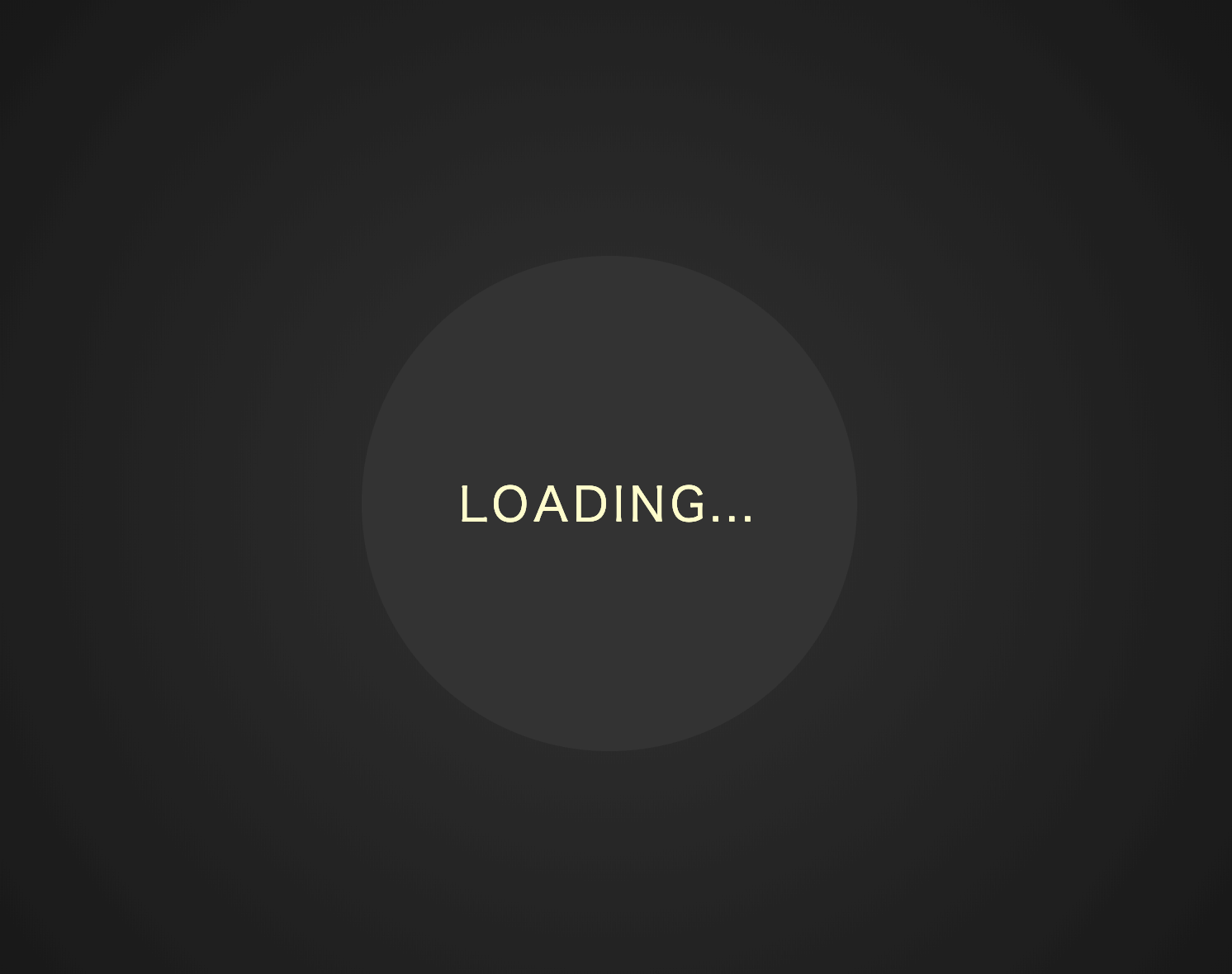
マークアップしましょう。
<!DOCTYPE html>
<html lang="ja">
  <head>
    <meta charset="UTF-8" />
    <link rel="stylesheet" href="css/styles.css" />
  </head>
  <body>
    <div class="container">
      <div class="image">
        <div class="text">Loading...</div>
      </div>
    </div>
  </body>
</html>
body {
  margin: 0;
  padding: 0;
  background: radial-gradient(circle, #333, #111);
}

.container {
  position: relative;
  width: 100%;
  height: 100vh;
  display: flex;
  align-items: center;
  justify-content: center;
}

.image {
  width: 300px;
  height: 300px;
  border-radius: 50%;
  background: #333;
}

.text {
  color: #fffccc;
  text-align: center;
  line-height: 300px;
  font-size: 28px;
  letter-spacing: 3px;
  text-transform: uppercase;
}
細かいことですが
body のbackgroundに、radial-gradient を設定すると面白いです。
中心から放射状に同心円を作ることができ、内側を明るく、外側を暗くできます。
表現物が光を発する時に、この効果を使えば、明かりで照らされている様を表現することができます。
❷.
では、conic-gradient を使いましょう。
イメージとしては、前回の記事のように、before クラスと、calc メソッドを使います。
.image {
  position: relative;  //追加
}


.image:before {
  content: "";
  position: absolute;
  top: -4px;
  left: -4px;
  border-radius: 50%;
  z-index: -1;
  background: conic-gradient(orange, yellow, green, cyan, blue, violet, orange);
  width: calc(100% + 8px);
  height: calc(100% + 8px);
}
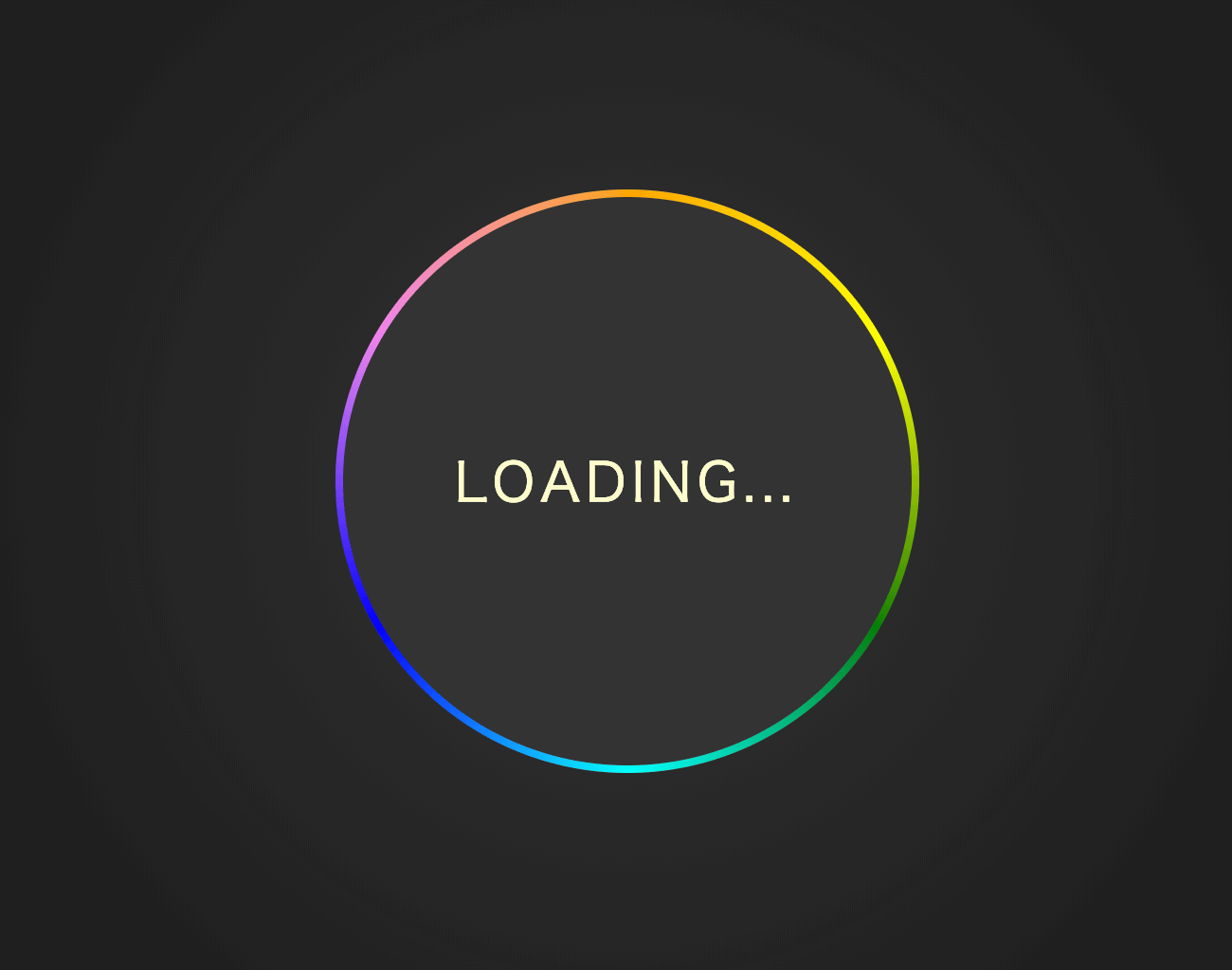
いい感じです。
z-index を外すとこうなってます。
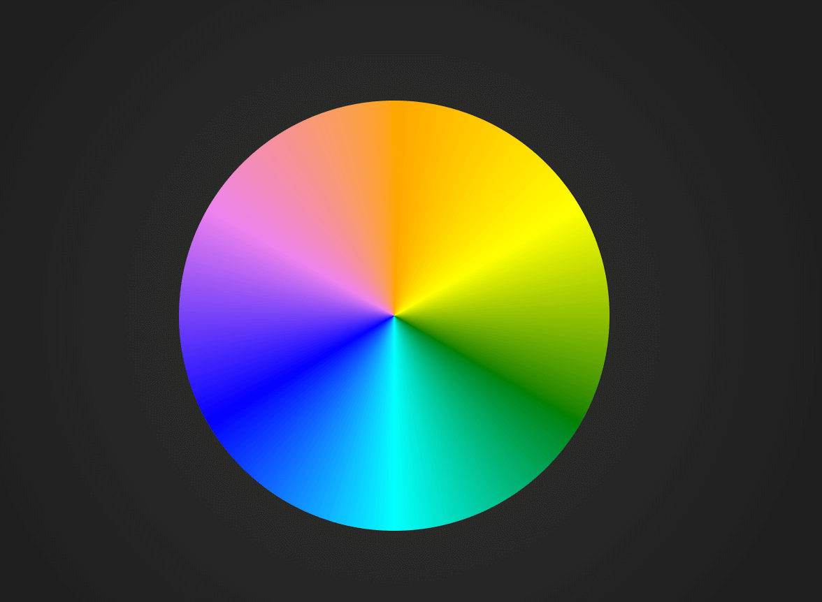
円周のグラデーションは、この conic- gradient が最適ですね。
❸.
では、アニメーションとblurテクニックを使いましょう。
また、せっかくなので、img クラスのbackground に、conic-gradient を使いましょう。
.img{
        ・・・
  background: conic-gradient(#333,#222, #111, #222, #333);
}

.image:before,
.image:after {
  content: "";
  position: absolute;
  border-radius: 50%;
  z-index: -1;
  background: conic-gradient(orange, yellow, green, cyan, blue, violet, orange);
  animation: round 2s linear infinite;
}

.image:before {
  top: -1px;
  left: -1px;
  width: calc(100% + 2px);
  height: calc(100% + 2px);

}

.image:after {
  top: -4px;
  left: -4px;
  width: calc(100% + 8px);
  height: calc(100% + 8px);
  filter: blur(10px);
}

@keyframes round {
  100% {
    transform: rotate(360deg);
  }
}
See the Pen Conic Glowing Loader by hiroya iizuka (@hiroyaiizuka) on CodePen.
完成しました。
conic-gradient を使えば、簡単にこういう円周のグラデーションができますね。それでは、また明日〜