CSS animation day32 となりました。
最近あったかくなりましたね。
本日は、microinteraction として使える、scroll arrow part2 をお届けします。
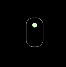
1. 完成版

See the Pen Mouse Scroll Arow by hiroya iizuka (@hiroyaiizuka) on CodePen.
2. 参考文献
Mouse-Animation-Scroll-CSS
Animated Mouse Scroll Using Only HTML & CSS
3. 分解してみる
❶.
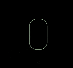
マークアップしましょう。
<!DOCTYPE html>
<html lang="ja">
  <head>
    <meta charset="UTF-8" />
    <link rel="stylesheet" href="css/styles.css" />
  </head>
  <body>
    <div class="container">
      <div class="mouse"></div>
    </div>
  </body>
</html>
body {
  padding: 0;
  margin: 0;
  background: #000;
}

.container {
  display: flex;
  flex-direction: column;
  justify-content: center;
  align-items: center;
  width: 100vw;
  height: 100vh;
}

.mouse {
  width: 70px;
  height: 120px;
  border: 1px solid #cfc;
  border-radius: 30px;
}

次に、マウスの中に、小さな丸を作りましょう。
HTMLを汚したくないので、beforeクラスを使います。
.mouse:before {
  content: "";
  width: 20px;
  height: 20px;
  background: #cfc;
  display: flex;
  margin: 20px auto;
  border-radius: 50px;
}

❷.
以下のように、animation を作ります。
- opacity を変化させる
- 丸の位置を、下にずラス
- 前回作った矢印と、合体させる。
順にやっていきましょう。
.mouse:before {
  content: "";
  width: 20px;
  height: 20px;
  background: #cfc;
  display: flex;
  margin: 20px auto;
  border-radius: 50px;
  animation: mouse 1.3s infinite;
}

@keyframes mouse {
  0% {
    opacity: 0;
  }
  25% {
    opacity: 1;
  }
  100% {
    opacity: 0;
  }
}
いい感じです。
次に、移動させましょう。
@keyframes mouse {
  0% {
    opacity: 0;
  }
  25% {
    opacity: 1;
  }
  100% {
    opacity: 0;
    transform: translateY(60px);
  }
}
いい感じです。
❸.
前回作った矢印のアニメーションと合体し、2つのアニメーションの違和感がないように、微調整します。
<!DOCTYPE html>
<html lang="ja">
  <head>
    <meta charset="UTF-8" />
    <link rel="stylesheet" href="css/styles.css" />
  </head>
  <body>
    <div class="container">
      <div class="mouse"></div>
      <div class="arrow"></div>
      <div class="arrow"></div>
      <div class="arrow"></div>
    </div>
  </body>
</html>
.arrow {
  width: 30px;
  height: 30px;
  border-bottom: 1px solid #cfc;
  border-right: 1px solid #cfc;
  transform: rotate(45deg);
  animation: move 1.3s infinite;
  margin: -3px;
}

@keyframes move {
  0% {
    opacity: 0;
  }
  25% {
    opacity: 0.7;
  }
  100% {
    opacity: 0;
    transform: translateY(40px) rotate(45deg);
  }
}
できました!
❹.
microinteraction ということを考えると、この表現がギリギリシンプルの範囲内かなという気がします。
TechAcademyの記事 によると、microinteraction は、デザイナーのエゴをすて、単一の動きで表現する必要があります。
今回の場合、単一な下向きの動きを取り入れているので、例えば、ここに横方向の動きを加えると、マイクロなインタラクションではなくなります。User が適切なアクションをとれるという本来の目的を見失ってしまいますね。
このように、デザイナーのエゴを捨てるというのは、難しいですが、重要です。What や How からでなく、Why → How → What の順番で考えることが大事です。つまり、なぜアニメーションを作るのか?と考えなければらなず、今後も、常に気をつけていきたいところです。
それでは、また明日〜