CSS animation day11 となりました。
だいぶ、自然系ネタが尽きてきました。本日は、おしゃれな太陽を表現します。
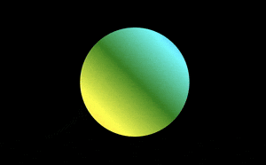
1. 完成版
See the Pen shining sun by hiroya iizuka (@hiroyaiizuka) on CodePen.
2. 参考文献
3. 分解してみる
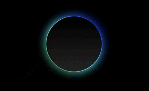
❶.
では背景から作りましょう。
<!DOCTYPE html>
<html lang="ja">
  <head>
    <meta charset="UTF-8" />
    <link rel="stylesheet" href="css/styles.css" />
  </head>
  <body>
    <div class="shadow"></div>
  </body>
</html>
body {
  margin: 0;
  padding: 0;
  background: #000;
}

.shadow {
  position: relative;
  margin: 200px auto 0;
  width: 250px;
  height: 250px;
  border-radius: 50%;
  background: linear-gradient(#000, #262626);
}

❷.
では、次に虹色を表現します。
.shadow:before {
  content: "";
  position: absolute;
  top: 0px;
  left: 0px;
  border-radius: 50%;
  background: linear-gradient(orange, yellow, green, cyan, blue, violet);
  width: 100%;
  height: 100%;
  background-size: 100%;

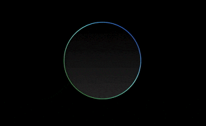
この虹色を影にするために背面に持ってくるためには、z-index: -1 とすれば良いですが、完全に裏になると、虹色がグラディエントが前面の黒に重なり、見えなくなります。
top, left をいじってみましょう。
.shadow:before {
  content: "";
  position: absolute;
  top: -2px;
  left: -2px;
  border-radius: 50%;
  background: linear-gradient(orange, yellow, green, cyan, blue, violet);
  width: 100%;
  height: 100%;
  background-size: 100%;
  z-index: -1;
}

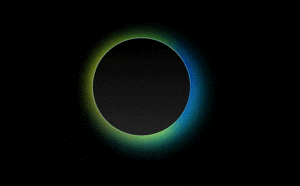
いい感じになりました。
全周に影をつけるために、width, height を変更しましょう。
.shadow:before {
  content: "";
  position: absolute;
  top: -2px;
  left: -2px;
  border-radius: 50%;
  background: linear-gradient(orange, yellow, green, cyan, blue, violet);
  width: calc(100% + 4px);
  height: calc(100% + 4px);
  background-size: 100%;
  z-index: -1;
}

ポイントは、一つ
calc()
これは、レスポンシブデザイン対応のため、異なる単位(%, px)で計算したいときに、役立つ便利なメソッドです。
詳細は こちら の記事をご参照ください。
❸.
アニメーションを設定する。
アニメーションで、X座標を動かして、輪郭に虹色の変化をだしたいとします。
ただ今のままでは、グラデーションは横に同じ色が重なっているため、X軸への平行移動では、色の変化は出ません。そこで、虹色のグラデーションの先頭に任意の角度 (ここでは45度)をつけて、色の変化を明瞭に出しましょう。
.shadow:before {
  content: "";
  position: absolute;
  top: -2px;
  left: -2px;
  border-radius: 50%;
  background: linear-gradient(45deg, orange, yellow, green, cyan, blue, violet);
  width: calc(100% + 4px);
  height: calc(100% + 4px);
  background-size: 400%;
  animation: shadow 20s linear infinite;
}

@keyframes shadow {
  0% {
    background-position: 0 0;
  }
  50% {
    background-position: 400% 0;
  }
  100% {
    background-position: 0 0;
  }
}
z index: -1 にして
かなり出来上がってきました。
では、最後、さらに表現力をあげます。
❹.
blur をつけよう!
body {
  margin: 0;
  padding: 0;
  background: #000;
}

.shadow {
  position: relative;
  margin: 200px auto 0;
  width: 250px;
  height: 250px;
  border-radius: 50%;
  background: linear-gradient(#000, #262626);
}

.shadow:before,
.shadow:after {
  content: "";
  position: absolute;
  top: -2px;
  left: -2px;
  border-radius: 50%;
  background: linear-gradient(45deg, orange, yellow, green, cyan, blue, violet);
  width: calc(100% + 4px);
  height: calc(100% + 4px);
  background-size: 400%;
  z-index: -1;
  animation: shadow 20s linear infinite;
}

.shadow:after {
  filter: blur(20px);
}

@keyframes shadow {
  0% {
    background-position: 0 0;
  }
  50% {
    background-position: 300% 0;
  }
  100% {
    background-position: 0 0;
  }
}

after擬似クラスで、blurをつけました。
filterプロパティ は超優秀で、blur以外にも、明るくしたり、コントラストをつけたりすることができます。
.shadow:after {
  filter: blur(20px) drop-shadow(16px 16px 16px red) invert(200%);
}
こんな素敵な表現が、CSSだけでできるなんて、素敵ですね。
ではまた明日〜!