こんにちはみんな様、クリスマスがそろそろ近づいて、私はその雰囲気に溶け込むために雪片を降る効果を持つcssアニメーションについての少しのヒントを共有したいと思います。
Let's start!
Images:
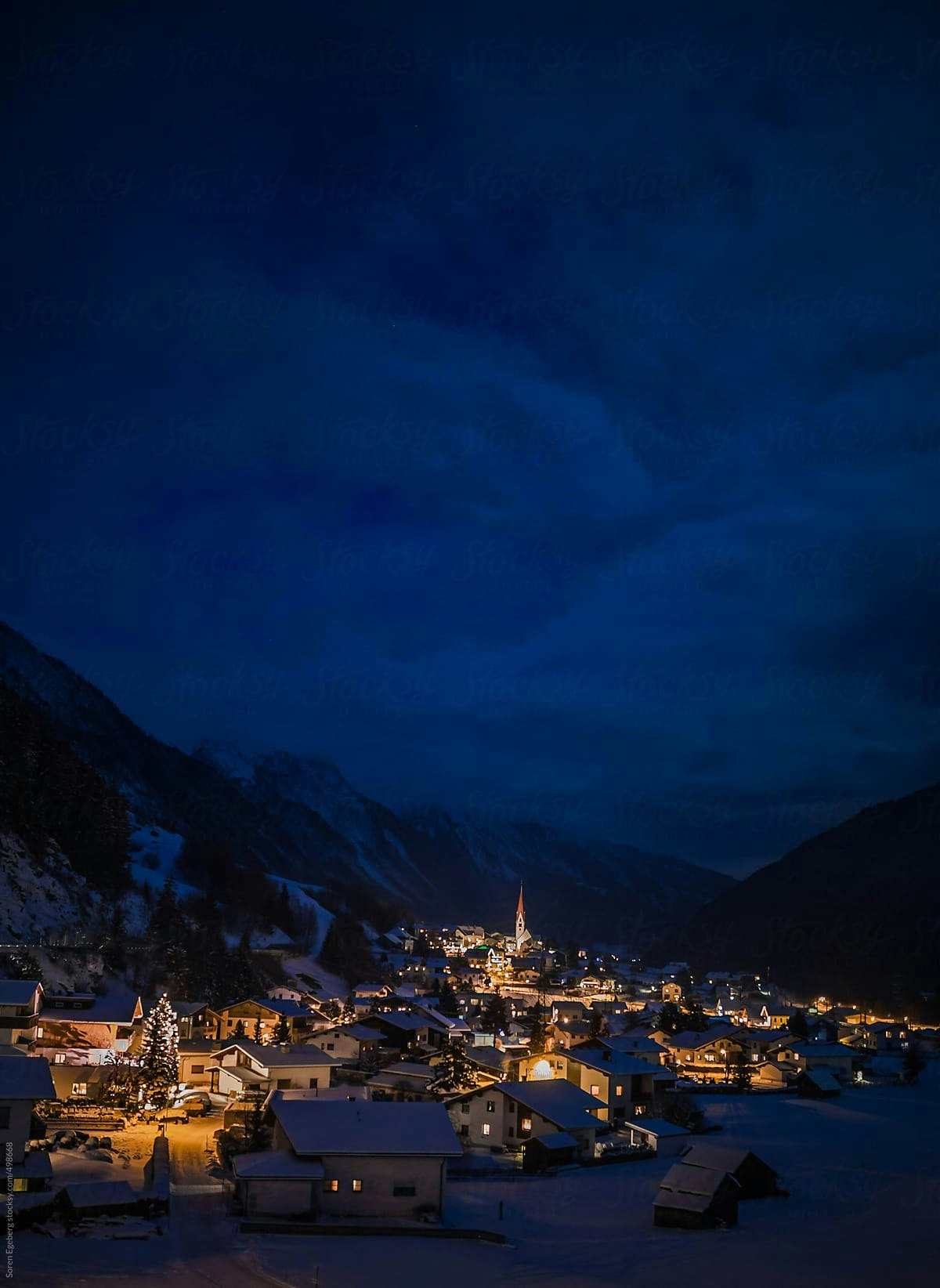
コンテキストに適した背景を選択してください:私はこれを選びます:
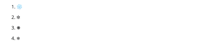
次に、いくつかの雪片イコンを選択します。私は常にHTMLコードを使用します。
Styles:
次に、一般的なスタイル
- {margin:0; padding:0;}
html, body {
width: 100%;
min-height: 100%;
height: auto !important;
height: 100%;
font-size: 1.5em;
overflow: hidden;
}
nevado {
width: 768px;
min-height: 100%!important;
height: 800px;
position: relative;
margin: 0 auto;
}
fondo-imag img {
position:absolute;
top:0;
left:0;
right:0;
bottom:0;
margin:auto;
min-width:50%;
min-height:50%;
}
雪イコンのスタイル:
nevar div {
position: absolute;
top: -10px;
animation-name: nieve, copos;
animation-iteration-count: infinite;
animation-direction: normal;
animation-timing-function: ease-in;
}
.copos {
color: rgba(255,255,255,.7);
font-size: 1em;
position: absolute;
}
次に、各雪片イコンのサイズが異なり、落下速度も異なります。異なるスタイル:ここでは、7つの異なるタイプをスタイルします。
.copos.c1 {
font-size: 1.7em;
left: 60px;
animation-duration: 5s;
color:rgba(160,240,255, .6);
}
.copos.c2 {
font-size: 1.2em;
left: 140px;
animation-duration: 8s;
}
.copos.c3 {
font-size: 1.1em;
left: 220px;
animation-duration: 9s;
}
.copos.c4 {
font-size: 1.5em;
left: 300px;
animation-duration: 6s;
color:rgba(48,176,255, .4);
}
.copos.c5 {
font-size: 1em;
left: 380px;
animation-duration: 7s;
}
.copos.c6 {
font-size: .9em;
left: 470px;
animation-duration: 10s;
}
.copos.c7 {
font-size: 2em;
left: 570px;
animation-duration: 10s;
color:rgba(0,240,255, .4);
}
.copos.c8 {
font-size: 1em;
left: 670px;
animation-duration: 12s;
}
.copos span {
display: block;
top: -50px;
font-size: 1.3em;
opacity: .8;
white-space: pre;
font-family: monospace;
}
Animations
nieve : これは、上記のスタイルの雪片のそれぞれがこのアニメーションに付随することを意味します。最初から、その上部の位置は-100pxになり、最後まで、その位置は1200pxになります、 各クラスに対応するc1->c8はアニメーション時間になり、各クラスは異なるドロップ率、異なるアニメーション時間になります。
@keyframes nieve {
from {top: -100px;}
to {top: 1200px;}
}
copos : このアニメーションは、スノーフレーク自体を2つの円で定義します。
@keyframes copos {
0% { transform: rotate(0deg) translate(0px, 0px);}
100% { transform: rotate(720deg) translate(0px, 100px);}
}
See the Pen gOwOjep by dq-nguyen-quang-minh (@dq-nguyen-quang-minh) on CodePen.