React Material-UI + react-hooks-form
React.js の入力フォームのライブラリに react-hooks-form がありますが、これと Material-UI のコンポーネントを組み合わせる方法についてまとめます。
検索に時間がかかったので備忘録がてらまとめます。
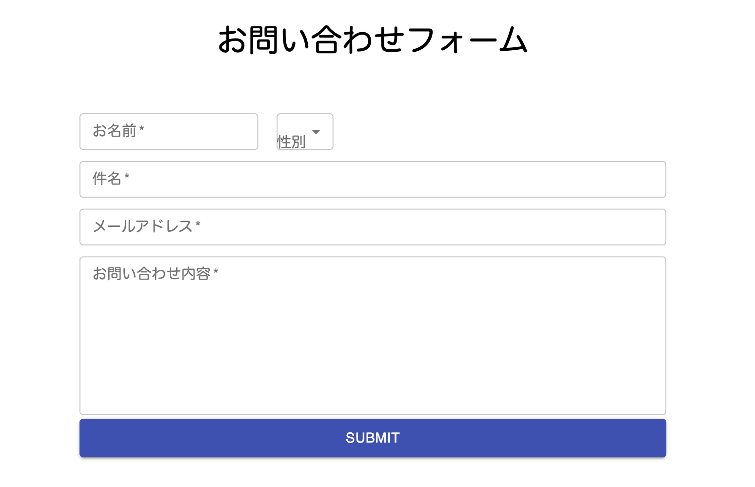
全体像
全体を Boxコンポーネント(Form 要素)で囲み、TextField を配置しボタンで Submit 処理を発火しています。
肝となるのは react-hook-form の Controller コンポーネントです。
Controller コンポーネントの Props に render がありますが、こちらに表示したい Material-UI のコンポーネントを配置します。今回は TextField ですが、CheckBox なども可能です。
// 1.FormすべてのPropsを宣言
// subject, email, messageのコードは省略している
type FormProps = {
  name: string;
  gender: string;
  subject: string;
  email: string;
  message: string;
};

const Contact: React.FC<any> = (props) => {
  // 2,react-hook-form使用の宣言
  const {
    handleSubmit,
    control,
    formState: { errors },
  } = useForm<FormProps>({
    mode: "onBlur", // blur イベントからバリデーションがトリガーされます。
    criteriaMode: "all", // all -> 発生した全てのエラーが収集されます。
    shouldFocusError: false, //true -> エラーのある最初のフィールドがフォーカスされます。
  });
  // 3.Submit発火時に実行されるメソッド。ここでPOSTメソッドなどを呼ぶ
  const onSubmit: SubmitHandler<FormProps> = (data) => {
    console.log(data);
  };

  return (
    <Box
      component="form"
      marginTop="50px"
      width="100%"
      display="flex"
      flexDirection="column"
      justifyContent="center"
      onSubmit={handleSubmit(onSubmit)}
    >
      <Controller
        name="name"
        control={control}
        rules={{
          required: "入力必須ですよ!",
          maxLength: {
            value: 30,
            message: "30文字以下で入力してくださいね!",
          },
        }}
        render={({
          field: { onChange, onBlur, value, name, ref },
          fieldState: { invalid, isTouched, isDirty, error },
        }) => (
          <TextField
            label="お名前"
            placeholder="田中太郎"
            multiline
            required
            value={value}
            variant="outlined"
            margin="dense"
            onChange={onChange}
            onBlur={onBlur}
            error={Boolean(error)}
            helperText={error?.message}
          />
        )}
      />

      {/*/email, gender, subject, message は省略*/}

      <Button type="submit" color="primary" variant="contained" size="large">
        送信する
      </Button>
    </Box>
  );
};
Props の型
Props の型は以下の通りですが、これは入力フォームの持つ要素に応じて変更します。
お名前、件名、メールアドレス、お問い合わせ内容があるイメージです。
type FormProps = {
  name: string;
  gender: string;
  subject: string;
  email: string;
  message: string;
};
useForm
react-hook-form を使用するために必要な関数宣言です。
関数宣言の引数にオブジェクトとしてオプションを渡しています。API v6
const {
  handleSubmit,
  control,
  formState: { errors },
} = useForm<FormProps>({
  mode: "onBlur", // blur イベントからバリデーションがトリガーされます。
  criteriaMode: "all", // all -> 発生した全てのエラーが収集されます。
  shouldFocusError: false, //true -> エラーのある最初のフィールドがフォーカスされます。
});
Controller
外部制御されたコンポーネントを使用するためのラッパーコンポーネントです。
公式によると Controller の Props である render の内部で Material-UI のコンポーネントを使用すると簡単になるらしいです。
Controller React Hook Form
rules という Props にオブジェクトを渡すことで、バリデーションを設定できます。以下にあるのは未入力、31文字以上の際にエラーメッセージを表示させる例です。pattern など正規表現も取り扱っています。useForm register
  rules={{
    required: "入力必須ですよ!",
    maxLength: {
      value: 30,
      message: "30文字以下で入力してくださいね!",
    },
  }}
render のコールバックの引数にある name や onChange は、react-hook-form からの値を Material-UI コンポーネントの TextField に渡しています。fieldState オブジェクトの error は、name 要素がエラーだった(上記の rules が True のとき)、エラーのステートを返却します。エラーメッセージは error.message で取得できるのでそれを helperText の Props に渡してバリデーションメッセージを表示しています。
<Controller
  name="name"
  control={control}
  rules={{
    required: "入力必須やで!",
    maxLength: {
      value: 30,
      message: "30文字以下で入力するんやで!",
    },
  }}
  render={({
    field: { onChange, onBlur, value, name, ref },
    fieldState: { invalid, isTouched, isDirty, error },
  }) => (
    <TextField
      label="お名前"
      placeholder="田中太郎"
      required
      value={value}
      variant="outlined"
      margin="dense"
      onChange={onChange}
      onBlur={onBlur}
      error={Boolean(error)}
      helperText={error?.message}
    />
  )}
/>