はじめに
SwiftUIの標準コンポーネントのSliderはこのような実装になります。
Slider(value: $value,
              in: -100...100,
              step: 1,
              onEditingChanged: { _ in
})
.frame(width:300, height:30)

しかし、標準Sliderでは、中央を0とし、そこ始まり、左右に移動するとバーの色が伸びていくSliderは実装できません。
そこで、今回は調べながらそれっぽいのを作ってみたという記事になります。
注意
若干未完成で、少し微妙なところが残っています。
修正アイデア頂ける方は、コメント頂けると助かります。
まず実装したコンポーネントの挙動はこのような感じです。

全体のコードはこのようになりました。
struct CenterOriginSlider: View {
    typealias onEditingChangedType = () -> Void
    @Binding var value: Double

    private var bounds: ClosedRange<Double>
    private var tintColor: Color
    private var onEditingChanged: onEditingChangedType

    private enum ThumbDirection {
        case left, right
    }

    init(value: Binding<Double>,
         in bounds: ClosedRange<Double> = 1...100,
         tint: Color = .accentColor,
         onEditingChanged: @escaping onEditingChangedType = {}) {
        self._value = value
        self.bounds = bounds
        self.tintColor = tint
        self.onEditingChanged = onEditingChanged
    }

    var body: some View {
        GeometryReader { gr in
            let adjustValue = 5.0
            let minValue = adjustValue
            let maxValue = gr.size.width - adjustValue
            let scale = (maxValue - minValue) / (bounds.upperBound - bounds.lowerBound)
            let lower = bounds.lowerBound
            let sliderValue = ((value - minValue - lower) * scale)
            let valueBarWidth = fabs(value) * scale
            let thumbDirection: ThumbDirection = value < 0 ? .left : .right

            ZStack {
                TrackBar(width: gr.size.width)
                ValueTrackBar(valueWidth: valueBarWidth,
                              barWidth: maxValue,
                              thumbDirection: thumbDirection,
                              color: tintColor)
                Thumb(value: $value,
                      offset: sliderValue,
                      minValue: minValue,
                      maxValue: maxValue,
                      scale: scale,
                      lower: lower) {
                    onEditingChanged()
                }
            }
        }
    }

    private struct TrackBar: View {
        let width: Double
        private let height = 4.0
        private let color = Color(white: 0.9, opacity: 1.0)

        var body: some View {
            RoundedRectangle(cornerRadius: height)
                .fill(color)
                .frame(width: width,
                       height: height)
        }
    }

    private struct ValueTrackBar: View {
        let valueWidth: Double
        let barWidth: Double
        let barheight = 4.0
        let thumbDirection: ThumbDirection
        let color: Color

        var body: some View {
            HStack {
                if thumbDirection == .left {
                    Spacer()
                }
                Rectangle()
                    .fill(color)
                    .frame(width: valueWidth, height: barheight)
                    .padding(thumbDirection == .left ? .trailing : .leading, barWidth * 0.5)
                if thumbDirection == .right {
                    Spacer()
                }
            }
        }
    }

    private struct Thumb: View {
        @Binding var value: Double
        let offset: Double
        let minValue: Double
        let maxValue: Double
        let scale: Double
        let lower: Double
        let step: Double = 1.0
        let onEditingChanged: () -> Void
        @State private var lastCoordinate: Double = 0.0
        private let color = Color.white

        var body: some View {
            HStack {
                Circle()
                    .fill(.white)
                    .frame(width: 26)
                    .shadow(color: .black.opacity(0.2), radius: 4, x: 0, y: 4)
                    .offset(x: offset)
                    .gesture(
                        DragGesture(minimumDistance: 0)
                            .onChanged { value in
                                let translationWidth = value.translation.width
                                if abs(translationWidth) < 0.1 {
                                    lastCoordinate = offset
                                }
                                guard abs(translationWidth) > 0.1 else { return }
                                let distance = lastCoordinate + translationWidth
                                let nextCoordinate = translationWidth > 0 ? min(maxValue, distance) : max(minValue, distance)
                                self.value = ((nextCoordinate - minValue) / scale) + lower
                                onEditingChanged()
                            }
                    )
                Spacer()
            }
        }
    }
}
使用するときは、このようになります。
struct ContentView: View {

    @State private var value: Double = 0

    var body: some View {

        VStack {
            CenterOriginSlider(value: $value,
                               in: -100...100,
                               onEditingChanged: {
            })
            .frame(width:300, height: 30)
            Text("value: \(value)")
        }.padding()
    }
}
解説
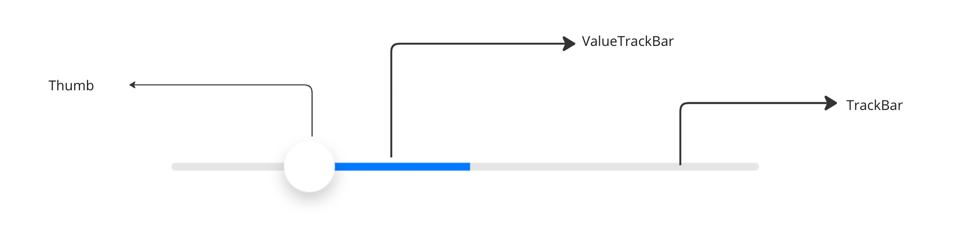
今回作ったコンポーネントは大きく3つのコンポーネントに分解できます。
一番親となるCenterOriginSliderのbody内を見てもらうと、TrackBar、ValueTrackBar、ThumbがZtack内に登録しています。
ZStack {
    TrackBar(width: gr.size.width)
    ValueTrackBar(valueWidth: valueBarWidth,
                  barWidth: maxValue,
                  thumbDirection: thumbDirection,
                  color: tintColor)
    Thumb(value: $value,
          offset: sliderValue,
          minValue: minValue,
          maxValue: maxValue,
          scale: scale,
          lower: lower) {
        onEditingChanged()
    }
}
ポイント1
まずValueTrackBarで行っている、"中央から伸びた分だけ色を付ける"というのをどう実装していくかがポイントになります。
今回は、Spacerとpaddingを使い、マイナス方向とプラス方向で、配置を変えることで実現しました。
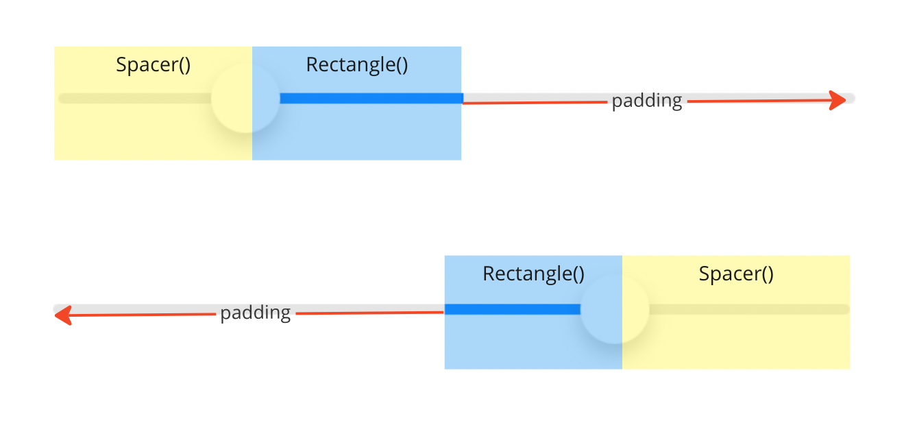
HStack {
    if thumbDirection == .left {
        Spacer()
    }
    Rectangle()
        .fill(color)
        .frame(width: valueWidth, height: barheight)
        .padding(thumbDirection == .left ? .trailing : .leading, barWidth * 0.5)
    if thumbDirection == .right {
        Spacer()
    }
}
ポイント2
次のポイントがThumbのDragGestureによって変化量を計算する部分で、この部分はこちらの記事を参考にさせてもらいながら、実装しましたが、若干カクついたりする場合があり、その補正が自分でもまだクリアになっていないところです。
Circle()
    .fill(.white)
    .frame(width: 26)
    .shadow(color: .black.opacity(0.2), radius: 4, x: 0, y: 4)
    .offset(x: offset)
    .gesture(
        DragGesture(minimumDistance: 0)
            .onChanged { value in
                let translationWidth = value.translation.width
                if abs(translationWidth) < 0.1 {
                    lastCoordinate = offset
                }
                guard abs(translationWidth) > 0.1 else { return }
                let distance = lastCoordinate + translationWidth
                let nextCoordinate = translationWidth > 0 ? min(maxValue, distance) : max(minValue, distance)
                self.value = ((nextCoordinate - minValue) / scale) + lower
                onEditingChanged()
            }
    )
if abs(translationWidth) < 0.1で lastCoordinateを保持することで、タップした瞬間の位置を保持していて、これがないと、Dragした瞬間に移動してしまったりします。
このあたりもっとスマートな実装があればコメント頂けると嬉しいです。
微妙なところ
標準のSliderと並べるとこんな感じで、近い見た目にはなりましたが、より標準のSliderに寄せるにはまだ課題が残っています。
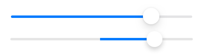
- Darkモードのときに
TabBarの色を変える -
Thumbの変化量が違う -
stepに対応していない
おわりに
ということで、課題がありますが、それっぽいものを作ることができたのと、意外と面倒なことがわかりました。