あらまし
前回の「Kv Languageの基本」の使い方で、Kivyの基本的な使い方がなんとなくわかったかと思います。
今回は実際に簡単なアプリを作成してさらに理解を深めていきます。
作成するもの
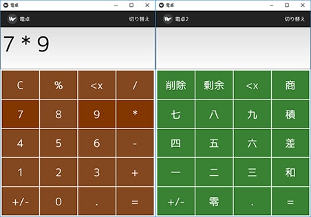
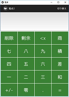
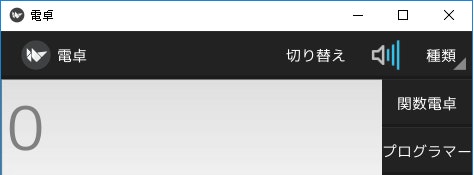
作成するものは電卓アプリです。ボタンで数字と演算子を入力し「=」ボタンをおすと演算結果が表示されます。また切り替えを押すとデザインが変わります
あらたに習得する内容
あらたに習得する内容は以下になります
- GridLayoutの使い方
- ActionBar、およびその周りの使い方
- get_color_from_hex()による色の指定の仕方
- clear_widgets() とFactory(),add_widget()の使用方法
参考リンク
Kivyで電卓アプリを作成することは海外のチュートリアルではよく取り合げられています。
参考にしたものをあげます。
プログラムについて
Kivyを使用したコードの書き方ですが、色々な書き方があります。あくまでもこれは一例です。また、今回の記事を書く際に使用したソースコードをGithubに挙げております。ただし、fontは配置しておりませんので必要な際はご自分で用意して配置してください。
検証環境
検証環境は以下の通りです。
OS: Windows10 64bit
Kivy:1.9.1
Python3.4※
※Python2系でもコードは実行できますが、日本語表示の箇所でエラーになります。その際は、コードを変更してみてください。(例:'日本語'→u'日本語')
またKv Languageファイルですが、Python3系の場合は”Shift-jis”でPython2系は"utf-8"で保存してください。
以下、実際にコードと結果を載せていきます。
実行結果
実行結果は以下の通りです。
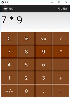
起動すると画面が表示されます。通常の電卓と同じ動作が可能です。※1頭のバーの切り替えボタンを押すと以下のデザインに切り替わります※2
※1 「.」などの少数点表示など一部の機能は未実装です。
※2 あくまで切り替わるだけでボタンを押した際の動作などは未実装です。
コード
プログラムは以下の通りです。
# -*- coding: utf-8 -*
from kivy.config import Config
Config.set('graphics', 'width', '400')
Config.set('graphics', 'height', '800')
import kivy
kivy.require('1.9.1')

from kivy.uix.boxlayout import BoxLayout
from kivy.app import App
from kivy.core.text import LabelBase, DEFAULT_FONT
from kivy.core.window import Window
from kivy.properties import BooleanProperty
from kivy.utils import get_color_from_hex
from kivy.resources import resource_add_path

from kivy.factory import Factory

# from kivy.core.window import Window
# Window.size = (450, 600)

# デフォルトに使用するフォントを変更する
resource_add_path('fonts')
LabelBase.register(DEFAULT_FONT, 'mplus-2c-regular.ttf') #日本語が使用できるように日本語フォントを指定する


class Calculator1(BoxLayout):

    clear_bool = BooleanProperty(False)

    def print_number(self, number):
        '''入力された値が入る'''
        if self.clear_bool:
            self.clear_display()

        text = "{}{}".format(self.display.text, number) # 今までの入力された文字列と入力された値が表示される
        self.display.text = text

        print("数字「{0}」が押されました".format(number))

    def print_operator(self, operator):
        if self.clear_bool:
            self.clear_bool = False

        text = "{} {} ".format(self.display.text, operator)
        self.display.text = text

        print("演算子「{0}」が押されました".format(operator))

    def print_point(self, operator):
        # 「.」が押されれた場合の処理

        print("(未実装)演算子「{0}」が押されました".format(operator))

    def clear_display(self):
        self.display.text = ""
        self.clear_bool = False

        print("「c」が押されました")
    def del_char(self):
        ''' "<x"を押された場合の計算結果を表示  '''

        self.display.text = self.display.text[:-1]

        print("「<x」が押されました")

    def calculate(self):
        ''' "="を押された場合の計算結果を表示  '''
        try:
            self.display.text = str(eval(self.display.text)) # 単一の式を評価  例:eval("5 + 10") は15になる
            self.clear_bool = True

            print('計算完了')
        except:
            # 数字を入力せずに '=’を押した場合などのエラー対策
            print('error 入力ミス')


# class Calculator2(BoxLayout):
#    def __init__(self, **kwargs):
#        super(Calculator2, self).__init__(**kwargs)


class CalculatorRoot(BoxLayout):
    def __init__(self, **kwargs):
        super(CalculatorRoot, self).__init__(**kwargs)

    def change_calc(self):
        self.clear_widgets()
        self.add_widget(Calculator1())

    def change_calc2(self):
        self.clear_widgets()
        calc2 = Factory.Calculator2()
        #calc2 = Calculator2()

        self.add_widget(calc2)


class CalculatorApp(App):
    def __init__(self, **kwargs):
        super(CalculatorApp, self).__init__(**kwargs)

        self.title = '電卓'
    pass


if __name__ == "__main__":
    Window.clearcolor = get_color_from_hex('#FFFFFF')
    CalculatorApp().run()
Kvファイル
Kvファイルは以下の通りです。
# : import get_color_from_hex kivy.utils.get_color_from_hex

CalculatorRoot


<CalculatorRoot>
    Calculator1
        id: calculator1

<calculator1>
# 画面全体のレイアウト
    orientation: "vertical" # オブジェクトを水平に配置
    display: display_input

    ActionBar:

        ActionView:
            ActionPrevious:
                title: '電卓'
                with_previous: False # trueだと頭のロゴがボタンになる?

            ActionButton:
                text: '切り替え'
                on_press: print("push ");app.root.change_calc2()

#            ActionButton:
#                text: '音'
#                icon: 'atlas://data/images/defaulttheme/audio-volume-high'

#            ActionGroup:    # ボタンをグループ化する
#                text: '種類'
#                ActionButton:
#                    text: '関数電卓'
#                ActionButton:
#                    text: 'プログラマー'


    TextInput:  # 数字表示部分
        id: display_input
        size_hint_y: 1  # 縦の大きさを全体の 1/5.5 の割合で表示する
        font_size: 60
        hint_text: '0'

    Keyboard:   # テーンキーの表示部分
        size_hint_y: 3.5    # 縦の大きさを全体の 3.5/4.5 の割合で表示する


<Keyboard@GridLayout>:  # class Keyboard(GridLayout):と同じ意味

    # 4列×5行のボタンを作成する
    cols: 4
    rows: 5

    spacing: 2
    padding: 4

    # 1列目
    ClearButton:    # ボタンの種類
        text: "C"   # ボタンの表示名
    CalcButton:
        text: "%"
    DelButton:
        text: "<x"
    OperatorButton:
        text: "/"

    # 2列目
    NumberButton:
        text: "7"
    NumberButton:
        text: "8"
    NumberButton:
        text: "9"
    OperatorButton:
        text: "*"

    # 3列目
    NumberButton:
        text: "4"
    NumberButton:
        text: "5"
    NumberButton:
        text: "6"
    OperatorButton:
        text: "-"

    # 4列目
    NumberButton:
        text: "1"
    NumberButton:
        text: "2"
    NumberButton:
        text: "3"
    OperatorButton:
        text: "+"

    # 5列目
    CalcButton:
        text: "+/-"
    NumberButton:
        text: "0"
    CalcButton:
        text: "."
    EqualButton:
        text: "="

<ButtonFormat@Button>:
    font_size: '30dp'
    background_normal: ''
    background_down: ''
    background_color: get_color_from_hex("#83481F")
    on_press: self.background_color = get_color_from_hex("#825534")
    on_release: self.background_color = get_color_from_hex("#823600")


<NumberButton@ButtonFormat>:
    #font: "Roboto"
    font_size: '30dp'
    bold: True
    on_press:  app.root.ids['calculator1'].print_number(self.text)   # ボタンが押されたとき main.pyの Calculatorクラスのprint_number()が実行される

<OperatorButton@ButtonFormat>:
    on_press:  app.root.ids['calculator1'].print_operator(self.text)

<ClearButton@ButtonFormat>:
    on_press:  app.root.ids['calculator1'].clear_display()

<DelButton@ButtonFormat>:
    on_press:  app.root.ids['calculator1'].del_char()

<EqualButton@ButtonFormat>:
    on_press:  app.root.ids['calculator1'].calculate()

<CalcButton@ButtonFormat>:  #小数点を表示する予定だが未実装
    on_press:  app.root.ids['calculator1'].print_point(self.text)


<Calculator2@BoxLayout>
    id: calculator2

    orientation: "vertical" # オブジェクトを水平に配置
    display: display_input

    ActionBar:
        ActionView:
            ActionPrevious:
                title: '電卓2'
                with_previous: False # trueだと頭のロゴがボタンになる?
            ActionOverflow:

            ActionButton:
                text: '切り替え'
                on_press: print("push2 ");app.root.change_calc()


    TextInput:  # 数字表示部分
        id: display_input
        size_hint_y: 1  # 縦の大きさを全体の 1/4.5 の割合で表示する
        font_size: 60
    Keyboard2:   # テーンキーの表示部分
        size_hint_y: 3.5    # 縦の大きさを全体の 3.5/4.5 の割合で表示する


<Keyboard2@GridLayout>:  # class Keyboard(GridLayout):と同じ意味

    # 4列×5行のボタンを作成する
    cols: 4
    rows: 5

    spacing: 2
    padding: 4

    # 1列目
    ClearButton2:    # ボタンの種類
        text: "削除"   # ボタンの表示名

    CalcButton2:
        text: "剰余"
    DelButton2:
        text: "<x"
    OperatorButton2:
        text: "商"

    # 2列目
    NumberButton2:
        text: "七"
        calc_val: '7'
    NumberButton2:
        text: "八"
        calc_val: '8'
    NumberButton2:
        text: "九"
        calc_val: '9'

    OperatorButton2:
        text: "積"

    # 3列目
    NumberButton2:
        text: "四"
    NumberButton2:
        text: "五"
    NumberButton2:
        text: "六"
    OperatorButton2:
        text: "差"

    # 4列目
    NumberButton2:
        text: "一"
    NumberButton2:
        text: "二"
    NumberButton2:
        text: "三"
    OperatorButton2:
        text: "和"

    # 5列目
    CalcButton2:
        text: "+/-"
    NumberButton2:
        text: "零"
    CalcButton2:
        text: "."
    EqualButton2:
        text: "="

<ButtonFormat2@Button>:
    font_size: '30dp'
    background_normal: ''
    background_down: ''
    background_color: get_color_from_hex("#398133")
    on_press: self.background_color = get_color_from_hex("#73FF66")
    on_release: self.background_color = get_color_from_hex("#52824E")


<NumberButton2@ButtonFormat2>:
    bold: True

<OperatorButton2@ButtonFormat2>:

<ClearButton2@ButtonFormat2>:

<DelButton2@ButtonFormat2>:

<EqualButton2@ButtonFormat2>:

<CalcButton2@ButtonFormat2>:
解説
Kv Languageの基本的な説明は前回行ったので、前回の説明しきれなかった部分を中心に説明します。
まずはKvファイルから説明します。
起動時のレイアウトについて
起動時は、rootWidgetのCalculatorRootにはcalculator設定されています。
その中でcalculator1は以下のコードになっています。
<calculator1>
# 画面全体のレイアウト
    orientation: "vertical" # オブジェクトを水平に配置
    display: display_input

    ActionBar:

        ActionView:
            ActionPrevious:
                title: '電卓'
                with_previous: False # trueだと頭のロゴがボタンになる?
            ActionOverflow:

            ActionButton:
                text: '切り替え'
                on_press: print("push ");app.root.change_calc2()
    TextInput:  # 数字表示部分
        id: display_input
        size_hint_y: 1  # 縦の大きさを全体の 1/4.5 の割合で表示する
        font_size: 60
        hint_text: '0'

    Keyboard:   # テーンキーの表示部分
        size_hint_y: 3.5    # 縦の大きさを全体の 3.5/4.5 の割合で表示する
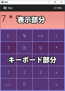
calculator1がメインのレイアウトでこのうち、TextInputが表示領域をKeyboardがキーボードの部分でこれがメインのレイアウトになります。
TextInputの「size_hint_y」の値が「1」でKeyboardの「size_hint_y」の値が「3.5」となっており、TextInputとでKeyboardの縦方向の表示領域はこの比率に沿って配置されています。
TextInputについて
TextInputは文字入力ができるwighetです。今回はhint_text: '0'というプロパティを使用しています。hint_text: は未入力時の文字の表示を設定できます。
参考
そのうちKewbordはGridLayoutを元にして作成したカスタムwidgetです。
<Keyboard@GridLayout>:
GridLayoutについて
公式サイトから転載
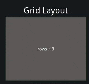
GirdLayoutはグリッド(格子)上にwidgetを配置することが出来るwidgetです。
<Keyboard@GridLayout>:  # class Keyboard(GridLayout):と同じ意味

    # 4列×5行のボタンを作成する
    cols: 4
    rows: 5
基本的な使用方法としては「cols」が横方向を、「rows」が縦方向のセルの数を設定します。両方設定する必要はなく、「cols」のみ設定することも可能です。
今回はキーボードを作成することに使用しました。
また今回は使用していませんがセルごとに「size_hint」を使用できるので、そうすることでグリッドのサイズを個別に調整することが可能です。
なお、BoxLayoutを組み合わせて使用しても同様のレイアウトは実現できますので、GirdLayoutを使用するかBoxLayoutを使用するかは個人の好みによると思います。
参考
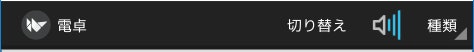
ActionBarについて
ActoonBar はandroidのアクションバー(Action Bar)と同じように、タイトルやアイコンを表示したり、ボタンを追加したりできます。おもに画面の上部、下部に設定します
    ActionBar:

        ActionView:
            ActionPrevious:
                title: '電卓'
                with_previous: False # trueだと戻るボタン
            ActionOverflow:

            ActionButton:
                text: '切り替え'
                on_press: print("push ");app.root.change_calc2()

            ActionButton:
                text: '音'
                icon: 'atlas://data/images/defaulttheme/audio-volume-high'

            ActionGroup:    # ボタンをグループ化する
                text: '種類'
                ActionButton:
                    text: '関数電卓'
                ActionButton:
                    text: 'プログラマー'
ActionViewはBoxLayoutをbaseにしたクラスで、使用してボタンなどを並べます。
ActionPreviousは、アプリのタイトルと戻るボタンを設定します。「title」プロパティに名前を、「with_previous」のプロパティを「True」にすると、kivyのアイコンをクリックすると前のページに戻ることが出きます。ただし、戻る機能を使用するにはslideなどで複数の画面を作成する必要があります。
またアイコン画像は「app_icon」パラメータを指定することで変更可能です。
「ActionButton」を使用するとボタンを追加します。「icon」パラメータで画像を変更できます。※iconの画像指定に「atlas」を使用しています。「atlas」は次の項目で説明します。
「ActionGroup」を使用するとボタンをグループ化します。実行結果は以下の通りです。
参考
atlasについて
atlas(アトラス)とは複数の画像を1つの画像にまとめたもののことです。
ゲームやCGなどでよく使用する技術で、メモリの節約や読み込みを短くするために使用します。詳しい説明は「Unity アトラス」などで検索すると出てきます
kivyでもatlasを使用しており、デフォルトのボタンやon/offスイッチなどはすべてこの仕組みを使用しております。
Kivyのatlasはatlas形式(拡張子 .atlas)のファイルとその内部で指定されたpngファイルで実現します。atlasファイルはjson形式で以下のようになります.
{
    "<basename>-<index>.png": {
        "id1": [ <x座標>, <y座標>, <幅>, <高さ> ],
        "id2": [ <x座標>, <y座標>, <幅>, <高さ> ],
        # ...
    },
    # ...
}
実際のファイルは以下の通りです。
kivy/data/images/defaulttheme.atlas
{
    "defaulttheme-0.png": {
        "action_bar": [
            158,
            133,
            36,
            36
        ],
        "action_group": [
            452,
            171,
            33,
            48
        ],
        "action_group_disabled": [
            2,
            121,
            33,
            48
        ],
        ~省略~
        "audio-volume-high": [
            464,
            406,
            48,
            48
        ],
    ~省略~
    }
}
defaulttheme-0.png
atlasですが、個人的な印象だとデスクトップアプリを作成する場合だと、自分で用意して使用することはあまりないと思います。理由としてはメモリや読み込みが早くなる利点はありますが、反面ファイルの管理が面倒になるのと、現在のPCの標準的なスペックから見ても、atlasを使用せずに個々の画像ファイルから読み込んで使用しても実動作には十分だと思います。
RPGのマップ用に小さな画像を画面全体でタイル状に読み込むやシューティングゲームの弾幕のように大量に画像を表示するなどない限りは使用しなくてもよいかと思います。
参考
Kvファイルでの複数行実行について
ActionButton:
    text: '切り替え'
    on_press: print("push ");app.root.change_calc2()
on_press時のコマンドを見るとprintコマンドの後、「;」があります。「;」を書くことで、複数のコマンドを実行できます。またこれは「;」のあと、改行+スペースで行をそろえることもできます。
on_press:
    app.ans = eval(input.text);
    input.text = str(app.ans)
get_color_from_hex()による色の取得について
    #: import get_color_from_hex kivy.utils.get_color_from_hex

    background_color: get_color_from_hex("#83481F")
    on_press: self.background_color = get_color_from_hex("#825534")
    on_release: self.background_color = get_color_from_hex("#823600")
get_color_from_hex()を用いることで色を16進表記から取得できます。
get_color_from_hex()kivy.utilsからimportしますが、Python側ではimportしていません。
# : import get_color_from_hex kivy.utils.get_color_from_hex
と書くことで、Kvファイル側でimportできます。
参考
解説2
次にPythonファイル側の解説をします。
Pythonファイル側は前回の基本的な説明の内容でほとんど説明が可能です。一つだけ新規の要素があります。それはwidgetの切り替えです。
widgetの切り替え
以下該当するコードの抜粋は以下の通りです。
from kivy.factory import Factory

class Calculator1(BoxLayout):
    clear_bool = BooleanProperty(False)

    def print_number(self, number):
       ~ 省略~

# class Calculator2(BoxLayout):
#    def __init__(self, **kwargs):
#        super(Calculator2, self).__init__(**kwargs)

class CalculatorRoot(BoxLayout):

 def change_calc(self):
        self.clear_widgets()
        self.add_widget(Calculator1())

    def change_calc2(self):
        self.clear_widgets()
        calc2 = Factory.Calculator2()
        #calc2 = Calculator2()

        self.add_widget(calc2)
またkvファイルは以下の通りです
<Calculator2@BoxLayout>
  ~省略~
change_calc()での関数ですが、
clear_widgets()ですが、これは該当する子のwidgetをすべて削除します。特定のwidgetのみを指定して削除する場合はremove_widget('widget名')を使用します。反対にadd_widget('widget名')を指定することでwidgetを追加できます。
change_calc()は一旦、CalculatorRootに属しているwidgetをすべて削除(画面をクリア)して、新たにCalculator1クラスのwidgetを追加します。
次にchange_calc2()ですが、同様に画面をクリアして新たにCalculator2のwidgetを追加していますが、change_calc()とは大きな違いがあります。
それはCalculator1クラスはPythonファイル内で定義していますが、Calculator2クラスはPython側で定義していません。kvファイル側で定義しています。
self.add_widget(Calculator2())
Calculator2()をCalculator1()と同じように直接実行すると起動時にエラーになります。
from kivy.factory import Factory

calc2 = Factory.Calculator2()
そこで今回使用するのはFactoryクラスです。
Factoryクラスを使用すると任意のクラスまたはモジュールを自動的に登録し、プロジェクト内の任意の場所にあるクラスをインスタンス化することが可能です。そのためkvファイルで定義した、widgetを使用できます。
この方法を使用すると、画面だけを使用したい場合で機能実装がいらない場合、Pythonファイルにwidgetを記載しなくても済むのでプログラムが簡潔に書けます。
今回の場合ですとFactoryクラスを使用しない場合、コメントアウトしていたように、Pythonファイル内でCalculator2()クラスを宣言して、初期化などを宣言する必要があります。
class Calculator2(BoxLayout):
    def __init__(self, **kwargs):
        super(Calculator2, self).__init__(**kwargs)
参考
-
複数のモジュールそれぞれがKvLanguageで同じ名前のWidgetを定義した時に起こる事
Factoryと起動時に設定されるWidgetに関しての考察が書かれています。
なお、画面を切り替える方法ですが、後は、CarouselやScreenManagerを使用する方法があります。Carouselに関しては実際にやられている方もいるので参考に挙げておきます。ScreenManagerの使用方法は次回説明します。
参考
まとめ
今回で簡単な一枚の画面でおわるアプリは作成できるようになるかとおもいます。
次回はKivyでWebAPIの使用の仕方、ScreenManagerを用いた画面遷移について説明します。
この内容の続き
新しく内容を追加しました。