はじめに
この記事を紹介しようと思ったきっかけは以下の通りです.
- データ比較用の棒グラフを白黒で作成したかったので,ハッチングにより対応することにしました.色とりどりのグラフはよく見かけますが,今の時代に白黒グラフは以外に少ない?
- 2軸グラフを作成する時,凡例部をうまくプログラムできないかと考えていたのですが,気に入った方法が見つかったので,実践してみることにしました.
棒グラフのプログラムは,こちらのサイト を参考に,自前のものを書き換えています.
なお,当方の環境は以下のとおりです.
- MacBook Pro (Retina, 13-inch, Mid 2014)
- macOS High Sierra
- Python 3.7.0
- matplotlib 2.2.2
ハッチングパターン
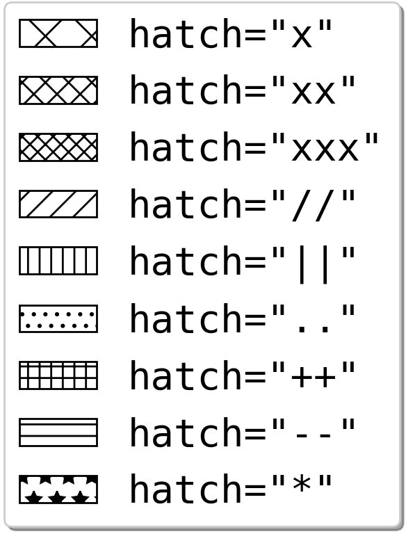
下の図は,棒グラフ本体は描画せずに,凡例だけを描画し,余白削除をしたものです.
上の図を描くコードは以下の通り.
-
plt.axis('off')で軸を消しています. - 棒のデータはいれず,プロット位置と棒の幅は,
plt.plot([0][0],width=0, ...)とし,ラベルとハッチングパターンのみを指定します.この時,それぞれを変数,g1, ... g9 に格納します. -
plt.legendで handlers に g1 から g9 を入れて凡例を描画します. - ハッチングパターンは,x とか xx とか,描きたいパターンの記号の数を増やすと細かくなります.
- この方法は,matplotlib Legend guide を参考にしました.
プログラム全文
import matplotlib.pyplot as plt


def main():
    fsz=20   # fontsize
    fig=plt.figure(facecolor='w')
    plt.rcParams['font.size']=fsz
    plt.rcParams['font.family']='monospace'
    plt.axis('off')

    g1=plt.bar([0],[0],width=0,align='center',label='hatch="x"',fill=None,hatch='x')
    g2=plt.bar([0],[0],width=0,align='center',label='hatch="xx"',fill=None,hatch='xx')
    g3=plt.bar([0],[0],width=0,align='center',label='hatch="xxx"',fill=None,hatch='xxx')
    g4=plt.bar([0],[0],width=0,align='center',label='hatch="//"',fill=None,hatch='//')
    g5=plt.bar([0],[0],width=0,align='center',label='hatch="||"',fill=None,hatch='||')
    g6=plt.bar([0],[0],width=0,align='center',label='hatch=".."',fill=None,hatch='..')
    g7=plt.bar([0],[0],width=0,align='center',label='hatch="++"',fill=None,hatch='++')
    g8=plt.bar([0],[0],width=0,align='center',label='hatch="--"',fill=None,hatch='--')
    g9=plt.bar([0],[0],width=0,align='center',label='hatch="*"',fill=None,hatch='*')
    # 凡例をまとめて描画
    plt.legend(handles=[g1,g2,g3,g4,g5,g6,g7,g8,g9],loc='best',shadow=True)

    fnameF='fig_legend.jpg'
    plt.savefig(fnameF, dpi=200, bbox_inches="tight", pad_inches=0.1)
    plt.show()


# ==============
# Execution
# ==============
if __name__ == '__main__': main()
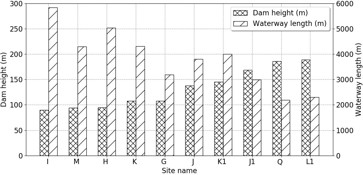
2軸の棒グラフ
2軸棒グラフの描画事例を以下に示します.これは筆者が Python matplotlibで棒グラフ(2軸グラフと積み上げグラフ) に投稿したプログラムを書き換えたものです.
上記グラフのコードを以下に示します.
左軸グラフのデータ描画部を g1=plt.bar(x,hp,width=w, ...) とし,右軸グラフのデータ描画部を,g2=plt.bar(x+w,lp,width=w, ...) として,凡例を,plt.legend(handles=[g1,g2], ...) で描画しています.
なお,元データをプロット時に並び替えたいので,文字列も含めて numpy 配列にしています.並び替えは numpy.argsort で昇順のインデックスを取得し,あとは一気に書き換えます.
プログラム全文
import matplotlib.pyplot as plt
import numpy as np


def main():
    # プロットデータ
    site=np.array(['L1','K ','M ','Q ','K1 ','J ','J1','G ','H ','I '])
    hdam=np.array([ 189, 108,  94, 186, 145, 138, 169, 108, 95,  90])
    lway=np.array([2304,4312,4300,2195,3999,3808,2987,3193,5034,5838])

    # データの並び替え
    ii=np.argsort(hdam)
    sp=site[ii]
    hp=hdam[ii]
    lp=lway[ii]

    x=np.arange(len(sp)) # x座標
    w=0.3 # 棒の幅

    fsz=16
    fig=plt.figure(figsize=(12,6),facecolor='w')
    plt.rcParams["font.size"] = fsz
    # 左軸グラフの描画
    plt.ylim(0,300)
    plt.ylabel('Dam height (m)')
    plt.xlabel('Site name')
    plt.xticks(x+w/2,sp,rotation=0)
    plt.grid(color='#999999',linestyle='--')
    g1=plt.bar(x,hp,width=w,align='center',label='Dam height (m)',fill=None,hatch='xx')
    # 右軸グラフの描画
    plt.twinx()
    plt.ylim(0,6000)
    plt.ylabel('Waterway length (m)')
    g2=plt.bar(x+w,lp,width=w,align='center',label='Waterway length (m)',fill=None,hatch='/')
    # 凡例をまとめて描画
    plt.legend(handles=[g1,g2],loc='best',shadow=True)

    plt.tight_layout()
    fnameF='fig_bar2.jpg'
    plt.savefig(fnameF, dpi=100, bbox_inches="tight", pad_inches=0.1)
    plt.show()


# ---------------
# Execute
# ---------------
if __name__ == '__main__': main()
1軸の棒グラフ
上記と似た事例として,1軸のデータ比較用棒グラフを示しておきます.
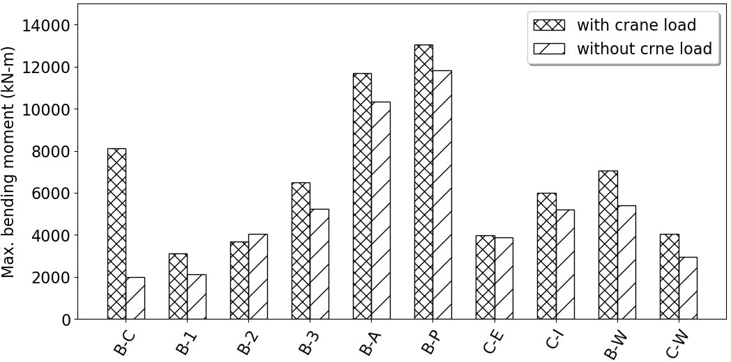
下に示すコードの中ではコメントアウトしていますが,これは1軸グラフなので,もちろん
plt.bar(x,  y1,width=w,label='with crane load',  align='center',lw=1,fill=None,hatch='xx')
plt.bar(x+w,y2,width=w,label='without crne load',align='center',lw=1,fill=None,hatch='/')
plt.legend(shadow=True,loc='best')
でも問題ありません.
プログラム全文
import matplotlib.pyplot as plt
import numpy as np


def main():
    # プロットデータ
    y1=[8127.220, 3109.375, 3683.840, 6504.671, 11687.447, 13068.109, 3993.506, 5995.114, 7050.279, 4058.274]
    y2=[1989.080, 2133.271, 4057.118, 5238.903, 10335.058, 11830.916, 3870.442, 5212.632, 5389.747, 2943.048]
    ss= ['B-C','B-1','B-2','B-3','B-A','B-P','C-E','C-I','B-W','C-W']

    x = np.arange(len(y1)) # x座標
    w = 0.3  #棒の幅

    fsz=16
    fig=plt.figure(figsize=(12,6),facecolor='w')
    plt.rcParams["font.size"]=fsz
    plt.rcParams['font.family']='sans-serif'
    plt.ylim([0,15000])
    plt.ylabel('Max. bending moment (kN-m)')
    plt.xticks(x+w/2,ss,rotation=60)
#    plt.bar(x,  y1,width=w,label='with crane load',  align='center',lw=1,fill=None,hatch='xx')
#    plt.bar(x+w,y2,width=w,label='without crne load',align='center',lw=1,fill=None,hatch='/')
#    plt.legend(shadow=True,loc='best')
    g1=plt.bar(x,  y1,width=w,label='with crane load',  align='center',lw=1,fill=None,hatch='xx')
    g2=plt.bar(x+w,y2,width=w,label='without crne load',align='center',lw=1,fill=None,hatch='/')
    plt.legend(handles=[g1,g2],loc='best',shadow=True)
    fnameF='fig_bar1.jpg'
    plt.savefig(fnameF, dpi=100, bbox_inches="tight", pad_inches=0.1)
    plt.show()


# ---------------
# Execute
# ---------------
if __name__ == '__main__': main()
おまけで余白削除Pythonプログラム
プログラムが格納されているディレクトリ内の jpg ファイルを検索し,余白削除を行うプログラムを紹介しておきます.参考記事を以下に示します・
from PIL import Image, ImageChops
import glob, os

def trim(im, border):
  bg = Image.new(im.mode, im.size, border)
  diff = ImageChops.difference(im, bg)
  bbox = diff.getbbox()
  if bbox:
    return im.crop(bbox)


def main():
    lfig=[os.path.basename(r) for r in glob.glob('*.jpg')]
    for fig in lfig:
        img_org=Image.open(fig,'r')
        img_new=trim(img_org,'#ffffff')
        img_new.save(fig, 'JPEG', quality=100, optimize=True)
        img_new.show()


# ==============
# Execution
# ==============
if __name__ == '__main__': main()
以 上