はじめに
機械学習というのがはやっているようだが、私の仕事上では今のところ特に必要性はない。とは言いながら10連休中に何か新しいことをやってみようと思い、scikit-learnをいじってみようと思い立った。TensorFlowも触ってみたいのだが、いまだにPython3.7へのインストールはうまくいかないようなので、Python3.7に問題なくインストールできるscikit-learnにしたわけである。
手始めに行ってみたのが、重回帰分析。まずはnumpyを用いて自作し、同じ処理をscikit-learnで行ってみた。使用したサンプルデータは、scikit-learnに付属のボストン土地価格である。
参考にしたサイトは以下の通り。
scikit-learnのデータセット
Pairplot
https://note.nkmk.me/python-seaborn-pandas-pairplot/
相関係数のheatmap
https://note.nkmk.me/python-pandas-corr/
今回紹介する内容は以下の通り。
前処理
サンプルデータとしてscikit-learn付属のデータベースを利用するため、以下の前処理を実行。
- データセットの解説を表示し目的変数名を確認
- データセットの内容を、メインプログラムで読み込むため、一度csvファイルとして保存。
- seabor のPairplotと相関行列のHeatmapでデータの関連線をざっくりと把握。
重回帰分析
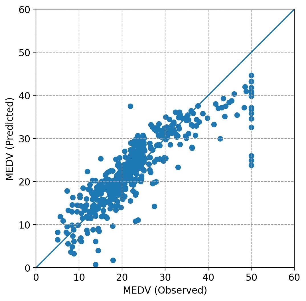
重回帰分析プログラム本体での処理内容は以下の通り。今回の紹介事例では、オリジナルデータのままの回帰と、オリジナルデータを標準化(平均値:0、標準偏差:1)したものの回帰を行っている。
- csvファイルよりデータ読み込み
- 正規方程式を作成し、
np.linalg.solveで解く - 目的変数と回帰推定値の重相関係数を算出
- 目的変数(観測値)と回帰推定値の関係をプロット
ここでは練習なので、説明変数の吟味・選択は行わず、全変数を使った計算をしている。
データセットの解説を見る
import pandas as pd
from sklearn import datasets

dataset = datasets.load_boston()
print(dataset.DESCR)
これにより、MEDV という変数が目的変数(下記説明では target)であることがわかる。
.. _boston_dataset:

Boston house prices dataset
---------------------------

**Data Set Characteristics:**

    :Number of Instances: 506

    :Number of Attributes: 13 numeric/categorical predictive. Median Value (attribute 14) is usually the target.

    :Attribute Information (in order):
        - CRIM     per capita crime rate by town
        - ZN       proportion of residential land zoned for lots over 25,000 sq.ft.
        - INDUS    proportion of non-retail business acres per town
        - CHAS     Charles River dummy variable (= 1 if tract bounds river; 0 otherwise)
        - NOX      nitric oxides concentration (parts per 10 million)
        - RM       average number of rooms per dwelling
        - AGE      proportion of owner-occupied units built prior to 1940
        - DIS      weighted distances to five Boston employment centres
        - RAD      index of accessibility to radial highways
        - TAX      full-value property-tax rate per $10,000
        - PTRATIO  pupil-teacher ratio by town
        - B        1000(Bk - 0.63)^2 where Bk is the proportion of blacks by town
        - LSTAT    % lower status of the population
        - MEDV     Median value of owner-occupied homes in $1000's

    :Missing Attribute Values: None

    :Creator: Harrison, D. and Rubinfeld, D.L.

This is a copy of UCI ML housing dataset.
https://archive.ics.uci.edu/ml/machine-learning-databases/housing/


This dataset was taken from the StatLib library which is maintained at Carnegie Mellon University.

The Boston house-price data of Harrison, D. and Rubinfeld, D.L. 'Hedonic
prices and the demand for clean air', J. Environ. Economics & Management,
vol.5, 81-102, 1978.   Used in Belsley, Kuh & Welsch, 'Regression diagnostics
...', Wiley, 1980.   N.B. Various transformations are used in the table on
pages 244-261 of the latter.

The Boston house-price data has been used in many machine learning papers that address regression
problems.

.. topic:: References

   - Belsley, Kuh & Welsch, 'Regression diagnostics: Identifying Influential Data and Sources of Collinearity', Wiley, 1980. 244-261.
   - Quinlan,R. (1993). Combining Instance-Based and Model-Based Learning. In Proceedings on the Tenth International Conference of Machine Learning, 236-243, University of Massachusetts, Amherst. Morgan Kaufmann.
データのファイル化
一般的なデータ処理を考え、scikit-learn付属のデータセットをcsvファイルに書き込み保存する。
import pandas as pd
from sklearn import datasets

dataset = datasets.load_boston()
df = pd.DataFrame(dataset.data,columns=dataset.feature_names)
df['MEDV'] = dataset.target
pd.options.display.float_format = '{:10.4f}'.format
print(df.head())

df.to_csv('boston.csv', index=False)
作成したデータフレームの表示結果(先頭付近)は以下の通り。
       CRIM         ZN      INDUS       CHAS        NOX         RM  \
0     0.0063    18.0000     2.3100     0.0000     0.5380     6.5750
1     0.0273     0.0000     7.0700     0.0000     0.4690     6.4210
2     0.0273     0.0000     7.0700     0.0000     0.4690     7.1850
3     0.0324     0.0000     2.1800     0.0000     0.4580     6.9980
4     0.0691     0.0000     2.1800     0.0000     0.4580     7.1470

         AGE        DIS        RAD        TAX    PTRATIO          B  \
0    65.2000     4.0900     1.0000   296.0000    15.3000   396.9000
1    78.9000     4.9671     2.0000   242.0000    17.8000   396.9000
2    61.1000     4.9671     2.0000   242.0000    17.8000   392.8300
3    45.8000     6.0622     3.0000   222.0000    18.7000   394.6300
4    54.2000     6.0622     3.0000   222.0000    18.7000   396.9000

       LSTAT       MEDV
0     4.9800    24.0000
1     9.1400    21.6000
2     4.0300    34.7000
3     2.9400    33.4000
4     5.3300    36.2000
ざっくりとデータを眺める
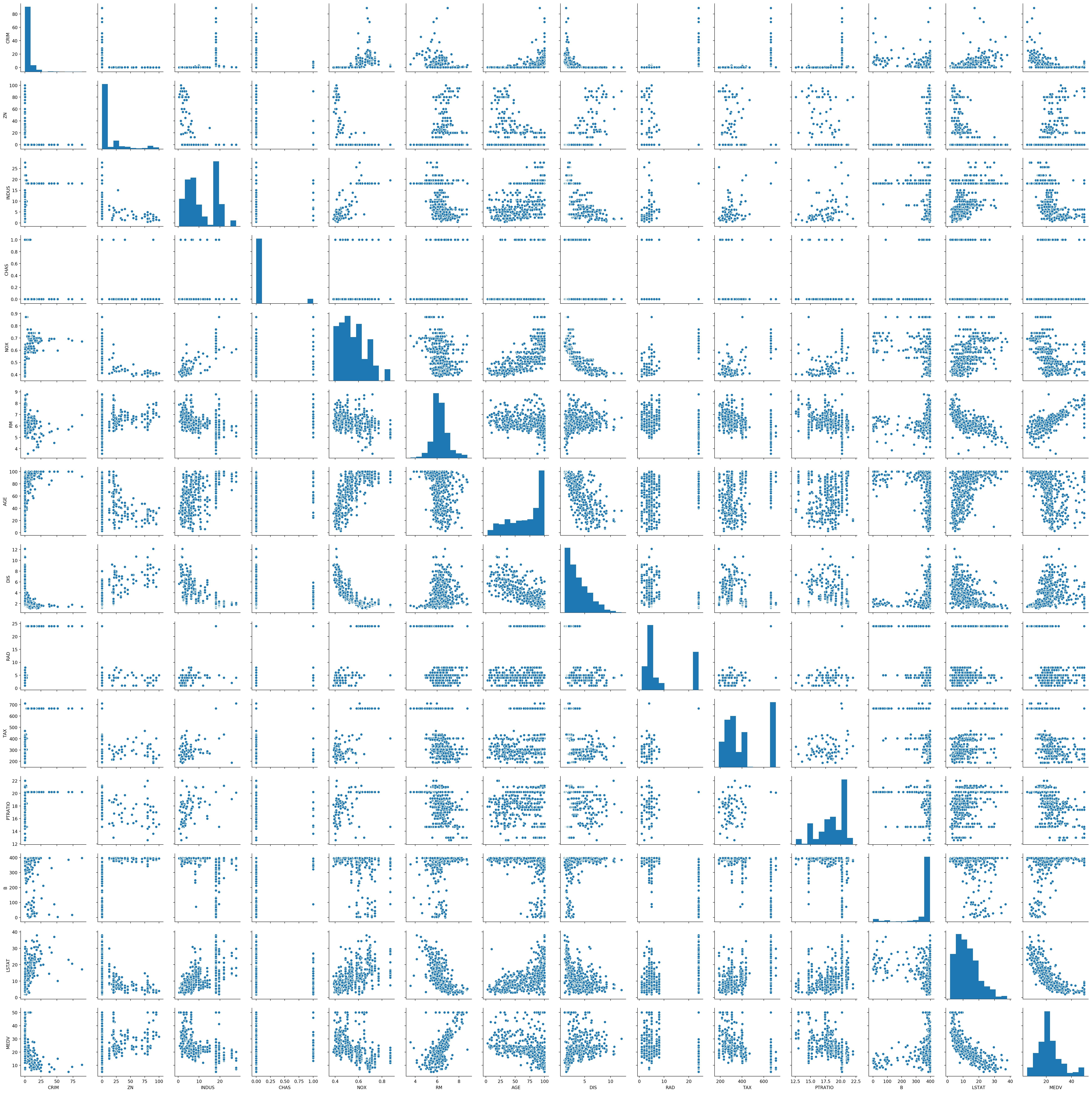
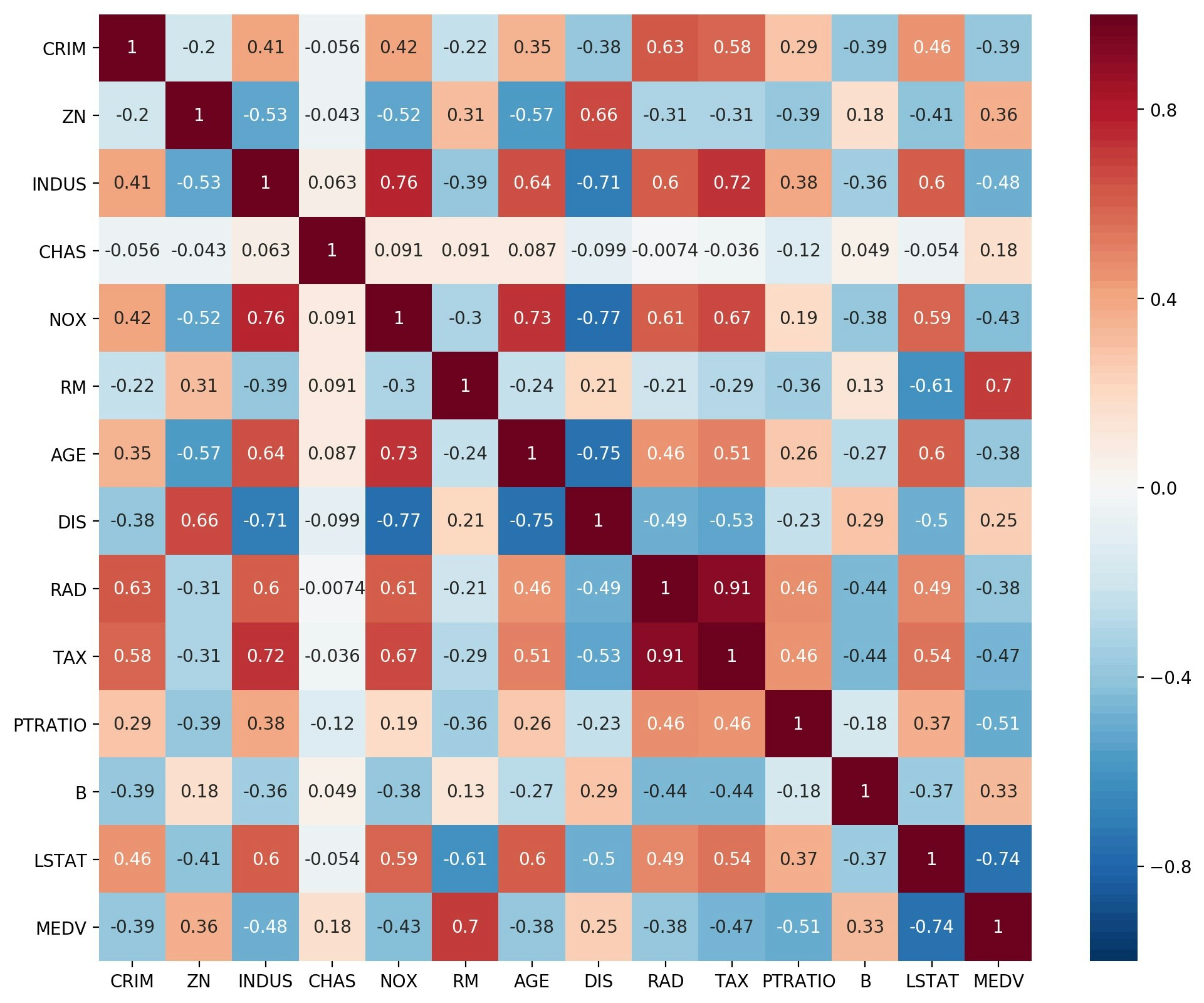
ざっくりとデータを眺めるため、seaborn の pairplot と、相関行列の heatmap を描いてみた。
これらにより、目的変数の説明に必要な変数が、直感的にわかる。
seaborn を使うのは初めてだが、簡単な操作で作図が実現でき、とても便利。
Heatmap の色は、相関係数の表示なので、最小0、最大1、中央0としているところがミソです。でもなんとなくパッとしない感じなので、もっといい感じにしたい。
import numpy as np
import pandas as pd
import matplotlib.pyplot as plt
import seaborn as sns


fnameR='boston.csv' # input file name
df = pd.read_csv(fnameR, sep=',') # data input as a DataFrame

sns.pairplot(df)
fnameF='fig_mra1.jpg'
plt.savefig(fnameF, dpi=200, bbox_inches="tight", pad_inches=0.1)
plt.show()

cm=np.corrcoef(df.transpose())
plt.figure(figsize=(12, 10))
cmap = sns.color_palette("RdBu_r", 100)
sns.heatmap(cm, annot=True,vmax=1,vmin=-1,center=0,cmap=cmap,xticklabels=df.columns,yticklabels=df.columns)
fnameF='fig_mra2.jpg'
plt.savefig(fnameF, dpi=200, bbox_inches="tight", pad_inches=0.1)
plt.show()
Pairplot
相関行列のHeatmap
numpyを用いた自作
import numpy as np
import pandas as pd
import matplotlib.pyplot as plt


def drawfig(yd,ye,ystr):
    fsz=12
    xmin=0;xmax=60
    ymin=0;ymax=60
    plt.figure(figsize=(6,6),facecolor='w')
    plt.rcParams['font.size']=fsz
    plt.rcParams['font.family']='sans-serif'
    plt.xlim([xmin,xmax])
    plt.ylim([ymin,ymax])
    plt.xlabel(ystr+' (Observed)')
    plt.ylabel(ystr+' (Predicted)')
    plt.grid(color='#999999',linestyle='dashed')
    plt.gca().set_aspect('equal',adjustable='box')
    plt.scatter(yd,ye)
    plt.plot([xmin,xmax],[ymin,ymax],'-')
    fnameF='fig_mra.jpg'
    plt.savefig(fnameF, dpi=200, bbox_inches="tight", pad_inches=0.1)
    plt.show()


def calc(df,ystr):
    x1=df.drop(ystr, axis=1).values # create numpy array of data without objective variable
    x2=np.ones((len(df),1),dtype=np.float64) # create column vector with values of one
    xd=np.hstack([x1,x2]) # create data matrix with conjunction of numpy arrays
    yd=df[ystr].values # create column vector of objective variable
    aa=np.dot(xd.T,xd) # normal equation (1)
    bb=np.dot(yd,xd) # normal equation (2)
    cc=np.linalg.solve(aa,bb) # splve normal equation
    ye=np.dot(xd,cc) # estimate predicted values
    rr=np.corrcoef(yd,ye)[0][1] # multiple correlation coefficient
    coef=np.append(cc,rr) # partial regression coefficients + r
    return yd,ye,coef


def main():
    fnameR='boston.csv' # input file name
    ystr='MEDV'        # name of objective variable
    df = pd.read_csv(fnameR, sep=',') # data input as a DataFrame
    cname=[]
    cname.extend(df.columns.values) # add column names in the list
    cname.remove(ystr) # remove objective variable name from list
    cname.extend(['constant','r']) # add names of 'constant' and 'r' in the list

    yd1,ye1,coef1=calc(df,ystr) # calculation for multiple regression analysis
    drawfig(yd1,ye1,ystr) # draw a relationship between observed data and predicted data

    y_mean=np.mean(df,axis=0)      # mean of each column
    y_std=np.std(df,axis=0,ddof=1) # standard deviation of each column by N-doff
    df=(df-y_mean)/y_std           # standardization
    yd2,ye2,coef2=calc(df,ystr)    # calculation for multiple regression analysis

    pd.options.display.float_format = '{:15.4f}'.format
    dfr=pd.DataFrame({'Name':cname,'Original':coef1,'STD':coef2})
    print(dfr.to_string(index=False))


if __name__ == '__main__':
    main()
scikit-learnを用いた実装
import numpy as np
import pandas as pd
import matplotlib.pyplot as plt
from sklearn import linear_model


def drawfig(yd,ye,ystr):
    fsz=12
    xmin=0;xmax=60
    ymin=0;ymax=60
    plt.figure(figsize=(6,6),facecolor='w')
    plt.rcParams['font.size']=fsz
    plt.rcParams['font.family']='sans-serif'
    plt.xlim([xmin,xmax])
    plt.ylim([ymin,ymax])
    plt.xlabel(ystr+' (Observed)')
    plt.ylabel(ystr+' (Predicted)')
    plt.grid(color='#999999',linestyle='dashed')
    plt.gca().set_aspect('equal',adjustable='box')
    plt.scatter(yd,ye)
    plt.plot([xmin,xmax],[ymin,ymax],'-')
    plt.show()


def calc(df,ystr):
    clf = linear_model.LinearRegression()
    xd = df.drop(ystr, axis=1).values # create data matrix without objective variable
    yd = df[ystr].values # create column vector of objective variable
    clf.fit(xd,yd)
    ye = clf.predict(xd) # estimate predicted values
    const=clf.intercept_ # constant term
    rr=np.sqrt(clf.score(xd, yd)) # multiple correlation coefficient
    coef=np.append(clf.coef_,const) # conjunction of partial regression coefficients and constant term
    coef=np.append(coef,rr) # append correlation coefficient to regression coefficient vector
    return yd,ye,coef


def main():
    fnameR='boston.csv' # input file name
    ystr='MEDV'  # name of objective variable
    df = pd.read_csv(fnameR, sep=',') # data unput
    cname=[]
    cname.extend(df.columns.values) # add column names in the list
    cname.remove(ystr) # remove objective variable name from list
    cname.extend(['constant','r']) # add names of 'constant' and 'r' in the list

    yd1,ye1,coef1=calc(df,ystr) # calculation for multiple regression analysis
    drawfig(yd1,ye1,ystr) # draw a relationship between observed data and predicted data

    y_mean=np.mean(df,axis=0)      # mean of each column
    y_std=np.std(df,axis=0,ddof=1) # standard deviation of each column by N-doff
    df=(df-y_mean)/y_std           # standardization
    yd2,ye2,coef2=calc(df,ystr)

    pd.options.display.float_format = '{:15.4f}'.format
    dfr=pd.DataFrame({'Name':cname,'Original':coef1,'STD':coef2})
    print(dfr.to_string(index=False))


if __name__ == '__main__':
    main()
出力事例
下記は画面出力事例。
Nameは変数名、Originalは生データのまま、STDは生データを標準化処理(平均値:0、標準偏差:1)したものの処理結果。
     Name        Original             STD
     CRIM         -0.1080         -0.1010
       ZN          0.0464          0.1177
    INDUS          0.0206          0.0153
     CHAS          2.6867          0.0742
      NOX        -17.7666         -0.2238
       RM          3.8099          0.2911
      AGE          0.0007          0.0021
      DIS         -1.4756         -0.3378
      RAD          0.3060          0.2897
      TAX         -0.0123         -0.2260
  PTRATIO         -0.9527         -0.2243
        B          0.0093          0.0924
    LSTAT         -0.5248         -0.4074
 constant         36.4595         -0.0000
        r          0.8606          0.8606
感想
- データをざっくり見るため、seabornでPairplotと相関行列のHeatmapを作ってみたが、とても簡単にでき、便利である。
- 回帰分析だけのコーディング量は、自作でもscukit-learn利用でもそれほど変わらない。
- 画面出力、csv出力するなら、pandasのDetaFrameとして書き出すのが便利である。
- 最近の仕事で統計分析をすることはないのだが、勉強がてらいろいろやってみようと思う。
以 上