Bootstrapのcontainerのレスポンシブについての記事です。
containerとは
Bootstrapで用意されているクラス。レスポンシブデザインを手軽に実装するために用意されたもので、グリッドシステム1を用いている。
containerの種類
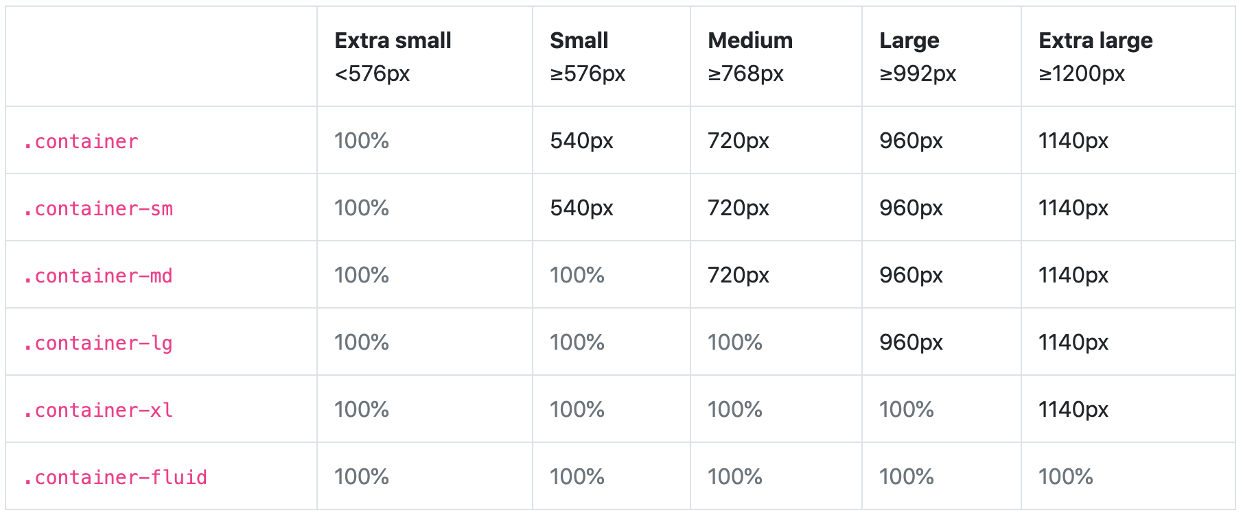 (Bootstrap[ドキュメント](https://getbootstrap.jp/docs/4.4/layout/overview/)より参照)
.container
各ブレークポイントでmax-widthを設定している。
.container-fluid
すべてのブレークポイントでwidth:100%になる。
.container-{breakpoint}
Bootstrap v4.4で新しく追加された。
指定されたブレークポイントまでwidth:100%になる。
最後に
containerで指定されているmax-width以外の値を用いたい際、わざわざレスポンシブ用のcssファイルで値を指定していたので、3つ目の.container-{breakpoint} クラスがありがたいです。
-
画面幅を12分割し、その内どれくらいの幅を使用するかを指定することで、簡単にレスポンシブデザインを実装することのできるシステムのこと。 ↩