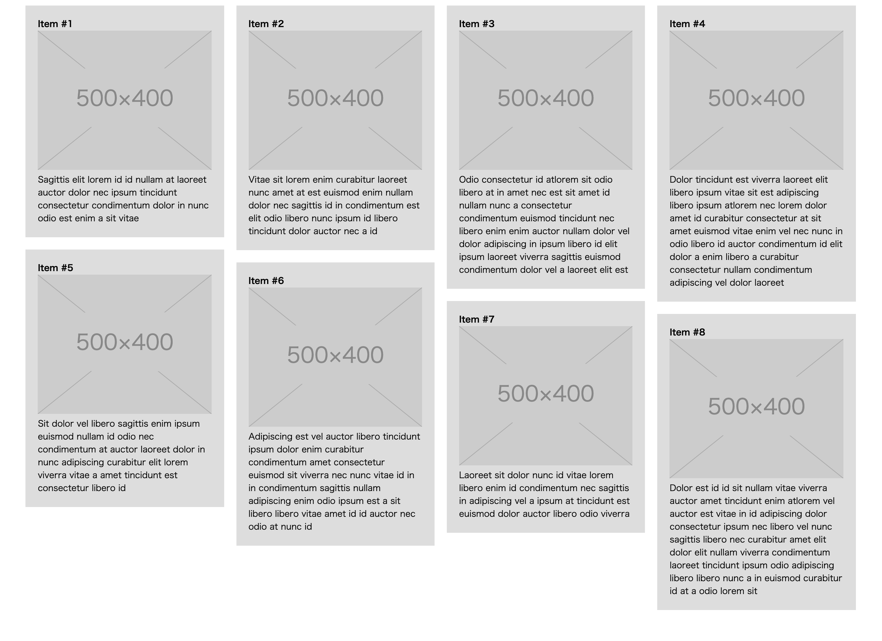
react-masonry-cssを使ってこういうデザインを実装します。(このデザインはCSSだけだと結構しんどいです。)
$ yarb add react-masonry-css # or npm install -D react-masonry-css
JSX
import React from "react"
import Masonry from "react-masonry-css"

export default () => {
  const events = [
    {
      "title": "React勉強会",
      "text": "Reactの勉強をします"
    },
    {
      "title": "JavaScript勉強会",
      "text": "JavaScriptの勉強をします"
    },
    {
      "title": "Ruby勉強会",
      "text": "Rubyの勉強をします"
    },
    {
      "title": "Rails勉強会",
      "text": "Railsの勉強をします"
    },
    {
      "title": "TypeScript勉強会",
      "text": "TypeScriptの勉強をします"
    }
  ]
  // 1行に表示するカラム数
  const breakpointColumnsObj = {
    default: 4,
    1350: 3,
    1048: 2,
    576: 1,
  }
  return (
    <div>
      <h1>勉強会一覧</h1>
      <Masonry
        breakpointCols={breakpointColumnsObj}
        className="my-masonry-grid"
        columnClassName="my-masonry-grid_column"
      >
        {events.map(e => (
          <div className='event-card'>
            <h3>{e.title}</h3>
            <p>{e.text}</p>
          </div>
      ))}
      </Masonry>
    </div>
  )
}
CSS
.my-masonry-grid {
  display: flex;
  margin-left: -30px; /* 項目間の余白のサイズ */
  width: auto;
}
.my-masonry-grid_column {
  padding-left: 30px; /* 項目間の余白のサイズ */
  background-clip: padding-box;
}

.my-masonry-grid_column > .event-card {
  background: grey;
  margin-bottom: 30px;
}
注意点
この例では1行に4カラムをデフォルトのカラム数に設定しています。
576px以下の時は1カラムしか表示しないように設定していますが、ページ表示後の一瞬だけ4カラム表示されてしまいます。
これを防ぐために、絶対にきちんと表示したいスマホ専用のDOMを新たに作成し、PCで表示する時にはdisplay: noneで非表示にすることになりました。