cartopyとは
Cartopyは、地図を描画したりやその他の地理空間データ解析を行うために、地理空間データ処理用のPythonパッケージである
cartopyの本家
インストールはpipやcondaで簡単にできる。
ここでは緯度経度座標のデータを地図と一緒に描画するやり方をまとめる。
まず、地図を書く方法を説明し、次に、等値線やベクトルなどを描く。
基本
緯度経度データの描画に、よく使うモジュールは以下の通り。cartopyはshapeファイルの描画もできるので必要に応じてインポートすれば良いと思う。
import matplotlib.pyplot as plt
import cartopy.crs as ccrs
import cartopy.util as cutil
from cartopy.mpl.ticker import LongitudeFormatter, LatitudeFormatter
様々な図法で地図を描く
いくつか代表的なものをプロットしてみる
使える図法の一覧
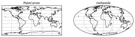
全球
正距円筒図法とモルワイデ図法(等積図法の一種)
import matplotlib.pyplot as plt
import cartopy.crs as ccrs

fig = plt.figure(figsize=(10,20))
proj = ccrs.PlateCarree()
ax = fig.add_subplot(1, 2, 1, projection=proj) # projectionを指定
ax.set_global()
ax.coastlines()
ax.gridlines()
ax.set_title("PlateCarree")
# mollweide
proj = ccrs.Mollweide()
ax = fig.add_subplot(1, 2, 2, projection=proj)
ax.set_global()
ax.coastlines()
ax.gridlines()
ax.set_title("mollweide")
plt.show()
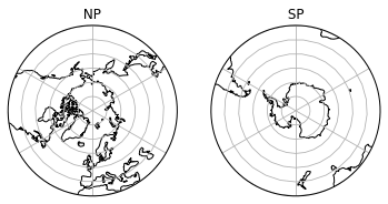
北極/南極中心
import matplotlib.pyplot as plt
import numpy as np
import matplotlib.path as mpath
import cartopy.crs as ccrs

fig = plt.figure() # figの準備

# 北極中心
proj = ccrs.AzimuthalEquidistant(central_longitude=0.0, central_latitude=90.0)
ax = fig.add_subplot(1, 2, 1, projection=proj)
# 描画範囲(緯度経度)の指定
ax.set_extent([-180, 180, 30, 90], ccrs.PlateCarree())
# 図の周囲を円形に切る
theta = np.linspace(0, 2*np.pi, 100)
center, radius = [0.5, 0.5], 0.5
verts = np.vstack([np.sin(theta), np.cos(theta)]).T
circle = mpath.Path(verts * radius + center)
ax.set_boundary(circle, transform=ax.transAxes)
#
ax.coastlines()
ax.gridlines()
ax.set_title( " NP ")

# 南極中心
proj = ccrs.AzimuthalEquidistant(central_longitude=0.0, central_latitude=-90.0)
ax = fig.add_subplot(1, 2, 2, projection=proj)
# 描画範囲(緯度経度)の指定
ax.set_extent([-180, 180, -90,-30], ccrs.PlateCarree())
# 図の周囲を円形に切る
theta = np.linspace(0, 2*np.pi, 100)
center, radius = [0.5, 0.5], 0.5
verts = np.vstack([np.sin(theta), np.cos(theta)]).T
circle = mpath.Path(verts * radius + center)
ax.set_boundary(circle, transform=ax.transAxes)
#
ax.coastlines()
ax.gridlines()
ax.set_title( " SP ")
plt.show()
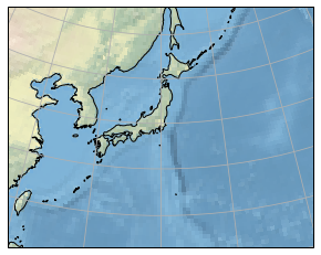
日本域
import matplotlib.pyplot as plt
import numpy as np
import matplotlib.path as mpath
import cartopy.crs as ccrs

fig = plt.figure()
'''
 北緯60度東経140度中心のポーラステレオ座標
'''
proj = ccrs.Stereographic(central_latitude=60, central_longitude=140)
ax = fig.add_subplot(1, 1, 1, projection=proj)
ax.set_extent([120, 160, 20, 50], ccrs.PlateCarree())
# ax.set_global()
ax.stock_img() # 陸海を表示
ax.coastlines(resolution='50m',) # 海岸線の解像度を上げる
ax.gridlines()
plt.show()
緯度経度座標のデータを描画する
データは京都大学生存圏研究所(http://database.rish.kyoto-u.ac.jp/arch/ncep/)
から取得したNCEP再解析を描画する。
サンプルスクリプトのimport 一覧
import netCDF4
import numpy as np
import matplotlib.pyplot as plt
import matplotlib.path as mpath
import matplotlib.cm as cm
import matplotlib.ticker as mticker
import cartopy.crs as ccrs
import cartopy.util as cutil
from cartopy.mpl.ticker import LongitudeFormatter, LatitudeFormatter
等値線
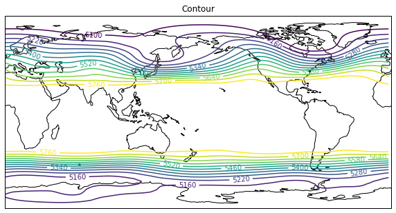
500hPaのジオポテンシャル高度を描画。
今は緯度経度座標のデータを描画するので、axesのplojectionでは描画したい図法を指定して、contourfなど呼ぶ際には、transform=ccrs..PlateCarree()を指定する。
**どの図法を描くときもtransform=ccrs.PlateCarree()**を指定する。
**ax.set_extent()でもccrs.PlateCarree()**を指定することに注意。
# netcdfを読む
nc = netCDF4.Dataset("hgt.mon.ltm.nc","r")
hgt = nc.variables["hgt"][:]
level = nc.variables["level"][:]
lat = nc.variables["lat"][:]
lon = nc.variables["lon"][:]
nc.close()
# データの切り取り
data = hgt[0,5,:,:]
# 描画部分
fig = plt.figure(figsize=(10,10))
proj = ccrs.PlateCarree(central_longitude= 180)
ax = fig.add_subplot(1, 1, 1, projection=proj)
#
levels=np.arange(5100,5800,60)# 等値線の間隔を指定
CN = ax.contour(lon,lat,data,transform=ccrs.PlateCarree(),levels=levels)
ax.clabel(CN,fmt='%.0f') # 等値線のラベルを付ける
#
ax.set_global()
ax.coastlines()
ax.set_title("Contour")
plt.show()
緯度経度データを描画する場合に、周期境界条件の切れ目場所で等値線やshadeが切れてしまう(この場合だと357.5度と360度の間の点)。
周期境界条件の足すことで、切れ目なく描画することができる。
切れ目が図の端にある場合は目立たないので、わざわざ追加しなくても良いかも。
'''
データは上と同じ
'''
fig = plt.figure(figsize=(20,10))
# 北極中心
proj = ccrs.AzimuthalEquidistant(central_longitude=0.0, central_latitude=90.0)
ax = fig.add_subplot(1, 2, 1, projection=proj)
ax.set_extent([-180, 180, 30, 90], ccrs.PlateCarree())# 描画範囲(緯度経度)の指定
# 図の周囲を円形に切る
theta = np.linspace(0, 2*np.pi, 100)
center, radius = [0.5, 0.5], 0.5
verts = np.vstack([np.sin(theta), np.cos(theta)]).T
circle = mpath.Path(verts * radius + center)
ax.set_boundary(circle, transform=ax.transAxes)
#
CF = ax.contourf(lon,lat,hgt[0,5,:,:], transform=ccrs.PlateCarree(),
                clip_path=(circle, ax.transAxes) ) # clip_pathを指定して円形にする
ax.coastlines()
plt.colorbar(CF, orientation="horizontal")
ax.set_title( "no add cyclic")
'''
cyclic pointを追加したもの
'''
ax = fig.add_subplot(1, 2, 2, projection=proj)
ax.set_extent([-180, 180, 30, 90], ccrs.PlateCarree()) # 描画範囲(緯度経度)の指定
# 図の周囲を円形に切る
theta = np.linspace(0, 2*np.pi, 100)
center, radius = [0.5, 0.5], 0.5
verts = np.vstack([np.sin(theta), np.cos(theta)]).T
circle = mpath.Path(verts * radius + center)
ax.set_boundary(circle, transform=ax.transAxes)
# cyclicな点を追加する
cyclic_data, cyclic_lon = cutil.add_cyclic_point(data, coord=lon)
# 追加されたかどうかの確認
print(lon)
print(cyclic_lon)
#
CF = ax.contourf(cyclic_lon,lat,cyclic_data, transform=ccrs.PlateCarree(),
                clip_path=(circle, ax.transAxes) ) # clip_pathを指定して円形にする
#
plt.colorbar(CF, orientation="horizontal")
ax.coastlines()
ax.set_title( "add cyclic")
plt.show()
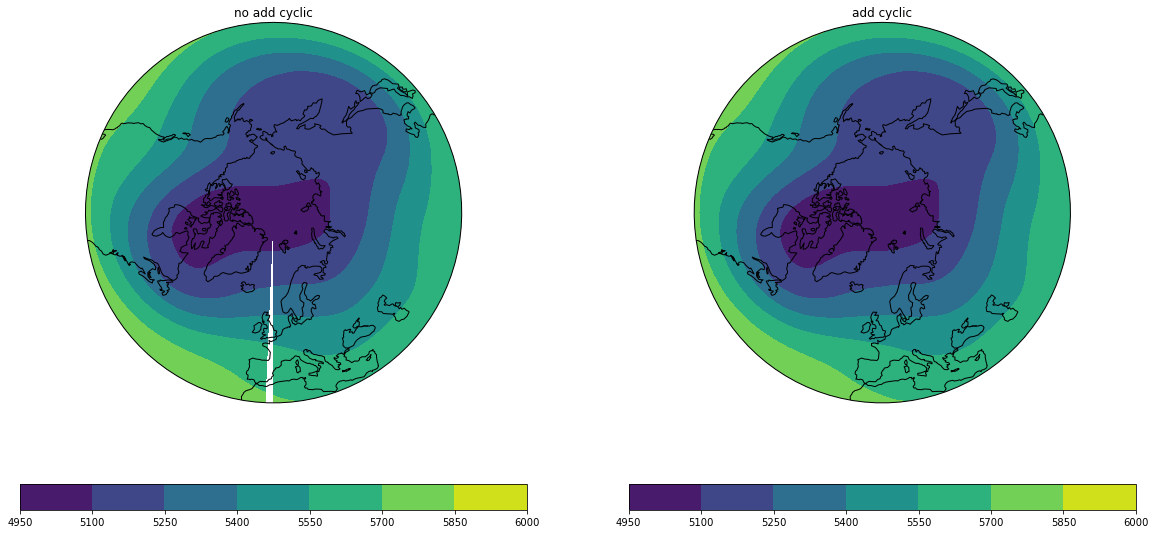
右では図の切れ目がなくなっている。
ベクトル
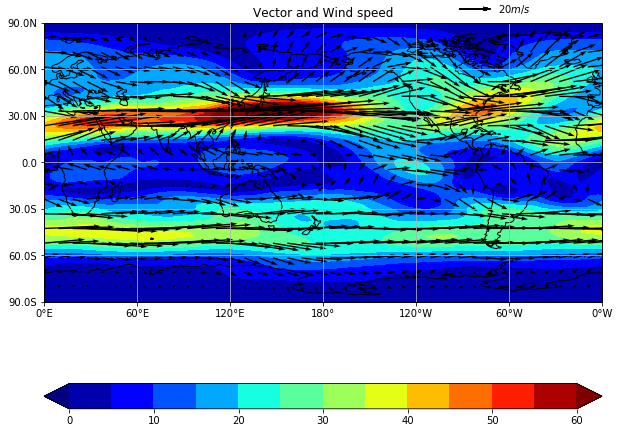
200 hPaの風。shadeで風速を描画。
grid線の調整についてもここで説明する。
# netcdfを読む
nc = netCDF4.Dataset("uwnd.mon.ltm.nc","r")
u = nc.variables["uwnd"][:][0,9,:,:]
level = nc.variables["level"][:]
lat = nc.variables["lat"][:]
lon = nc.variables["lon"][:]
nc.close()
#
nc = netCDF4.Dataset("vwnd.mon.ltm.nc","r")
v = nc.variables["vwnd"][:][0,9,:,:]
level = nc.variables["level"][:]
lat = nc.variables["lat"][:]
lon = nc.variables["lon"][:]
nc.close()
#
fig = plt.figure(figsize=(10,10))
proj = ccrs.PlateCarree(central_longitude= 180)
ax = fig.add_subplot(1, 1, 1, projection=proj)
#
sp = np.sqrt(u**2+v**2) # 風速を計算
sp, cyclic_lon = cutil.add_cyclic_point(sp, coord=lon)
#
levels=np.arange(0,61,5)
cf = ax.contourf(cyclic_lon, lat, sp, transform=ccrs.PlateCarree(), levels=levels, cmap=cm.jet, extend = "both")
# エラーメッセージを避けるために極(90N,90S)は描画しないことにしている。
Q = ax.quiver(lon,lat[1:-1],u[1:-1,:],v[1:-1,:],transform=ccrs.PlateCarree()  , regrid_shape=20, units='xy', angles='xy', scale_units='xy', scale=1)
# ベクトルの凡例を表示
qk = ax.quiverkey(Q, 0.8, 1.05, 20, r'$20 m/s$', labelpos='E',
                   coordinates='axes',transform=ccrs.PlateCarree() )
plt.colorbar(cf, orientation="horizontal" )
#
ax.coastlines()
ax.set_title("Vector and Wind speed(shade)")
ax.set_global()
#
# grid線の調整
# gridlineではなく gridを用いる
ax.set_xticks([0, 60, 120, 180, 240, 300, 359.9999999999], crs=ccrs.PlateCarree()) # gridを引く経度を指定 360にすると0Wが出ない
ax.set_yticks([-90, -60, -30, 0, 30, 60, 90], crs=ccrs.PlateCarree()) # gridを引く緯度を指定
lon_formatter = LongitudeFormatter(zero_direction_label=True) # 経度
lat_formatter = LatitudeFormatter(number_format='.1f',degree_symbol='') # 緯度。formatを指定することも可能
ax.xaxis.set_major_formatter(lon_formatter)
ax.yaxis.set_major_formatter(lat_formatter)
ax.grid()
plt.show()
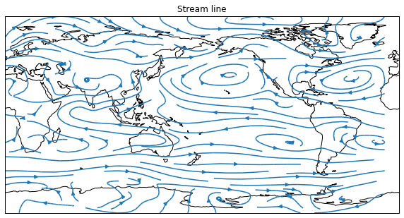
流線関数
850 hPaの流線。
streamplotを使う。
# netcdfを読む
nc = netCDF4.Dataset("uwnd.mon.ltm.nc","r")
u = nc.variables["uwnd"][:][7,2,:,:]
level = nc.variables["level"][:]
lat = nc.variables["lat"][:]
lon = nc.variables["lon"][:]
nc.close()
#
nc = netCDF4.Dataset("vwnd.mon.ltm.nc","r")
v = nc.variables["vwnd"][:][7,2,:,:]
level = nc.variables["level"][:]
lat = nc.variables["lat"][:]
lon = nc.variables["lon"][:]
nc.close()
'''
plot
'''
fig = plt.figure(figsize=(10,10))
proj = ccrs.PlateCarree(central_longitude= 180)
ax = fig.add_subplot(1, 1, 1, projection=proj)
stream = ax.streamplot(lon,lat,u,v,transform=ccrs.PlateCarree())
ax.clabel(CN,fmt='%.0f')
ax.set_global()
ax.coastlines()
ax.set_title("Stream line")
plt.show()