運よくFlutterでの開発プロジェクトに参加できましたので、Flutter開発する前に知っておきたいWidget集をまとめます。
それぞれのWidgetがどんなものなのか、イメージが湧けば十分だと思いますので、画像中心でいきます。
Widgetについて、公式のWidget catalogに詳しくまとまっています。
また、YouTubeでもWidget of the Weekとしてまとめられていますので、こちら全てチェックすることをおすすめします。
個人の見解でWidgetを選定していますのでご了承ください。
Layout系
Align
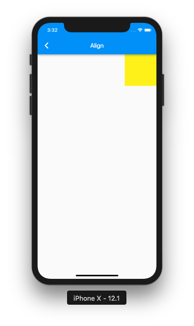
Align(
    alignment: Alignment.topRight,
    child: ...
  ),
名前の通りで、左上や右下など子Widgetの配置を揃えることができます。
Padding
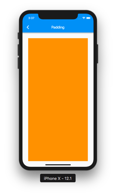
Padding(
    padding: EdgeInsets.all(30.0),
    child: ...
  ),
EdgeInsetsでPaddingのサイズを設定できます。
Container
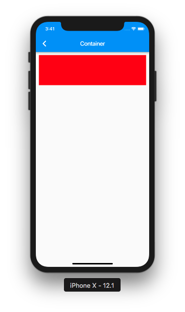
Container(
    height: 100.0,
    width: double.infinity,
    color: Colors.red,
    padding: EdgeInsets.all(10.0),
    margin: EdgeInsets.all(10.0),
    child: ...
  ),
高さや幅、色、Padding、Marginなどが組み合わさった、便利なWidgetです。
使い勝手がいいので、よく使われる基礎的なWidgetです。
Center
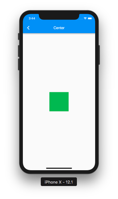
Center(
  child: ...
),
子Widgetを中央表示してくれます。
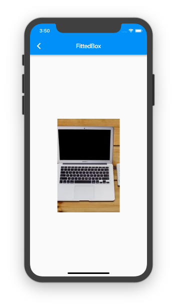
FittedBox / BoxFit
FittedBox(
  fit: BoxFit.fitHeight,
  child: Image.network('https://picsum.photos/250?image=9',),
  ),
),
領域の「高さを合わせて表示」したり「幅に合わせて表示」したりできるWidgetです。
もともと正方形の画像を、高さに合わせて表示(BoxFit.fitHeight)しています。
SafeArea
SafeArea(
  child: ...
),
SafeArea内を塗りつぶしています。
ノッチへの対応はこのWidgetで囲うだけです。
Multi Layout
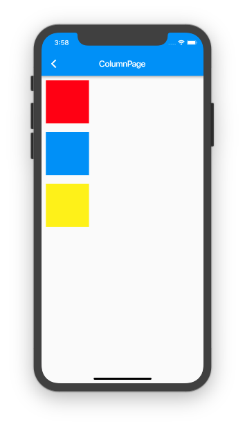
Column
Column(
  children: <Widget>[
    ...
    ...
  ],
),
縦方向に並べたい時のWidgetです。
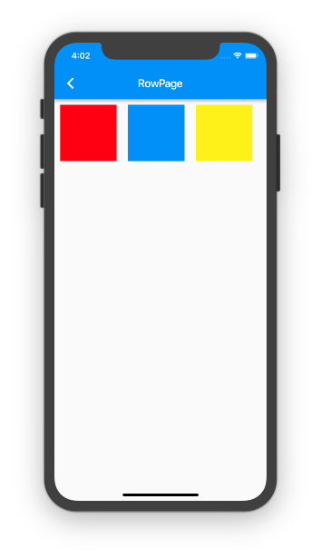
Row
Row(
  children: <Widget>[
    ...
    ...
  ],
),
Columnの横方向バージョンです。
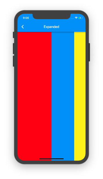
Expanded
Row(
  children: <Widget>[
    Expanded(
      flex: 3, child: ...
    ),
    Expanded(
      flex: 2, child: ...
    ),
    Expanded(
      flex: 1, child: ...
    ),
  ],
),
領域の最大限のサイズまで広げるWidgetです。
比率も指定できるため、こちらでは3:2:1の比率で表示しています。
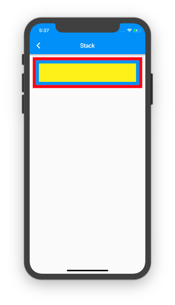
Stack
Stack(
  children: <Widget>[
    ...
    ...
  ],
),
複数Widgetを重ねて表示することができます。
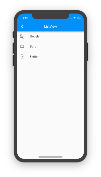
ListView / ListTile
ListView(
  children: <Widget>[
    ListTile(
      leading: Icon(Icons.g_translate),
      title: Text("Google"),
      ),
    ListTile(
      leading: Icon(Icons.computer),
      title: Text("Dart"),
    ),
    ListTile(
      leading: Icon(Icons.mobile_screen_share),
      title: Text("Flutter"),
    ),
  ],
),
ListViewとListTileで実現しています。
ListView.builderやListView.customなどがありますが、この辺りは割愛します。
横向きのListViewもscrollDirectionで指定してあげることで実現できます。
もちろんスクロール可能です。
TabBar / Tab / TabBarView
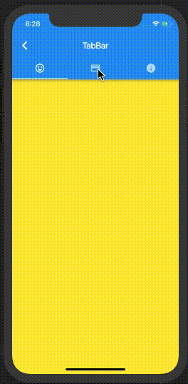
DefaultTabController(
  length: 3,
  child: Scaffold(
    appBar: AppBar(
      title: ...
      bottom: TabBar(
        tabs: <Widget>[
          Tab(icon: Icon(Icons.tag_faces,),),
          Tab(icon: Icon(Icons.credit_card,),),
          Tab(icon: Icon(Icons.info,),),
        ],
      ),
    ),
  body: TabBarView(
    children: <Widget>[
      Container(color: Colors.yellow,),
      Container(color: Colors.orange,),
      Container(color: Colors.red,),
    ]),
  ),
),
BottomNavigationBar
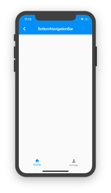
Scaffold(
  bottomNavigationBar: BottomNavigationBar(
    items: [
      BottomNavigationBarItem(...),
      BottomNavigationBarItem(...),
      ...
    ],
  ),
);
Item
Image
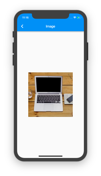
Image.network(...),
今回はImage.networkでURLを指定して表示しています。
他にもImage.assetでローカル画像を表示できたりします。
git画像がサポートされているのも嬉しいポイントです。
Icon
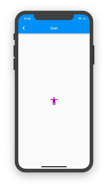
Icon(
  Icons.accessibility,
),
Iconsでかなり多くのアイコンが用意されているので、ほとんどカバーできると思います。
Progress
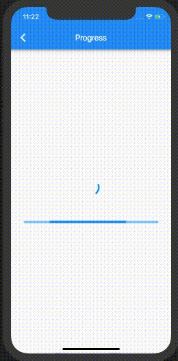
CircularProgressIndicator()
LinearProgressIndicator()
プログレスも2種類用意されています。
CheckBox / Radio / Switch
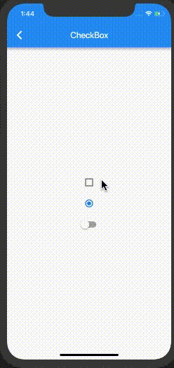
Checkbox(
  value: ...
),
Radio(
  value: ...
),
Switch(
  value: ...
),
設定画面などでよく使用される、CheckBox/Radio/Switchがそれぞれ用意されています。
Card

Card(
  child: ...
),
影の幅や形なども変えることができます。
もともとのサイズは0なので、親か子でサイズを指定することで表示されるようになります。
FloatingActionButton
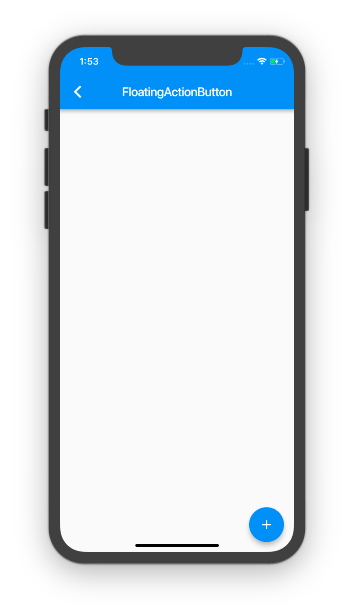
Scaffold(
  floatingActionButton: FloatingActionButton(
    child: Icon(Icons.add),
    onPressed: () {...},
  ),
);
右下のアイコンです。
floatingActionButtonLocationでFABアイコンの場所を変えられます。
Drawer
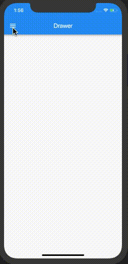
Scaffold(
  drawer: Drawer(
    child: ...
  ),
);
自動的にハンバーガーアイコンが表示されます。
その他にもDrawerHeaderというWidgetも用意されています。
CircleAvatar
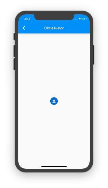
CircleAvatar(
  child: Icon(Icons.person),
),
プロフィール画像などに使われる円形のWidgetです。
Opacity
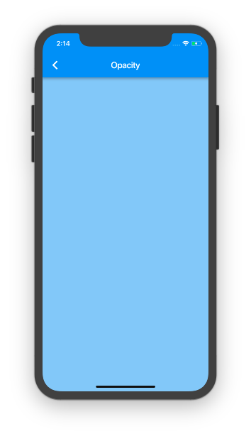
Opacity(
  opacity: 0.5,
  child: ...
),
子Widgetをすべて透過できます。
Button
RaisedButton
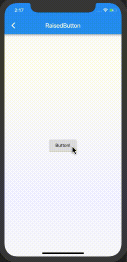
RaisedButton(
  child: Text("Button!"),
  onPressed: () {}
),
スタンダードなボタンです。
FlatButton
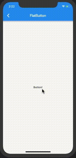
FlatButton(
  child: Text("Button!"),
  onPressed: () {}
),
IconButton
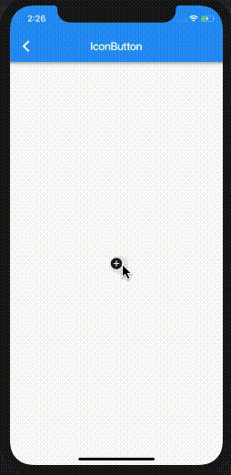
IconButton(
  icon: Icon(Icons.add_circle),
  onPressed: () {},
),
DropDownButton
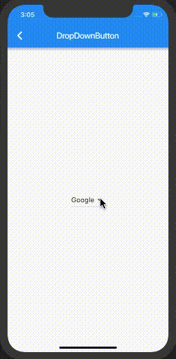
DropdownButton(
  value: ...,
  items: [
    DropdownMenuItem(...),
  ],
  onChanged: (value) {...},
),
書き方は伝わりにくいと思いますので、直接コードみてみてください。
drop_down_button.dart
Text
Text / TextStyle
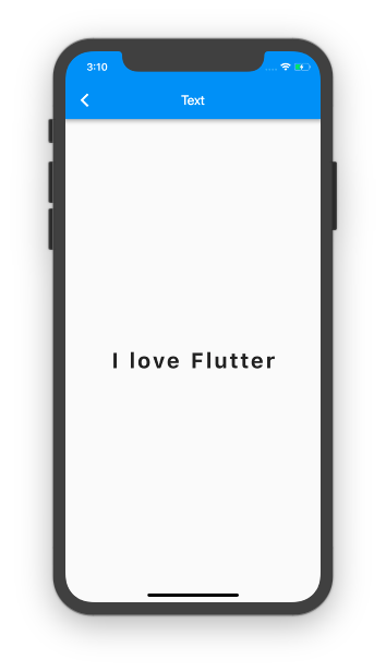
Text('I love Flutter',
  style: TextStyle(
    fontSize: 32.0,
    fontWeight: FontWeight.bold,
    fontStyle: FontStyle.normal,
    letterSpacing: 4.0,
  ),
),
文字サイズや色などもTextStyleで簡単に設定できます。
Cookbookにカスタムフォントに変更する方法も解説されています。
TextField
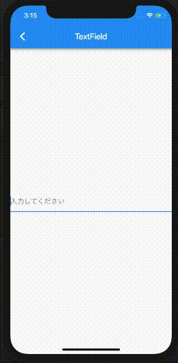
TextField(
  decoration: InputDecoration(
    hintText: '入力してください'
  ),
),
簡易的に入力ボックスを実装できるWidgetです。
InputFormTextも用意されています。
Animation
AnimatedPositioned etc..
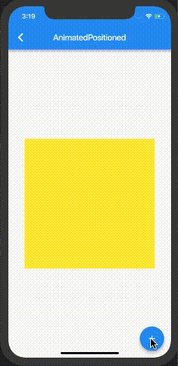
FlutterではAnimation系が充実していて、他にもAnimatedOpacityやAnimatedPaddingなどなど複数用意されています。
以下で、とてもわかりやすく解説してくれています。
[参考]: https://medium.com/flutter-jp/implicit-animation-b9d4b7358c28
まとめ
今回のプロジェクトをGitHubにおいていますので、もしよければご覧ください。
これ以外にも、たくさんの便利なWidgetが用意されています。
以下の2つはチェックしておくことをおすすめします。
1. Widget catalog
2. Widget of the Week