はじめに
AndroidViewで実装されたAlertDialogをCompose化する際に、
「BeforeとAfterを見比べると、何か違う…」ということがありました。
本記事では、ComposeのAlertDialogをAndroidViewのAlertDialogに近づけるにはどうすればいいかを調査します。
本記事では、以下を使用します。
- Material2
- MaterialAlertDialogBuilder / AndroidView
- AlertDialog / JetpackCompose
間違いや不備等ございましたら、ご指摘いただけますと幸いです。
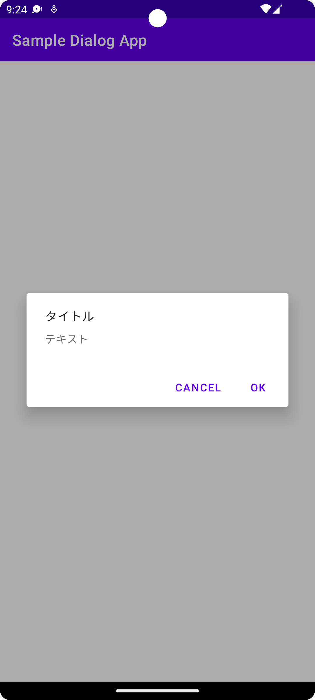
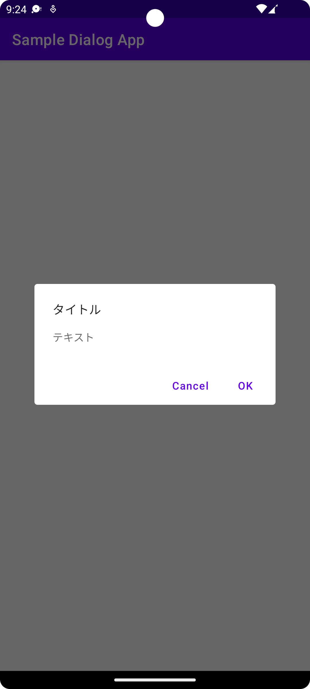
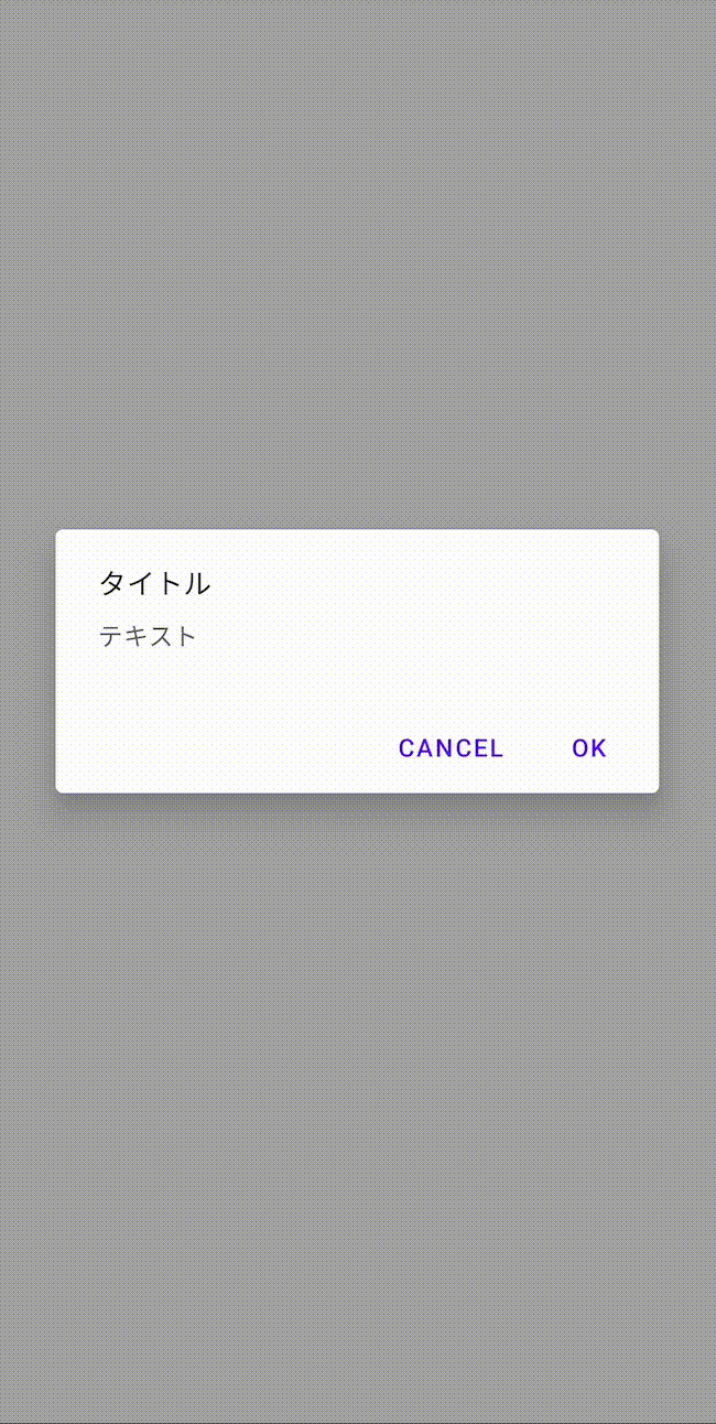
比較
| AndroidView | JetpackCompose |
|---|---|
 |
 |
以下、AlertDialogを実装しているコードです。
ライブラリで用意されているものに、テキストをセットしただけのものです。
//AndroidView
MaterialAlertDialogBuilder(requireContext())
            .setTitle("タイトル")
            .setMessage("テキスト")
            .setPositiveButton("OK", null)
            .setNegativeButton("Cancel", null)
//JetpackCompose
AlertDialog(
        onDismissRequest = { },
        title = {
            Text(text = "タイトル")
        },
        text = {
            Text("テキスト")
        },
        confirmButton = {
            TextButton(
                onClick = { }
            ) {
                Text("OK")
            }
        },
        dismissButton = {
            TextButton(
                onClick = { }
            ) {
                Text(text = "Cancel")
            }
        },
    )
何が違うのか
大きく異なるのは
- 背景の濃度
- elevationの有無
- ダイアログのサイズ
かと思います。
ComposeでもMaterialAlertDialogを再現したい
MaterialAlertDialogの背景濃度等を調べてComposeに適用できれば、目的は達成されそうです。
ところで、ComposeのAlertDialogは、DialogのcontentにAlertDialogContenteを渡しており、テキストやボタンをよしなに配置してくれています。
@Composable
fun AlertDialog(
    onDismissRequest: () -> Unit,
    buttons: @Composable () -> Unit,
    modifier: Modifier = Modifier,
    title: (@Composable () -> Unit)? = null,
    text: @Composable (() -> Unit)? = null,
    shape: Shape = MaterialTheme.shapes.medium,
    backgroundColor: Color = MaterialTheme.colors.surface,
    contentColor: Color = contentColorFor(backgroundColor),
    properties: DialogProperties = DialogProperties()
) {
    Dialog(
        onDismissRequest = onDismissRequest,
        properties = properties
    ) {
        // ダイアログ内のコンポーネントをよしなに配置
        AlertDialogContent(
            buttons = buttons,
            modifier = modifier,
            title = title,
            text = text,
            shape = shape,
            backgroundColor = backgroundColor,
            contentColor = contentColor
        )
    }
}
つまり、AlertDialogを使用してもAlertDialogContentを直接操作できないため、カスタマイズするのは難しそうです。
従って、Dialogを使用し、contentに自作したレイアウトを渡す必要があります。
背景の濃度を調べる
よく調べてみると、Material Designの公式に、デフォルト値の記載がありました。
https://m2.material.io/components/dialogs/android#full-screen-dialog
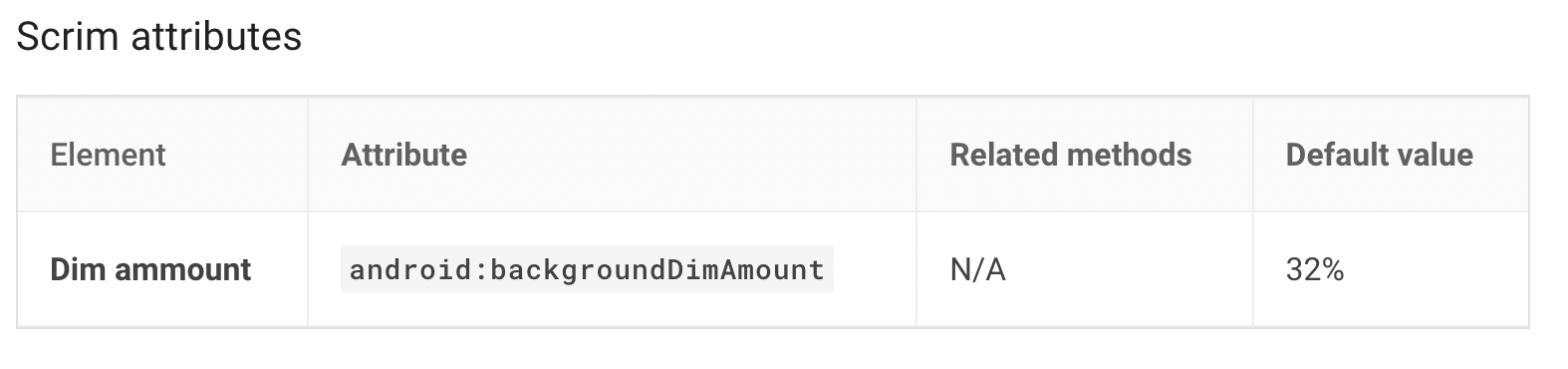
dimAmountを32%に設定するとよさそうです。
エレベーションを調べる
公式より、ThemeOverlay.MaterialComponents.MaterialAlertDialogを調べます。
こちらを辿っていくと、以下が見つかります。
<style name="Base.V21.ThemeOverlay.AppCompat.Dialog" parent="Base.V7.ThemeOverlay.AppCompat.Dialog">
    <!-- abc_floating_window_z = 16 -->
    <item name="android:windowElevation">@dimen/abc_floating_window_z</item>
</style>
elevationを16dpに設定するとよさそうです。
サイズを調べる
公式に、insetの値が記載されています。
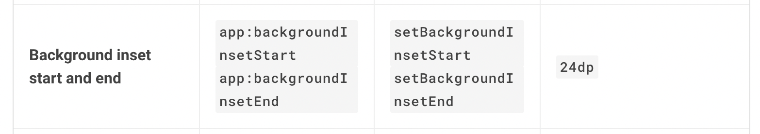
(左右marginを24dpにすればいいのかな…と思ったのですが、どう見ても幅広だったので、最終的にはそれっぽい値を設定しました。)
Dialog / AlertDialogでは、引数にDialogPropertiesが渡されています。
その中のusePlatformDefaultWidthをfalseにすると、デフォルト幅を変更することができます。
AlertDialogの代わりにDialogで実装する
背景の濃度とElevationの値がわかったので、それらを適用したDialogを実装します。
先述の通り、AlertDialogContentを使用できないため、レイアウトは自力で実装します。
こちらとMaterialAlertDialogの画像とAlertDialogの実装を参考に、それっぽく実装しました。
若干の違いはあるものの、背景濃度とElevationが同じなため、
ぱっと見区別はつかないのではないでしょうか?!
| AndroidView | JetpackCompose |
|---|---|
|
 |
以下、Dialogの実装コードです。
Dialog(
        onDismissRequest = {},
        properties = DialogProperties(
            // widthを自由に設定する
            usePlatformDefaultWidth = false
        )
    ) {
        Surface(
            modifier = Modifier
                .fillMaxWidth()
                // それっぽい左右マージン
                .padding(horizontal = 36.dp),
            shape = MaterialTheme.shapes.medium,
            color = MaterialTheme.colors.surface,
            contentColor = contentColorFor(MaterialTheme.colors.surface),
            // Elevationの設定
            elevation = 16.dp
        ) {
            // 背景濃度の設定
            (LocalView.current.parent as DialogWindowProvider).window.setDimAmount(0.32f)
            Column {
                Box(
                    modifier = Modifier
                        .padding(start = 24.dp, end = 24.dp)
                        .height(40.dp),
                    contentAlignment = Alignment.BottomStart
                ) {
                    Column {
                        Text(
                            text = "タイトル",
                            style = MaterialTheme.typography.subtitle1
                        )
                    }
                }
                Box(
                    modifier = Modifier
                        .padding(start = 24.dp, end = 24.dp)
                        .height(36.dp),
                    contentAlignment = Alignment.BottomStart
                ) {
                    Text(
                        text = "テキスト",
                        style = MaterialTheme.typography.body2
                    )
                }
                Spacer(modifier = Modifier.height(28.dp))
                Row(
                    modifier = Modifier
                        .fillMaxWidth()
                        .padding(horizontal = 8.dp),
                    horizontalArrangement = Arrangement.End
                ) {
                    TextButton(
                        onClick = { }
                    ) {
                        Text(text = "CANCEL")
                    }
                    Spacer(modifier = Modifier.width(8.dp))
                    TextButton(
                        onClick = { }
                    ) {
                        Text(text = "OK")
                    }
                }
            }
        }
    }
終わりに
本記事は、とにかくMaterialAlertDialogっぽくすることを目標にしました。
そのため、謎の左右マージンを設定していたり、文字数が増えたらレイアウト崩れしそうな実装をしております。スペースもちゃんと計算しておりません。
ComposeのDialogのデフォルト値を調べる!が真の目標だったのですが、なかなかちょっと見つけられなかったので、今後の課題にします。