Matplotlib
- グラフ描画ライブラリ
- 公式サイト
- 基本Python + Numpy + matplotlib + SciPy + etc.の組み合わせて使用
インストール
pip install matplotlib
最初の例
import matplotlib.pyplot as plt # 呪い

squares = [1, 4, 9, 16, 25]
plt.plot(squares) # defalutは点同士が直線で結びついている
plt.show() # 上の指示に従い、描画し、見せる

日本語表示
デフォルトは日本語使用できないため、ちょっとした設定が必要になります。
要は、matplotlibのフォント設定を日本語対応のフォントを変更する。
- https://ipafont.ipa.go.jp/node17#jp からIPAexフォントをダウンロード、現時点は「IPAexフォント Ver.004.01」が最新
- ダウンロードしたファイルを解凍し、中の
ipaexg.ttfファイルを${オブジェクトパス}\venv\Lib\site-packages\matplotlib\mpl-data\fonts\ttfにコピーする - ${オブジェクトパス}\venv\Lib\site-packages\matplotlib\mpl-dataは以下にあるmatplotlibrcを開き
- font.familyで検索
-
#font.family : sans-serifの下にfont.family : IPAexGothicを追記する - matplotlibのキャッシュの保存先の内容を全部削除する
下記のコードでフォントパスとキャッシュの保存先を調べることができる
print(matplotlib.matplotlib_fname())   # フォントパス
print(matplotlib.get_cachedir())       # キャッシュの保存先
もう一つ方法は、設定ファイルを修正しないが、毎回下記のコードを追記しないといけない
plt.rcParams['font.sans-serif']=['IPAexGothic']
もしくは
plt.rcParams["font.family"] = "IPAexGothic"
飾り
import matplotlib.pyplot as plt

squares = [1, 4, 9, 16, 25]
plt.plot(squares, linewidth = 5)  # 線をちょっと太くする

plt.title("平方", fontsize = 24)
plt.xlabel("値", fontsize = 14)
plt.ylabel("値の二乗", fontsize = 14)

# 軸の目盛りの表示設定
plt.tick_params(axis = 'both', labelsize = 14)
plt.show()

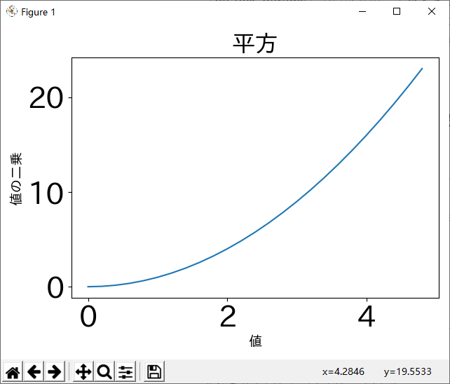
import numpy as np
import matplotlib.pyplot as plt

# 0から5を0.2刻みの点を作成することにより、線が滑らかに見える
x = np.arange(0., 5., 0.2)
plt.plot(x, x * x)

plt.title("平方", fontsize = 24)
plt.xlabel("値", fontsize = 14)
plt.ylabel("値の二乗", fontsize = 14)

# 目盛りの文字サイズをちょっと大きめに設定
plt.tick_params(labelsize = 30)

plt.show()

目盛りのサイズが大きくすると、X軸やY軸のラベルがはみ出して、見えなくなるが、もちろん画面のサイズを調整して、見えるようにすればいいが、plt.tight_layout()をplt.show()前に入れれば、自動的に収める状態で表示してくれる。
import numpy as np
import matplotlib.pyplot as plt

x = np.arange(0., 5., 0.2)
plt.plot(x, x * x)

plt.title("平方", fontsize = 24)
plt.xlabel("値", fontsize = 14)
plt.ylabel("値の二乗", fontsize = 14)

plt.tick_params(labelsize = 30)

plt.tight_layout()
plt.show()
点で表示したい(散布図)
scatter()を使用する。
import matplotlib.pyplot as plt

x_values = [1, 2, 3, 4, 5]
y_values = [1, 4, 9, 16, 25]
plt.scatter(x_values, y_values, s=100)  # sは点のサイズを指定

plt.show()

データは自動計算から取得する
import matplotlib.pyplot as plt

x_values = list(range(1, 1001))
y_values = [x**2 for x in x_values]
plt.scatter(x_values, y_values, s=4)

plt.axis([0, 1100, 0, 1100000])  # 軸の範囲
plt.show()

色のカスタマイズ
パラメータcで色を指定することができる
plt.scatter(x_values, y_values, c='red', s=40)
RGBで指定することもできる。RGB それぞれのを色の要素を 0.0 ~ 1.0 のタプルで指定することも可能です。
plt.scatter(x_values, y_values, c=(0, 0, 0.8), s=40)
カラーマップ
カラーマップ (color map) は、描画する際に使用する値と色の対応関係を表す。データ可視化にあたり、カラーマップの選択は、データの変化のルールなどを強調することができる。例えば、浅い色で小さい値を表し、濃い色で多い値を強調するなど。
import matplotlib.pyplot as plt

x_values = list(range(1, 1001))
y_values = [x**2 for x in x_values]
plt.scatter(x_values, y_values, c=y_values, cmap=plt.cm.Blues)

plt.show()

詳しくはオフィシャルサイトを参照する。Examples⇒Color
グラフを保存
plt.show()の代わりにplt.savefig()を使用する
plt.savefig(`squares_plot.png`, bbox_inches='tight')
bbox_inches='tight'を指定すると、余分の空白を切り落としてくれる。
保存できるファイルの拡張子は
eps, jpeg, jpg, pdf, pgf, png, ps, raw, rgba, svg, svgz, tif, tiff
軸を非表示
plt.axes().get_xaxis().set_visible(False)
plt.axes().get_yaxis().set_visible(False)
サイズ調整
plt.figure(figsize=(10, 6)) # 単位はインチ
plt.figure(dpi=128, figsize=(10, 6)) # デフォルトは80dpi