pandasの表ちょっと見にくいな…色ほしいな…
と、ある時思ったのでした。
EXCELに移してデータバーとかつけるのも面倒だし、Jupyter上でなんとかできないかね?と思ってたら普通にpandasにそんな機能がついていたのよね笑
知らなかった笑
以下のサイトで発見した。
https://pbpython.com/styling-pandas.html
DataFrame.style
DataFrame.styleについては以下のページで詳細な機能がわかる。
https://pandas.pydata.org/pandas-docs/version/0.18/style.html
sklearnに含まれるデータセットbostonで実践
# パッケージインポート
import pandas as pd
from sklearn import datasets
import numpy as np
import matplotlib.pyplot as plt
import seaborn as sns

# データ読み込み
boston = datasets.load_boston()
boston_df=pd.DataFrame(boston.data)
boston_df.columns = boston.feature_names # カラム名を挿入
boston_df['PRICE'] = pd.DataFrame(boston.target)
display(boston_df)

これにEXCELのようなデータバーをつける
display(boston_df.style.bar())

おお、できた。しかしなんか血みどろだな…。
血みどろはイヤなので、カラムを選択して、色も変えることができる。
subsetにカラム名を指定したり、barをつなげるように記述したりするとカスタマイズできる。
# カラム指定
display(boston_df.style.bar(subset=['RM','AGE']))
# カラム指定かつそれぞれ色分け
display(boston_df.style\
        .bar(subset=['RM'],color=['lightcoral'])\
        .bar(subset=['AGE'],color=['lightgreen'])\
        .bar(subset=['TAX'],color=['lightblue']))


いけるやん!
カラースケールも試してみよう。
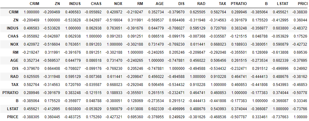
# 相関行列の作成
boston_corr=boston_df.corr()
display(boston_corr)
# 色を付ける
display(boston_corr.style.background_gradient(cmap='coolwarm'))

いけるやん!(二回目)
こんな感じでEXCELでの表の加工はpandasでもできることを知ったのであった。
ちなみにEXCELファイルでそのまま出力も可能。
# openpyxlパッケージがinstall済みであること
n_df=boston_corr.style.background_gradient(cmap='coolwarm')
n_df.to_excel('test.xlsx')
'test.xlsx'の中身↓

見やすいNotebookを作るためにいろいろ活用できそうだ!
おまけ(sparklines)
sparklinesというパッケージでpandasの表の中にヒストグラムが書ける
例えば、CHAS:チャールズ川 (1: 川の周辺, 0: それ以外)ごとに、以下の平均を出す。
・DIS:5つのボストン市の雇用施設からの重み付き距離
・PRISE:住宅価格
display(boston_df.groupby('CHAS')[['DIS','PRICE']].mean())

ほーん、チャールズ川の周辺の方がボストン市の雇用施設との距離が近くて家賃は高めなのね、ということはわかる。
けど外れ値があって傾向はほぼ同じなのに平均が高くなっているかも。
そこで、関数を定義して、
from sparklines import sparklines
# 関数を定義
def sparkline_hist(x, bin_num=10):
    bins=np.histogram(x, bins=bin_num)[0]
    sl = sparklines(bins)[0]
    return sl
groupbyに関数を適用させると、
display(boston_df.groupby('CHAS')[['DIS','PRICE']].agg(['mean', sparkline_hist]))

ヒストグラムっぽいのが表の中に出た!
どうやらチャールズ川の周辺じゃなくてもボストン市の雇用施設との距離が近いところはたくさんありそうだぞ、とかチャールズ川の周辺の方はかなり家賃が高い家とそうでない家の二極化っぽいぞとかがpandas上でざっとわかる。
しかしなぜか自分のJupyter上だと、ヒストグラムっぽいものが下に凸になった部分とかがあってそれは謎のまま。
sparkline_hist関数の中身を検証してみると特に下に凸にならないのに、なぜだろうか
# sparkline_hist関数の中身検証
bins=np.histogram(boston_df[boston_df['CHAS']==0]['DIS'], bins=10)[0]
sl = sparklines(bins)[0]
print(sl)
bins=np.histogram(boston_df[boston_df['CHAS']==1]['DIS'], bins=10)[0]
sl = sparklines(bins)[0]
print(sl)

ちなみに実際にヒストグラムを書いてみると、以下のような感じでした。
fig=plt.figure(figsize=(10,5))
ax=plt.subplot(1,2,1)
ax.hist(boston_df[boston_df['CHAS']==0]['DIS'],bins=10, color='red', label='CHAS=0',alpha=0.5, density=True)
ax.hist(boston_df[boston_df['CHAS']==1]['DIS'],bins=10, color='blue', label='CHAS=1',alpha=0.5, density=True)
ax.legend(loc='upper right')
ax.set_ylabel('density')
ax.set_xlabel('DIS')
ax.set_title('DIS Hist')

ax2=plt.subplot(1,2,2)
ax2.hist(boston_df[boston_df['CHAS']==0]['PRICE'],bins=10, color='red', label='CHAS=0',alpha=0.5, density=True)
ax2.hist(boston_df[boston_df['CHAS']==1]['PRICE'],bins=10, color='blue', label='CHAS=1',alpha=0.5, density=True)
ax2.legend(loc='upper right')
ax2.set_ylabel('density')
ax2.set_xlabel('PRICE')
ax2.set_title('PRICE Hist')
plt.tight_layout()
plt.show()

sparklines面白かったけど、特に有益な使い道は思いつかないな…笑
普通にヒストグラム描きますわ。笑
以上!